Willkommen bei den Top‑Schriften – hier treffen Beliebtheit und Qualität aufeinander. Das sind die in diesem Jahr am häufigsten heruntergeladenen und genutzten Fonts. Wenn Sie sichere Optionen für Logo, Web oder Social suchen, starten Sie hier.
Jeder Top‑Font überzeugt durch Balance, Lesbarkeit und Vielseitigkeit. Sie finden moderne Sans‑Serifs, elegante Scripts, Vintage‑Serifs und minimalistische Displays.
-
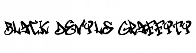
( Fonts by Cikareotype Studio )
A bold, graffiti-inspired font with dynamic, jagged lines and a rebellious urban style.
 Herunterladen 66 Downloads@WebFont
 -
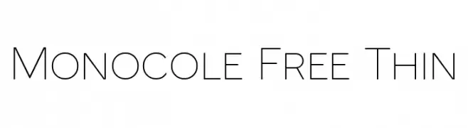
( Fonts by Craft Supply Co - Personal-use only. For commercial use please contact owner. )
A sleek, minimalist font with thin, uniform strokes and balanced spacing.
![Monocole Free Thin Frei Schriftart Herunterladen]() Herunterladen 66 Downloads@WebFont
Herunterladen 66 Downloads@WebFont -
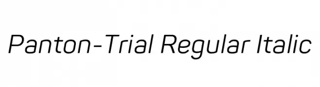
( Fonts by Fontfabric - Svetoslav Simov - Personal-use only. For commercial use please contact owner. )
A modern, italic sans-serif font with a clean and dynamic style.
![Panton-Trial Regular Italic Frei Schriftart Herunterladen]() Herunterladen 66 Downloads@WebFont
Herunterladen 66 Downloads@WebFont -
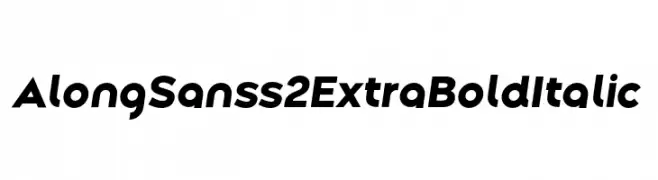
( Fonts by Ryul Davidson - Personal-use only. For commercial use please contact owner. )
A bold, italicized sans-serif font with a modern geometric style.
![Along Sans s2 ExtraBoldItalic Frei Schriftart Herunterladen]() Herunterladen 66 Downloads@WebFont
Herunterladen 66 Downloads@WebFont -
( Fonts by Lettersiro Studio - Muhammad Sirojuddin - Personal-use only. For commercial use please contact owner. )
An elegant and flowing script font with smooth, connected strokes.
![Holland Frei Schriftart Herunterladen]() Herunterladen 66 Downloads@WebFont
Herunterladen 66 Downloads@WebFont -
( Fonts by Mans Greback - www.mansgreback.com - Personal-use only. For commercial use please contact owner. )
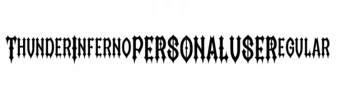
A bold, gothic-inspired font with sharp serifs and high contrast.
![Thunder Inferno PERSONAL USE Regular Frei Schriftart Herunterladen]() Herunterladen 66 Downloads@WebFont
Herunterladen 66 Downloads@WebFont -
( Fonts by www.selawetype.com - Personal-use only. FOR DONATION https://www.paypal.me/selawe . For commercial use please contact owner. )
A graceful script font with flowing, handwritten strokes and elegant curves.
![Quillines Frei Schriftart Herunterladen]() Herunterladen 66 Downloads@WebFont
Herunterladen 66 Downloads@WebFont -
( Fonts by Abo Daniel Studio - Panggah Laksono - Personal-use only. For commercial use please contact owner. )
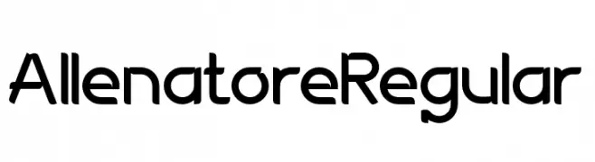
A modern, geometric sans-serif font with clean lines and a friendly appearance.
![AllenatoreRegular Frei Schriftart Herunterladen]() Herunterladen 66 Downloads@WebFont
Herunterladen 66 Downloads@WebFont -
( Fonts by Johandika Syahputra Lubis - Personal-use only. For commercial use please contact owner. )
A modern, bold italic font with a sleek and dynamic style.
![BrandingPro-BoldItalic Frei Schriftart Herunterladen]() Herunterladen 66 Downloads@WebFont
Herunterladen 66 Downloads@WebFont -
( Fonts by JOEBOB graphics - Joe vanderHam - Personal-use only. For commercial use please contact owner. )
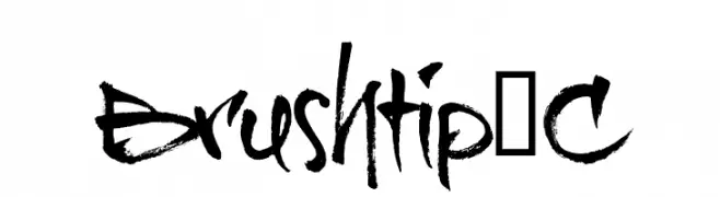
A bold, brush-style font with dynamic and expressive strokes.
![Brushtip-C Frei Schriftart Herunterladen]() Herunterladen 66 Downloads@WebFont
Herunterladen 66 Downloads@WebFont -
( Vladimir Nikolic - www.coroflot.com/vladimirnikolic )
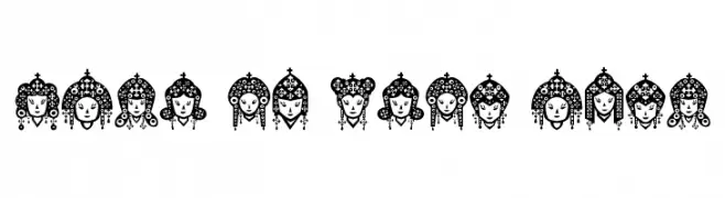
Intricately detailed idol heads with elaborate headdresses in a decorative style.
![Head of Idol Regular Frei Schriftart Herunterladen]() Herunterladen 66 Downloads@WebFont
Herunterladen 66 Downloads@WebFont -
( Fonts by www.selawetype.com - Personal-use only. FOR DONATION https://www.paypal.me/selawe . For commercial use please contact owner. )
A playful and elegant script font with fluid, cursive letterforms.
![Quillines Frei Schriftart Herunterladen]() Herunterladen 66 Downloads@WebFont
Herunterladen 66 Downloads@WebFont -
( Walter Paggioro - www.raptuscreativi.com/site/fields/type-design/ )
A tall, narrow, and elegant font with a modern aesthetic.
![cancello Frei Schriftart Herunterladen]() Herunterladen 66 Downloads@WebFont
Herunterladen 66 Downloads@WebFont -
![Liza Thin Frei Schriftart Herunterladen]() Herunterladen 66 Downloads
Herunterladen 66 Downloads -
( Fonts by Maulana Creative - Gilang Maulana - Personal-use only. For commercial use please contact owner. )
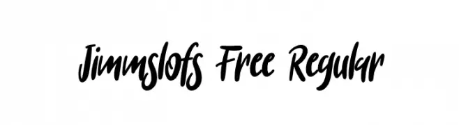
A bold, expressive handwritten font with fluid and lively strokes.
![Jimmslofs Free Regular Frei Schriftart Herunterladen]() Herunterladen 66 Downloads@WebFont
Herunterladen 66 Downloads@WebFont -
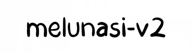
( Fonts by fadlilunasi - Fadli raihan - Personal-use only. For commercial use please contact owner. )
A playful, rounded font with a hand-drawn, casual style.
![melunasi-v2 Frei Schriftart Herunterladen]() Herunterladen 66 Downloads@WebFont
Herunterladen 66 Downloads@WebFont -
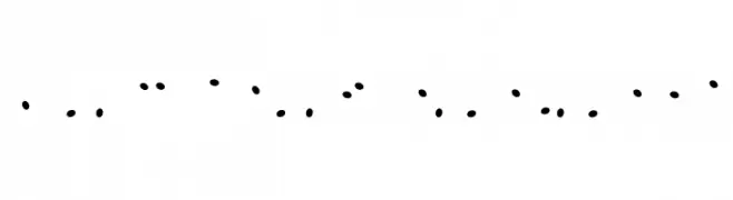
( Darrell Flood )
A playful, dotted font with a whimsical and bubbly appearance.
![Juicy Fruity Highlights Frei Schriftart Herunterladen]() Herunterladen 66 Downloads@WebFont
Herunterladen 66 Downloads@WebFont -
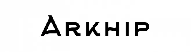
( Fonts by Design Klimov - Personal-use only. For commercial use please contact owner. )
A bold, modern font with clean, geometric lines and balanced proportions.
![Arkhip Frei Schriftart Herunterladen]() Herunterladen 66 Downloads@WebFont
Herunterladen 66 Downloads@WebFont -
( Fonts by Kong Font - fontkong.com - Personal-use only. For commercial use please contact owner. )
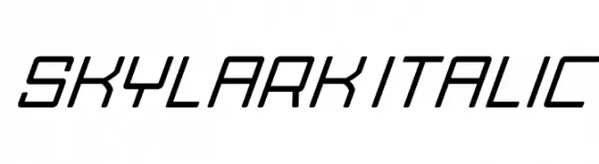
A sleek, italicized font with a modern, geometric design.
![Skylark Italic Frei Schriftart Herunterladen]() Herunterladen 66 Downloads@WebFont
Herunterladen 66 Downloads@WebFont -
( Fonts by Mans Greback - www.mansgreback.com - Personal-use only. For commercial use please contact owner. )
A playful, casual handwritten font with smooth, flowing strokes.
![Apple Hut Frei Schriftart Herunterladen]() Herunterladen 66 Downloads@WebFont
Herunterladen 66 Downloads@WebFont -
( Fonts by 177Studio )
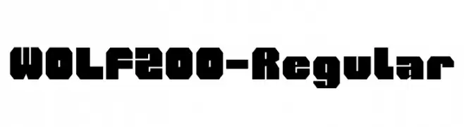
A bold, geometric font with strong, angular lines and a blocky appearance.
![WOLF200-Regular Frei Schriftart Herunterladen]() Herunterladen 66 Downloads@WebFont
Herunterladen 66 Downloads@WebFont -
( Noto is a trademark of Google Inc. Noto fonts are open source. All Noto fonts are published under the SIL Open Font License, Version 1.1 )
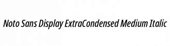
A modern, extra-condensed sans-serif typeface with medium weight and italic style.
![Noto Sans Display ExtraCondensed Medium Italic Frei Schriftart Herunterladen]() Herunterladen 66 Downloads@WebFont
Herunterladen 66 Downloads@WebFont -
( Fonts by Vunira Design - Personal-use only. For commercial use please contact owner. )
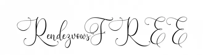
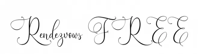
An elegant script font with intricate swirls and flourishes.
![RendezvowsFREE Frei Schriftart Herunterladen]() Herunterladen 66 Downloads@WebFont
Herunterladen 66 Downloads@WebFont -
( Fonts by Vunira Design - Personal-use only. For commercial use please contact owner. )
An elegant script font with ornate swashes and flowing letterforms.
![Rendezvows FREE Frei Schriftart Herunterladen]() Herunterladen 66 Downloads@WebFont
Herunterladen 66 Downloads@WebFont -
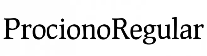
( Fonts by Barry Schwartz - Personal-use only. For commercial use please contact owner. )
A classic serif font with elegant, well-proportioned characters and moderate contrast.
![Prociono Regular Frei Schriftart Herunterladen]() Herunterladen 66 Downloads@WebFont
Herunterladen 66 Downloads@WebFont -
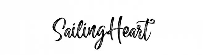
( Fonts by Din Studio - Donis Miftahudin - Personal-use only. For commercial use please contact owner. )
A flowing, elegant script font with dynamic curves and artistic flair.
![Sailing Heart Frei Schriftart Herunterladen]() Herunterladen 66 Downloads@WebFont
Herunterladen 66 Downloads@WebFont -
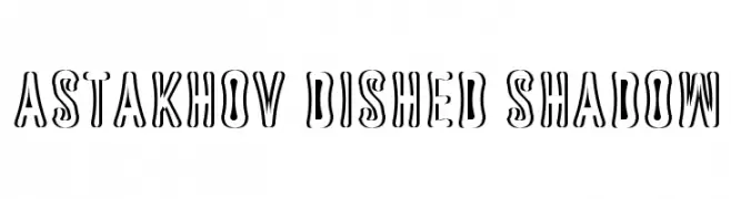
( Fonts by Dmitry Astakhov - www.behance.net/adonis-abe1e - Personal-use only. For commercial use please contact owner. )
A bold, shadowed font with a three-dimensional effect.
![Astakhov Dished Shadow Frei Schriftart Herunterladen]() Herunterladen 66 Downloads@WebFont
Herunterladen 66 Downloads@WebFont -
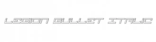
( Iconian Fonts - Daniel Zadorozny - www.iconian.com )
A futuristic, angular, and italic font with outlined characters.
![Legion Bullet Italic Frei Schriftart Herunterladen]() Herunterladen 66 Downloads@WebFont
Herunterladen 66 Downloads@WebFont -
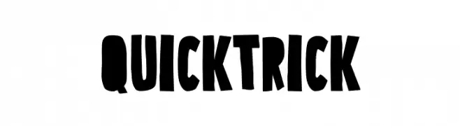
( Fonts by Eko Bimantara )
A bold, playful font with hand-drawn, exaggerated letterforms.
![Quick Trick Frei Schriftart Herunterladen]() Herunterladen 66 Downloads@WebFont
Herunterladen 66 Downloads@WebFont -
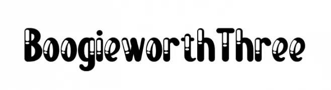
( Fonts by Kong Font - https://fontkong.com/ - Personal-use only. For commercial use please contact owner. )
A bold, playful display font with retro cut-out details.
![Boogie worth Three Frei Schriftart Herunterladen]() Herunterladen 66 Downloads@WebFont
Herunterladen 66 Downloads@WebFont -
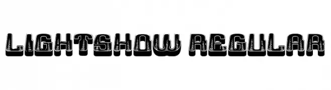
( Fonts by Vladimir Nikolic - www.creativefabrica.com/designer/vladimirnikolic/ - Personal-use only. For commercial use please contact owner. )
A bold, decorative font with a textured, vintage appearance and three-dimensional effect.
![Lightshow Regular Frei Schriftart Herunterladen]() Herunterladen 66 Downloads@WebFont
Herunterladen 66 Downloads@WebFont -
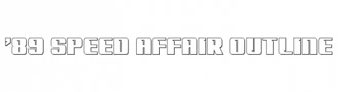
( Fonts by Iconian Fonts - Daniel Zadorozny - Personal-use only. For commercial use please contact owner. )
A bold, geometric outline font with a modern, futuristic style.
!['89 Speed Affair Outline Frei Schriftart Herunterladen]() Herunterladen 66 Downloads@WebFont
Herunterladen 66 Downloads@WebFont -
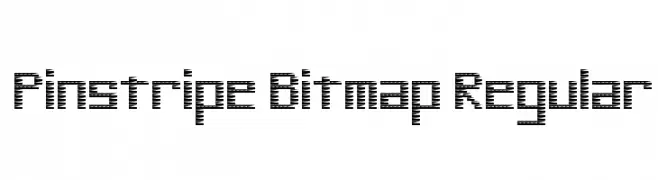
( Nerdle Pants )
A pinstripe-patterned, bitmap-style font with a modern and retro feel.
![Pinstripe Bitmap Regular Frei Schriftart Herunterladen]() Herunterladen 66 Downloads@WebFont
Herunterladen 66 Downloads@WebFont -
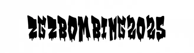
( Fonts by Woodcutter )
A bold, jagged font with a graffiti-inspired, distressed look.
![Zgz Bombing 2025 Frei Schriftart Herunterladen]() Herunterladen 66 Downloads@WebFont
Herunterladen 66 Downloads@WebFont -
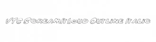
( Fonts by Vigilante Typeface Corporation Larry Yerkes. Personal-use only. For commercial use please contact owner. )
A bold, outlined, italic font with a playful and dynamic style.
![VTC ScreamItLoud Outline Italic Frei Schriftart Herunterladen]() Herunterladen 66 Downloads@WebFont
Herunterladen 66 Downloads@WebFont


Welche Schriften sind gerade am populärsten?
Poppins, Roboto, Montserrat, Open Sans und Lato sind wegen ihrer klaren Formen und breiten Einsetzbarkeit sehr gefragt – von Markenauftritt über Landingpages bis hin zu Postern.
Welche Fonts eignen sich für Logos?
Geometrische Sans‑Serifs (z. B. Poppins, Familien im Gotham‑Stil) sind ein häufiger Griff für sauberes, skalierbares Branding. Für eine persönlichere Note bleiben Scripts und Handschrift‑Stile beliebt. Kombinieren Sie einen prägnanten Headline‑Font mit einer neutralen Brotschrift für Wiedererkennung und Harmonie.
Wie oft wird die Top‑Liste aktualisiert?
Regelmäßig – basierend auf realen Downloads und Interaktionen. Schauen Sie öfter vorbei, um aufstrebende Favoriten früh zu entdecken.
💡 Tipp: Seite bookmarken – Trends wechseln schnell, und heutige Top‑Schriften inspirieren morgen vielleicht das Rebranding.