Willkommen bei den Top‑Schriften – hier treffen Beliebtheit und Qualität aufeinander. Das sind die in diesem Jahr am häufigsten heruntergeladenen und genutzten Fonts. Wenn Sie sichere Optionen für Logo, Web oder Social suchen, starten Sie hier.
Jeder Top‑Font überzeugt durch Balance, Lesbarkeit und Vielseitigkeit. Sie finden moderne Sans‑Serifs, elegante Scripts, Vintage‑Serifs und minimalistische Displays.
-
( Misti's Fonts - mistifonts.com/ )
A playful handwritten font with a casual and friendly vibe.
 Herunterladen 65 Downloads@WebFont
 -
( Noto is a trademark of Google Inc. Noto fonts are open source. All Noto fonts are published under the SIL Open Font License, Version 1.1 )
A bold, modern font with thick strokes and clear characters.
![Noto Sans Devanagari UI ExtraBold Frei Schriftart Herunterladen]() Herunterladen 65 Downloads@WebFont
Herunterladen 65 Downloads@WebFont -
( Fonts by Austie Bost Fonts - Austin Owens - Personal-use only. For commercial use please contact owner. )
A playful, paw-print adorned font with a whimsical, hand-drawn style.
![Austie Bost Kitten Klub Frei Schriftart Herunterladen]() Herunterladen 65 Downloads@WebFont
Herunterladen 65 Downloads@WebFont -
( Fonts by Galdino Otten - Personal-use only. For commercial use please contact owner. )
A rugged, barbed wire-inspired font with a hand-drawn appearance.
![Old Barbwire Frei Schriftart Herunterladen]() Herunterladen 65 Downloads@WebFont
Herunterladen 65 Downloads@WebFont -
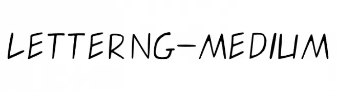
( Personal-use only. For commercial use please contact owner. )
A playful handwritten font with smooth, slanted strokes and a casual feel.
![letterng-medium Frei Schriftart Herunterladen]() Herunterladen 65 Downloads@WebFont
Herunterladen 65 Downloads@WebFont -
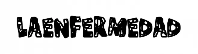
( Fonts by Woodcutter )
A bold, distressed font with a playful and irregular design.
![La Enfermedad Frei Schriftart Herunterladen]() Herunterladen 65 Downloads@WebFont
Herunterladen 65 Downloads@WebFont -
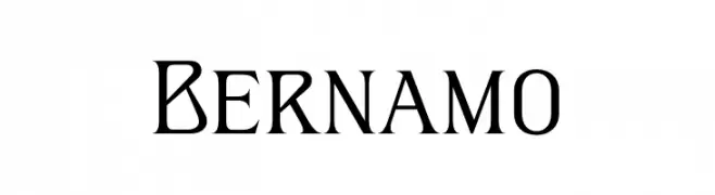
( Fonts by typeformerstudio.com - Personal-use only. For commercial use please contact owner. )
A modern serif font with sharp, angular serifs and clean lines.
![Bernamo Frei Schriftart Herunterladen]() Herunterladen 65 Downloads@WebFont
Herunterladen 65 Downloads@WebFont -
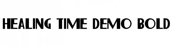
( Fonts by CalligraphyFonts - Personal-use only. For commercial use please contact owner. )
A bold, modern font with geometric shapes and clean lines, perfect for impactful headlines and branding.
![Healing Time Demo Bold Frei Schriftart Herunterladen]() Herunterladen 65 Downloads@WebFont
Herunterladen 65 Downloads@WebFont -
( Fonts by Edric Studio - Personal-use only. For commercial use please contact owner. )
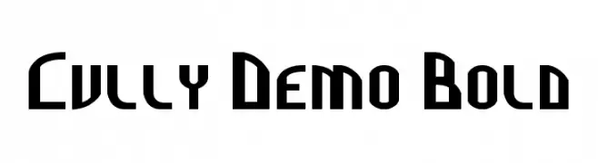
A bold, geometric font with a modern, futuristic style and strong, angular lines.
![Cully Demo Bold Frei Schriftart Herunterladen]() Herunterladen 65 Downloads@WebFont
Herunterladen 65 Downloads@WebFont -
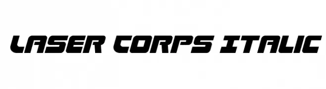
( Fonts by Daniel Zadorozny - www.iconian.com - Personal-use only. For commercial use please contact owner. )
A bold, italic, futuristic font with angular shapes and a dynamic slant.
![Laser Corps Italic Frei Schriftart Herunterladen]() Herunterladen 65 Downloads@WebFont
Herunterladen 65 Downloads@WebFont -
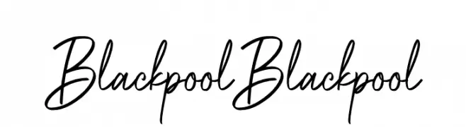
( Fonts by Bluestype Studio - Jefri Dwi Alfatah - Personal-use only. For commercial use please contact owner. )
A lively script font with fluid, cursive strokes and a natural handwritten feel.
![Blackpool Blackpool Frei Schriftart Herunterladen]() Herunterladen 65 Downloads@WebFont
Herunterladen 65 Downloads@WebFont -
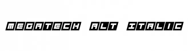
( Fonts by Darrell Flood - Personal-use only. For commercial use please contact owner. )
A bold, geometric, and italic font with a futuristic style.
![Megatech Alt Italic Frei Schriftart Herunterladen]() Herunterladen 65 Downloads@WebFont
Herunterladen 65 Downloads@WebFont -
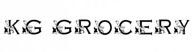
( Katz Fontz - katzfonts.50megs.com/kg.html )
A whimsical, decorative font with cartoon characters embedded in each letter.
![KG GROCERY Frei Schriftart Herunterladen]() Herunterladen 64 Downloads@WebFont
Herunterladen 64 Downloads@WebFont -
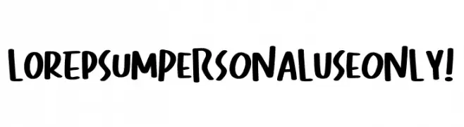
( Fonts by Kong Font )
A bold, playful handwritten font with thick strokes and a casual style.
![Lorepsum PERSONAL USE ONLY! Frei Schriftart Herunterladen]() Herunterladen 64 Downloads@WebFont
Herunterladen 64 Downloads@WebFont -
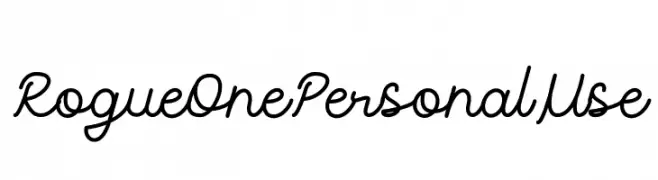
( Fonts by Attype Studio - Fadli Ramadhan Iskandar - Personal-use only. For commercial use please contact owner. )
A smooth, flowing script font with elegant, connected letters.
![Rogue One Personal Use Frei Schriftart Herunterladen]() Herunterladen 64 Downloads@WebFont
Herunterladen 64 Downloads@WebFont -
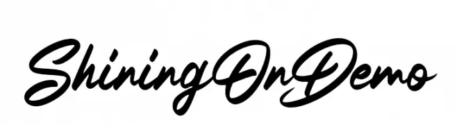
( Fonts by Luthfy Darsa - Personal-use only. For commercial use please contact owner. )
A bold, elegant script font with fluid, cursive letters.
![ShiningOnDemo Frei Schriftart Herunterladen]() Herunterladen 64 Downloads@WebFont
Herunterladen 64 Downloads@WebFont -
( Font-a-licious - www.fontalicious.com/ )
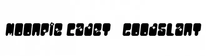
A bold, playful font with star-shaped cutouts and a futuristic, space-themed design.
![MoonPie Cadet GoodSlant Frei Schriftart Herunterladen]() Herunterladen 64 Downloads@WebFont
Herunterladen 64 Downloads@WebFont -
( Fonts by 4th february - Personal-use only. For commercial use please contact owner. )
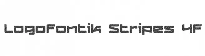
A bold, modern font with a unique diagonal striped pattern.
![Logofontik Stripes 4F Frei Schriftart Herunterladen]() Herunterladen 64 Downloads@WebFont
Herunterladen 64 Downloads@WebFont -
( Fonts by Daniel Zadorozny - www.iconian.com - Personal-use only. For commercial use please contact owner. )
Bold, italicized outline font with a modern and dynamic style.
![Elephant Gun Outline Italic Frei Schriftart Herunterladen]() Herunterladen 64 Downloads@WebFont
Herunterladen 64 Downloads@WebFont -
( Fonts by Darrell Flood - Personal-use only. For commercial use please contact owner. )
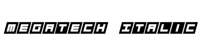
A bold, geometric, and italicized font with a futuristic style.
![Megatech Italic Frei Schriftart Herunterladen]() Herunterladen 64 Downloads@WebFont
Herunterladen 64 Downloads@WebFont -
( Fonts by Halymunt Studio halymuntstudio.com - Personal-use only. For commercial use please contact owner. )
A sophisticated and elegant script font with fluid, connected letterforms.
![Costella Frei Schriftart Herunterladen]() Herunterladen 64 Downloads@WebFont
Herunterladen 64 Downloads@WebFont -
( Fonts by Anwar - Personal-use only. For commercial use please contact owner. )
A lively, handwritten font with dynamic strokes and artistic flair.
![Lettersmith Frei Schriftart Herunterladen]() Herunterladen 64 Downloads@WebFont
Herunterladen 64 Downloads@WebFont -
( Fonts by Erik Studio - Personal-use only. For commercial use please contact owner. )
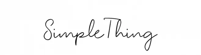
A casual, handwritten font with a modern, flowing style.
![Simple Thing Frei Schriftart Herunterladen]() Herunterladen 64 Downloads@WebFont
Herunterladen 64 Downloads@WebFont -
( Fonts by LetterFreshStudio - Rizki Andika - Personal-use only. For commercial use please contact owner. )
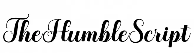
An elegant script font with high contrast and ornate flourishes.
![TheHumbleScript Frei Schriftart Herunterladen]() Herunterladen 64 Downloads@WebFont
Herunterladen 64 Downloads@WebFont -
( Fonts by Mans Greback - Personal-use only. For commercial use please contact owner. )
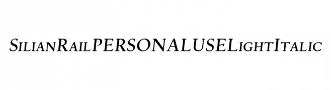
A light, elegant serif font with italic styling, perfect for sophisticated designs.
![Silian Rail PERSONAL USE Light Italic Frei Schriftart Herunterladen]() Herunterladen 64 Downloads@WebFont
Herunterladen 64 Downloads@WebFont -
( Murat Yegul - www.formatltd.com )
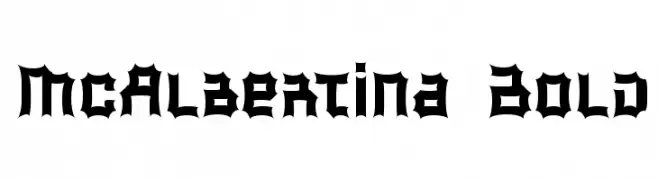
A bold, gothic-inspired font with sharp, angular edges and a heavy weight.
![McAlbertina Bold Frei Schriftart Herunterladen]() Herunterladen 64 Downloads@WebFont
Herunterladen 64 Downloads@WebFont -
( Katz Fontz - katzfonts.50megs.com/kg.html )
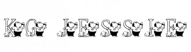
A whimsical font with characters integrated into each letter, perfect for playful designs.
![KG JESSIE Frei Schriftart Herunterladen]() Herunterladen 64 Downloads@WebFont
Herunterladen 64 Downloads@WebFont -
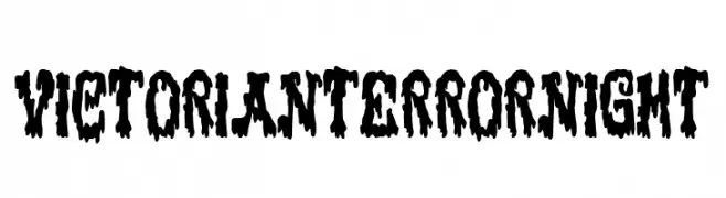
( Fonts by Woodcutter )
A bold, dripping font with a horror-inspired design.
![Victorian Terror Night Frei Schriftart Herunterladen]() Herunterladen 64 Downloads@WebFont
Herunterladen 64 Downloads@WebFont -
( Fonts by www.selawetype.com - Personal-use only. FOR DONATION https://www.paypal.me/selawe . For commercial use please contact owner. )
A dynamic, cursive handwritten font with medium contrast and fluid strokes.
![PinSign Frei Schriftart Herunterladen]() Herunterladen 64 Downloads@WebFont
Herunterladen 64 Downloads@WebFont -
( Fonts by AnyTypeCo - Personal-use only. For commercial use please contact owner. )
A graceful and flowing script font with elegant curves.
![Someday Frei Schriftart Herunterladen]() Herunterladen 64 Downloads@WebFont
Herunterladen 64 Downloads@WebFont -
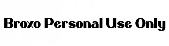
( Fonts by Luxima Creative Studio - Susilo Hidayat - Personal-use only. For commercial use please contact owner. )
A bold, modern font with thick strokes and unique curves.
![Broxo Personal Use Only Frei Schriftart Herunterladen]() Herunterladen 64 Downloads@WebFont
Herunterladen 64 Downloads@WebFont -
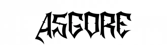
( Fonts by Sealoung - Saiful Anwar - Personal-use only. For commercial use please contact owner. )
A bold, gothic font with sharp, angular lines and dramatic serifs.
![ASGORE Frei Schriftart Herunterladen]() Herunterladen 64 Downloads@WebFont
Herunterladen 64 Downloads@WebFont -
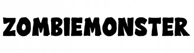
( Fonts by AV Type - Aldo Vesely - Personal-use only. For commercial use please contact owner. )
A bold, playful font with a rugged, hand-drawn appearance.
![Zombie Monster Frei Schriftart Herunterladen]() Herunterladen 64 Downloads@WebFont
Herunterladen 64 Downloads@WebFont -
( Fonts by Noah Type - noahtype.com - Personal-use only. For commercial use please contact owner. )
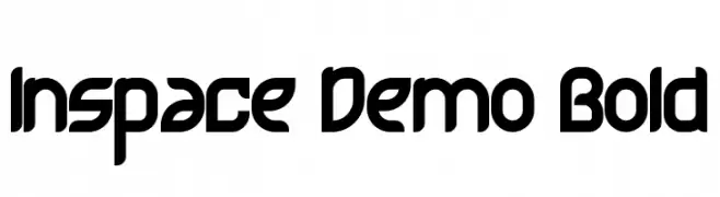
A bold, futuristic font with smooth, rounded edges and a geometric structure.
![Inspace Demo Bold Frei Schriftart Herunterladen]() Herunterladen 64 Downloads@WebFont
Herunterladen 64 Downloads@WebFont -
( Fonts by Jetsmax.com - Personal-use only. For commercial use please contact owner. )
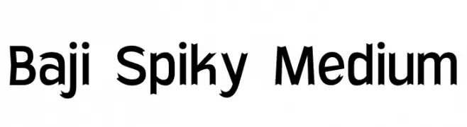
A bold, spiky font with sharp, angular edges for a striking appearance.
![Baji Spiky Medium Frei Schriftart Herunterladen]() Herunterladen 64 Downloads@WebFont
Herunterladen 64 Downloads@WebFont


Welche Schriften sind gerade am populärsten?
Poppins, Roboto, Montserrat, Open Sans und Lato sind wegen ihrer klaren Formen und breiten Einsetzbarkeit sehr gefragt – von Markenauftritt über Landingpages bis hin zu Postern.
Welche Fonts eignen sich für Logos?
Geometrische Sans‑Serifs (z. B. Poppins, Familien im Gotham‑Stil) sind ein häufiger Griff für sauberes, skalierbares Branding. Für eine persönlichere Note bleiben Scripts und Handschrift‑Stile beliebt. Kombinieren Sie einen prägnanten Headline‑Font mit einer neutralen Brotschrift für Wiedererkennung und Harmonie.
Wie oft wird die Top‑Liste aktualisiert?
Regelmäßig – basierend auf realen Downloads und Interaktionen. Schauen Sie öfter vorbei, um aufstrebende Favoriten früh zu entdecken.
💡 Tipp: Seite bookmarken – Trends wechseln schnell, und heutige Top‑Schriften inspirieren morgen vielleicht das Rebranding.