Willkommen bei den Top‑Schriften – hier treffen Beliebtheit und Qualität aufeinander. Das sind die in diesem Jahr am häufigsten heruntergeladenen und genutzten Fonts. Wenn Sie sichere Optionen für Logo, Web oder Social suchen, starten Sie hier.
Jeder Top‑Font überzeugt durch Balance, Lesbarkeit und Vielseitigkeit. Sie finden moderne Sans‑Serifs, elegante Scripts, Vintage‑Serifs und minimalistische Displays.
-
 Herunterladen 1541 Downloads@WebFont
 -
( Fonts by www.DigitalDreamDesign.net )
A bold, angular font with geometric shapes and a futuristic aesthetic.
![D3 Factorism Katakana Frei Schriftart Herunterladen]() Herunterladen 1541 Downloads@WebFont
Herunterladen 1541 Downloads@WebFont -
![Woodcut Frei Schriftart Herunterladen]() Herunterladen 1541 Downloads@WebFont
Herunterladen 1541 Downloads@WebFont -
( Fonts by a www.fontfabric.com. Personal-use only. For commercial use please contact owner. )
A bold, geometric font with clean lines and a modern appearance.
![Kankin Frei Schriftart Herunterladen]() Herunterladen 1540 Downloads@WebFont
Herunterladen 1540 Downloads@WebFont -
![EMEN Lowercase Frei Schriftart Herunterladen]() Herunterladen 1540 Downloads@WebFont
Herunterladen 1540 Downloads@WebFont -
( Fonts by www.kimberlygeswein.com - Kimberly Geswein )
A bold, handwritten script font with a playful and cohesive style.
![KG Always A Good Time Frei Schriftart Herunterladen]() Herunterladen 1540 Downloads@WebFont
Herunterladen 1540 Downloads@WebFont -
( Copyright � 1997 - 2011, John Vargas Beltr�n (www.johnvargasbeltran.com|john.vargasbeltran@gmail.com) )
A playful and whimsical font with rounded, flowing letterforms.
![Macondo Frei Schriftart Herunterladen]() Herunterladen 1540 Downloads@WebFont
Herunterladen 1540 Downloads@WebFont -
( Fonts by Jacob Fisher - www.pizzadude.dk )
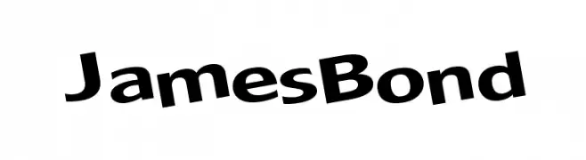
A bold, slightly italic font with a modern and dynamic style.
![JamesBond Frei Schriftart Herunterladen]() Herunterladen 1540 Downloads@WebFont
Herunterladen 1540 Downloads@WebFont -
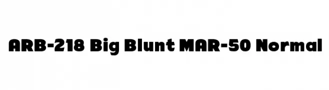
![ARB-218 Big Blunt MAR-50 Normal Frei Schriftart Herunterladen]() Herunterladen 1540 Downloads@WebFont
Herunterladen 1540 Downloads@WebFont -
( Fonts by Apostrophic Lab )
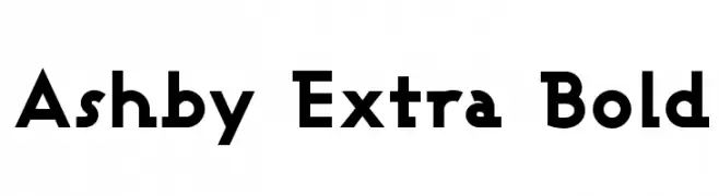
A bold, geometric font with a modern and powerful aesthetic.
![Ashby Extra Bold Frei Schriftart Herunterladen]() Herunterladen 1540 Downloads@WebFont
Herunterladen 1540 Downloads@WebFont -
( Fonts by Khurasan )
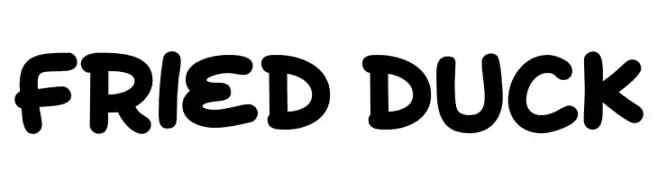
A playful, bold font with rounded, thick strokes and a whimsical touch.
![Fried Duck Frei Schriftart Herunterladen]() Herunterladen 1539 Downloads@WebFont
Herunterladen 1539 Downloads@WebFont -
![Sabado Frei Schriftart Herunterladen]() Herunterladen 1539 Downloads@WebFont
Herunterladen 1539 Downloads@WebFont -
( Fonts by New Typography - Vernon Adams. Personal-use only. For commercial use please contact owner. )
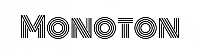
A bold, geometric font with parallel line detailing for a modern, decorative look.
![Monoton Frei Schriftart Herunterladen]() Herunterladen 1539 Downloads@WebFont
Herunterladen 1539 Downloads@WebFont -
( Font by Jonathan Harris - www.tattoowoo.com )
A playful handwritten font with a whimsical and artistic style.
![[Catalina] Frei Schriftart Herunterladen]() Herunterladen 1539 Downloads@WebFont
Herunterladen 1539 Downloads@WebFont -
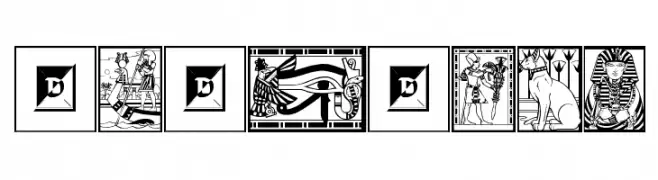
![Egyptian Frei Schriftart Herunterladen]() Herunterladen 1539 Downloads@WebFont
Herunterladen 1539 Downloads@WebFont -
![Rodolphe Tryout Frei Schriftart Herunterladen]() Herunterladen 1539 Downloads@WebFont
Herunterladen 1539 Downloads@WebFont -
( Fonts by Ahmad Zulfikar Ali )
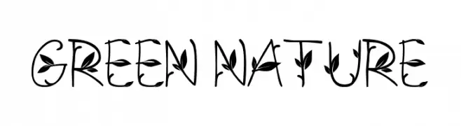
A decorative font with leaf motifs integrated into each character, offering a nature-inspired aesthetic.
![GREEN NATURE Frei Schriftart Herunterladen]() Herunterladen 1538 Downloads@WebFont
Herunterladen 1538 Downloads@WebFont -
( Rachel San )
A modern, bold sans-serif font with geometric letterforms and balanced spacing.
![Meraki Frei Schriftart Herunterladen]() Herunterladen 1538 Downloads@WebFont
Herunterladen 1538 Downloads@WebFont -
( Copyright (c) 2015, Christian Thalmann and the Cormorant Project Authors (github.com/CatharsisFonts/Cormorant) )
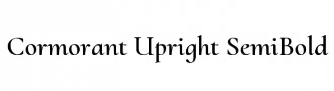
A refined serif font with a semi-bold weight and elegant, upright style.
![Cormorant Upright SemiBold Frei Schriftart Herunterladen]() Herunterladen 1538 Downloads@WebFont
Herunterladen 1538 Downloads@WebFont -
![Athene Frei Schriftart Herunterladen]() Herunterladen 1538 Downloads@WebFont
Herunterladen 1538 Downloads@WebFont -
( Fonts by Divide By Zero! - fonts.tom7.com )
A whimsical and decorative script font with playful, flowing letterforms.
![Melanie [Girly] Frei Schriftart Herunterladen]() Herunterladen 1538 Downloads@WebFont
Herunterladen 1538 Downloads@WebFont -
( Fonts by Altsys Metamorphosis )
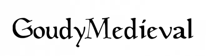
A medieval-style font with decorative elements and intricate details, ideal for historical-themed projects.
![GoudyMedieval Frei Schriftart Herunterladen]() Herunterladen 1538 Downloads@WebFont
Herunterladen 1538 Downloads@WebFont -
( Fonts by Tyler Finck )
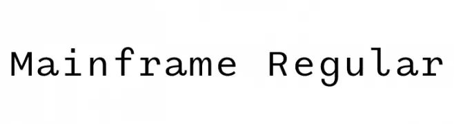
A clean, modern monospaced typeface with uniform character width and height.
![Mainframe Regular Frei Schriftart Herunterladen]() Herunterladen 1537 Downloads@WebFont
Herunterladen 1537 Downloads@WebFont -
( Noto is a trademark of Google Inc. Noto fonts are open source. All Noto fonts are published under the SIL Open Font License, Version 1.1 )
A clean, modern sans-serif font with excellent readability and uniform stroke widths.
![Noto Sans Kannada Frei Schriftart Herunterladen]() Herunterladen 1537 Downloads@WebFont
Herunterladen 1537 Downloads@WebFont -
( imagex - www.imagex-fonts.com )
A playful, doodle-patterned font with bold, rounded characters.
![Doodle Gum Frei Schriftart Herunterladen]() Herunterladen 1537 Downloads@WebFont
Herunterladen 1537 Downloads@WebFont -
![MadeleineBold Frei Schriftart Herunterladen]() Herunterladen 1537 Downloads@WebFont
Herunterladen 1537 Downloads@WebFont -
![Midnight Valentine Frei Schriftart Herunterladen]() Herunterladen 1537 Downloads@WebFont
Herunterladen 1537 Downloads@WebFont -
( Copyright (c) 2012, Eduardo Tunni (http://www.tipo.net.ar), with Reserved Font Name 'Offside' )
A modern, geometric font with rounded edges and a clean, minimalistic style.
![Offside Frei Schriftart Herunterladen]() Herunterladen 1537 Downloads@WebFont
Herunterladen 1537 Downloads@WebFont -
( Fonts by Dieter Steffmann )
A bold, angular font with a historical and powerful aesthetic.
![Viking Medium Frei Schriftart Herunterladen]() Herunterladen 1537 Downloads@WebFont
Herunterladen 1537 Downloads@WebFont -
( Font by Pedro Munoz Pastor - fodkito.deviantart.com )
A pixelated, retro-style font inspired by classic video game graphics.
![Game Over Regular Frei Schriftart Herunterladen]() Herunterladen 1537 Downloads@WebFont
Herunterladen 1537 Downloads@WebFont -
( Fonts by Joanna Angulska - Personal-use only. For commercial use please contact owner. )
A tall, narrow font with a modern and sleek design.
![Komoda-Regular Frei Schriftart Herunterladen]() Herunterladen 1536 Downloads@WebFont
Herunterladen 1536 Downloads@WebFont -
( Fonts by Fabien Despinoy - Personal-use only. For commercial use please contact owner. )
A bold, elegant script font with a flowing, connected style.
![FabfeltScript Bold Regular Frei Schriftart Herunterladen]() Herunterladen 1536 Downloads@WebFont
Herunterladen 1536 Downloads@WebFont -
( Fonts by www.kimberlygeswein.com - Kimberly Geswein )
A playful, handwritten font with smooth, rounded edges and a casual style.
![KG Architects Daughter Frei Schriftart Herunterladen]() Herunterladen 1536 Downloads@WebFont
Herunterladen 1536 Downloads@WebFont -
![Obelix Pro Cry Frei Schriftart Herunterladen]() Herunterladen 1536 Downloads@WebFont
Herunterladen 1536 Downloads@WebFont -
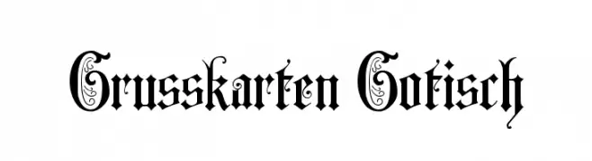
( Fonts by Dieter Steffmann )
An ornate Blackletter font with decorative uppercase and sharp, angular lowercase letters.
![Grusskarten Gotisch Frei Schriftart Herunterladen]() Herunterladen 1536 Downloads@WebFont
Herunterladen 1536 Downloads@WebFont


![[Catalina] Frei Schriftart Herunterladen](https://d144mzi0q5mijx.cloudfront.net/img/0/C/Catalina.webp)


![Melanie [Girly] Frei Schriftart Herunterladen](https://d144mzi0q5mijx.cloudfront.net/img/M/E/Melanie-Girly.webp)


Welche Schriften sind gerade am populärsten?
Poppins, Roboto, Montserrat, Open Sans und Lato sind wegen ihrer klaren Formen und breiten Einsetzbarkeit sehr gefragt – von Markenauftritt über Landingpages bis hin zu Postern.
Welche Fonts eignen sich für Logos?
Geometrische Sans‑Serifs (z. B. Poppins, Familien im Gotham‑Stil) sind ein häufiger Griff für sauberes, skalierbares Branding. Für eine persönlichere Note bleiben Scripts und Handschrift‑Stile beliebt. Kombinieren Sie einen prägnanten Headline‑Font mit einer neutralen Brotschrift für Wiedererkennung und Harmonie.
Wie oft wird die Top‑Liste aktualisiert?
Regelmäßig – basierend auf realen Downloads und Interaktionen. Schauen Sie öfter vorbei, um aufstrebende Favoriten früh zu entdecken.
💡 Tipp: Seite bookmarken – Trends wechseln schnell, und heutige Top‑Schriften inspirieren morgen vielleicht das Rebranding.