Willkommen bei den Top‑Schriften – hier treffen Beliebtheit und Qualität aufeinander. Das sind die in diesem Jahr am häufigsten heruntergeladenen und genutzten Fonts. Wenn Sie sichere Optionen für Logo, Web oder Social suchen, starten Sie hier.
Jeder Top‑Font überzeugt durch Balance, Lesbarkeit und Vielseitigkeit. Sie finden moderne Sans‑Serifs, elegante Scripts, Vintage‑Serifs und minimalistische Displays.
-
( Fonts by Adefa Studio - Personal-use only. For commercial use please contact owner. )
A playful, handwritten font with smooth, flowing characters.
 Herunterladen 66 Downloads@WebFont
 -
( Fonts by Lettersiro Studio - Muhammad Sirojuddin - Personal-use only. For commercial use please contact owner. )
A bold, playful font with rounded strokes and a hand-drawn feel.
![Lost World Frei Schriftart Herunterladen]() Herunterladen 66 Downloads@WebFont
Herunterladen 66 Downloads@WebFont -
( Fonts by Cloutierfontes - Steve Cloutier - Personal-use only. For commercial use please contact owner. )
A bold, distressed font with a rugged, grunge aesthetic.
![CF Seek and Destroy PERSO Regular Frei Schriftart Herunterladen]() Herunterladen 66 Downloads@WebFont
Herunterladen 66 Downloads@WebFont -
( Fonts by Julio Laily Domingo Ahad - Personal-use only. For commercial use please contact owner. )
A playful brush-style font with bold, dynamic strokes and a hand-painted appearance.
![BangBang Cute Brush Font Frei Schriftart Herunterladen]() Herunterladen 66 Downloads@WebFont
Herunterladen 66 Downloads@WebFont -
( Fonts by Maulana Creative - Gilang Maulana - Personal-use only. For commercial use please contact owner. )
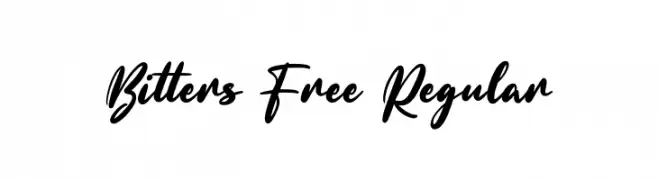
A bold, expressive script font with fluid, cursive strokes.
![Bitters Free Regular Frei Schriftart Herunterladen]() Herunterladen 66 Downloads@WebFont
Herunterladen 66 Downloads@WebFont -
( Alfabag )
A bold, pixelated typeface with a retro digital aesthetic.
![pKNB Frei Schriftart Herunterladen]() Herunterladen 66 Downloads@WebFont
Herunterladen 66 Downloads@WebFont -
( Fonts by Woodcutter )
A bold, distressed font with a grungy, textured style.
![Spanish Joker Frei Schriftart Herunterladen]() Herunterladen 66 Downloads@WebFont
Herunterladen 66 Downloads@WebFont -
( Fonts by CalligraphyFonts - Personal-use only. For commercial use please contact owner. )
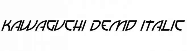
A dynamic italic font with sharp, angular lines and a modern aesthetic.
![Kawaguchi Demo Italic Frei Schriftart Herunterladen]() Herunterladen 66 Downloads@WebFont
Herunterladen 66 Downloads@WebFont -
( Fonts by www.chequered.ink - Chequered Ink - Personal-use only. For commercial use please contact owner. )
A bold, geometric font with a modern, condensed style.
![Caperput Frei Schriftart Herunterladen]() Herunterladen 66 Downloads@WebFont
Herunterladen 66 Downloads@WebFont -
( Iconian Fonts - Daniel Zadorozny - www.iconian.com )
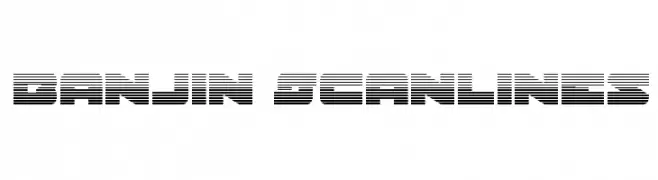
A bold, futuristic font with a unique horizontal scanline effect.
![Banjin Scanlines Frei Schriftart Herunterladen]() Herunterladen 66 Downloads@WebFont
Herunterladen 66 Downloads@WebFont -
( Daniel Plant - www.fontmonster.org )
A highly decorative and abstract font with bold, artistic characters.
![Lacerba Italic Frei Schriftart Herunterladen]() Herunterladen 66 Downloads@WebFont
Herunterladen 66 Downloads@WebFont -
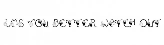
( London's Letters - www.londonsletters.com/ )
A festive, decorative font with Santa Claus elements on each letter.
![LMS You Better Watch Out Frei Schriftart Herunterladen]() Herunterladen 66 Downloads@WebFont
Herunterladen 66 Downloads@WebFont -
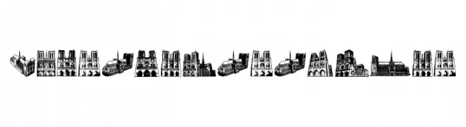
( Fonts by Vladimir Nikolic - https://www.creativefabrica.com/product/educated-deers/ref/144265/ - Personal-use only. For commercial use please contact owner. )
A decorative font inspired by Notre Dame's Gothic architecture.
![NotreDame Regular Frei Schriftart Herunterladen]() Herunterladen 66 Downloads@WebFont
Herunterladen 66 Downloads@WebFont -
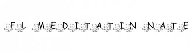
( FontasyLand - www.fontparty.com/designer.php3?dd=195 )
A playful font with meditating characters accompanying each letter.
![FL Meditatin' Nate Frei Schriftart Herunterladen]() Herunterladen 66 Downloads@WebFont
Herunterladen 66 Downloads@WebFont -
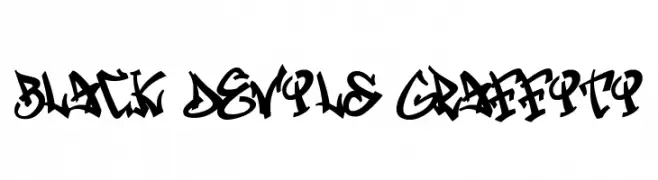
( Fonts by Cikareotype Studio )
A bold, graffiti-inspired font with dynamic, jagged lines and a rebellious urban style.
![Black Devils Graffiti Frei Schriftart Herunterladen]() Herunterladen 66 Downloads@WebFont
Herunterladen 66 Downloads@WebFont -
( Fonts by Ditya Ananto )
An edgy, barbed wire-inspired decorative font with sharp, angular lines.
![Gregori Frei Schriftart Herunterladen]() Herunterladen 66 Downloads@WebFont
Herunterladen 66 Downloads@WebFont -
( Fonts by Fontfabric - Svetoslav Simov - Personal-use only. For commercial use please contact owner. )
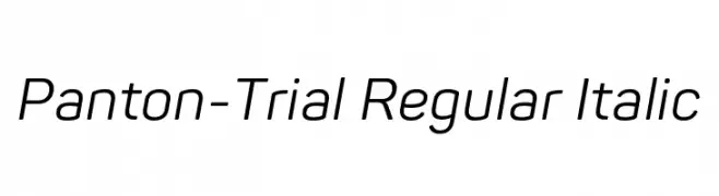
A modern, italic sans-serif font with a clean and dynamic style.
![Panton-Trial Regular Italic Frei Schriftart Herunterladen]() Herunterladen 66 Downloads@WebFont
Herunterladen 66 Downloads@WebFont -
( Fonts by PutraCetol Studio - www.putracetol.com - Personal-use only. For commercial use please contact owner. )
An elegant script font with flowing, interconnected letters and high contrast strokes.
![Daysha Personal Use Frei Schriftart Herunterladen]() Herunterladen 66 Downloads@WebFont
Herunterladen 66 Downloads@WebFont -
( Fonts by Ryul Davidson - Personal-use only. For commercial use please contact owner. )
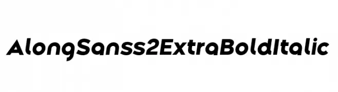
A bold, italicized sans-serif font with a modern geometric style.
![Along Sans s2 ExtraBoldItalic Frei Schriftart Herunterladen]() Herunterladen 66 Downloads@WebFont
Herunterladen 66 Downloads@WebFont -
( Fonts by www.selawetype.com - Personal-use only. FOR DONATION https://www.paypal.me/selawe . For commercial use please contact owner. )
A graceful script font with flowing, handwritten strokes and elegant curves.
![Quillines Frei Schriftart Herunterladen]() Herunterladen 66 Downloads@WebFont
Herunterladen 66 Downloads@WebFont -
( Fonts by Daniel Zadorozny - www.iconian.com - Personal-use only. For commercial use please contact owner. )
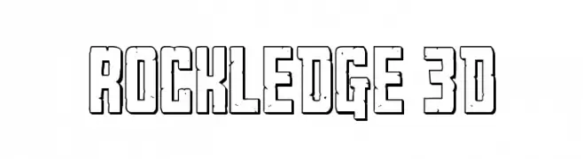
A bold, 3D geometric font with a retro, comic book style.
![Rockledge 3D Frei Schriftart Herunterladen]() Herunterladen 66 Downloads@WebFont
Herunterladen 66 Downloads@WebFont -
( Fonts by Abo Daniel Studio - Panggah Laksono - Personal-use only. For commercial use please contact owner. )
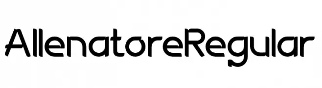
A modern, geometric sans-serif font with clean lines and a friendly appearance.
![AllenatoreRegular Frei Schriftart Herunterladen]() Herunterladen 66 Downloads@WebFont
Herunterladen 66 Downloads@WebFont -
( Fonts by Johandika Syahputra Lubis - Personal-use only. For commercial use please contact owner. )
A modern, bold italic font with a sleek and dynamic style.
![BrandingPro-BoldItalic Frei Schriftart Herunterladen]() Herunterladen 66 Downloads@WebFont
Herunterladen 66 Downloads@WebFont -
( Fonts by Almarkhatype - Abdul Malik Wisnu - Personal-use only. For commercial use please contact owner. )
A playful, modern handwritten font with fluid strokes and a casual feel.
![Lovely Sweetie Frei Schriftart Herunterladen]() Herunterladen 66 Downloads@WebFont
Herunterladen 66 Downloads@WebFont -
( Fonts by www.selawetype.com - Personal-use only. FOR DONATION https://www.paypal.me/selawe . For commercial use please contact owner. )
A playful and elegant script font with fluid, cursive letterforms.
![Quillines Frei Schriftart Herunterladen]() Herunterladen 66 Downloads@WebFont
Herunterladen 66 Downloads@WebFont -
( Walter Paggioro - www.raptuscreativi.com/site/fields/type-design/ )
A tall, narrow, and elegant font with a modern aesthetic.
![cancello Frei Schriftart Herunterladen]() Herunterladen 66 Downloads@WebFont
Herunterladen 66 Downloads@WebFont -
![Liza Thin Frei Schriftart Herunterladen]() Herunterladen 66 Downloads
Herunterladen 66 Downloads -
( Darrell Flood )
A playful, dotted font with a whimsical and bubbly appearance.
![Juicy Fruity Highlights Frei Schriftart Herunterladen]() Herunterladen 66 Downloads@WebFont
Herunterladen 66 Downloads@WebFont -
( Fonts by Design Klimov - Personal-use only. For commercial use please contact owner. )
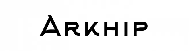
A bold, modern font with clean, geometric lines and balanced proportions.
![Arkhip Frei Schriftart Herunterladen]() Herunterladen 66 Downloads@WebFont
Herunterladen 66 Downloads@WebFont -
( Iconian Fonts - Daniel Zadorozny - www.iconian.com )
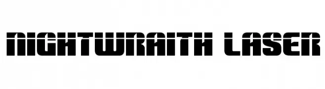
A bold, geometric font with a futuristic and cohesive design.
![Nightwraith Laser Frei Schriftart Herunterladen]() Herunterladen 66 Downloads@WebFont
Herunterladen 66 Downloads@WebFont -
( Fonts by Kong Font - fontkong.com - Personal-use only. For commercial use please contact owner. )
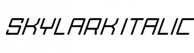
A sleek, italicized font with a modern, geometric design.
![Skylark Italic Frei Schriftart Herunterladen]() Herunterladen 66 Downloads@WebFont
Herunterladen 66 Downloads@WebFont -
( Fonts by Mans Greback - www.mansgreback.com - Personal-use only. For commercial use please contact owner. )
A playful, casual handwritten font with smooth, flowing strokes.
![Apple Hut Frei Schriftart Herunterladen]() Herunterladen 66 Downloads@WebFont
Herunterladen 66 Downloads@WebFont -
( Fonts by 177Studio )
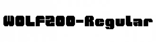
A bold, geometric font with strong, angular lines and a blocky appearance.
![WOLF200-Regular Frei Schriftart Herunterladen]() Herunterladen 66 Downloads@WebFont
Herunterladen 66 Downloads@WebFont -
( Fonts by Mindtype Co. - Putra Khan - Personal-use only. For commercial use please contact owner. )
An elegant, swash-filled font with calligraphic influences and decorative flourishes.
![ItalianHorskeySwashDemo Frei Schriftart Herunterladen]() Herunterladen 66 Downloads@WebFont
Herunterladen 66 Downloads@WebFont -
( Fonts by Vunira Design - Personal-use only. For commercial use please contact owner. )
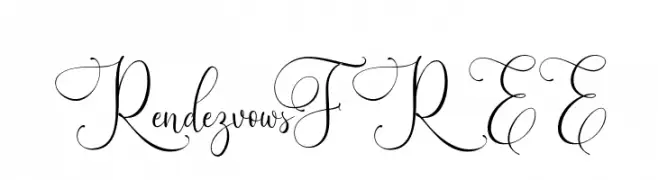
An elegant script font with intricate swirls and flourishes.
![RendezvowsFREE Frei Schriftart Herunterladen]() Herunterladen 66 Downloads@WebFont
Herunterladen 66 Downloads@WebFont


Welche Schriften sind gerade am populärsten?
Poppins, Roboto, Montserrat, Open Sans und Lato sind wegen ihrer klaren Formen und breiten Einsetzbarkeit sehr gefragt – von Markenauftritt über Landingpages bis hin zu Postern.
Welche Fonts eignen sich für Logos?
Geometrische Sans‑Serifs (z. B. Poppins, Familien im Gotham‑Stil) sind ein häufiger Griff für sauberes, skalierbares Branding. Für eine persönlichere Note bleiben Scripts und Handschrift‑Stile beliebt. Kombinieren Sie einen prägnanten Headline‑Font mit einer neutralen Brotschrift für Wiedererkennung und Harmonie.
Wie oft wird die Top‑Liste aktualisiert?
Regelmäßig – basierend auf realen Downloads und Interaktionen. Schauen Sie öfter vorbei, um aufstrebende Favoriten früh zu entdecken.
💡 Tipp: Seite bookmarken – Trends wechseln schnell, und heutige Top‑Schriften inspirieren morgen vielleicht das Rebranding.