Willkommen bei den Top‑Schriften – hier treffen Beliebtheit und Qualität aufeinander. Das sind die in diesem Jahr am häufigsten heruntergeladenen und genutzten Fonts. Wenn Sie sichere Optionen für Logo, Web oder Social suchen, starten Sie hier.
Jeder Top‑Font überzeugt durch Balance, Lesbarkeit und Vielseitigkeit. Sie finden moderne Sans‑Serifs, elegante Scripts, Vintage‑Serifs und minimalistische Displays.
-
( Fonts by douglas vitkauskas - Personal-use only. For commercial use please contact owner. )
A bold, playful font with a dynamic tilt and rounded, whimsical characters.
 Herunterladen 66 Downloads@WebFont
 -
( Fonts by Indotitas Squad )
![Rustic Towns Regular Frei Schriftart Herunterladen]() Herunterladen 66 Downloads@WebFont
Herunterladen 66 Downloads@WebFont -
( Fonts by Jorge Algarin - Personal-use only. For commercial use please contact owner. )
A bold, italicized font with a modern and dynamic style.
![Caracas Bold Italic Frei Schriftart Herunterladen]() Herunterladen 66 Downloads@WebFont
Herunterladen 66 Downloads@WebFont -
( Fonts by douglas vitkauskas - Personal-use only. For commercial use please contact owner. )
An expressive, brush-style font with dramatic strokes and a graffiti-like appearance.
![Vtks Stress Frei Schriftart Herunterladen]() Herunterladen 66 Downloads@WebFont
Herunterladen 66 Downloads@WebFont -
( Fonts by Daniel Zadorozny - www.iconian.com - Personal-use only. For commercial use please contact owner. )
A bold, 3D outline font with a futuristic and industrial design.
![Yeoman Jack 3D Frei Schriftart Herunterladen]() Herunterladen 66 Downloads@WebFont
Herunterladen 66 Downloads@WebFont -
( Fonts by bey Design - Personal-use only. For commercial use please contact owner. )
A bold, italicized font with rounded, smooth curves and a modern, playful style.
![Lamborgini Extra Bold Italic Frei Schriftart Herunterladen]() Herunterladen 66 Downloads@WebFont
Herunterladen 66 Downloads@WebFont -
( Fonts by Letterara - Thomas Aradea - Personal-use only. For commercial use please contact owner. )
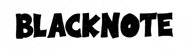
A bold, playful font with a hand-drawn, textured style.
![Black Note Frei Schriftart Herunterladen]() Herunterladen 66 Downloads@WebFont
Herunterladen 66 Downloads@WebFont -
( Fonts by Mozyen Studio - Personal-use only. For commercial use please contact owner. )
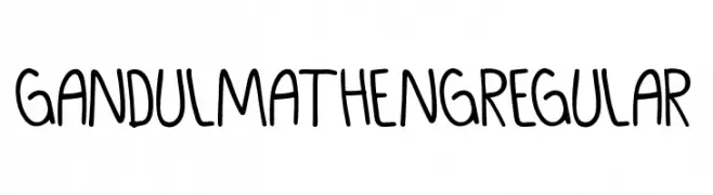
A playful, handwritten font with rounded edges and consistent stroke width.
![GANDUL MATHENG Regular Frei Schriftart Herunterladen]() Herunterladen 66 Downloads@WebFont
Herunterladen 66 Downloads@WebFont -
( Rajendra Bitling - www.rbitling.com )
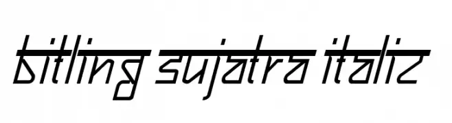
A modern, angular italic font with a futuristic and dynamic style.
![Bitling sujatra Italic Frei Schriftart Herunterladen]() Herunterladen 66 Downloads@WebFont
Herunterladen 66 Downloads@WebFont -
( Fonts by Letterara - Thomas Aradea - Personal-use only. For commercial use please contact owner. )
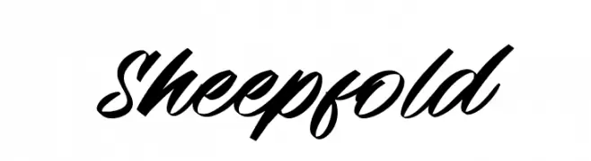
A bold, cursive script font with flowing, connected strokes.
![Sheepfold Frei Schriftart Herunterladen]() Herunterladen 66 Downloads@WebFont
Herunterladen 66 Downloads@WebFont -
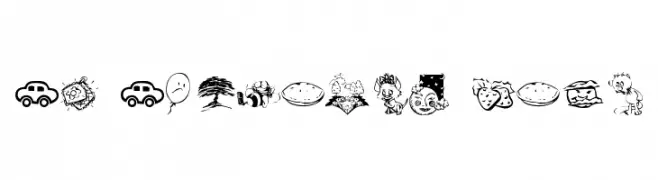
( Fonts by Kat`s Fun Fonts - Personal-use only. For commercial use please contact owner. )
Hand-drawn pictogram dingbat font with playful illustrations.
![KR Katlings Five Frei Schriftart Herunterladen]() Herunterladen 66 Downloads@WebFont
Herunterladen 66 Downloads@WebFont -
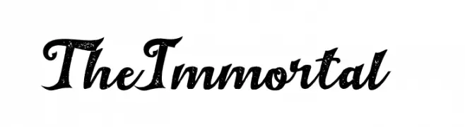
( Fonts by Haksen Studio - Sarwo Edhi Prayitno - Personal-use only. For commercial use please contact owner. )
A bold, textured script font with a vintage yet modern appeal.
![The Immortal 1 Frei Schriftart Herunterladen]() Herunterladen 66 Downloads@WebFont
Herunterladen 66 Downloads@WebFont -
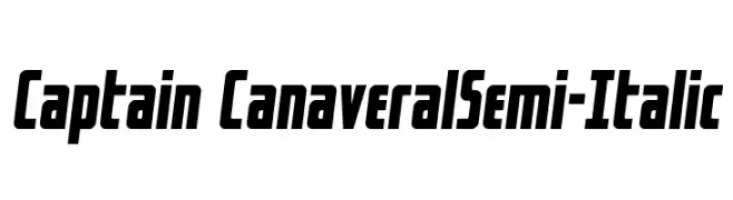
( Fonts by Iconian Fonts - Daniel Zadorozny - Personal-use only. For commercial use please contact owner. )
A bold, semi-italic font with a dynamic and modern style.
![Captain CanaveralSemi-Italic Frei Schriftart Herunterladen]() Herunterladen 66 Downloads@WebFont
Herunterladen 66 Downloads@WebFont -
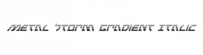
( Iconian Fonts - Daniel Zadorozny - www.iconian.com )
A bold, futuristic italic font with a gradient effect and geometric design.
![Metal Storm Gradient Italic Frei Schriftart Herunterladen]() Herunterladen 66 Downloads@WebFont
Herunterladen 66 Downloads@WebFont -
( Fonts by Studio Hello Good )
A bold, dynamic handwritten font with a brush-like texture and expressive style.
![Cruel Machine Frei Schriftart Herunterladen]() Herunterladen 66 Downloads@WebFont
Herunterladen 66 Downloads@WebFont -
( Fonts by Ishmael Studio - Ismail Abdurrasyid - Personal-use only. For commercial use please contact owner. )
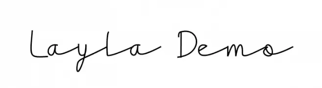
A playful, handwritten font with a casual and whimsical style.
![Layla Demo Frei Schriftart Herunterladen]() Herunterladen 66 Downloads@WebFont
Herunterladen 66 Downloads@WebFont -
( Fonts by Kruweks Studio - Personal-use only. For commercial use please contact owner. )
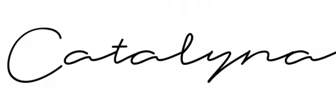
A graceful script font with a fluid, handwritten style and elegant curves.
![Catalyna Frei Schriftart Herunterladen]() Herunterladen 66 Downloads@WebFont
Herunterladen 66 Downloads@WebFont -
( Fonts by Nirmana Visual - Sigit Dwipa - Personal-use only. For commercial use please contact owner. )
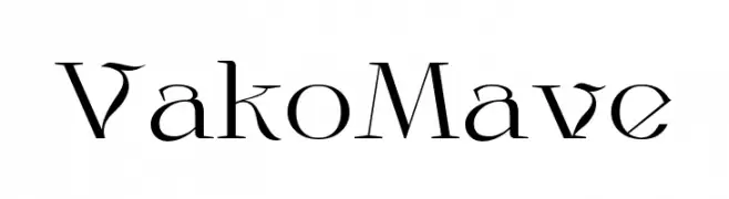
A modern and elegant font with artistic letterforms and decorative elements.
![VakoMave Frei Schriftart Herunterladen]() Herunterladen 66 Downloads@WebFont
Herunterladen 66 Downloads@WebFont -
( Fonts by selawetype - Personal-use only. For commercial use please contact owner. )
A playful, handwritten font with bold strokes and a casual style.
![Mastere Frei Schriftart Herunterladen]() Herunterladen 66 Downloads@WebFont
Herunterladen 66 Downloads@WebFont -
( Fonts by Allouse Studio - Personal-use only. For commercial use please contact owner. )
A modern, elegant cursive font with fluid connections and graceful curves.
![Galih Ratna Frei Schriftart Herunterladen]() Herunterladen 66 Downloads@WebFont
Herunterladen 66 Downloads@WebFont -
( Fonts by Almarkhatype - Abdul Malik Wisnu - Personal-use only. For commercial use please contact owner. )
A dynamic handwritten font with fluid, expressive strokes.
![The Roletta Frei Schriftart Herunterladen]() Herunterladen 66 Downloads@WebFont
Herunterladen 66 Downloads@WebFont -
( Fonts by Gilar Studio - Personal-use only. For commercial use please contact owner. )
An elegant script font with intricate swirls and decorative flourishes.
![Sulqata Frei Schriftart Herunterladen]() Herunterladen 66 Downloads@WebFont
Herunterladen 66 Downloads@WebFont -
( Fonts by Mans Greback - Personal-use only. For commercial use please contact owner. )
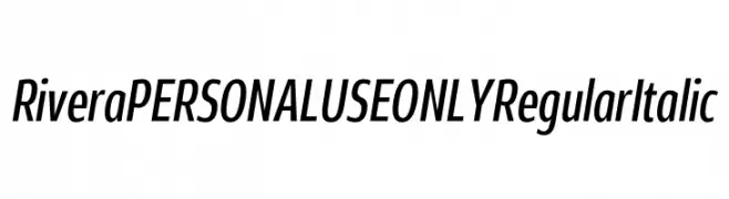
A modern, italicized font with medium contrast and a sleek, condensed design.
![Rivera PERSONAL USE ONLY Regular Italic Frei Schriftart Herunterladen]() Herunterladen 66 Downloads@WebFont
Herunterladen 66 Downloads@WebFont -
( Fonts by Adam Rucki - Personal-use only. For commercial use please contact owner. )
A futuristic and dynamic font with geometric and organic elements.
![Zefir Frei Schriftart Herunterladen]() Herunterladen 66 Downloads@WebFont
Herunterladen 66 Downloads@WebFont -
( Iconian Fonts - Daniel Zadorozny - www.iconian.com )
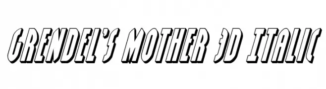
A bold, 3D italic font with a shadow effect for a dynamic look.
![Grendel's Mother 3D Italic Frei Schriftart Herunterladen]() Herunterladen 66 Downloads@WebFont
Herunterladen 66 Downloads@WebFont -
( Intellecta Design - Paulo W - new.myfonts.com/foundry/Intellecta_Design/?refby=paulow )
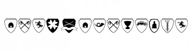
Heraldic shield icons with medieval and fantasy motifs in bold black-and-white.
![EasyHeraldics Frei Schriftart Herunterladen]() Herunterladen 66 Downloads@WebFont
Herunterladen 66 Downloads@WebFont -
( Zetafonts - www.zetafonts.com )
A bold, heavy italic font with rounded, smooth characters.
![KabrioAbarth-HeavyItalic Frei Schriftart Herunterladen]() Herunterladen 66 Downloads@WebFont
Herunterladen 66 Downloads@WebFont -
( Noto is a trademark of Google Inc. Noto fonts are open source. All Noto fonts are published under the SIL Open Font License, Version 1.1 )
No valid font glyphs are visible.
![Noto Sans Tai Le Frei Schriftart Herunterladen]() Herunterladen 66 Downloads@WebFont
Herunterladen 66 Downloads@WebFont -
( Fonts by Situjuh Nazara - 7ntypes.com - Personal-use only. For commercial use please contact owner. )
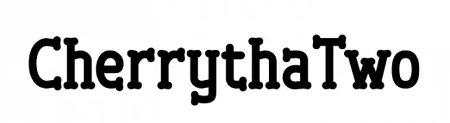
A playful, bold font with rounded edges and a whimsical style.
![Cherrytha Two Frei Schriftart Herunterladen]() Herunterladen 66 Downloads@WebFont
Herunterladen 66 Downloads@WebFont -
( Fonts by Allouse Studio - Personal-use only. For commercial use please contact owner. )
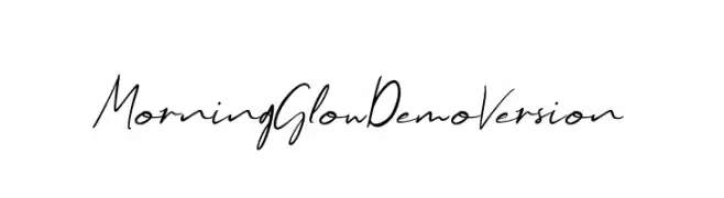
A casual, elegant handwritten font with fluid, flowing letterforms.
![Morning Glow Demo Version Frei Schriftart Herunterladen]() Herunterladen 66 Downloads@WebFont
Herunterladen 66 Downloads@WebFont -
( Fonts by Vladimir Nikolic )
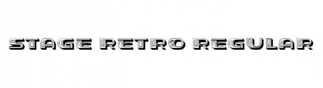
A bold, retro-inspired font with a geometric, three-dimensional design.
![Stage Retro Regular Frei Schriftart Herunterladen]() Herunterladen 66 Downloads@WebFont
Herunterladen 66 Downloads@WebFont -
( Fonts by Ramli Setiadi - Personal-use only. For commercial use please contact owner. )
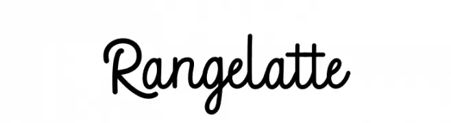
A playful, flowing script font with smooth, rounded curves.
![Rangelatte Frei Schriftart Herunterladen]() Herunterladen 66 Downloads@WebFont
Herunterladen 66 Downloads@WebFont -
( Fonts by bey Design - Personal-use only. For commercial use please contact owner. )
A bold, playful script font with a handwritten style and decorative elements.
![Bodyluck Frei Schriftart Herunterladen]() Herunterladen 66 Downloads@WebFont
Herunterladen 66 Downloads@WebFont -
( Béla Frank - belafrank.com )
A bold, geometric font with tall, narrow characters and a modern style.
![FRRamaNous Frei Schriftart Herunterladen]() Herunterladen 66 Downloads@WebFont
Herunterladen 66 Downloads@WebFont -
( Debut Studio - Ari Fadli - creativemarket.com/debutstudio )
A bold, expressive script font with modern, dynamic curves.
![MiddleClassScript Frei Schriftart Herunterladen]() Herunterladen 66 Downloads@WebFont
Herunterladen 66 Downloads@WebFont


Welche Schriften sind gerade am populärsten?
Poppins, Roboto, Montserrat, Open Sans und Lato sind wegen ihrer klaren Formen und breiten Einsetzbarkeit sehr gefragt – von Markenauftritt über Landingpages bis hin zu Postern.
Welche Fonts eignen sich für Logos?
Geometrische Sans‑Serifs (z. B. Poppins, Familien im Gotham‑Stil) sind ein häufiger Griff für sauberes, skalierbares Branding. Für eine persönlichere Note bleiben Scripts und Handschrift‑Stile beliebt. Kombinieren Sie einen prägnanten Headline‑Font mit einer neutralen Brotschrift für Wiedererkennung und Harmonie.
Wie oft wird die Top‑Liste aktualisiert?
Regelmäßig – basierend auf realen Downloads und Interaktionen. Schauen Sie öfter vorbei, um aufstrebende Favoriten früh zu entdecken.
💡 Tipp: Seite bookmarken – Trends wechseln schnell, und heutige Top‑Schriften inspirieren morgen vielleicht das Rebranding.