Willkommen bei den Top‑Schriften – hier treffen Beliebtheit und Qualität aufeinander. Das sind die in diesem Jahr am häufigsten heruntergeladenen und genutzten Fonts. Wenn Sie sichere Optionen für Logo, Web oder Social suchen, starten Sie hier.
Jeder Top‑Font überzeugt durch Balance, Lesbarkeit und Vielseitigkeit. Sie finden moderne Sans‑Serifs, elegante Scripts, Vintage‑Serifs und minimalistische Displays.
-
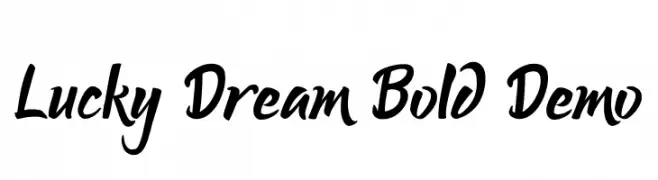
( Fonts by Mindtype Co. - Putra Khan - Personal-use only. For commercial use please contact owner. )
A bold, expressive script font with flowing, cursive letterforms.
 Herunterladen 65 Downloads@WebFont
 -
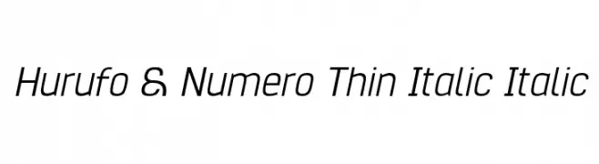
( Fonts by Situjuh Nazara - 7ntypes.com - Personal-use only. For commercial use please contact owner. )
A sleek, thin, italicized font with a modern and elegant design.
![Hurufo & Numero Thin Italic Italic Frei Schriftart Herunterladen]() Herunterladen 65 Downloads@WebFont
Herunterladen 65 Downloads@WebFont -
( Dismantle Destroy - Matthew Tyndall - creativemarket.com/Dismantle )
A bold, outlined font with a wide, decorative style.
![Quiet the Thief OutlinedWide Frei Schriftart Herunterladen]() Herunterladen 65 Downloads@WebFont
Herunterladen 65 Downloads@WebFont -
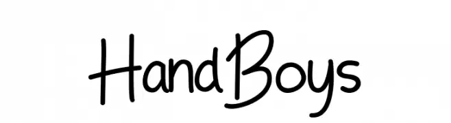
( Fonts by Adefa Studio - Personal-use only. For commercial use please contact owner. )
A playful, handwritten font with smooth, flowing characters.
![Hand Boys Frei Schriftart Herunterladen]() Herunterladen 65 Downloads@WebFont
Herunterladen 65 Downloads@WebFont -
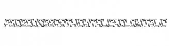
( Fonts by zamjump - Ahmad Zamzami - Personal-use only. For commercial use please contact owner. )
A bold, italic, hollow font with a modern, futuristic style.
![FODECUMBERS THICK ITALIC HOLOW Italic Frei Schriftart Herunterladen]() Herunterladen 65 Downloads@WebFont
Herunterladen 65 Downloads@WebFont -
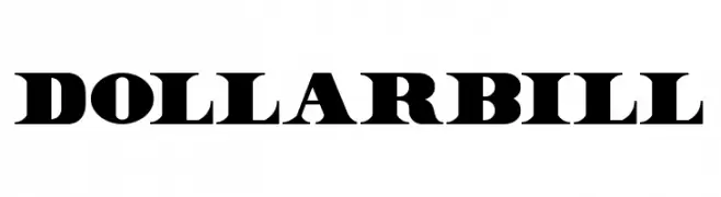
( Fonts by Twicolabs Fontdation - Fahrizal Tawakkal - Personal-use only. For commercial use please contact owner. )
A bold, high-contrast serif font with dramatic strokes and a classic yet modern appeal.
![Dollar Bill Frei Schriftart Herunterladen]() Herunterladen 65 Downloads@WebFont
Herunterladen 65 Downloads@WebFont -
( Alfabag )
A bold, pixelated typeface with a retro digital aesthetic.
![pKNB Frei Schriftart Herunterladen]() Herunterladen 65 Downloads@WebFont
Herunterladen 65 Downloads@WebFont -
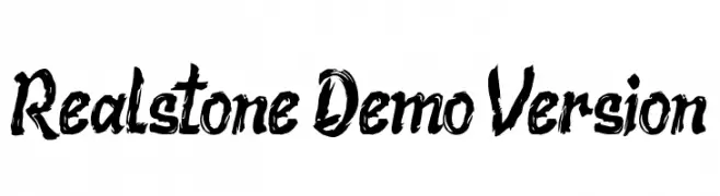
( Fonts by Subectype & Orenari - Rangga Subekti & Ari - Personal-use only. For commercial use please contact owner. )
A bold, brushstroke-style font with a dynamic and textured appearance.
![Realstone Demo Version Frei Schriftart Herunterladen]() Herunterladen 65 Downloads@WebFont
Herunterladen 65 Downloads@WebFont -
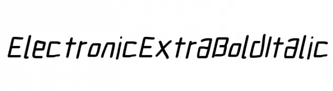
( Fonts by CannotIntoSpaceFonts - KineticPlasma Fonts - Personal-use only. For commercial use please contact owner. )
A bold, italicized font with a modern, geometric style.
![Electronic ExtraBold Italic Frei Schriftart Herunterladen]() Herunterladen 65 Downloads@WebFont
Herunterladen 65 Downloads@WebFont -
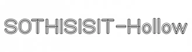
( Fonts by weknow - Wino S Kadir - Personal-use only. For commercial use please contact owner. )
A modern hollow font with a double-line structure and geometric shapes.
![SO THIS IS IT-Hollow Frei Schriftart Herunterladen]() Herunterladen 65 Downloads@WebFont
Herunterladen 65 Downloads@WebFont -
( Fonts by Ditya Ananto )
An edgy, barbed wire-inspired decorative font with sharp, angular lines.
![Gregori Frei Schriftart Herunterladen]() Herunterladen 65 Downloads@WebFont
Herunterladen 65 Downloads@WebFont -
( Fonts by Mocha Frappuccino - Personal-use only. For commercial use please contact owner. )
Bold, brush-style font with a dynamic appearance.
![Hojlund Frei Schriftart Herunterladen]() Herunterladen 65 Downloads@WebFont
Herunterladen 65 Downloads@WebFont -
( Fonts by Damarletter )
![Endeline Script Frei Schriftart Herunterladen]() Herunterladen 65 Downloads@WebFont
Herunterladen 65 Downloads@WebFont -
( Fonts by PutraCetol Studio - www.putracetol.com - Personal-use only. For commercial use please contact owner. )
An elegant script font with flowing, interconnected letters and high contrast strokes.
![Daysha Personal Use Frei Schriftart Herunterladen]() Herunterladen 65 Downloads@WebFont
Herunterladen 65 Downloads@WebFont -
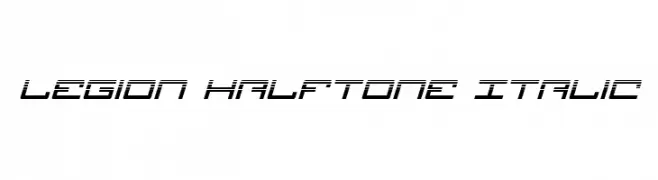
( Iconian Fonts - Daniel Zadorozny - www.iconian.com )
A futuristic, italicized font with a halftone effect and segmented lines.
![Legion Halftone Italic Frei Schriftart Herunterladen]() Herunterladen 65 Downloads@WebFont
Herunterladen 65 Downloads@WebFont -
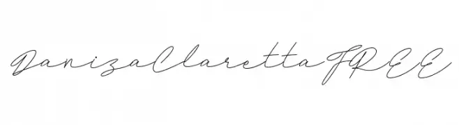
( Fonts by InspiraType )
Light, flowing handwritten script with a casual, elegant style.
![DanizaClarettaFREE Frei Schriftart Herunterladen]() Herunterladen 65 Downloads@WebFont
Herunterladen 65 Downloads@WebFont -
( Fonts by www.selawetype.com - Personal-use only. FOR DONATION https://www.paypal.me/selawe . For commercial use please contact owner. )
A graceful script font with flowing, handwritten strokes and elegant curves.
![Quillines Frei Schriftart Herunterladen]() Herunterladen 65 Downloads@WebFont
Herunterladen 65 Downloads@WebFont -
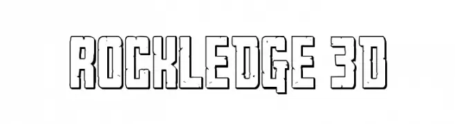
( Fonts by Daniel Zadorozny - www.iconian.com - Personal-use only. For commercial use please contact owner. )
A bold, 3D geometric font with a retro, comic book style.
![Rockledge 3D Frei Schriftart Herunterladen]() Herunterladen 65 Downloads@WebFont
Herunterladen 65 Downloads@WebFont -
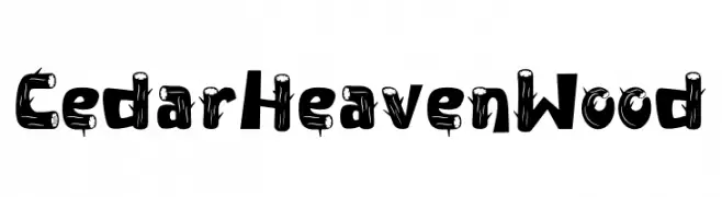
( Fonts by PutraCetol Studio )
A decorative, wood-grain inspired font with a rustic and playful style.
![Cedar Heaven Wood Frei Schriftart Herunterladen]() Herunterladen 65 Downloads@WebFont
Herunterladen 65 Downloads@WebFont -
( Fonts by ingoFonts - Ingo Zimmermann - Personal-use only. For commercial use please contact owner. )
A bold, italic, and expanded sans-serif font with high contrast, ideal for modern headlines.
![EconoSansRed-84HeavyExpIta Frei Schriftart Herunterladen]() Herunterladen 65 Downloads@WebFont
Herunterladen 65 Downloads@WebFont -
( Fonts by Peter Olexa - Personal-use only. For commercial use please contact owner. )
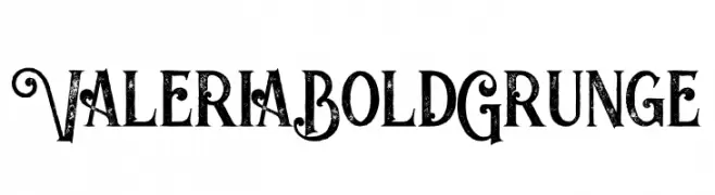
A bold, grunge-style font with decorative swirls and distressed textures.
![Valeria Bold Grunge Frei Schriftart Herunterladen]() Herunterladen 65 Downloads@WebFont
Herunterladen 65 Downloads@WebFont -
( Daniel Plant - www.fontmonster.org )
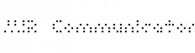
A tactile writing system using raised dots for visually impaired readers.
![MIR Communicator Frei Schriftart Herunterladen]() Herunterladen 65 Downloads@WebFont
Herunterladen 65 Downloads@WebFont -
( Fonts by zatari - Personal-use only. For commercial use please contact owner. )
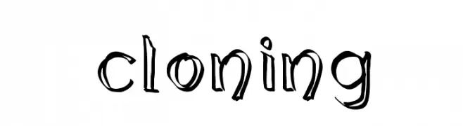
A playful, hand-drawn font with bold, varied strokes and a whimsical style.
![cloning Frei Schriftart Herunterladen]() Herunterladen 65 Downloads@WebFont
Herunterladen 65 Downloads@WebFont -
( Fonts by Attype Studio - Fadli Ramadhan Iskandar - Personal-use only. For commercial use please contact owner. )
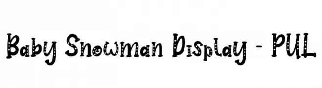
A playful, dotted font with bold, rounded characters and a hand-drawn feel.
![Baby Snowman Display - PUL Frei Schriftart Herunterladen]() Herunterladen 65 Downloads@WebFont
Herunterladen 65 Downloads@WebFont -
( Fonts by Kat`s Fun Fonts - Personal-use only. For commercial use please contact owner. )
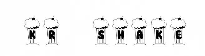
A whimsical, popcorn-themed decorative font with bold, cartoonish letters.
![KR Shake Frei Schriftart Herunterladen]() Herunterladen 65 Downloads@WebFont
Herunterladen 65 Downloads@WebFont -
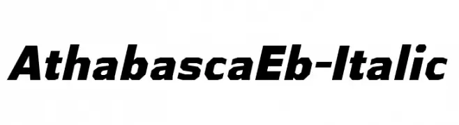
( Typodermic Fonts - Ray Larabie - www.typodermicfonts.com/ )
A bold, italic font with a dynamic, geometric style.
![AthabascaEb-Italic Frei Schriftart Herunterladen]() Herunterladen 65 Downloads@WebFont
Herunterladen 65 Downloads@WebFont -
( Fonts by Graphicfresh - Personal-use only. For commercial use please contact owner. )
A bold, brush-style font with dynamic and expressive strokes.
![Sketching Frei Schriftart Herunterladen]() Herunterladen 65 Downloads@WebFont
Herunterladen 65 Downloads@WebFont -
( Fonts by Mindtype Co. - Putra Khan - Personal-use only. For commercial use please contact owner. )
An elegant, swash-filled font with calligraphic influences and decorative flourishes.
![ItalianHorskeySwashDemo Frei Schriftart Herunterladen]() Herunterladen 65 Downloads@WebFont
Herunterladen 65 Downloads@WebFont -
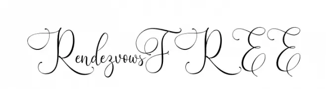
( Fonts by Vunira Design - Personal-use only. For commercial use please contact owner. )
An elegant script font with intricate swirls and flourishes.
![RendezvowsFREE Frei Schriftart Herunterladen]() Herunterladen 65 Downloads@WebFont
Herunterladen 65 Downloads@WebFont -
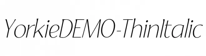
( Fonts by Font People - Personal-use only. For commercial use please contact owner. )
A thin, italic font with elegant, elongated letterforms and high contrast.
![YorkieDEMO-ThinItalic Frei Schriftart Herunterladen]() Herunterladen 65 Downloads@WebFont
Herunterladen 65 Downloads@WebFont -
( Fonts by GulioSt - Wahy Sapt - Personal-use only. For commercial use please contact owner. )
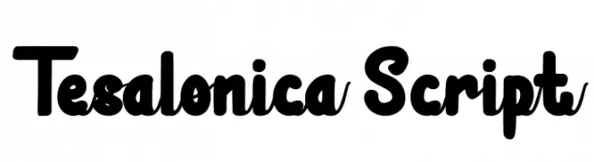
A bold, playful script font with rounded strokes and smooth curves.
![Tesalonica Script Frei Schriftart Herunterladen]() Herunterladen 65 Downloads@WebFont
Herunterladen 65 Downloads@WebFont -
( Fonts by Java Pep - Personal-use only. For commercial use please contact owner. )
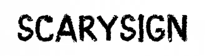
A bold, textured font with a spooky, hand-drawn appearance.
![Scary Sign Frei Schriftart Herunterladen]() Herunterladen 65 Downloads@WebFont
Herunterladen 65 Downloads@WebFont -
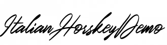
( Fonts by Mindtype Co. - Putra Khan - Personal-use only. For commercial use please contact owner. )
A fluid and elegant script font with a handwritten style.
![ItalianHorskeyDemo Frei Schriftart Herunterladen]() Herunterladen 65 Downloads@WebFont
Herunterladen 65 Downloads@WebFont -
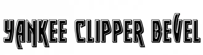
( Iconian Fonts - Daniel Zadorozny - www.iconian.com )
A bold, beveled font with a three-dimensional, decorative style.
![Yankee Clipper Bevel Frei Schriftart Herunterladen]() Herunterladen 65 Downloads@WebFont
Herunterladen 65 Downloads@WebFont -
( Xerographer Fonts - Max Infeld - xerographer.blogspot.com )
A geometric, angular font with a modern, futuristic style.
![Pelanquier Frei Schriftart Herunterladen]() Herunterladen 65 Downloads@WebFont
Herunterladen 65 Downloads@WebFont


Welche Schriften sind gerade am populärsten?
Poppins, Roboto, Montserrat, Open Sans und Lato sind wegen ihrer klaren Formen und breiten Einsetzbarkeit sehr gefragt – von Markenauftritt über Landingpages bis hin zu Postern.
Welche Fonts eignen sich für Logos?
Geometrische Sans‑Serifs (z. B. Poppins, Familien im Gotham‑Stil) sind ein häufiger Griff für sauberes, skalierbares Branding. Für eine persönlichere Note bleiben Scripts und Handschrift‑Stile beliebt. Kombinieren Sie einen prägnanten Headline‑Font mit einer neutralen Brotschrift für Wiedererkennung und Harmonie.
Wie oft wird die Top‑Liste aktualisiert?
Regelmäßig – basierend auf realen Downloads und Interaktionen. Schauen Sie öfter vorbei, um aufstrebende Favoriten früh zu entdecken.
💡 Tipp: Seite bookmarken – Trends wechseln schnell, und heutige Top‑Schriften inspirieren morgen vielleicht das Rebranding.