Willkommen bei den Top‑Schriften – hier treffen Beliebtheit und Qualität aufeinander. Das sind die in diesem Jahr am häufigsten heruntergeladenen und genutzten Fonts. Wenn Sie sichere Optionen für Logo, Web oder Social suchen, starten Sie hier.
Jeder Top‑Font überzeugt durch Balance, Lesbarkeit und Vielseitigkeit. Sie finden moderne Sans‑Serifs, elegante Scripts, Vintage‑Serifs und minimalistische Displays.
-
( Fonts by Maulana Creative - Gilang Maulana - Personal-use only. For commercial use please contact owner. )
A flowing, elegant script font with a modern, handwritten style.
 Herunterladen 65 Downloads@WebFont
 -
( Iconian Fonts - Daniel Zadorozny - www.iconian.com )
A bold, condensed, and italicized font with a futuristic and angular design.
![Intergalactic Condensed Italic Frei Schriftart Herunterladen]() Herunterladen 65 Downloads@WebFont
Herunterladen 65 Downloads@WebFont -
( Gyrl Friday - katgyrl.com/fonts/ )
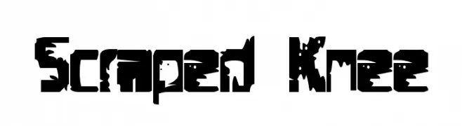
A rugged, distressed font with a bold, grungy texture and irregular edges.
![Scraped Knee Frei Schriftart Herunterladen]() Herunterladen 65 Downloads@WebFont
Herunterladen 65 Downloads@WebFont -
( Fonts by Peter Wiegel - www.peter-wiegel.de - Personal-use only. For commercial use please contact owner. )
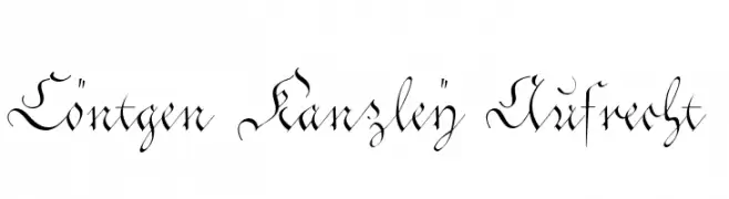
A decorative, calligraphic font with ornate flourishes and classic elegance.
![Cöntgen Kanzley Aufrecht Frei Schriftart Herunterladen]() Herunterladen 65 Downloads@WebFont
Herunterladen 65 Downloads@WebFont -
( Fonts by Din Studio - Donis Miftahudin - Personal-use only. For commercial use please contact owner. )
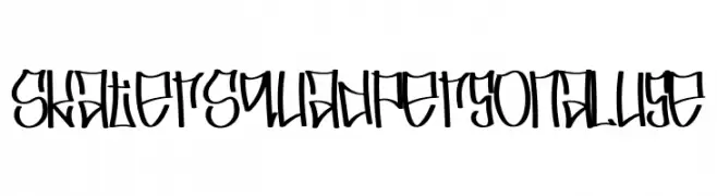
A bold, graffiti-inspired font with angular, dynamic characters.
![Skater Squad personal use Frei Schriftart Herunterladen]() Herunterladen 65 Downloads@WebFont
Herunterladen 65 Downloads@WebFont -
( Fonts by Din Studio - Donis Miftahudin - Personal-use only. For commercial use please contact owner. )
An elegant, flowing script font with graceful curves and a decorative style.
![Amadora Frei Schriftart Herunterladen]() Herunterladen 65 Downloads@WebFont
Herunterladen 65 Downloads@WebFont -
( kizzles the cat )
A playful, hand-drawn font with quirky, irregular shapes and a whimsical style.
![full hole Frei Schriftart Herunterladen]() Herunterladen 65 Downloads@WebFont
Herunterladen 65 Downloads@WebFont -
( Fonts by Helotype - Yudi Setiawan - Personal-use only. For commercial use please contact owner. )
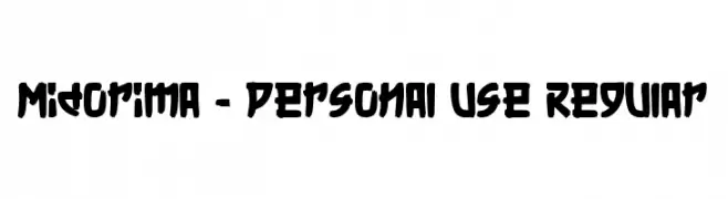
A bold, brush-style font with expressive and dynamic strokes.
![Midorima - Personal Use Regular Frei Schriftart Herunterladen]() Herunterladen 65 Downloads@WebFont
Herunterladen 65 Downloads@WebFont -
( Fonts by Pilaster Davy - Personal-use only. For commercial use please contact owner. )
A classic serif font with high contrast and elegant serifs.
![Archaic1897 Frei Schriftart Herunterladen]() Herunterladen 65 Downloads@WebFont
Herunterladen 65 Downloads@WebFont -
( Fonts by Vladimir Nikolic )
A bold, decorative font with multi-layered, tubular strokes.
![Tuyaux Thin Regular Frei Schriftart Herunterladen]() Herunterladen 65 Downloads@WebFont
Herunterladen 65 Downloads@WebFont -
( Fonts by Daniel Zadorozny - www.iconian.com - Personal-use only. For commercial use please contact owner. )
A bold, italicized font with a dynamic gradient effect and horizontal line design.
![Bandit & Snowman Gradient Ital Frei Schriftart Herunterladen]() Herunterladen 65 Downloads@WebFont
Herunterladen 65 Downloads@WebFont -
( Fonts by Creatype Studio - Rian Rahardi - Personal-use only. For commercial use please contact owner. )
A bold, brush-style font with a hand-painted, artistic appearance.
![Mandhy Regular Frei Schriftart Herunterladen]() Herunterladen 65 Downloads@WebFont
Herunterladen 65 Downloads@WebFont -
( Fonts by Letterhend Studio - Hendry Juanda - Personal-use only. For commercial use please contact owner. )
A bold, geometric font with rounded edges and a strong presence.
![Squiborn DEMO Frei Schriftart Herunterladen]() Herunterladen 65 Downloads@WebFont
Herunterladen 65 Downloads@WebFont -
( Fonts by Situjuh Nazara - 7ntypes.com - Personal-use only. For commercial use please contact owner. )
A playful and dynamic font with a blend of curves and straight lines.
![Maybe Yes Frei Schriftart Herunterladen]() Herunterladen 65 Downloads@WebFont
Herunterladen 65 Downloads@WebFont -
( Fonts by Daniel Zadorozny - www.iconian.com - Personal-use only. For commercial use please contact owner. )
A bold, extra-expanded font with sharp, angular lines and a modern geometric style.
![Hydronaut Extra-Expanded Frei Schriftart Herunterladen]() Herunterladen 65 Downloads@WebFont
Herunterladen 65 Downloads@WebFont -
( Michael Parson - www.typogama.com )
A bold, geometric stencil font with rounded shapes and a modern aesthetic.
![Elsuave-Regular Frei Schriftart Herunterladen]() Herunterladen 65 Downloads@WebFont
Herunterladen 65 Downloads@WebFont -
( Eldertype Studio - creativemarket.com/eldertype )
A playful, handwritten script font with flowing, interconnected strokes.
![ahsley Regular Frei Schriftart Herunterladen]() Herunterladen 65 Downloads@WebFont
Herunterladen 65 Downloads@WebFont -
( Fonts by Daniel Zadorozny - www.iconian.com - Personal-use only. For commercial use please contact owner. )
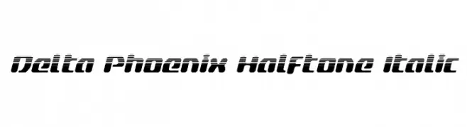
A bold, italicized font with a halftone effect, exuding a dynamic and futuristic style.
![Delta Phoenix Halftone Italic Frei Schriftart Herunterladen]() Herunterladen 65 Downloads@WebFont
Herunterladen 65 Downloads@WebFont -
( Iconian Fonts - Daniel Zadorozny - www.iconian.com )
A bold, geometric font with a retro disco vibe and semi-italic slant.
![Disco Duck Semi-Italic Frei Schriftart Herunterladen]() Herunterladen 65 Downloads@WebFont
Herunterladen 65 Downloads@WebFont -
( Fonts by Khurasan )
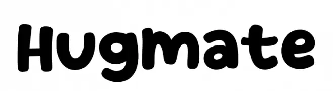
A playful, bold font with rounded, bubbly characters.
![Hugmate Frei Schriftart Herunterladen]() Herunterladen 65 Downloads@WebFont
Herunterladen 65 Downloads@WebFont -
( Fonts by Perspectype Studio )
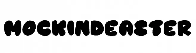
A playful, bold font with rounded, bubble-like characters.
![Mockind Easter Frei Schriftart Herunterladen]() Herunterladen 65 Downloads@WebFont
Herunterladen 65 Downloads@WebFont -
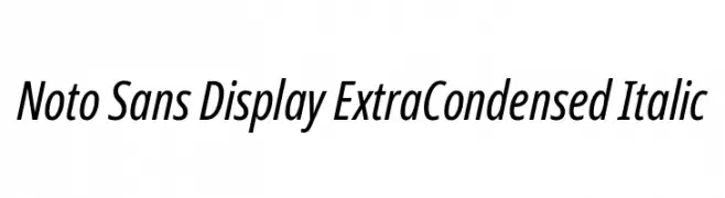
( Noto is a trademark of Google Inc. Noto fonts are open source. All Noto fonts are published under the SIL Open Font License, Version 1.1 )
A sleek, extra condensed italic typeface with a modern and dynamic style.
![Noto Sans Display ExtraCondensed Italic Frei Schriftart Herunterladen]() Herunterladen 65 Downloads@WebFont
Herunterladen 65 Downloads@WebFont -
( Fonts by Peter Wiegel - www.peter-wiegel.de - Personal-use only. For commercial use please contact owner. )
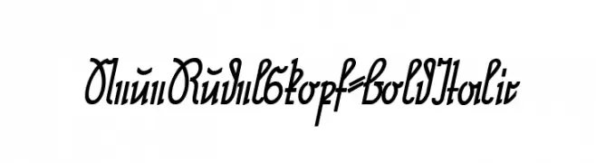
A bold, italic script font with flowing, interconnected letterforms.
![NeueRudelskopf-BoldItalic Frei Schriftart Herunterladen]() Herunterladen 65 Downloads@WebFont
Herunterladen 65 Downloads@WebFont -
( Fonts by Gilar Studio - Personal-use only. For commercial use please contact owner. )
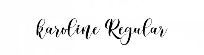
An elegant script font with flowing, interconnected letters and calligraphic style.
![karoline Regular Frei Schriftart Herunterladen]() Herunterladen 65 Downloads@WebFont
Herunterladen 65 Downloads@WebFont -
( Fonts by Kat`s Fun Fonts - Personal-use only. For commercial use please contact owner. )
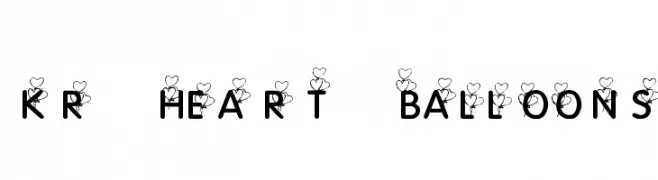
A whimsical font with heart-shaped balloon embellishments on bold uppercase letters.
![KR Heart Balloons Frei Schriftart Herunterladen]() Herunterladen 65 Downloads@WebFont
Herunterladen 65 Downloads@WebFont -
( Iconian Fonts - Daniel Zadorozny - www.iconian.com )
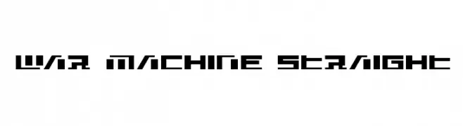
A bold, geometric font with a futuristic and industrial design.
![War Machine Straight Frei Schriftart Herunterladen]() Herunterladen 65 Downloads@WebFont
Herunterladen 65 Downloads@WebFont -
( Fonts by Kong Font - fontkong.com - Personal-use only. For commercial use please contact owner. )
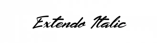
A dynamic, italic script font with elegant, flowing characters and medium contrast.
![Extendo Italic Frei Schriftart Herunterladen]() Herunterladen 65 Downloads@WebFont
Herunterladen 65 Downloads@WebFont -
( Fonts by Paul Vincent - Personal-use only. For commercial use please contact owner. )
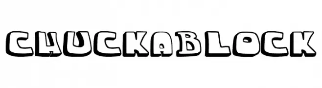
A bold, playful font with a 3D block-like appearance.
![chuckablock Frei Schriftart Herunterladen]() Herunterladen 65 Downloads@WebFont
Herunterladen 65 Downloads@WebFont -
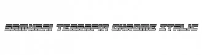
![Samurai Terrapin Chrome Italic Frei Schriftart Herunterladen]() Herunterladen 65 Downloads@WebFont
Herunterladen 65 Downloads@WebFont -
( Fonts by Afkari Studio )
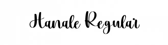
Bold, playful script with hand-lettered, calligraphic flair.
![Hanale Regular Frei Schriftart Herunterladen]() Herunterladen 65 Downloads@WebFont
Herunterladen 65 Downloads@WebFont -
( Fonts by Letterhend Studio - Hendry Juanda - Personal-use only. For commercial use please contact owner. )
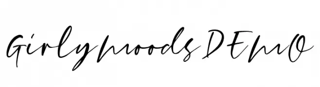
A lively and expressive handwritten font with fluid, dynamic strokes.
![GirlyMoodsDEMO Frei Schriftart Herunterladen]() Herunterladen 65 Downloads@WebFont
Herunterladen 65 Downloads@WebFont -
( Fonts by Typefar - Farul Arjianto - Personal-use only. For commercial use please contact owner. )
A bold, condensed font with a stamped, vintage texture.
![Patrice Stamp Demo Frei Schriftart Herunterladen]() Herunterladen 65 Downloads@WebFont
Herunterladen 65 Downloads@WebFont -
( London's Letters - www.londonsletters.com/ )
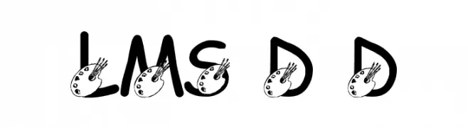
A bold, artistic font with palette embellishments for a creative touch.
![LMS Darren's Delight Frei Schriftart Herunterladen]() Herunterladen 65 Downloads@WebFont
Herunterladen 65 Downloads@WebFont -
( Fonts by Kong Font - https://fontkong.com/ - Personal-use only. For commercial use please contact owner. )
A playful, bold handwritten font with a smooth, rounded style.
![Limonea Frei Schriftart Herunterladen]() Herunterladen 65 Downloads@WebFont
Herunterladen 65 Downloads@WebFont -
( Fonts by Vultype - Candra Hamdani - Personal-use only. For commercial use please contact owner. )
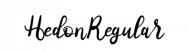
A lively and flowing script font with elegant, cursive strokes.
![Hedon Regular Frei Schriftart Herunterladen]() Herunterladen 65 Downloads@WebFont
Herunterladen 65 Downloads@WebFont


Welche Schriften sind gerade am populärsten?
Poppins, Roboto, Montserrat, Open Sans und Lato sind wegen ihrer klaren Formen und breiten Einsetzbarkeit sehr gefragt – von Markenauftritt über Landingpages bis hin zu Postern.
Welche Fonts eignen sich für Logos?
Geometrische Sans‑Serifs (z. B. Poppins, Familien im Gotham‑Stil) sind ein häufiger Griff für sauberes, skalierbares Branding. Für eine persönlichere Note bleiben Scripts und Handschrift‑Stile beliebt. Kombinieren Sie einen prägnanten Headline‑Font mit einer neutralen Brotschrift für Wiedererkennung und Harmonie.
Wie oft wird die Top‑Liste aktualisiert?
Regelmäßig – basierend auf realen Downloads und Interaktionen. Schauen Sie öfter vorbei, um aufstrebende Favoriten früh zu entdecken.
💡 Tipp: Seite bookmarken – Trends wechseln schnell, und heutige Top‑Schriften inspirieren morgen vielleicht das Rebranding.