Willkommen bei den Top‑Schriften – hier treffen Beliebtheit und Qualität aufeinander. Das sind die in diesem Jahr am häufigsten heruntergeladenen und genutzten Fonts. Wenn Sie sichere Optionen für Logo, Web oder Social suchen, starten Sie hier.
Jeder Top‑Font überzeugt durch Balance, Lesbarkeit und Vielseitigkeit. Sie finden moderne Sans‑Serifs, elegante Scripts, Vintage‑Serifs und minimalistische Displays.
-
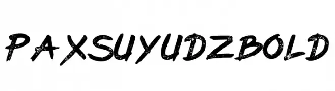
( Fonts by PutraCetol Studio - www.putracetol.com - Personal-use only. For commercial use please contact owner. )
A bold, distressed font with a rugged and edgy appearance.
 Herunterladen 65 Downloads@WebFont
 -
( Fonts by Vunira Design - Personal-use only. For commercial use please contact owner. )
A playful, bold handwritten font with rounded, casual letterforms.
![Hello Day FREE Frei Schriftart Herunterladen]() Herunterladen 65 Downloads@WebFont
Herunterladen 65 Downloads@WebFont -
( Fonts by Rangkai Aksara - Personal-use only. For commercial use please contact owner. )
A playful, hand-drawn font with dynamic, irregular strokes.
![Little Waves Frei Schriftart Herunterladen]() Herunterladen 65 Downloads@WebFont
Herunterladen 65 Downloads@WebFont -
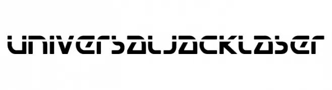
( Fonts by Iconian Fonts - Daniel Zadorozny - Personal-use only. For commercial use please contact owner. )
A bold, futuristic font with geometric, stencil-like letterforms.
![Universal Jack Laser Frei Schriftart Herunterladen]() Herunterladen 65 Downloads@WebFont
Herunterladen 65 Downloads@WebFont -
( Fonts by Wahyu Studio )
![Flower Minimalist Frei Schriftart Herunterladen]() Herunterladen 65 Downloads@WebFont
Herunterladen 65 Downloads@WebFont -
( Fonts by Daniel Zadorozny - www.iconian.com - Personal-use only. For commercial use please contact owner. )
A futuristic, italic font with bold, geometric characters and a dynamic style.
![Vertical Horizon Laser Italic Frei Schriftart Herunterladen]() Herunterladen 65 Downloads@WebFont
Herunterladen 65 Downloads@WebFont -
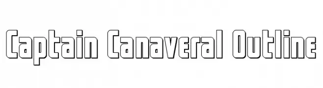
( Fonts by Iconian Fonts - Daniel Zadorozny - Personal-use only. For commercial use please contact owner. )
A bold, outlined font with a modern, futuristic style.
![Captain Canaveral Outline Frei Schriftart Herunterladen]() Herunterladen 65 Downloads@WebFont
Herunterladen 65 Downloads@WebFont -
( Fonts by MJB Letters - Muhammad Mujibulloh - Personal-use only. For commercial use please contact owner. )
A modern, elegant script font with flowing, cursive letters.
![Golden Moment Frei Schriftart Herunterladen]() Herunterladen 65 Downloads@WebFont
Herunterladen 65 Downloads@WebFont -
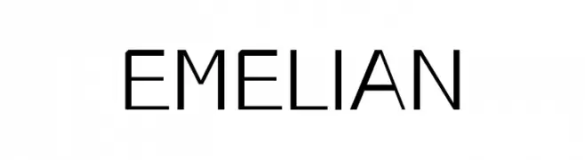
( Fonts by nendi emelia - pratiwi emelia - Personal-use only. For commercial use please contact owner. )
A modern, geometric sans-serif font with consistent stroke thickness and balanced spacing.
![EMELIAN Frei Schriftart Herunterladen]() Herunterladen 65 Downloads@WebFont
Herunterladen 65 Downloads@WebFont -
( Fonts by Arsy Creative - Personal-use only. For commercial use please contact owner. )
A bold, brush-style font with expressive and dynamic strokes.
![Jakarta Frei Schriftart Herunterladen]() Herunterladen 65 Downloads@WebFont
Herunterladen 65 Downloads@WebFont -
( Fonts by Have Fun with Fonts )
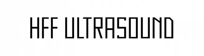
A geometric, angular font with a futuristic and digital aesthetic.
![HFF Ultrasound Frei Schriftart Herunterladen]() Herunterladen 65 Downloads@WebFont
Herunterladen 65 Downloads@WebFont -
( Fonts by Juan Manuel Meri )
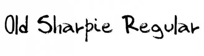
Handwritten, marker-style font with rough, textured strokes.
![Old Sharpie Regular Frei Schriftart Herunterladen]() Herunterladen 65 Downloads@WebFont
Herunterladen 65 Downloads@WebFont -
( Fonts by Allouse Studio - Personal-use only. For commercial use please contact owner. )
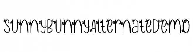
A whimsical decorative font with playful curls and loops.
![Sunny Bunny Alternate Demo Frei Schriftart Herunterladen]() Herunterladen 65 Downloads@WebFont
Herunterladen 65 Downloads@WebFont -
( Fonts by Letterhend Studio - Hendry Juanda - Personal-use only. For commercial use please contact owner. )
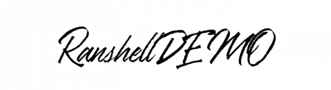
A dynamic, cursive script font with bold, sweeping strokes.
![RanshellDEMO Frei Schriftart Herunterladen]() Herunterladen 65 Downloads@WebFont
Herunterladen 65 Downloads@WebFont -
( Fonts by Mans Greback - Personal-use only. For commercial use please contact owner. )
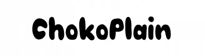
A bold, rounded font with a playful and friendly style.
![Choko Plain Frei Schriftart Herunterladen]() Herunterladen 65 Downloads@WebFont
Herunterladen 65 Downloads@WebFont -
( Fonts by Ronny Studio )
A bold, handwritten-style font with dynamic and fluid strokes.
![Echoed Vandalism DEMO Frei Schriftart Herunterladen]() Herunterladen 65 Downloads@WebFont
Herunterladen 65 Downloads@WebFont -
( Fonts by AminMario - Amin Mario - Personal-use only. For commercial use please contact owner. )
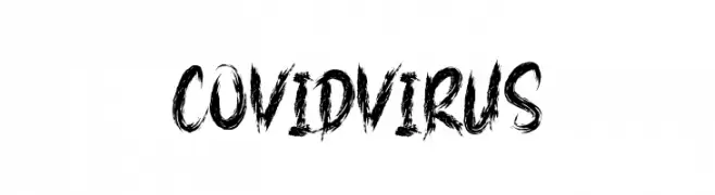
A bold, textured font with a chaotic, brush-stroke style.
![COVID VIRUS Frei Schriftart Herunterladen]() Herunterladen 65 Downloads@WebFont
Herunterladen 65 Downloads@WebFont -
( Fonts by Iconian Fonts - Daniel Zadorozny - Personal-use only. For commercial use please contact owner. )
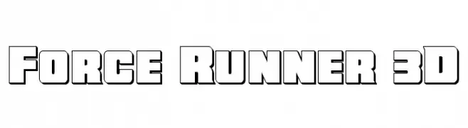
A bold, 3D font with a modern, impactful design.
![Force Runner 3D Frei Schriftart Herunterladen]() Herunterladen 65 Downloads@WebFont
Herunterladen 65 Downloads@WebFont -
( Iconian Fonts - Daniel Zadorozny - www.iconian.com )
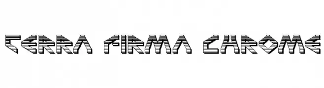
A bold, futuristic font with a three-dimensional, striped design.
![Terra Firma Chrome Frei Schriftart Herunterladen]() Herunterladen 65 Downloads@WebFont
Herunterladen 65 Downloads@WebFont -
( Fonts by Syaf Rizal - Khurasan - Personal-use only. For commercial use please contact owner. )
A casual, elegant handwritten font with smooth, flowing lines.
![Ballite Frei Schriftart Herunterladen]() Herunterladen 65 Downloads@WebFont
Herunterladen 65 Downloads@WebFont -
( Fonts by Maulana Creative )
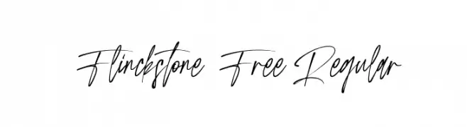
An elegant, flowing script font with a natural handwriting style.
![Flinckstone Free Regular Frei Schriftart Herunterladen]() Herunterladen 65 Downloads@WebFont
Herunterladen 65 Downloads@WebFont -
( Fonts by Mozyen Studio - Personal-use only. For commercial use please contact owner. )
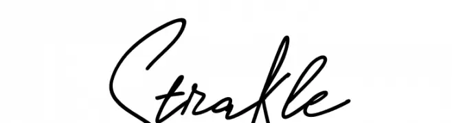
A fluid and elegant handwritten font with a cursive style.
![Strakle Frei Schriftart Herunterladen]() Herunterladen 65 Downloads@WebFont
Herunterladen 65 Downloads@WebFont -
( Fonts by Daniel Zadorozny - www.iconian.com - Personal-use only. For commercial use please contact owner. )
A playful, bold font with thick, uneven strokes and a hand-drawn feel.
![Charmling Frei Schriftart Herunterladen]() Herunterladen 65 Downloads@WebFont
Herunterladen 65 Downloads@WebFont -
( Fonts by Daniel Zadorozny - www.iconian.com - Personal-use only. For commercial use please contact owner. )
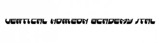
A bold, futuristic font with geometric shapes and a dynamic slant.
![Vertical Horizon Academy Ital Frei Schriftart Herunterladen]() Herunterladen 65 Downloads@WebFont
Herunterladen 65 Downloads@WebFont -
( Fonts by Bexxtype - Personal-use only. For commercial use please contact owner. )
An elegant, flowing script font with ornate uppercase and smooth lowercase letters.
![ningsih Frei Schriftart Herunterladen]() Herunterladen 65 Downloads@WebFont
Herunterladen 65 Downloads@WebFont -
( Fonts by Iconian Fonts - Daniel Zadorozny - Personal-use only. For commercial use please contact owner. )
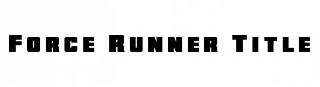
A bold, geometric font with a strong, industrial feel.
![Force Runner Title Frei Schriftart Herunterladen]() Herunterladen 65 Downloads@WebFont
Herunterladen 65 Downloads@WebFont -
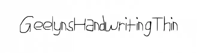
( GeelynEdits - plus.google.com/u/0/108461348931992643310/ )
A thin, handwritten font with a casual and personal style.
![Geelyn_s_Handwriting_Thin Frei Schriftart Herunterladen]() Herunterladen 65 Downloads@WebFont
Herunterladen 65 Downloads@WebFont -
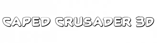
( Fonts by Iconian Fonts )
A bold, playful font with a 3D effect and cartoonish style.
![Caped Crusader 3D Frei Schriftart Herunterladen]() Herunterladen 65 Downloads@WebFont
Herunterladen 65 Downloads@WebFont -
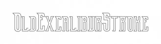
( Fonts by Edric Studio www.creativefabrica.com/designer/edricstudio/ - Personal-use only. For commercial use please contact owner. )
A bold, medieval-inspired font with sharp, angular lines and an outline style.
![Old Excalibur Stroke Frei Schriftart Herunterladen]() Herunterladen 65 Downloads@WebFont
Herunterladen 65 Downloads@WebFont -
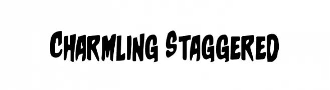
( Fonts by Daniel Zadorozny - www.iconian.com - Personal-use only. For commercial use please contact owner. )
A playful, bold font with a staggered baseline and rounded, irregular shapes.
![Charmling Staggered Frei Schriftart Herunterladen]() Herunterladen 65 Downloads@WebFont
Herunterladen 65 Downloads@WebFont -
( Fonts by Allouse Studio - Personal-use only. For commercial use please contact owner. )
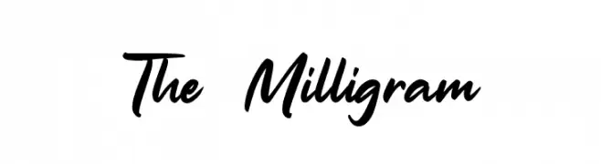
A dynamic, flowing script font with elegant, cursive letterforms.
![The Milligram Frei Schriftart Herunterladen]() Herunterladen 65 Downloads@WebFont
Herunterladen 65 Downloads@WebFont -
( Fonts by Dikas Studio - Andika Setiawan - Personal-use only. For commercial use please contact owner. )
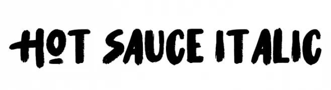
A bold, brush-style italic font with dynamic strokes and a handcrafted appearance.
![Hot Sauce Italic Frei Schriftart Herunterladen]() Herunterladen 65 Downloads@WebFont
Herunterladen 65 Downloads@WebFont -
( Fonts by Ramli Setiadi - Personal-use only. For commercial use please contact owner. )
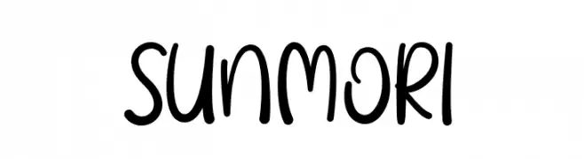
A playful, handwritten font with smooth, rounded edges and a casual style.
![SUNMORI Frei Schriftart Herunterladen]() Herunterladen 65 Downloads@WebFont
Herunterladen 65 Downloads@WebFont -
( Fonts by Arterfak Project - Ahmad Ramzi Fahruddin - Personal-use only. For commercial use please contact owner. )
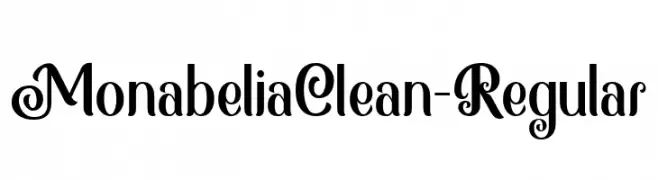
A decorative and elegant font with intricate swirls and loops.
![MonabeliaClean-Regular Frei Schriftart Herunterladen]() Herunterladen 65 Downloads@WebFont
Herunterladen 65 Downloads@WebFont -
( Fonts by Wahyu Eka Prasetya - wepfont.com - Personal-use only. For commercial use please contact owner. )
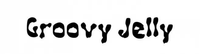
A playful, wavy font with a bold, fluid design.
![Groovy Jelly Frei Schriftart Herunterladen]() Herunterladen 65 Downloads@WebFont
Herunterladen 65 Downloads@WebFont


Welche Schriften sind gerade am populärsten?
Poppins, Roboto, Montserrat, Open Sans und Lato sind wegen ihrer klaren Formen und breiten Einsetzbarkeit sehr gefragt – von Markenauftritt über Landingpages bis hin zu Postern.
Welche Fonts eignen sich für Logos?
Geometrische Sans‑Serifs (z. B. Poppins, Familien im Gotham‑Stil) sind ein häufiger Griff für sauberes, skalierbares Branding. Für eine persönlichere Note bleiben Scripts und Handschrift‑Stile beliebt. Kombinieren Sie einen prägnanten Headline‑Font mit einer neutralen Brotschrift für Wiedererkennung und Harmonie.
Wie oft wird die Top‑Liste aktualisiert?
Regelmäßig – basierend auf realen Downloads und Interaktionen. Schauen Sie öfter vorbei, um aufstrebende Favoriten früh zu entdecken.
💡 Tipp: Seite bookmarken – Trends wechseln schnell, und heutige Top‑Schriften inspirieren morgen vielleicht das Rebranding.