Willkommen bei den Top‑Schriften – hier treffen Beliebtheit und Qualität aufeinander. Das sind die in diesem Jahr am häufigsten heruntergeladenen und genutzten Fonts. Wenn Sie sichere Optionen für Logo, Web oder Social suchen, starten Sie hier.
Jeder Top‑Font überzeugt durch Balance, Lesbarkeit und Vielseitigkeit. Sie finden moderne Sans‑Serifs, elegante Scripts, Vintage‑Serifs und minimalistische Displays.
-
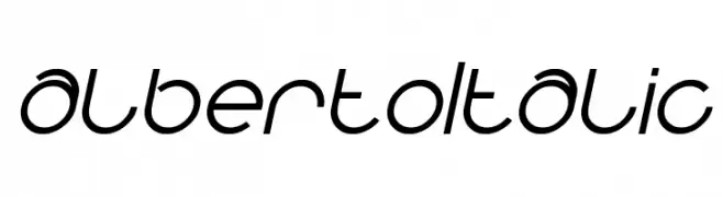
( Fonts by weknow - Wino S Kadir - Personal-use only. For commercial use please contact owner. )
A modern, italic font with smooth curves and consistent stroke width.
 Herunterladen 63 Downloads@WebFont
 -
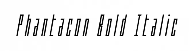
( Iconian Fonts - Daniel Zadorozny - www.iconian.com )
A bold, italicized font with elongated, narrow characters and a modern, dynamic style.
![Phantacon Bold Italic Frei Schriftart Herunterladen]() Herunterladen 63 Downloads@WebFont
Herunterladen 63 Downloads@WebFont -
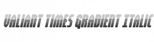
( Fonts by Daniel Zadorozny - www.iconian.com - Personal-use only. For commercial use please contact owner. )
A bold, italicized font with a gradient effect and dynamic, modern style.
![Valiant Times Gradient Italic Frei Schriftart Herunterladen]() Herunterladen 63 Downloads@WebFont
Herunterladen 63 Downloads@WebFont -
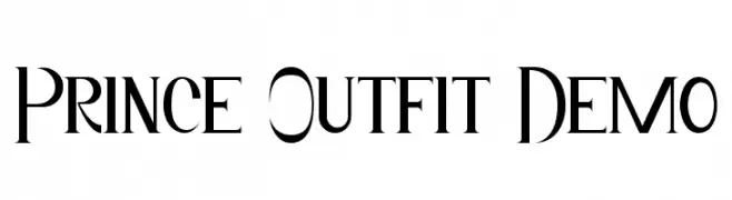
( Fonts by Edric Studio - Personal-use only. For commercial use please contact owner. )
A modern-vintage font with elegant, high-contrast letterforms and sharp serifs.
![Prince Outfit Demo Frei Schriftart Herunterladen]() Herunterladen 63 Downloads@WebFont
Herunterladen 63 Downloads@WebFont -
( Fonts by Kong Font - Personal-use only. For commercial use please contact owner. )
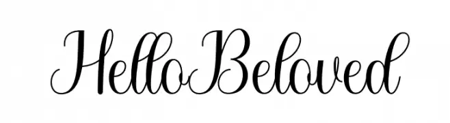
An elegant, flowing script font with sophisticated, cursive letterforms.
![Hello Beloved Frei Schriftart Herunterladen]() Herunterladen 63 Downloads@WebFont
Herunterladen 63 Downloads@WebFont -
( Fonts by Vunira Design - Personal-use only. For commercial use please contact owner. )
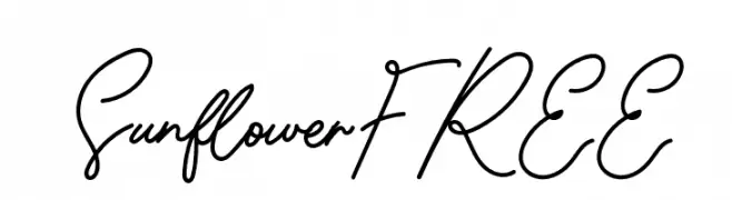
A cursive, handwritten-style font with elegant, flowing strokes.
![SunflowerFREE Frei Schriftart Herunterladen]() Herunterladen 63 Downloads@WebFont
Herunterladen 63 Downloads@WebFont -
( Fonts by RaisProject )
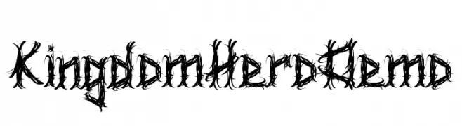
A decorative, thorny font with a gothic and edgy style.
![Kingdom Hero Demo Frei Schriftart Herunterladen]() Herunterladen 63 Downloads@WebFont
Herunterladen 63 Downloads@WebFont -
( Fonts by www.woodcutter.es - woodcutter Manero - Personal-use only. For commercial use please contact owner. )
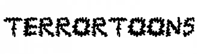
A bold, jagged, and playful font with a cartoonish, horror-themed aesthetic.
![TerrorToons Frei Schriftart Herunterladen]() Herunterladen 63 Downloads@WebFont
Herunterladen 63 Downloads@WebFont -
( Extram Studios - Lewis Bauer )
A modern, geometric font with clean lines and a slightly condensed style.
![Obti Sans Frei Schriftart Herunterladen]() Herunterladen 63 Downloads@WebFont
Herunterladen 63 Downloads@WebFont -
( Noto is a trademark of Google Inc. Noto fonts are open source. All Noto fonts are published under the SIL Open Font License, Version 1.1 )
Image contains placeholder glyphs, not a valid font sample.
![Noto Serif Lao Condensed ExtraLight Frei Schriftart Herunterladen]() Herunterladen 63 Downloads@WebFont
Herunterladen 63 Downloads@WebFont -
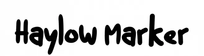
( Fonts by Kurnia Setyadi - Personal-use only. For commercial use please contact owner. )
A playful, handwritten marker-style font with bold, rounded characters.
![Haylow Marker Frei Schriftart Herunterladen]() Herunterladen 63 Downloads@WebFont
Herunterladen 63 Downloads@WebFont -
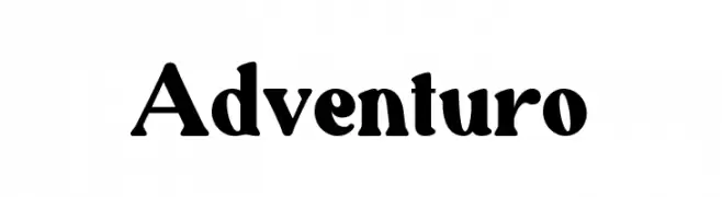
( Fonts by Pen Culture - Revo Farisky - Personal-use only. For commercial use please contact owner. )
A bold, high-contrast serif font with a classic and adventurous style.
![Adventuro Frei Schriftart Herunterladen]() Herunterladen 63 Downloads@WebFont
Herunterladen 63 Downloads@WebFont -
( Fonts by dhridjie - Sulistiyono Widodo - Personal-use only. For commercial use please contact owner. )
A bold, angular font with a futuristic and sporty style.
![adrenal Frei Schriftart Herunterladen]() Herunterladen 63 Downloads@WebFont
Herunterladen 63 Downloads@WebFont -
( Fonts by VinType )
A lively handwritten script with tall, narrow, and fluid letterforms.
![Fake Soul Demo Frei Schriftart Herunterladen]() Herunterladen 63 Downloads@WebFont
Herunterladen 63 Downloads@WebFont -
( Fonts by Yumna Family - yumna Type - Personal-use only. For commercial use please contact owner. )
A bold, geometric sans-serif font with a modern and structured design.
![Grover Frei Schriftart Herunterladen]() Herunterladen 63 Downloads@WebFont
Herunterladen 63 Downloads@WebFont -
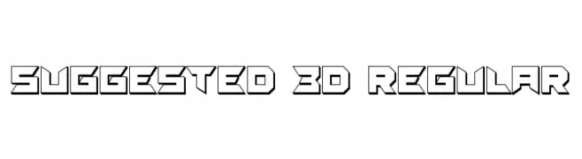
( Vladimir Nikolic - www.coroflot.com/vladimirnikolic )
A bold, 3D geometric font with angular, futuristic characters.
![Suggested 3D Regular Frei Schriftart Herunterladen]() Herunterladen 63 Downloads@WebFont
Herunterladen 63 Downloads@WebFont -
( Fonts by Letterena Studios )
A lively and expressive handwritten font with dynamic strokes and artistic flair.
![bluetank Frei Schriftart Herunterladen]() Herunterladen 63 Downloads@WebFont
Herunterladen 63 Downloads@WebFont -
( Fonts by StringLabs - stringlabscreative.com - Personal-use only. For commercial use please contact owner. )
A lively cursive script font with fluid, interconnected characters.
![Mashiya Frei Schriftart Herunterladen]() Herunterladen 63 Downloads@WebFont
Herunterladen 63 Downloads@WebFont -
( Fonts by Fadlilah Studio - Personal-use only. For commercial use please contact owner. )
An elegant, flowing script font with dynamic, cursive letterforms.
![Vocation Frei Schriftart Herunterladen]() Herunterladen 63 Downloads@WebFont
Herunterladen 63 Downloads@WebFont -
( Fonts by Geronimo Fonts - Personal-use only. For commercial use please contact owner. )
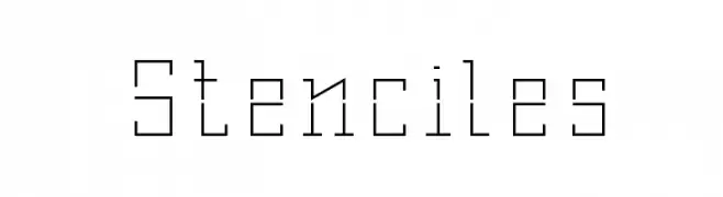
A geometric stencil font with a mechanical, industrial style.
![Stenciles Frei Schriftart Herunterladen]() Herunterladen 63 Downloads@WebFont
Herunterladen 63 Downloads@WebFont -
( CROLrene )
An artistic font with thin, elongated strokes and a hand-drawn appearance.
![PIJL Frei Schriftart Herunterladen]() Herunterladen 63 Downloads@WebFont
Herunterladen 63 Downloads@WebFont -
( Fonts by Daniel Zadorozny - www.iconian.com - Personal-use only. For commercial use please contact owner. )
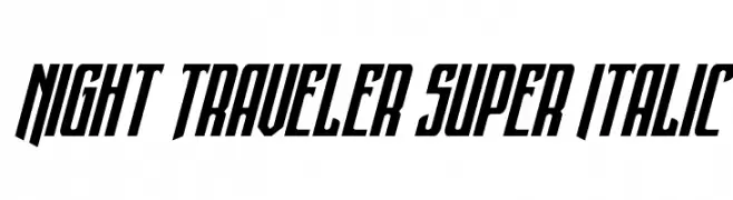
A bold, italic font with a dynamic and futuristic style.
![Night Traveler Super Italic Frei Schriftart Herunterladen]() Herunterladen 63 Downloads@WebFont
Herunterladen 63 Downloads@WebFont -
( Fonts by Zkhai Creative - Personal-use only. For commercial use please contact owner. )
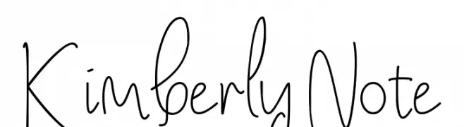
A playful handwritten font with tall, narrow letters and a whimsical style.
![Kimberly Note Frei Schriftart Herunterladen]() Herunterladen 63 Downloads@WebFont
Herunterladen 63 Downloads@WebFont -
( Fonts by 177studio - Personal-use only. For commercial use please contact owner. )
A bold, brush-style font with expressive, hand-drawn strokes.
![BLOGGER 1983 BRUSH Regular Frei Schriftart Herunterladen]() Herunterladen 63 Downloads@WebFont
Herunterladen 63 Downloads@WebFont -
( Fonts by Edric Studio - Personal-use only. For commercial use please contact owner. )
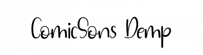
A playful, handwritten-style font with flowing, cursive-like strokes.
![ComicSons Demp Frei Schriftart Herunterladen]() Herunterladen 63 Downloads@WebFont
Herunterladen 63 Downloads@WebFont -
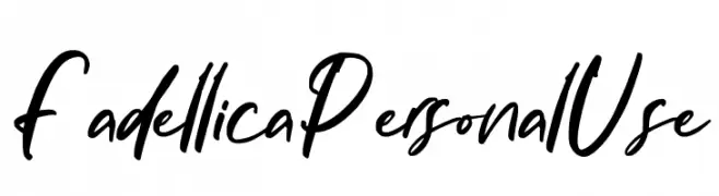
( Fonts by Ditatype - Personal-use only. For commercial use please contact owner. )
A bold, handwritten font with a dynamic and expressive style.
![Fadellica Personal Use Frei Schriftart Herunterladen]() Herunterladen 63 Downloads@WebFont
Herunterladen 63 Downloads@WebFont -
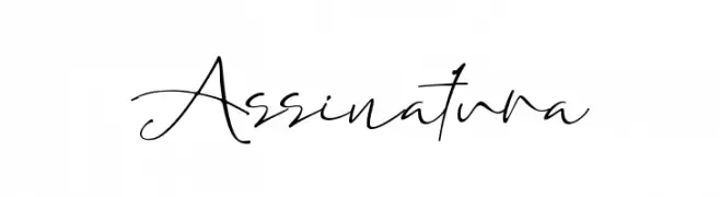
( Fonts by Letterara - Thomas Aradea - Personal-use only. For commercial use please contact owner. )
A cursive, handwritten-style font with elegant, flowing strokes.
![Assinatura Frei Schriftart Herunterladen]() Herunterladen 63 Downloads@WebFont
Herunterladen 63 Downloads@WebFont -
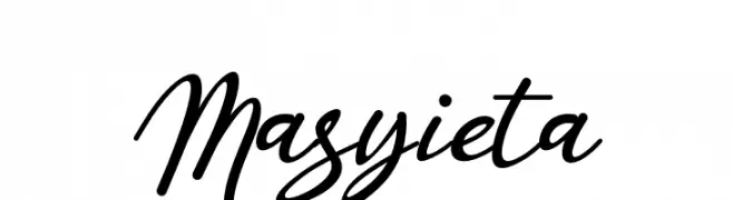
( Fonts by Famco Typefoundry - Personal-use only. For commercial use please contact owner. )
An elegant, flowing script font with interconnected, cursive letters.
![Masyieta Frei Schriftart Herunterladen]() Herunterladen 63 Downloads@WebFont
Herunterladen 63 Downloads@WebFont -
( Fonts by Woodcutter )
A bold, hand-drawn font with a playful and artistic style.
![Stupidland Frei Schriftart Herunterladen]() Herunterladen 63 Downloads@WebFont
Herunterladen 63 Downloads@WebFont -
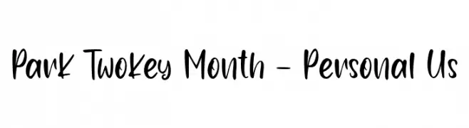
( Fonts by Haksen Studio - Sarwo Edhi Prayitno - Personal-use only. For commercial use please contact owner. )
A bold, playful handwritten font with fluid strokes and whimsical character designs.
![Park Twokey Month - Personal Us Frei Schriftart Herunterladen]() Herunterladen 63 Downloads@WebFont
Herunterladen 63 Downloads@WebFont -
( Fonts by Kotak Kuning Studio - kotakkuning.com - Personal-use only. For commercial use please contact owner. )
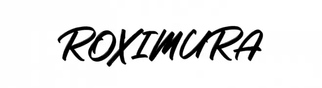
A bold, expressive script font with flowing, interconnected strokes.
![Roximura Frei Schriftart Herunterladen]() Herunterladen 63 Downloads@WebFont
Herunterladen 63 Downloads@WebFont -
( Fonts by Awanstudioz - Personal-use only. For commercial use please contact owner. )
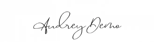
A graceful and elegant script font with fluid lines and delicate curves.
![Audrey_Demo Frei Schriftart Herunterladen]() Herunterladen 63 Downloads@WebFont
Herunterladen 63 Downloads@WebFont -
( Fonts by Omotu Studio - Ibnu Utomo - Personal-use only. For commercial use please contact owner. )
An elegant and decorative script font with flowing, cursive letterforms.
![FinchStamped_DEMO Frei Schriftart Herunterladen]() Herunterladen 63 Downloads@WebFont
Herunterladen 63 Downloads@WebFont -
( Fonts by Iconian Fonts - Daniel Zadorozny - Personal-use only. For commercial use please contact owner. )
A bold, semi-italic font with a futuristic and dynamic style.
![Battlefield Semi-Italic Frei Schriftart Herunterladen]() Herunterladen 63 Downloads@WebFont
Herunterladen 63 Downloads@WebFont -
( Fonts by Intellecta Design - Paulo W - Personal-use only. For commercial use please contact owner. )
A bold, condensed font with high contrast and a modern style.
![Neretta Frei Schriftart Herunterladen]() Herunterladen 63 Downloads@WebFont
Herunterladen 63 Downloads@WebFont


Welche Schriften sind gerade am populärsten?
Poppins, Roboto, Montserrat, Open Sans und Lato sind wegen ihrer klaren Formen und breiten Einsetzbarkeit sehr gefragt – von Markenauftritt über Landingpages bis hin zu Postern.
Welche Fonts eignen sich für Logos?
Geometrische Sans‑Serifs (z. B. Poppins, Familien im Gotham‑Stil) sind ein häufiger Griff für sauberes, skalierbares Branding. Für eine persönlichere Note bleiben Scripts und Handschrift‑Stile beliebt. Kombinieren Sie einen prägnanten Headline‑Font mit einer neutralen Brotschrift für Wiedererkennung und Harmonie.
Wie oft wird die Top‑Liste aktualisiert?
Regelmäßig – basierend auf realen Downloads und Interaktionen. Schauen Sie öfter vorbei, um aufstrebende Favoriten früh zu entdecken.
💡 Tipp: Seite bookmarken – Trends wechseln schnell, und heutige Top‑Schriften inspirieren morgen vielleicht das Rebranding.