Willkommen bei den Top‑Schriften – hier treffen Beliebtheit und Qualität aufeinander. Das sind die in diesem Jahr am häufigsten heruntergeladenen und genutzten Fonts. Wenn Sie sichere Optionen für Logo, Web oder Social suchen, starten Sie hier.
Jeder Top‑Font überzeugt durch Balance, Lesbarkeit und Vielseitigkeit. Sie finden moderne Sans‑Serifs, elegante Scripts, Vintage‑Serifs und minimalistische Displays.
-
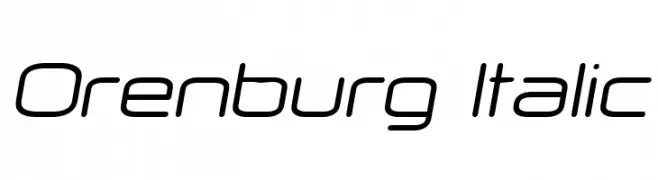
( Fonts by Vladimir Nikolic - https://www.creativefabrica.com/product/educated-deers/ref/144265/ - Personal-use only. For commercial use please contact owner. )
A sleek, modern italic font with smooth curves and consistent stroke width.
 Herunterladen 65 Downloads@WebFont
 -
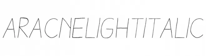
( Antipixel - Julia Martínez Diana - www.antipixel.com.ar/ )
A light, handwritten-style font with thin strokes and a slight slant.
![AracneLightItalic Frei Schriftart Herunterladen]() Herunterladen 65 Downloads@WebFont
Herunterladen 65 Downloads@WebFont -
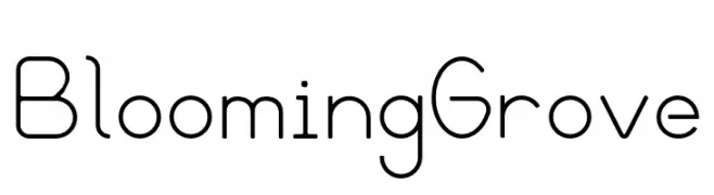
( Fonts by Nathan Eady - Personal-use only. For commercial use please contact owner. )
A modern, geometric sans-serif font with consistent stroke width and balanced proportions.
![Blooming Grove Frei Schriftart Herunterladen]() Herunterladen 65 Downloads@WebFont
Herunterladen 65 Downloads@WebFont -
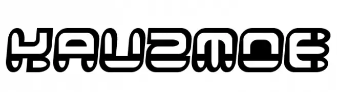
( Etherbrian - www.etherbrian.com/ )
A bold, futuristic font with geometric and rounded characters.
![Kauzmoe Frei Schriftart Herunterladen]() Herunterladen 65 Downloads@WebFont
Herunterladen 65 Downloads@WebFont -
( Fonts by Rian Dryana )
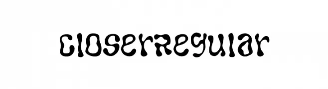
A playful, wavy font with a fluid, dynamic appearance.
![CloserRegular Frei Schriftart Herunterladen]() Herunterladen 65 Downloads@WebFont
Herunterladen 65 Downloads@WebFont -
( Noto is a trademark of Google Inc. Noto fonts are open source. All Noto fonts are published under the SIL Open Font License, Version 1.1 )
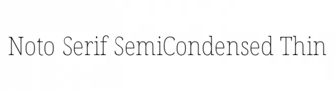
A refined serif typeface with thin strokes and a semi-condensed structure.
![Noto Serif SemiCondensed Thin Frei Schriftart Herunterladen]() Herunterladen 65 Downloads@WebFont
Herunterladen 65 Downloads@WebFont -
( Fonts by Peter Wiegel - www.peter-wiegel.de - Personal-use only. For commercial use please contact owner. )
A dynamic and edgy font with sharp, angular strokes and a modern flair.
![cbe Frei Schriftart Herunterladen]() Herunterladen 65 Downloads@WebFont
Herunterladen 65 Downloads@WebFont -
( Fonts by alphArtype - Agung Rohmat - Personal-use only. For commercial use please contact owner. )
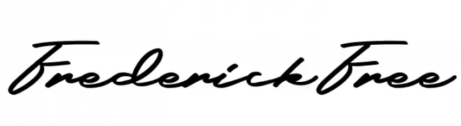
A classic and elegant script font with fluid, connected letterforms.
![FrederickFree Frei Schriftart Herunterladen]() Herunterladen 65 Downloads@WebFont
Herunterladen 65 Downloads@WebFont -
( Fonts by Kimberly Geswein )
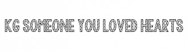
A bold, decorative font with heart patterns on each character.
![KG Someone You Loved Hearts Frei Schriftart Herunterladen]() Herunterladen 65 Downloads@WebFont
Herunterladen 65 Downloads@WebFont -
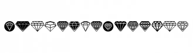
( Fonts by Vladimir Nikolic - https://www.creativefabrica.com/product/educated-deers/ref/144265/ - Personal-use only. For commercial use please contact owner. )
A gem-themed decorative icon set with geometric diamond illustrations.
![Diamondo Regular Frei Schriftart Herunterladen]() Herunterladen 65 Downloads@WebFont
Herunterladen 65 Downloads@WebFont -
( Fonts by AdanteCreative - Personal-use only. For commercial use please contact owner. )
A bold, brush-style font with a dynamic and expressive handwritten appearance.
![Crowtig Frei Schriftart Herunterladen]() Herunterladen 65 Downloads@WebFont
Herunterladen 65 Downloads@WebFont -
( Fonts by MaxnorType - Maxnor Ahmad - Personal-use only. For commercial use please contact owner. )
A flowing, cursive script font with elegant, connected letters.
![Krakatau Frei Schriftart Herunterladen]() Herunterladen 65 Downloads@WebFont
Herunterladen 65 Downloads@WebFont -
( Fonts by Pollux of Geminorum - Addy Sukma Bharata - Personal-use only. For commercial use please contact owner. )
A dynamic and elegant script font with fluid, cursive strokes.
![Almada Frei Schriftart Herunterladen]() Herunterladen 65 Downloads@WebFont
Herunterladen 65 Downloads@WebFont -
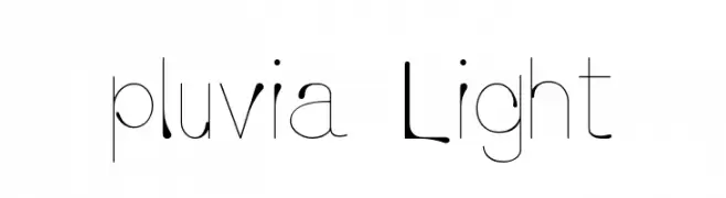
( Grant Milne - grantmilne.com/ )
A modern, elegant font with high contrast and thin strokes.
![pluvia Light Frei Schriftart Herunterladen]() Herunterladen 65 Downloads@WebFont
Herunterladen 65 Downloads@WebFont -
( Fonts by Garisman Studio - Risman Ginarwan - Personal-use only. For commercial use please contact owner. )
A bold, playful script font with a modern, handwritten style.
![Motowerks Frei Schriftart Herunterladen]() Herunterladen 65 Downloads@WebFont
Herunterladen 65 Downloads@WebFont -
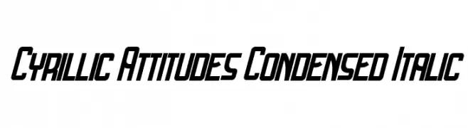
( Fonts by Vladimir Nikolic - www.creativefabrica.com/designer/vladimirnikolic/ - Personal-use only. For commercial use please contact owner. )
A bold, condensed, and italicized font with a dynamic and modern style.
![Cyrillic Attitudes Condensed Italic Frei Schriftart Herunterladen]() Herunterladen 65 Downloads@WebFont
Herunterladen 65 Downloads@WebFont -
( Fonts by Andrean Prabowo - Personal-use only. For commercial use please contact owner. )
A decorative script font with flowing, interconnected letters and calligraphic style.
![Christmas Story Frei Schriftart Herunterladen]() Herunterladen 65 Downloads@WebFont
Herunterladen 65 Downloads@WebFont -
( Fonts by Studio Hello Good )
A bold, graffiti-inspired font with sharp angles and a dynamic, urban style.
![DUMBELITE Frei Schriftart Herunterladen]() Herunterladen 65 Downloads@WebFont
Herunterladen 65 Downloads@WebFont -
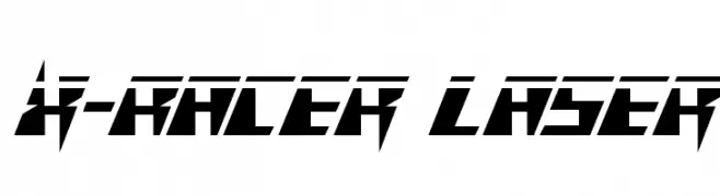
( Fonts by Iconian Fonts - Daniel Zadorozny - Personal-use only. For commercial use please contact owner. )
A futuristic, angular font with sharp edges and a racing-inspired design.
![X-Racer Laser Frei Schriftart Herunterladen]() Herunterladen 65 Downloads@WebFont
Herunterladen 65 Downloads@WebFont -
( Fonts by Zetafonts - Personal-use only. For commercial use please contact owner. )
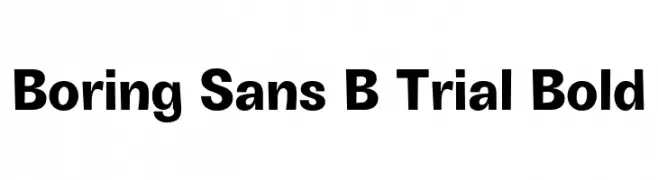
A bold, modern sans-serif font with clean lines and uniform stroke widths.
![Boring Sans B Trial Bold Frei Schriftart Herunterladen]() Herunterladen 65 Downloads@WebFont
Herunterladen 65 Downloads@WebFont -
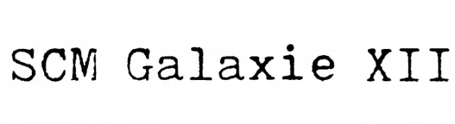
( Aleksandar Stevanov - www.behance.net/Stevanov )
A vintage, typewriter-style font with a rough, textured appearance.
![SCM Galaxie XII Frei Schriftart Herunterladen]() Herunterladen 65 Downloads@WebFont
Herunterladen 65 Downloads@WebFont -
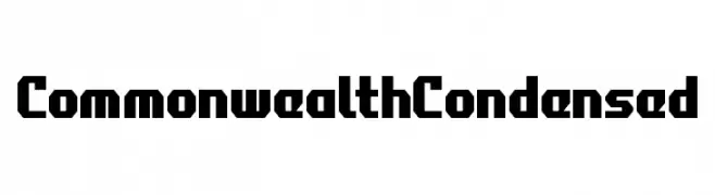
( Fonts by Iconian Fonts - Daniel Zadorozny - Personal-use only. For commercial use please contact owner. )
A bold, geometric, and condensed font with a strong, angular design.
![Commonwealth Condensed Frei Schriftart Herunterladen]() Herunterladen 65 Downloads@WebFont
Herunterladen 65 Downloads@WebFont -
( Fonts by Ndiscovered - Natanael Gama - Personal-use only. For commercial use please contact owner. )
A bold, elegant serif font with a classic Roman influence.
![Cinzel-Bold Frei Schriftart Herunterladen]() Herunterladen 65 Downloads@WebFont
Herunterladen 65 Downloads@WebFont -
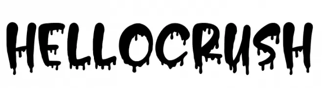
( Fonts by Typefar - Farul Arjianto - Personal-use only. For commercial use please contact owner. )
A bold, dripping font with a playful and edgy aesthetic.
![Hello Crush Frei Schriftart Herunterladen]() Herunterladen 65 Downloads@WebFont
Herunterladen 65 Downloads@WebFont -
( weknow - Wino S Kadir - www.creativefabrica.com/designer/weknow/ )
A bold, geometric font with hollow interiors and a futuristic style.
![ENERMOUS-Hollow Frei Schriftart Herunterladen]() Herunterladen 65 Downloads@WebFont
Herunterladen 65 Downloads@WebFont -
( Fonts by 177Studio )
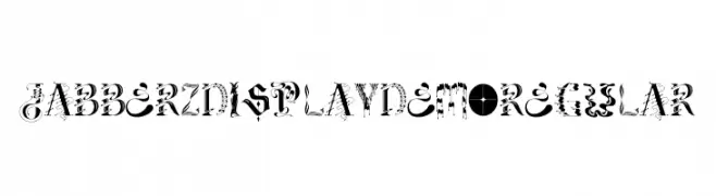
A decorative and artistic typeface with intricate patterns and playful designs.
![Jabberz Display Demo Regular Frei Schriftart Herunterladen]() Herunterladen 65 Downloads@WebFont
Herunterladen 65 Downloads@WebFont -
( Noto is a trademark of Google Inc. Noto fonts are open source. All Noto fonts are published under the SIL Open Font License, Version 1.1 )
Invalid font sample; only placeholder glyphs are visible.
![Noto Serif Hebrew ExtraCondensed SemiBold Frei Schriftart Herunterladen]() Herunterladen 65 Downloads@WebFont
Herunterladen 65 Downloads@WebFont -
( Fonts by wep - Wahyu Eka Prasetya - Personal-use only. For commercial use please contact owner. )
A bold, hand-drawn font with a playful and dynamic style.
![Drenges Frei Schriftart Herunterladen]() Herunterladen 65 Downloads@WebFont
Herunterladen 65 Downloads@WebFont -
( Lauren Thompson - www.nymfont.com/ )
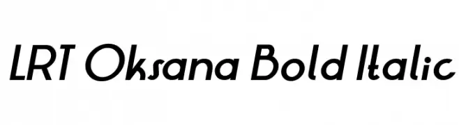
A bold, italic font with a modern and dynamic style.
![LRT Oksana Bold Italic Frei Schriftart Herunterladen]() Herunterladen 65 Downloads@WebFont
Herunterladen 65 Downloads@WebFont -
( Fonts by Wahyu Eka Prasetya - wepfont.com - Personal-use only. For commercial use please contact owner. )
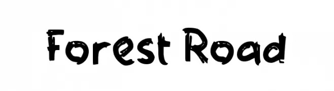
A bold, playful handwritten font with uneven strokes and a casual feel.
![Forest Road Frei Schriftart Herunterladen]() Herunterladen 65 Downloads@WebFont
Herunterladen 65 Downloads@WebFont -
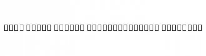
( Noto is a trademark of Google Inc. Noto fonts are open source. All Noto fonts are published under the SIL Open Font License, Version 1.1 )
The font is not displaying correctly, showing placeholder boxes.
![Noto Serif Thai Condensed Medium Frei Schriftart Herunterladen]() Herunterladen 65 Downloads@WebFont
Herunterladen 65 Downloads@WebFont -
( Fonts by Ndiscovered - Natanael Gama - Personal-use only. For commercial use please contact owner. )
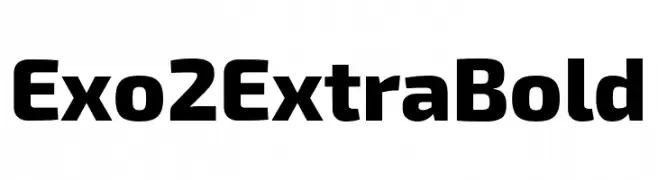
A bold, modern typeface with a geometric structure and slightly condensed appearance.
![Exo 2 Extra Bold Frei Schriftart Herunterladen]() Herunterladen 65 Downloads@WebFont
Herunterladen 65 Downloads@WebFont -
( Fonts by Typodermic Fonts - Raymond Larabie - Personal-use only. For commercial use please contact owner. )
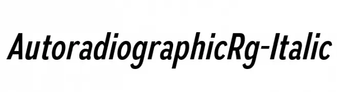
A modern italic font with clean lines and smooth curves.
![AutoradiographicRg-Italic Frei Schriftart Herunterladen]() Herunterladen 65 Downloads@WebFont
Herunterladen 65 Downloads@WebFont -
( Fonts by Woodcutter )
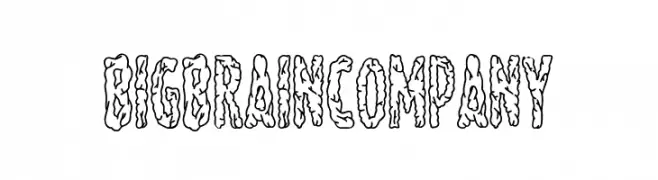
A bold, organic font with a dripping, hand-drawn style.
![Big Brain Company Frei Schriftart Herunterladen]() Herunterladen 65 Downloads@WebFont
Herunterladen 65 Downloads@WebFont -
( Fonts by Vunira Design )
A bold, flowing script font with elegant curves and connected strokes.
![Raymond Frei Schriftart Herunterladen]() Herunterladen 65 Downloads@WebFont
Herunterladen 65 Downloads@WebFont


Welche Schriften sind gerade am populärsten?
Poppins, Roboto, Montserrat, Open Sans und Lato sind wegen ihrer klaren Formen und breiten Einsetzbarkeit sehr gefragt – von Markenauftritt über Landingpages bis hin zu Postern.
Welche Fonts eignen sich für Logos?
Geometrische Sans‑Serifs (z. B. Poppins, Familien im Gotham‑Stil) sind ein häufiger Griff für sauberes, skalierbares Branding. Für eine persönlichere Note bleiben Scripts und Handschrift‑Stile beliebt. Kombinieren Sie einen prägnanten Headline‑Font mit einer neutralen Brotschrift für Wiedererkennung und Harmonie.
Wie oft wird die Top‑Liste aktualisiert?
Regelmäßig – basierend auf realen Downloads und Interaktionen. Schauen Sie öfter vorbei, um aufstrebende Favoriten früh zu entdecken.
💡 Tipp: Seite bookmarken – Trends wechseln schnell, und heutige Top‑Schriften inspirieren morgen vielleicht das Rebranding.