Willkommen bei den Top‑Schriften – hier treffen Beliebtheit und Qualität aufeinander. Das sind die in diesem Jahr am häufigsten heruntergeladenen und genutzten Fonts. Wenn Sie sichere Optionen für Logo, Web oder Social suchen, starten Sie hier.
Jeder Top‑Font überzeugt durch Balance, Lesbarkeit und Vielseitigkeit. Sie finden moderne Sans‑Serifs, elegante Scripts, Vintage‑Serifs und minimalistische Displays.
-
( Fonts by Lettersweet Studio )
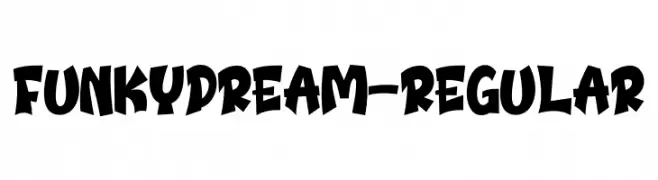
A bold, playful font with exaggerated, whimsical letterforms.
 Herunterladen 62 Downloads@WebFont
 -
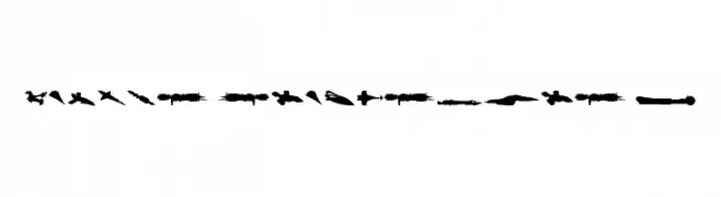
( Fonts by Daniel Zadorozny - www.iconian.com - Personal-use only. For commercial use please contact owner. )
A display font featuring spaceship silhouettes as glyphs.
![Famous Spaceships 2 Frei Schriftart Herunterladen]() Herunterladen 62 Downloads@WebFont
Herunterladen 62 Downloads@WebFont -
( Fonts by Aquilera Saiman - Personal-use only. For commercial use please contact owner. )
An elegant, flowing script font with intricate loops and flourishes.
![Wedding Party Frei Schriftart Herunterladen]() Herunterladen 62 Downloads@WebFont
Herunterladen 62 Downloads@WebFont -
( Fonts by Shara Weber - Personal-use only. For commercial use please contact owner. )
A casual, handwritten font with smooth, rounded characters.
![GelPenLight Frei Schriftart Herunterladen]() Herunterladen 62 Downloads@WebFont
Herunterladen 62 Downloads@WebFont -
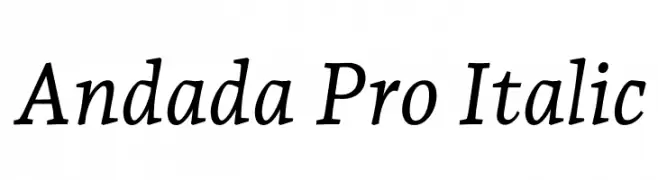
( Copyright 2011 The Andada Pro Project Authors (https://github.com/huertatipografica/Andada) )
Elegant serif italic font with moderate contrast and classic styling.
![Andada Pro Italic Frei Schriftart Herunterladen]() Herunterladen 62 Downloads@WebFont
Herunterladen 62 Downloads@WebFont -
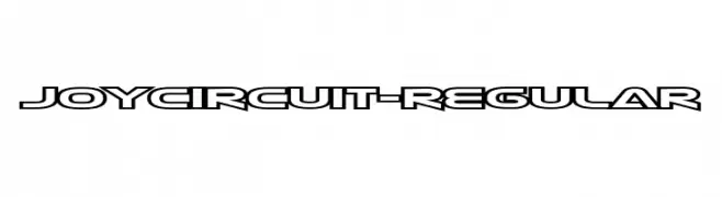
( Fonts by Typodermic Fonts - Raymond Larabie - Personal-use only. For commercial use please contact owner. )
A futuristic, geometric font with bold, angular lines and a modern aesthetic.
![JoyCircuit-Regular Frei Schriftart Herunterladen]() Herunterladen 62 Downloads@WebFont
Herunterladen 62 Downloads@WebFont -
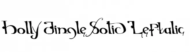
( Iconian Fonts - Daniel Zadorozny - www.iconian.com )
A whimsical and decorative font with playful curves and intricate details.
![Holly Jingle Solid Leftalic Frei Schriftart Herunterladen]() Herunterladen 62 Downloads@WebFont
Herunterladen 62 Downloads@WebFont -
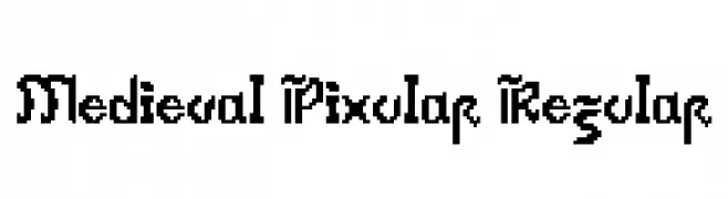
( Fonts by WilliamOsborn - Personal-use only. For commercial use please contact owner. )
A pixelated, medieval-inspired font with a retro digital aesthetic.
![Medieval Pixular Regular Frei Schriftart Herunterladen]() Herunterladen 62 Downloads@WebFont
Herunterladen 62 Downloads@WebFont -
( Fonts by imagex - Personal-use only. For commercial use please contact owner. )
A bold, distressed font with a vintage collegiate style.
![Second Hand Campus Frei Schriftart Herunterladen]() Herunterladen 62 Downloads@WebFont
Herunterladen 62 Downloads@WebFont -
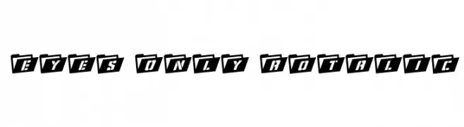
( Iconian Fonts - Daniel Zadorozny - www.iconian.com )
A bold, italicized font with a unique folder-like design for each character.
![Eyes Only Rotalic Frei Schriftart Herunterladen]() Herunterladen 62 Downloads@WebFont
Herunterladen 62 Downloads@WebFont -
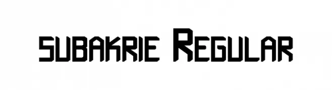
( Fonts by kntype.co )
A bold, geometric font with angular lines and a modern aesthetic.
![subakrie Regular Frei Schriftart Herunterladen]() Herunterladen 62 Downloads@WebFont
Herunterladen 62 Downloads@WebFont -
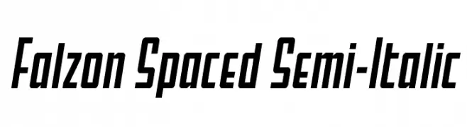
( Fonts by Daniel Zadorozny - www.iconian.com - Personal-use only. For commercial use please contact owner. )
A modern, semi-italic font with a bold weight and condensed style.
![Falzon Spaced Semi-Italic Frei Schriftart Herunterladen]() Herunterladen 62 Downloads@WebFont
Herunterladen 62 Downloads@WebFont -
( Fonts by Wahyu Studio - Wahyu Setiyawan - Personal-use only. For commercial use please contact owner. )
A playful and elegant script font with a handwritten style.
![Livelove Frei Schriftart Herunterladen]() Herunterladen 62 Downloads@WebFont
Herunterladen 62 Downloads@WebFont -
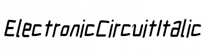
( Fonts by CannotIntoSpaceFonts - KineticPlasma Fonts - Personal-use only. For commercial use please contact owner. )
A modern, italic font with a technical, digital aesthetic.
![Electronic Circuit Italic Frei Schriftart Herunterladen]() Herunterladen 62 Downloads@WebFont
Herunterladen 62 Downloads@WebFont -
( Fonts by Kateeng Ciu - Personal-use only. For commercial use please contact owner. )
An elegant and flowing script font with graceful curves and a sophisticated style.
![Wedding Frei Schriftart Herunterladen]() Herunterladen 62 Downloads@WebFont
Herunterladen 62 Downloads@WebFont -
( Fonts by DumadiStyle )
Elegant handwritten script font.
![Rethinker Frei Schriftart Herunterladen]() Herunterladen 62 Downloads@WebFont
Herunterladen 62 Downloads@WebFont -
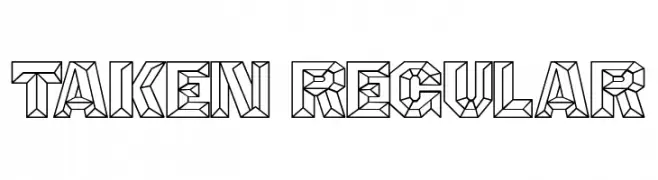
( Fonts by Vladimir Nikolic - www.creativefabrica.com/designer/vladimirnikolic/ - Personal-use only. For commercial use please contact owner. )
A geometric, three-dimensional font with a bold, faceted design.
![Taken Regular Frei Schriftart Herunterladen]() Herunterladen 62 Downloads@WebFont
Herunterladen 62 Downloads@WebFont -
( Fonts by Kong Font - Personal-use only. For commercial use please contact owner. )
An elegant and flowing script font with decorative letterforms.
![Eagles Lucas Frei Schriftart Herunterladen]() Herunterladen 62 Downloads@WebFont
Herunterladen 62 Downloads@WebFont -
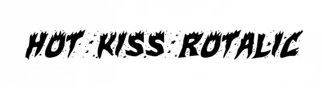
( Iconian Fonts - Daniel Zadorozny - www.iconian.com )
A bold, jagged font with flame-like edges for dramatic designs.
![Hot Kiss Rotalic Frei Schriftart Herunterladen]() Herunterladen 62 Downloads@WebFont
Herunterladen 62 Downloads@WebFont -
Schriftart von SunshineGlow972. For commercial use please contact the owner.
( Darokian Proper Conscript )
A modern, sleek font with clean lines and balanced structure.
![Darokian Regular Frei Schriftart Herunterladen]() Herunterladen 62 Downloads@WebFont
Herunterladen 62 Downloads@WebFont -
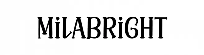
( Fonts by Situjuh Nazara - 7ntypes.com - Personal-use only. For commercial use please contact owner. )
A playful and decorative font with a modern vintage style.
![Mila Bright Frei Schriftart Herunterladen]() Herunterladen 62 Downloads@WebFont
Herunterladen 62 Downloads@WebFont -
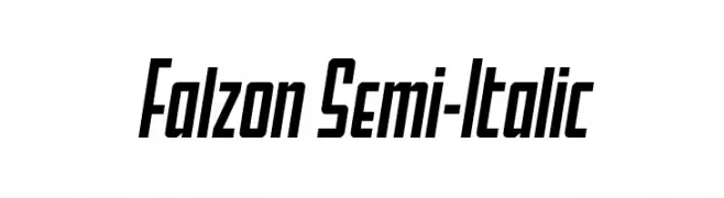
( Fonts by Daniel Zadorozny - www.iconian.com - Personal-use only. For commercial use please contact owner. )
A bold, italic font with a modern and dynamic style.
![Falzon Semi-Italic Frei Schriftart Herunterladen]() Herunterladen 62 Downloads@WebFont
Herunterladen 62 Downloads@WebFont -
( Fonts by Balpirick - Personal-use only. For commercial use please contact owner. )
A bold, cursive script font with a dynamic and elegant handwritten style.
![Columbian Frei Schriftart Herunterladen]() Herunterladen 62 Downloads@WebFont
Herunterladen 62 Downloads@WebFont -
( Fonts by Denny Subagja - Personal-use only. For commercial use please contact owner. )
A playful, handwritten font with smooth, rounded edges and a casual style.
![Babybo Frei Schriftart Herunterladen]() Herunterladen 62 Downloads@WebFont
Herunterladen 62 Downloads@WebFont -
( Fonts by Kong Font - Personal-use only. For commercial use please contact owner. )
A flowing, cursive font with elegant loops and artistic flair.
![EaglesLucas Frei Schriftart Herunterladen]() Herunterladen 62 Downloads@WebFont
Herunterladen 62 Downloads@WebFont -
( Fonts by Sizimon.id - Personal-use only. For commercial use please contact owner. )
An elegant script font with fluid, connected strokes and a natural handwriting style.
![Bellisia Frei Schriftart Herunterladen]() Herunterladen 62 Downloads@WebFont
Herunterladen 62 Downloads@WebFont -
( Fonts by Iconian Fonts - Daniel Zadorozny - Personal-use only. For commercial use please contact owner. )
A bold, outlined, italic font with a modern, dynamic style.
!['89 Speed Affair Outline Ital Frei Schriftart Herunterladen]() Herunterladen 62 Downloads@WebFont
Herunterladen 62 Downloads@WebFont -
( Fonts by Subectype & Orenari - Rangga Subekti & Ari - Personal-use only. For commercial use please contact owner. )
A lively script font with fluid, cursive letterforms and a handwritten appearance.
![Romi Dorama Frei Schriftart Herunterladen]() Herunterladen 62 Downloads@WebFont
Herunterladen 62 Downloads@WebFont -
( Fonts by Zetafonts - Personal-use only. For commercial use please contact owner. )
A refined serif font with thin, elegant strokes and a modern aesthetic.
![CalvinoTrial Thin Frei Schriftart Herunterladen]() Herunterladen 62 Downloads@WebFont
Herunterladen 62 Downloads@WebFont -
( Fonts by Damarletter - Ardian Nuvianto - Personal-use only. For commercial use please contact owner. )
A bold, expressive handwritten font with dynamic strokes and a modern flair.
![Better minds Frei Schriftart Herunterladen]() Herunterladen 62 Downloads@WebFont
Herunterladen 62 Downloads@WebFont -
( Fonts by wep - Wahyu Eka Prasetya - Personal-use only. For commercial use please contact owner. )
A bold, distressed font with a rugged, textured appearance.
![Dinding Frei Schriftart Herunterladen]() Herunterladen 62 Downloads@WebFont
Herunterladen 62 Downloads@WebFont -
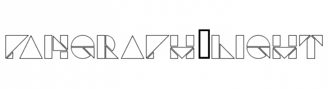
( Giacomo Marangon - www.giacomomarangon.altervista.org/ )
A geometric, abstract font with modern, artistic lines and shapes.
![Pangraph-Light Frei Schriftart Herunterladen]() Herunterladen 62 Downloads@WebFont
Herunterladen 62 Downloads@WebFont -
( Fonts by Andika Fez - Personal-use only. For commercial use please contact owner. )
A bold, geometric font with clean lines and modern style.
![berlinsans Frei Schriftart Herunterladen]() Herunterladen 62 Downloads@WebFont
Herunterladen 62 Downloads@WebFont -
( Fonts by Bangkit Tri Setiadi - Personal-use only. For commercial use please contact owner. )
A bold, dynamic script font with elegant curves and strong presence.
![Monthelo-Regular Frei Schriftart Herunterladen]() Herunterladen 62 Downloads@WebFont
Herunterladen 62 Downloads@WebFont -
( Fonts by Letterpedia - Axel Alessandro Satriawan - Personal-use only. For commercial use please contact owner. )
A graceful script font with flowing, cursive strokes and elegant curves.
![Paris Frei Schriftart Herunterladen]() Herunterladen 62 Downloads@WebFont
Herunterladen 62 Downloads@WebFont


Welche Schriften sind gerade am populärsten?
Poppins, Roboto, Montserrat, Open Sans und Lato sind wegen ihrer klaren Formen und breiten Einsetzbarkeit sehr gefragt – von Markenauftritt über Landingpages bis hin zu Postern.
Welche Fonts eignen sich für Logos?
Geometrische Sans‑Serifs (z. B. Poppins, Familien im Gotham‑Stil) sind ein häufiger Griff für sauberes, skalierbares Branding. Für eine persönlichere Note bleiben Scripts und Handschrift‑Stile beliebt. Kombinieren Sie einen prägnanten Headline‑Font mit einer neutralen Brotschrift für Wiedererkennung und Harmonie.
Wie oft wird die Top‑Liste aktualisiert?
Regelmäßig – basierend auf realen Downloads und Interaktionen. Schauen Sie öfter vorbei, um aufstrebende Favoriten früh zu entdecken.
💡 Tipp: Seite bookmarken – Trends wechseln schnell, und heutige Top‑Schriften inspirieren morgen vielleicht das Rebranding.