Willkommen bei den Top‑Schriften – hier treffen Beliebtheit und Qualität aufeinander. Das sind die in diesem Jahr am häufigsten heruntergeladenen und genutzten Fonts. Wenn Sie sichere Optionen für Logo, Web oder Social suchen, starten Sie hier.
Jeder Top‑Font überzeugt durch Balance, Lesbarkeit und Vielseitigkeit. Sie finden moderne Sans‑Serifs, elegante Scripts, Vintage‑Serifs und minimalistische Displays.
-
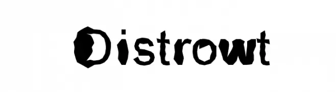
( Fonts by ronald sansone - Personal-use only. For commercial use please contact owner. )
A distorted, artistic font with irregular, hand-cut style.
 Herunterladen 62 Downloads@WebFont
 -
( Fonts by Letterara - Thomas Aradea - Personal-use only. For commercial use please contact owner. )
A whimsical script font with flowing, artistic strokes and decorative swirls.
![Floral Dream - personal use Frei Schriftart Herunterladen]() Herunterladen 62 Downloads@WebFont
Herunterladen 62 Downloads@WebFont -
( ADT )
A playful, hand-drawn font with bold, irregular strokes and a whimsical style.
![LeJeanPhi Frei Schriftart Herunterladen]() Herunterladen 62 Downloads@WebFont
Herunterladen 62 Downloads@WebFont -
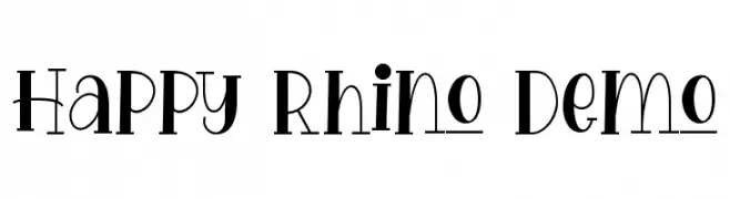
( Fonts by Edric Studio - Personal-use only. For commercial use please contact owner. )
A playful and whimsical font with bold, dynamic strokes and a hand-drawn feel.
![Happy Rhino Demo Frei Schriftart Herunterladen]() Herunterladen 62 Downloads@WebFont
Herunterladen 62 Downloads@WebFont -
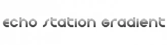
( Iconian Fonts - Daniel Zadorozny - www.iconian.com )
A bold, striped font with a futuristic, digital aesthetic.
![Echo Station Gradient Frei Schriftart Herunterladen]() Herunterladen 62 Downloads@WebFont
Herunterladen 62 Downloads@WebFont -
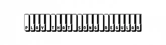
( Fonts by Vladimir Nikolic )
A playful, piano-themed font with bold, three-dimensional characters.
![Play That Song Regular Frei Schriftart Herunterladen]() Herunterladen 62 Downloads@WebFont
Herunterladen 62 Downloads@WebFont -
( Fonts by Allouse Studio - Personal-use only. For commercial use please contact owner. )
A playful, hand-drawn font with tall, narrow letterforms and a whimsical style.
![Historyline Frei Schriftart Herunterladen]() Herunterladen 62 Downloads@WebFont
Herunterladen 62 Downloads@WebFont -
( Fonts by Jadatype - Jada Akbal - Personal-use only. For commercial use please contact owner. )
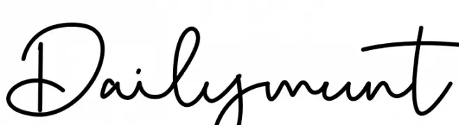
A playful handwritten font with fluid strokes and whimsical flair.
![Dailymunt Frei Schriftart Herunterladen]() Herunterladen 62 Downloads@WebFont
Herunterladen 62 Downloads@WebFont -
( Fonts by Phytypo Design - Personal-use only. For commercial use please contact owner. )
An elegant, flowing script font with a handwritten style.
![Soengenep Frei Schriftart Herunterladen]() Herunterladen 62 Downloads@WebFont
Herunterladen 62 Downloads@WebFont -
( Fonts by Typodermic Fonts - Raymond Larabie - Personal-use only. For commercial use please contact owner. )
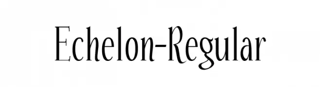
A tall, elegant serif font with sharp serifs and modern appeal.
![Echelon-Regular Frei Schriftart Herunterladen]() Herunterladen 62 Downloads@WebFont
Herunterladen 62 Downloads@WebFont -
( Fonts by Nick Curtis - Personal-use only. For commercial use please contact owner. )
A bold, geometric font with decorative elements and minimal contrast.
![SesquipedalianNF Frei Schriftart Herunterladen]() Herunterladen 62 Downloads@WebFont
Herunterladen 62 Downloads@WebFont -
( Fonts by Wino S Kadir - weknow - www.revolge.com/shop/weknow/ - Personal-use only. For commercial use please contact owner. )
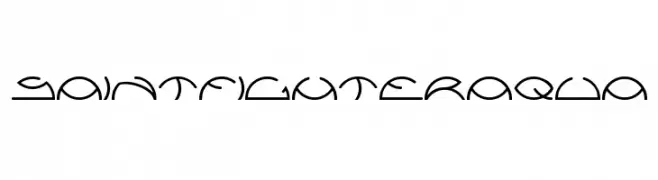
A futuristic, geometric font with a sleek and modern design.
![saintfighteraqua Frei Schriftart Herunterladen]() Herunterladen 62 Downloads@WebFont
Herunterladen 62 Downloads@WebFont -
( Fonts by Jadatype - Jada Akbal - Personal-use only. For commercial use please contact owner. )
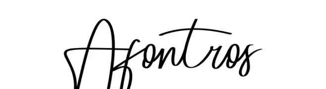
An elegant, flowing script font with a natural handwriting style.
![Afontros Frei Schriftart Herunterladen]() Herunterladen 62 Downloads@WebFont
Herunterladen 62 Downloads@WebFont -
( Noto is a trademark of Google Inc. Noto fonts are open source. All Noto fonts are published under the SIL Open Font License, Version 1.1 )
A thin, elegant serif font with a modern yet classic aesthetic.
![Noto Serif Lao Thin Frei Schriftart Herunterladen]() Herunterladen 62 Downloads@WebFont
Herunterladen 62 Downloads@WebFont -
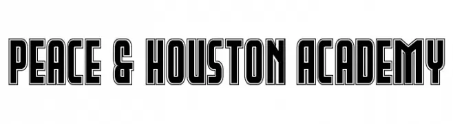
( Fonts by Daniel Zadorozny - www.iconian.com - Personal-use only. For commercial use please contact owner. )
A bold, outlined geometric font with sharp angles and clean lines.
![Peace & Houston Academy Frei Schriftart Herunterladen]() Herunterladen 62 Downloads@WebFont
Herunterladen 62 Downloads@WebFont -
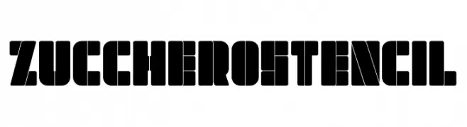
( Fonts by Kurnia Setyadi - Personal-use only. For commercial use please contact owner. )
A bold, geometric stencil font with a modern, industrial aesthetic.
![Zucchero Stencil Frei Schriftart Herunterladen]() Herunterladen 62 Downloads@WebFont
Herunterladen 62 Downloads@WebFont -
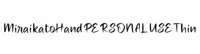
( Fonts by Mans Greback - Personal-use only. For commercial use please contact owner. )
A lively, expressive handwritten font with fluid strokes and playful aesthetics.
![Miraikato Hand PERSONAL USE Thin Frei Schriftart Herunterladen]() Herunterladen 62 Downloads@WebFont
Herunterladen 62 Downloads@WebFont -
( Fonts by www.selawetype.com - Personal-use only. FOR DONATION https://www.paypal.me/selawe . For commercial use please contact owner. )
A playful, bold handwritten font with rounded letterforms and a casual style.
![KIDEPARK Frei Schriftart Herunterladen]() Herunterladen 62 Downloads@WebFont
Herunterladen 62 Downloads@WebFont -
( Fonts by weknow - Wino S Kadir - Personal-use only. For commercial use please contact owner. )
A bold, rounded font with a modern and playful style.
![LMAO-Light Frei Schriftart Herunterladen]() Herunterladen 62 Downloads@WebFont
Herunterladen 62 Downloads@WebFont -
( Fonts by Iconian Fonts - Daniel Zadorozny - Personal-use only. For commercial use please contact owner. )
A bold, slanted font with tight spacing and strong visual impact.
![SurfQuest Slight-Leftalic Frei Schriftart Herunterladen]() Herunterladen 62 Downloads@WebFont
Herunterladen 62 Downloads@WebFont -
( Fonts by Jadatype - Jada Akbal - Personal-use only. For commercial use please contact owner. )
A dynamic script font with elegant, flowing characters and a modern yet classic appeal.
![Hayadoka Frei Schriftart Herunterladen]() Herunterladen 62 Downloads@WebFont
Herunterladen 62 Downloads@WebFont -
( Fonts by Mans Greback - Personal-use only. For commercial use please contact owner. )
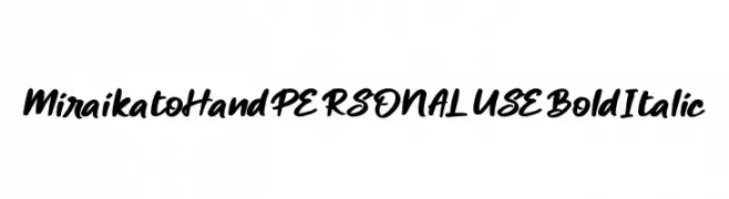
A bold, italic handwritten font with dynamic strokes and a smooth flow.
![Miraikato Hand PERSONAL USE Bold Italic Frei Schriftart Herunterladen]() Herunterladen 62 Downloads@WebFont
Herunterladen 62 Downloads@WebFont -
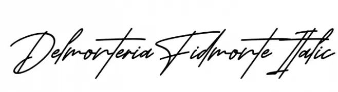
( Fonts by Perspectype Studio - Personal-use only. For commercial use please contact owner. )
A fluid and elegant cursive font with interconnected strokes, mimicking natural handwriting.
![Delmonteria Fidmonte Italic Frei Schriftart Herunterladen]() Herunterladen 62 Downloads@WebFont
Herunterladen 62 Downloads@WebFont -
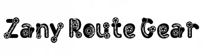
( Fonts by PutraCetol Studio )
A bold, decorative font with intricate gear motifs and mechanical themes.
![Zany Route Gear Frei Schriftart Herunterladen]() Herunterladen 62 Downloads@WebFont
Herunterladen 62 Downloads@WebFont -
( Fonts by wepfont - Wahyu Eka Prasetya - Personal-use only. For commercial use please contact owner. )
A bold, expressive handwritten font with dynamic strokes and artistic flair.
![Mumet Mikir Frei Schriftart Herunterladen]() Herunterladen 62 Downloads@WebFont
Herunterladen 62 Downloads@WebFont -
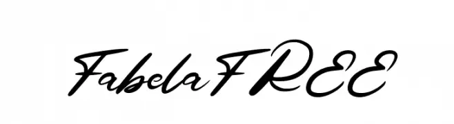
( Fonts by Vunira Design - Personal-use only. For commercial use please contact owner. )
A bold, flowing script font with elegant cursive letterforms and medium contrast.
![FabelaFREE Frei Schriftart Herunterladen]() Herunterladen 62 Downloads@WebFont
Herunterladen 62 Downloads@WebFont -
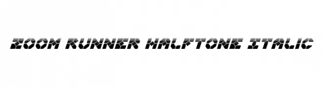
( Fonts by Iconian Fonts )
A bold, italicized font with a halftone effect, ideal for dynamic and modern designs.
![Zoom Runner Halftone Italic Frei Schriftart Herunterladen]() Herunterladen 62 Downloads@WebFont
Herunterladen 62 Downloads@WebFont -
( Fonts by Kong Font - https://fontkong.com/ - Personal-use only. For commercial use please contact owner. )
A bold, dynamic brush script font with expressive strokes.
![Bestbrustligature Frei Schriftart Herunterladen]() Herunterladen 62 Downloads@WebFont
Herunterladen 62 Downloads@WebFont -
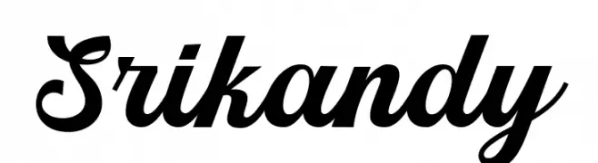
( Fonts by Picatype Studio - Personal-use only. For commercial use please contact owner. )
A bold, elegant script font with flowing cursive design.
![Srikandy Frei Schriftart Herunterladen]() Herunterladen 62 Downloads@WebFont
Herunterladen 62 Downloads@WebFont -
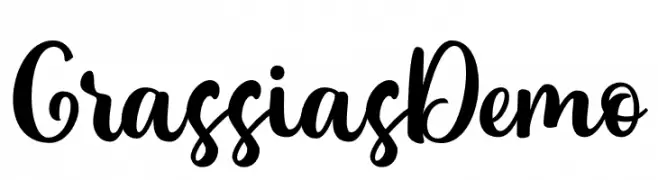
( Fonts by Rochart Studio - Rochadi Sudarma - Personal-use only. For commercial use please contact owner. )
A bold, playful script font with a handwritten style.
![Grassias Demo Frei Schriftart Herunterladen]() Herunterladen 62 Downloads@WebFont
Herunterladen 62 Downloads@WebFont -
( Fonts by Kong Font - fontkong.com - Personal-use only. For commercial use please contact owner. )
A graceful and flowing script font with elegant, fluid strokes.
![Amora Frei Schriftart Herunterladen]() Herunterladen 62 Downloads@WebFont
Herunterladen 62 Downloads@WebFont -
![EATMYEGGROLLS Frei Schriftart Herunterladen]() Herunterladen 62 Downloads@WebFont
Herunterladen 62 Downloads@WebFont -
( Fonts by Cão Fila Lettering - Cão Fila - Personal-use only. For commercial use please contact owner. )
A dynamic brush script font with fluid, expressive strokes and artistic flair.
![Brush Fila Frei Schriftart Herunterladen]() Herunterladen 62 Downloads@WebFont
Herunterladen 62 Downloads@WebFont -
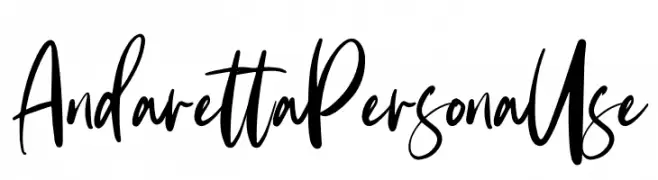
( Fonts by Ditatype - Personal-use only. For commercial use please contact owner. )
A dynamic and expressive handwritten font with fluid, flowing letterforms.
![Andaretta Persona Use Frei Schriftart Herunterladen]() Herunterladen 62 Downloads@WebFont
Herunterladen 62 Downloads@WebFont -
( Fonts by StringLabs - stringlabscreative.com - Personal-use only. For commercial use please contact owner. )
A bold, cursive font with dynamic, slanted characters.
![Maksum Frei Schriftart Herunterladen]() Herunterladen 62 Downloads@WebFont
Herunterladen 62 Downloads@WebFont


Welche Schriften sind gerade am populärsten?
Poppins, Roboto, Montserrat, Open Sans und Lato sind wegen ihrer klaren Formen und breiten Einsetzbarkeit sehr gefragt – von Markenauftritt über Landingpages bis hin zu Postern.
Welche Fonts eignen sich für Logos?
Geometrische Sans‑Serifs (z. B. Poppins, Familien im Gotham‑Stil) sind ein häufiger Griff für sauberes, skalierbares Branding. Für eine persönlichere Note bleiben Scripts und Handschrift‑Stile beliebt. Kombinieren Sie einen prägnanten Headline‑Font mit einer neutralen Brotschrift für Wiedererkennung und Harmonie.
Wie oft wird die Top‑Liste aktualisiert?
Regelmäßig – basierend auf realen Downloads und Interaktionen. Schauen Sie öfter vorbei, um aufstrebende Favoriten früh zu entdecken.
💡 Tipp: Seite bookmarken – Trends wechseln schnell, und heutige Top‑Schriften inspirieren morgen vielleicht das Rebranding.