Willkommen bei den Top‑Schriften – hier treffen Beliebtheit und Qualität aufeinander. Das sind die in diesem Jahr am häufigsten heruntergeladenen und genutzten Fonts. Wenn Sie sichere Optionen für Logo, Web oder Social suchen, starten Sie hier.
Jeder Top‑Font überzeugt durch Balance, Lesbarkeit und Vielseitigkeit. Sie finden moderne Sans‑Serifs, elegante Scripts, Vintage‑Serifs und minimalistische Displays.
-
( Fonts by Gunawan - Personal-use only. For commercial use please contact owner. )
A dynamic script font with smooth, flowing lines and a slight slant.
 Herunterladen 63 Downloads@WebFont
 -
( Fonts by Szymon Furjan - Personal-use only. For commercial use please contact owner. )
A playful, hand-drawn font with tall, narrow letters and a whimsical style.
![Colendra Alternate Frei Schriftart Herunterladen]() Herunterladen 63 Downloads@WebFont
Herunterladen 63 Downloads@WebFont -
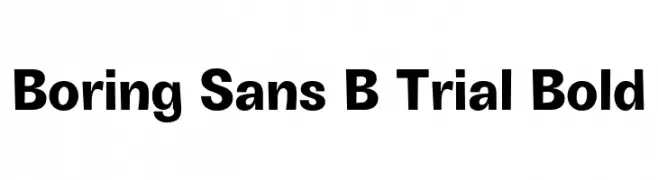
( Fonts by Zetafonts - Personal-use only. For commercial use please contact owner. )
A bold, modern sans-serif font with clean lines and uniform stroke widths.
![Boring Sans B Trial Bold Frei Schriftart Herunterladen]() Herunterladen 63 Downloads@WebFont
Herunterladen 63 Downloads@WebFont -
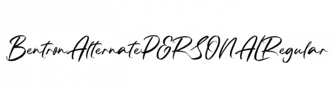
( Fonts by Mans Greback - www.mansgreback.com - Personal-use only. For commercial use please contact owner. )
A dynamic handwritten font with fluid, expressive strokes.
![Bentron Alternate PERSONAL Regular Frei Schriftart Herunterladen]() Herunterladen 63 Downloads@WebFont
Herunterladen 63 Downloads@WebFont -
( Fonts by Bearytype - Dian Hadi - Personal-use only. For commercial use please contact owner. )
A bold, flowing script font with elegant curves and dynamic slant.
![Gantry Frei Schriftart Herunterladen]() Herunterladen 63 Downloads@WebFont
Herunterladen 63 Downloads@WebFont -
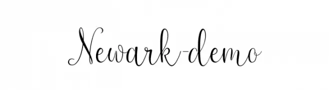
( Fonts by Sizimon.id - Personal-use only. For commercial use please contact owner. )
An elegant script font with flowing, ornate characters and decorative flourishes.
![Newark-demo Frei Schriftart Herunterladen]() Herunterladen 63 Downloads@WebFont
Herunterladen 63 Downloads@WebFont -
( Fonts by Figuree Studio - Icep Fadhil - Personal-use only. For commercial use please contact owner. )
A bold, energetic script font with a dynamic, handwritten style.
![Headlight Frei Schriftart Herunterladen]() Herunterladen 63 Downloads@WebFont
Herunterladen 63 Downloads@WebFont -
( Patricio Zambra )
A hand-drawn, artistic font with elongated, irregular letterforms.
![Etiketafont Frei Schriftart Herunterladen]() Herunterladen 63 Downloads@WebFont
Herunterladen 63 Downloads@WebFont -
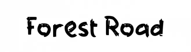
( Fonts by Wahyu Eka Prasetya - wepfont.com - Personal-use only. For commercial use please contact owner. )
A bold, playful handwritten font with uneven strokes and a casual feel.
![Forest Road Frei Schriftart Herunterladen]() Herunterladen 63 Downloads@WebFont
Herunterladen 63 Downloads@WebFont -
( Fonts by Edric Studio - Personal-use only. For commercial use please contact owner. )
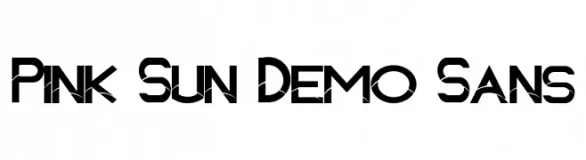
A bold, geometric font with a modern and futuristic design.
![Pink Sun Demo Sans Frei Schriftart Herunterladen]() Herunterladen 63 Downloads@WebFont
Herunterladen 63 Downloads@WebFont -
( Fonts by Vladimir Nikolic - https://www.creativefabrica.com/product/educated-deers/ref/144265/ - Personal-use only. For commercial use please contact owner. )
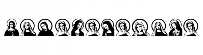
Ornamental icon font featuring stylized religious female portraits.
![Jungfrau Maria Regular Frei Schriftart Herunterladen]() Herunterladen 63 Downloads@WebFont
Herunterladen 63 Downloads@WebFont -
( Fonts by Eddy Goodboy - Personal-use only. For commercial use please contact owner. )
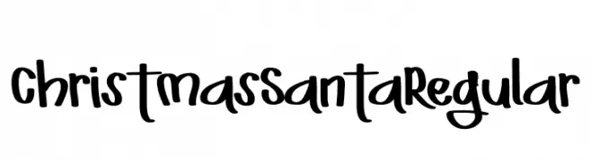
A playful, handwritten font with a festive, whimsical style.
![ChristmasSantaRegular Frei Schriftart Herunterladen]() Herunterladen 63 Downloads@WebFont
Herunterladen 63 Downloads@WebFont -
( Fonts by Iconian Fonts - Daniel Zadorozny - Personal-use only. For commercial use please contact owner. )
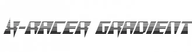
A bold, angular font with horizontal striping, evoking speed and modernity.
![X-Racer Gradient Frei Schriftart Herunterladen]() Herunterladen 63 Downloads@WebFont
Herunterladen 63 Downloads@WebFont -
( Fonts by Joko Setiono - Personal-use only. For commercial use please contact owner. )
A bold, geometric font with sharp angles and unique cutouts, ideal for modern designs.
![fozmi Frei Schriftart Herunterladen]() Herunterladen 63 Downloads@WebFont
Herunterladen 63 Downloads@WebFont -
( Fonts by Typefar - Farul Arjianto - Personal-use only. For commercial use please contact owner. )
A fluid, cursive font with elegant, flowing lines and a handwritten quality.
![Arealand Frei Schriftart Herunterladen]() Herunterladen 63 Downloads@WebFont
Herunterladen 63 Downloads@WebFont -
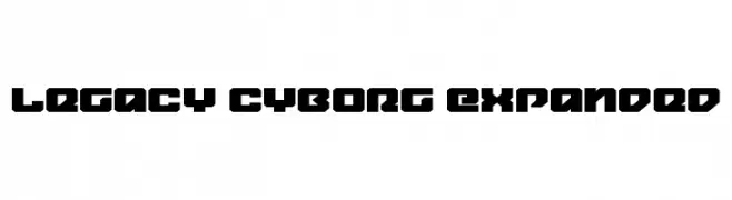
( Fonts by Daniel Zadorozny - www.iconian.com - Personal-use only. For commercial use please contact owner. )
A bold, geometric font with an industrial, futuristic style.
![Legacy Cyborg Expanded Frei Schriftart Herunterladen]() Herunterladen 63 Downloads@WebFont
Herunterladen 63 Downloads@WebFont -
( Fonts by Daniel Zadorozny - www.iconian.com - Personal-use only. For commercial use please contact owner. )
A bold, gradient, italic font with a dynamic, layered design.
![Elastic Lad Gradient Italic Frei Schriftart Herunterladen]() Herunterladen 63 Downloads@WebFont
Herunterladen 63 Downloads@WebFont -
( Fonts by Craft Supply Co - Personal-use only. For commercial use please contact owner. )
A bold, decorative font with a 3D extruded effect and vintage flair.
![Jocker Free Extrude Right Frei Schriftart Herunterladen]() Herunterladen 63 Downloads@WebFont
Herunterladen 63 Downloads@WebFont -
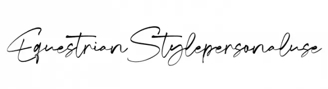
( Fonts by Din Studio - Donis Miftahudin - Personal-use only. For commercial use please contact owner. )
A dynamic, elegant handwritten font with flowing, interconnected strokes.
![Equestrian Style personal use Frei Schriftart Herunterladen]() Herunterladen 63 Downloads@WebFont
Herunterladen 63 Downloads@WebFont -
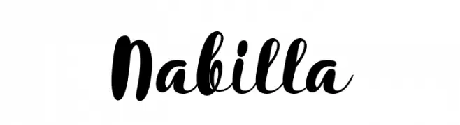
( Fonts by Kurnia Setyadi - Personal-use only. For commercial use please contact owner. )
A bold, expressive script font with a playful and dynamic style.
![Nabilla Frei Schriftart Herunterladen]() Herunterladen 63 Downloads@WebFont
Herunterladen 63 Downloads@WebFont -
( Fonts by Mans Greback - www.mansgreback.com - Personal-use only. For commercial use please contact owner. )
A playful, handwritten-style font with bold, rounded strokes and a lively character.
![Spicy Hut Frei Schriftart Herunterladen]() Herunterladen 63 Downloads@WebFont
Herunterladen 63 Downloads@WebFont -
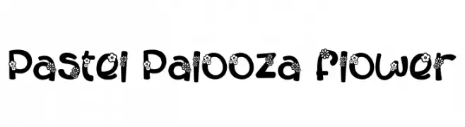
( Fonts by PutraCetol Studio )
A playful, flower-adorned font with bold, rounded characters.
![Pastel Palooza Flower Frei Schriftart Herunterladen]() Herunterladen 63 Downloads@WebFont
Herunterladen 63 Downloads@WebFont -
( Fonts by Hedi Miftah - Personal-use only. For commercial use please contact owner. )
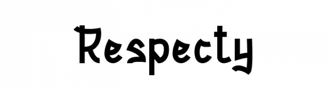
A playful, hand-drawn font with a whimsical and creative style.
![Respecty Frei Schriftart Herunterladen]() Herunterladen 63 Downloads@WebFont
Herunterladen 63 Downloads@WebFont -
( Fonts by Ospiro Enterprises - Personal-use only. For commercial use please contact owner. )
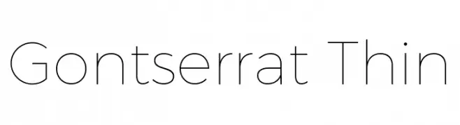
A thin, modern sans-serif font with a clean and elegant design.
![Gontserrat Thin Frei Schriftart Herunterladen]() Herunterladen 63 Downloads@WebFont
Herunterladen 63 Downloads@WebFont -
( Fonts by Szymon Furjan - Personal-use only. For commercial use please contact owner. )
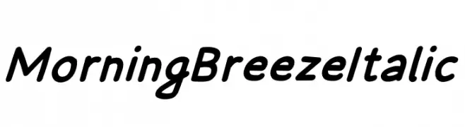
A smooth, flowing italic font with a playful and elegant style.
![Morning Breeze Italic Frei Schriftart Herunterladen]() Herunterladen 63 Downloads@WebFont
Herunterladen 63 Downloads@WebFont -
( Iconian Fonts - Daniel Zadorozny - www.iconian.com )
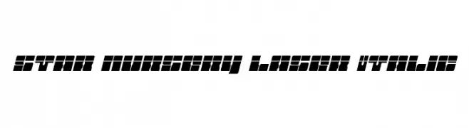
A bold, geometric, and italic font with a futuristic style.
![Star Nursery Laser Italic Frei Schriftart Herunterladen]() Herunterladen 63 Downloads@WebFont
Herunterladen 63 Downloads@WebFont -
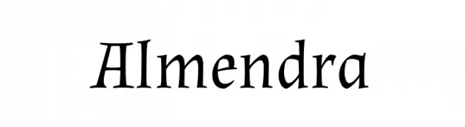
( Fonts by Ana Sanfelippo )
A classic, calligraphic serif font with elegant, traditional styling.
![Almendra Frei Schriftart Herunterladen]() Herunterladen 63 Downloads@WebFont
Herunterladen 63 Downloads@WebFont -
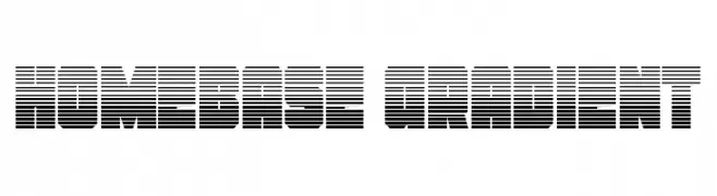
( Fonts by Daniel Zadorozny - www.iconian.com - Personal-use only. For commercial use please contact owner. )
A bold, geometric font with a striped gradient effect.
![Homebase Gradient Frei Schriftart Herunterladen]() Herunterladen 63 Downloads@WebFont
Herunterladen 63 Downloads@WebFont -
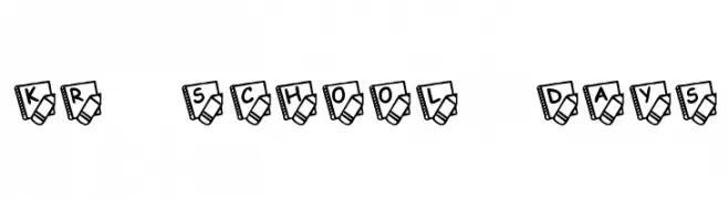
( Fonts by Kat`s Fun Fonts - Personal-use only. For commercial use please contact owner. )
A playful, school-themed decorative font with characters enclosed in a notebook and pencil design.
![KR School Days Frei Schriftart Herunterladen]() Herunterladen 63 Downloads@WebFont
Herunterladen 63 Downloads@WebFont -
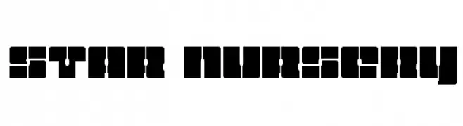
( Iconian Fonts - Daniel Zadorozny - www.iconian.com )
A bold, geometric font with a futuristic and innovative design.
![Star Nursery Frei Schriftart Herunterladen]() Herunterladen 63 Downloads@WebFont
Herunterladen 63 Downloads@WebFont -
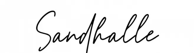
( Fonts by Letterrendra - Personal-use only. For commercial use please contact owner. )
A lively handwritten font with fluid, spontaneous strokes.
![Sandhalle Frei Schriftart Herunterladen]() Herunterladen 63 Downloads@WebFont
Herunterladen 63 Downloads@WebFont -
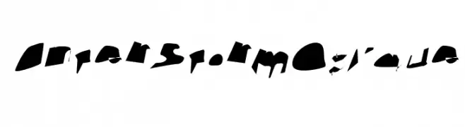
( Fonts by CannotIntoSpaceFonts - KineticPlasma Fonts - Personal-use only. For commercial use please contact owner. )
A bold, fragmented font with jagged edges and an abstract design.
![Interstorm Oblique Frei Schriftart Herunterladen]() Herunterladen 63 Downloads@WebFont
Herunterladen 63 Downloads@WebFont -
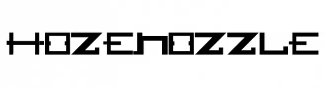
( Gregoryfonts - www.geocities.com/soho/coffeehouse/9609/fonts/fonts.html )
A bold, geometric font with a futuristic and digital aesthetic.
![HOZENOZZLE Frei Schriftart Herunterladen]() Herunterladen 63 Downloads@WebFont
Herunterladen 63 Downloads@WebFont -
( Noto is a trademark of Google Inc. Noto fonts are open source. All Noto fonts are published under the SIL Open Font License, Version 1.1 )
A clean, minimalistic sans-serif font with uniform stroke widths.
![Noto Sans Tamil ExtraLight Frei Schriftart Herunterladen]() Herunterladen 63 Downloads@WebFont
Herunterladen 63 Downloads@WebFont -
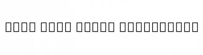
( Copyright © 2017 IBM Corp. with Reserved Font Name "Plex" )
Ultra-thin, geometric sans-serif with a modern, minimal look.
![IBM Plex Sans Devanagari Thin Frei Schriftart Herunterladen]() Herunterladen 63 Downloads@WebFont
Herunterladen 63 Downloads@WebFont


Welche Schriften sind gerade am populärsten?
Poppins, Roboto, Montserrat, Open Sans und Lato sind wegen ihrer klaren Formen und breiten Einsetzbarkeit sehr gefragt – von Markenauftritt über Landingpages bis hin zu Postern.
Welche Fonts eignen sich für Logos?
Geometrische Sans‑Serifs (z. B. Poppins, Familien im Gotham‑Stil) sind ein häufiger Griff für sauberes, skalierbares Branding. Für eine persönlichere Note bleiben Scripts und Handschrift‑Stile beliebt. Kombinieren Sie einen prägnanten Headline‑Font mit einer neutralen Brotschrift für Wiedererkennung und Harmonie.
Wie oft wird die Top‑Liste aktualisiert?
Regelmäßig – basierend auf realen Downloads und Interaktionen. Schauen Sie öfter vorbei, um aufstrebende Favoriten früh zu entdecken.
💡 Tipp: Seite bookmarken – Trends wechseln schnell, und heutige Top‑Schriften inspirieren morgen vielleicht das Rebranding.