Willkommen bei den Top‑Schriften – hier treffen Beliebtheit und Qualität aufeinander. Das sind die in diesem Jahr am häufigsten heruntergeladenen und genutzten Fonts. Wenn Sie sichere Optionen für Logo, Web oder Social suchen, starten Sie hier.
Jeder Top‑Font überzeugt durch Balance, Lesbarkeit und Vielseitigkeit. Sie finden moderne Sans‑Serifs, elegante Scripts, Vintage‑Serifs und minimalistische Displays.
-
( Fonts by Colative Studio - Personal-use only. For commercial use please contact owner. )
A graceful script font with fluid, connected strokes and a sophisticated style.
 Herunterladen 62 Downloads@WebFont
 -
( Fonts by Get Studio - Hermansyah , - Personal-use only. For commercial use please contact owner. )
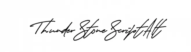
A dynamic, cursive script font with fluid, interconnected strokes.
![Thunder Stone Script Alt Frei Schriftart Herunterladen]() Herunterladen 62 Downloads@WebFont
Herunterladen 62 Downloads@WebFont -
( Fonts by Typotopia Studio - Personal-use only. For commercial use please contact owner. )
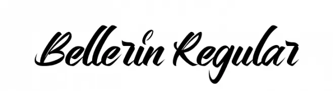
A dynamic and elegant script font with smooth, flowing connections.
![Bellerin Regular Frei Schriftart Herunterladen]() Herunterladen 62 Downloads@WebFont
Herunterladen 62 Downloads@WebFont -
( Fonts by Anggi Dwi Putra - Personal-use only. For commercial use please contact owner. )
A playful, handwritten font with rounded edges and a whimsical style.
![Sugar Kiddy Frei Schriftart Herunterladen]() Herunterladen 62 Downloads@WebFont
Herunterladen 62 Downloads@WebFont -
( Fonts by Scratchones )
A bold, handwritten-style font with tall, narrow letters and dynamic strokes.
![Black Hunter Frei Schriftart Herunterladen]() Herunterladen 62 Downloads@WebFont
Herunterladen 62 Downloads@WebFont -
( Fonts by PressGang Studios )
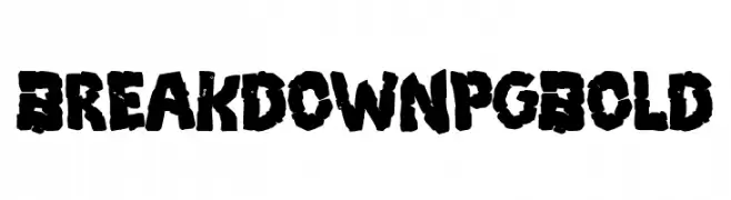
Bold, distressed font with a grunge style.
![Breakdown PG Bold Frei Schriftart Herunterladen]() Herunterladen 62 Downloads@WebFont
Herunterladen 62 Downloads@WebFont -
( Fonts by Vladimir Nikolic - https://www.creativefabrica.com/product/educated-deers/ref/144265/ - Personal-use only. For commercial use please contact owner. )
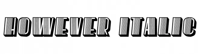
A bold, italic font with a three-dimensional striped effect.
![However Italic Frei Schriftart Herunterladen]() Herunterladen 62 Downloads@WebFont
Herunterladen 62 Downloads@WebFont -
( Fonts by Peter Wiegel - www.peter-wiegel.de - Personal-use only. For commercial use please contact owner. )
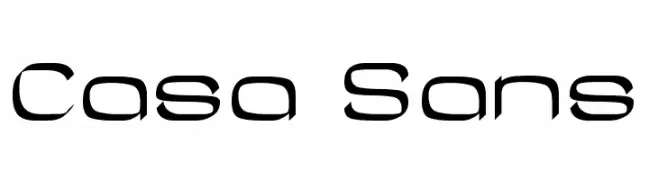
A modern, angular font with a futuristic design.
![Casa Sans Frei Schriftart Herunterladen]() Herunterladen 62 Downloads@WebFont
Herunterladen 62 Downloads@WebFont -
( Fonts by Daniel Zadorozny - www.iconian.com - Personal-use only. For commercial use please contact owner. )
A bold, geometric font with a strong, industrial style.
![Elastic Lad Frei Schriftart Herunterladen]() Herunterladen 62 Downloads@WebFont
Herunterladen 62 Downloads@WebFont -
( Fonts by Zeenesia Studio - Doni Purwoko - Personal-use only. For commercial use please contact owner. )
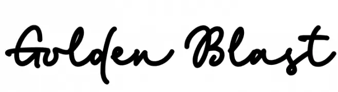
A bold, playful script font with smooth, flowing strokes.
![Golden Blast Frei Schriftart Herunterladen]() Herunterladen 62 Downloads@WebFont
Herunterladen 62 Downloads@WebFont -
( Fonts by Zetafonts - Personal-use only. For commercial use please contact owner. )
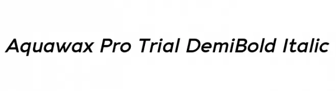
A modern, italic sans-serif font with smooth curves and consistent stroke width.
![Aquawax Pro Trial DemiBold Italic Frei Schriftart Herunterladen]() Herunterladen 62 Downloads@WebFont
Herunterladen 62 Downloads@WebFont -
( Fonts by Gartype Studio - Gartype Studio - Personal-use only. For commercial use please contact owner. )
A bold, playful handwritten font with rounded, organic characters.
![History Walker GT Demo Frei Schriftart Herunterladen]() Herunterladen 62 Downloads@WebFont
Herunterladen 62 Downloads@WebFont -
( Fonts by Khurasan - Syaf Rizal - Personal-use only. For commercial use please contact owner. )
A bold, flowing script font with elegant cursive letterforms.
![This July Frei Schriftart Herunterladen]() Herunterladen 62 Downloads@WebFont
Herunterladen 62 Downloads@WebFont -
( Fonts by wep - Wahyu Eka Prasetya - Personal-use only. For commercial use please contact owner. )
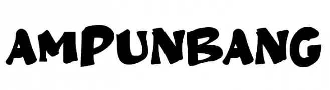
A bold, playful font with rounded, irregular shapes for a lively appearance.
![Ampun Bang Frei Schriftart Herunterladen]() Herunterladen 62 Downloads@WebFont
Herunterladen 62 Downloads@WebFont -
( Fonts by Wahyu Eka Prasetya - wepfont.com - Personal-use only. For commercial use please contact owner. )
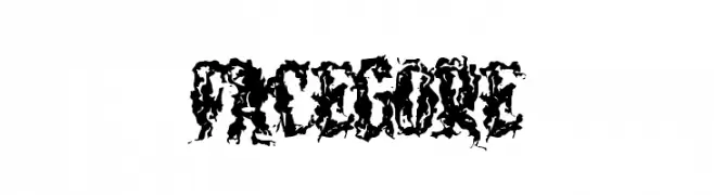
A bold, chaotic decorative font with jagged, organic textures.
![FACEGORE Frei Schriftart Herunterladen]() Herunterladen 62 Downloads@WebFont
Herunterladen 62 Downloads@WebFont -
( Fonts by Colative Studio - Personal-use only. For commercial use please contact owner. )
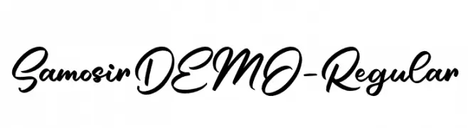
A cursive font with elegant, flowing strokes and artistic style.
![SamosirDEMO-Regular Frei Schriftart Herunterladen]() Herunterladen 62 Downloads@WebFont
Herunterladen 62 Downloads@WebFont -
( Fonts by Graphicfresh - Personal-use only. For commercial use please contact owner. )
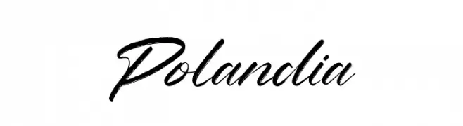
A dynamic and elegant script font with flowing cursive letters.
![Polandia Frei Schriftart Herunterladen]() Herunterladen 62 Downloads@WebFont
Herunterladen 62 Downloads@WebFont -
( Fonts by Iconian Fonts - Daniel Zadorozny - Personal-use only. For commercial use please contact owner. )
A bold, italicized outline font with a dynamic and geometric style.
![Punch Outline Super-Italic Frei Schriftart Herunterladen]() Herunterladen 62 Downloads@WebFont
Herunterladen 62 Downloads@WebFont -
( Fonts by Muhammad Wahyudin - Personal-use only. For commercial use please contact owner. )
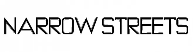
A modern, geometric font with narrow, angular characters and a futuristic style.
![NARROW STREETS Frei Schriftart Herunterladen]() Herunterladen 62 Downloads@WebFont
Herunterladen 62 Downloads@WebFont -
( Fonts by Raul Plancarte - Personal-use only. For commercial use please contact owner. )
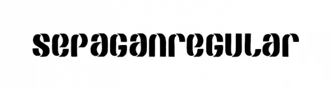
A bold, geometric stencil-style font with a modern industrial feel.
![SEPAGAN Regular Frei Schriftart Herunterladen]() Herunterladen 62 Downloads@WebFont
Herunterladen 62 Downloads@WebFont -
( Thirtypath - www.thirtypath.com )
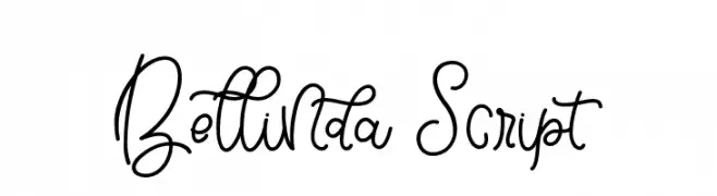
A playful and elegant script font with flowing, interconnected letters.
![Bellinda Script Frei Schriftart Herunterladen]() Herunterladen 62 Downloads@WebFont
Herunterladen 62 Downloads@WebFont -
( Fonts by Vladimir Nikolic - www.creativefabrica.com/designer/vladimirnikolic/ - Personal-use only. For commercial use please contact owner. )
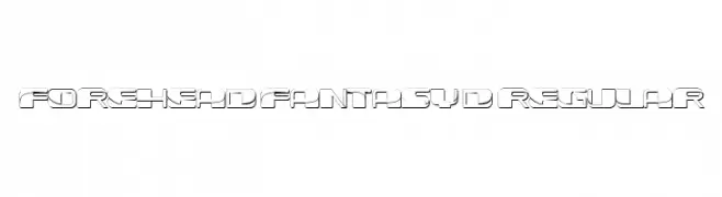
A futuristic, 3D geometric font with bold lines and sharp angles.
![Forehead Fantasy 3D Regular Frei Schriftart Herunterladen]() Herunterladen 62 Downloads@WebFont
Herunterladen 62 Downloads@WebFont -
( Fonts by Saqib Ahmad - Personal-use only. For commercial use please contact owner. )
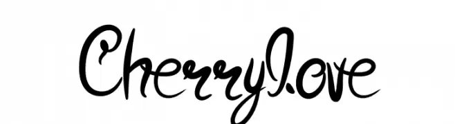
A whimsical and playful script font with decorative swirls and interconnected letters.
![Cherrylove Frei Schriftart Herunterladen]() Herunterladen 62 Downloads@WebFont
Herunterladen 62 Downloads@WebFont -
( Fonts by Woodcutter )
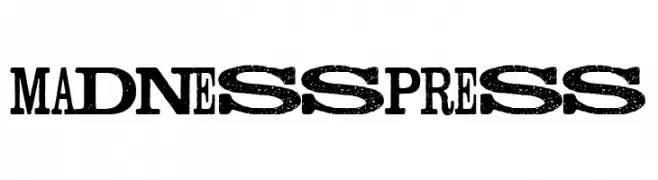
A bold, distressed font with a vintage, grunge aesthetic.
![Madness Press Frei Schriftart Herunterladen]() Herunterladen 62 Downloads@WebFont
Herunterladen 62 Downloads@WebFont -
( Fonts by Mans Greback - www.mansgreback.com - Personal-use only. For commercial use please contact owner. )
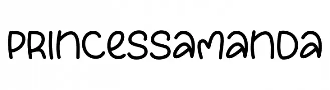
A playful, hand-drawn font with rounded, smooth strokes and a whimsical style.
![Princess Amanda Frei Schriftart Herunterladen]() Herunterladen 62 Downloads@WebFont
Herunterladen 62 Downloads@WebFont -
( Fonts by productype.com )
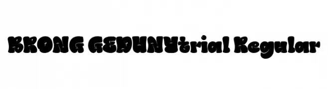
A bold, playful font with thick, rounded strokes and a whimsical style.
![BRONG GEDUNYtrial Regular Frei Schriftart Herunterladen]() Herunterladen 62 Downloads@WebFont
Herunterladen 62 Downloads@WebFont -
( Jairo Reyes )
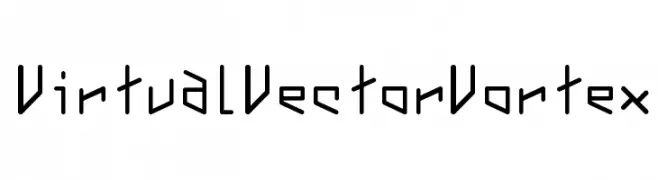
A futuristic, angular font with sharp edges and geometric shapes.
![VirtualVectorVortex Frei Schriftart Herunterladen]() Herunterladen 62 Downloads@WebFont
Herunterladen 62 Downloads@WebFont -
( Fonts by Vincenzo Vuono - Personal-use only. For commercial use please contact owner. )
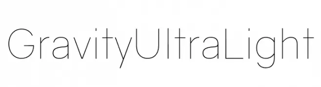
A modern, ultra-light font with clean lines and balanced spacing.
![Gravity UltraLight Frei Schriftart Herunterladen]() Herunterladen 62 Downloads@WebFont
Herunterladen 62 Downloads@WebFont -
( Fonts by Abo Daniel Studio - Panggah Laksono - Personal-use only. For commercial use please contact owner. )
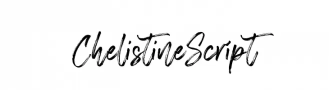
A dynamic, brush-style script font with expressive strokes.
![Chelistine Script Frei Schriftart Herunterladen]() Herunterladen 62 Downloads@WebFont
Herunterladen 62 Downloads@WebFont -
( Fonts by Ahmad Riqi - Personal-use only. For commercial use please contact owner. )
An elegant script font with intricate swirls and loops, perfect for sophisticated designs.
![fellyssa Frei Schriftart Herunterladen]() Herunterladen 62 Downloads@WebFont
Herunterladen 62 Downloads@WebFont -
( Fonts by FallenGraphic Studio - Vava Aryanto - Personal-use only. For commercial use please contact owner. )
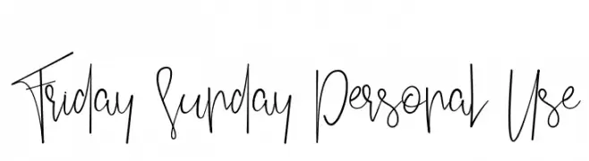
A playful, handwritten font with tall, narrow letters and whimsical curves.
![Friday Sunday Personal Use Frei Schriftart Herunterladen]() Herunterladen 62 Downloads@WebFont
Herunterladen 62 Downloads@WebFont -
( Fonts by Md Shohail Bhuian - Personal-use only. For commercial use please contact owner. )
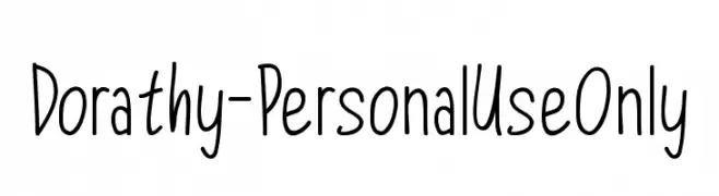
A playful, handwritten font with rounded, organic letterforms.
![Dorathy - Personal Use Only Frei Schriftart Herunterladen]() Herunterladen 62 Downloads@WebFont
Herunterladen 62 Downloads@WebFont -
( Fonts by Nick Curtis - Personal-use only. For commercial use please contact owner. )
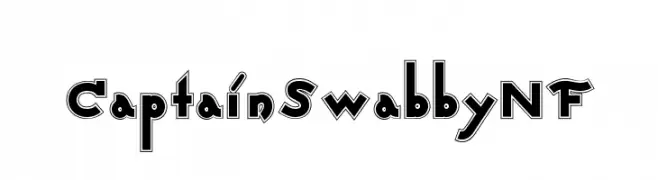
A bold, playful font with a three-dimensional outline and geometric style.
![CaptainSwabbyNF Frei Schriftart Herunterladen]() Herunterladen 62 Downloads@WebFont
Herunterladen 62 Downloads@WebFont -
( Fonts by Mans Greback - Personal-use only. For commercial use please contact owner. )
A refined serif font with thin, elongated strokes and sharp serifs, offering a sophisticated and modern look.
![MollySerifCPERSONAL-Thin Frei Schriftart Herunterladen]() Herunterladen 62 Downloads@WebFont
Herunterladen 62 Downloads@WebFont -
( Fonts by Mega Type - M Akmal - Personal-use only. For commercial use please contact owner. )
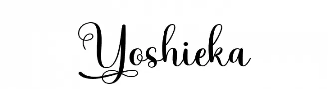
An elegant script font with flowing lines and intricate swirls, perfect for sophisticated designs.
![Yoshieka Frei Schriftart Herunterladen]() Herunterladen 62 Downloads@WebFont
Herunterladen 62 Downloads@WebFont


Welche Schriften sind gerade am populärsten?
Poppins, Roboto, Montserrat, Open Sans und Lato sind wegen ihrer klaren Formen und breiten Einsetzbarkeit sehr gefragt – von Markenauftritt über Landingpages bis hin zu Postern.
Welche Fonts eignen sich für Logos?
Geometrische Sans‑Serifs (z. B. Poppins, Familien im Gotham‑Stil) sind ein häufiger Griff für sauberes, skalierbares Branding. Für eine persönlichere Note bleiben Scripts und Handschrift‑Stile beliebt. Kombinieren Sie einen prägnanten Headline‑Font mit einer neutralen Brotschrift für Wiedererkennung und Harmonie.
Wie oft wird die Top‑Liste aktualisiert?
Regelmäßig – basierend auf realen Downloads und Interaktionen. Schauen Sie öfter vorbei, um aufstrebende Favoriten früh zu entdecken.
💡 Tipp: Seite bookmarken – Trends wechseln schnell, und heutige Top‑Schriften inspirieren morgen vielleicht das Rebranding.