Willkommen bei den Top‑Schriften – hier treffen Beliebtheit und Qualität aufeinander. Das sind die in diesem Jahr am häufigsten heruntergeladenen und genutzten Fonts. Wenn Sie sichere Optionen für Logo, Web oder Social suchen, starten Sie hier.
Jeder Top‑Font überzeugt durch Balance, Lesbarkeit und Vielseitigkeit. Sie finden moderne Sans‑Serifs, elegante Scripts, Vintage‑Serifs und minimalistische Displays.
-
( Fonts by Fachranheit - Fachrul Rozi - Personal-use only. For commercial use please contact owner. )
A lively and dynamic handwritten font with playful curves and irregular strokes.
 Herunterladen 63 Downloads@WebFont
 -
( Fonts by Wino S Kadir - weknow - www.revolge.com/shop/weknow/ - Personal-use only. For commercial use please contact owner. )
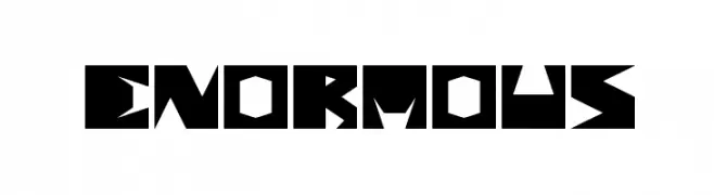
A bold, geometric font with sharp angles and a futuristic style.
![enormous Frei Schriftart Herunterladen]() Herunterladen 63 Downloads@WebFont
Herunterladen 63 Downloads@WebFont -
( Fonts by Vultype - Candra Hamdani - Personal-use only. For commercial use please contact owner. )
A lively and expressive script font with flowing, cursive letterforms.
![barcelona Regular Frei Schriftart Herunterladen]() Herunterladen 63 Downloads@WebFont
Herunterladen 63 Downloads@WebFont -
( Fonts by Mans Greback - www.mansgreback.com - Personal-use only. For commercial use please contact owner. )
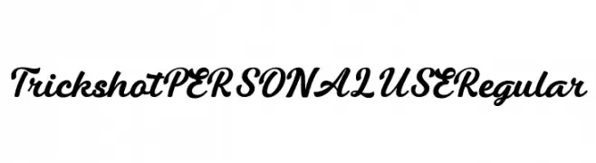
A bold, flowing script font with elegant, cursive letterforms.
![Trickshot PERSONAL USE Regular Frei Schriftart Herunterladen]() Herunterladen 63 Downloads@WebFont
Herunterladen 63 Downloads@WebFont -
( Fonts by Tebaltipis Studio )
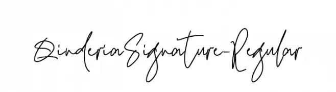
A flowing, cursive font with a natural handwriting style.
![QinderiaSignature-Regular Frei Schriftart Herunterladen]() Herunterladen 63 Downloads@WebFont
Herunterladen 63 Downloads@WebFont -
( Fonts by Projectype - Ahmad Lutfi Fauzi - Personal-use only. For commercial use please contact owner. )
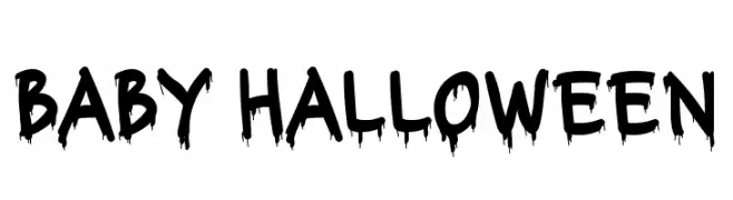
A playful, spooky font with a dripping effect, perfect for Halloween themes.
![Baby Halloween Frei Schriftart Herunterladen]() Herunterladen 63 Downloads@WebFont
Herunterladen 63 Downloads@WebFont -
( Fonts by peterdraw - Ahmad Syarif Afandi - Personal-use only. For commercial use please contact owner. )
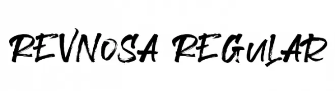
A bold, expressive brush script font with dynamic strokes and a hand-painted look.
![Revnosa Regular Frei Schriftart Herunterladen]() Herunterladen 63 Downloads@WebFont
Herunterladen 63 Downloads@WebFont -
( Fonts by Carlos Barbosa - Personal-use only. For commercial use please contact owner. )
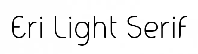
A modern, light, and rounded font with a minimalist style.
![Eri Light Serif Frei Schriftart Herunterladen]() Herunterladen 63 Downloads@WebFont
Herunterladen 63 Downloads@WebFont -
( Fonts by MJB Letters - Muhammad Mujibulloh - Personal-use only. For commercial use please contact owner. )
A graceful script font with elegant loops and swirls.
![Angeline Frei Schriftart Herunterladen]() Herunterladen 63 Downloads@WebFont
Herunterladen 63 Downloads@WebFont -
( Fonts by Motokiwo - Anton Cahyono - Personal-use only. For commercial use please contact owner. )
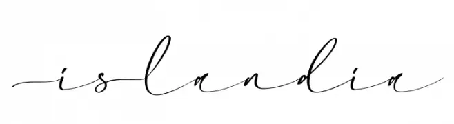
A graceful and elegant cursive font with flowing, connected letters.
![Islandia Frei Schriftart Herunterladen]() Herunterladen 63 Downloads@WebFont
Herunterladen 63 Downloads@WebFont -
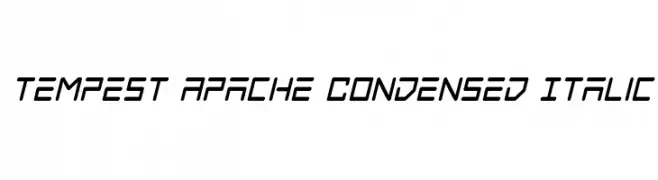
( Iconian Fonts - Daniel Zadorozny - www.iconian.com )
A dynamic, angular, condensed italic font with a modern, geometric style.
![Tempest Apache Condensed Italic Frei Schriftart Herunterladen]() Herunterladen 63 Downloads@WebFont
Herunterladen 63 Downloads@WebFont -
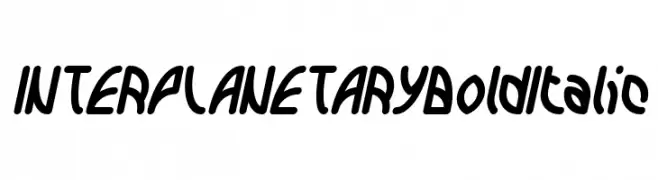
( weknow - Wino S Kadir - www.creativefabrica.com/designer/weknow/ )
A bold, italic, and futuristic font with rounded, slanted characters.
![INTERPLANETARY Bold Italic Frei Schriftart Herunterladen]() Herunterladen 63 Downloads@WebFont
Herunterladen 63 Downloads@WebFont -
( Fonts by Behind the Ink )
Tall, playful handwritten font with a casual, informal feel.
![My Dreams Frei Schriftart Herunterladen]() Herunterladen 63 Downloads@WebFont
Herunterladen 63 Downloads@WebFont -
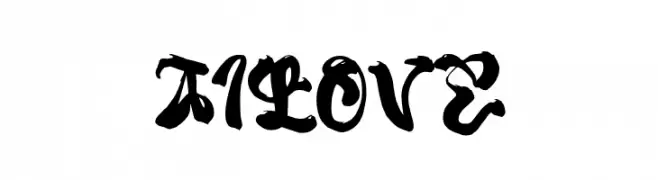
( Fonts by wepfont - Wahyu Eka Prasetya - Personal-use only. For commercial use please contact owner. )
A bold, blackletter-inspired font with dramatic curves and thick strokes.
![Ai Love Frei Schriftart Herunterladen]() Herunterladen 63 Downloads@WebFont
Herunterladen 63 Downloads@WebFont -
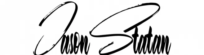
( Fonts by Letterara - Thomas Aradea - Personal-use only. For commercial use please contact owner. )
A dynamic, cursive handwritten font with fluid and expressive letterforms.
![Jason Statan Frei Schriftart Herunterladen]() Herunterladen 63 Downloads@WebFont
Herunterladen 63 Downloads@WebFont -
( Fonts by Md Shohail Bhuian - Personal-use only. For commercial use please contact owner. )
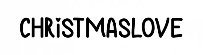
A playful, hand-drawn font with rounded, bold characters.
![Christmas Love Frei Schriftart Herunterladen]() Herunterladen 63 Downloads@WebFont
Herunterladen 63 Downloads@WebFont -
( Fonts by Letterena Studios )
A dynamic and expressive handwritten font with fluid strokes and playful elegance.
![Monglass Frei Schriftart Herunterladen]() Herunterladen 63 Downloads@WebFont
Herunterladen 63 Downloads@WebFont -
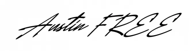
( Fonts by Vunira Design )
![Austin FREE Frei Schriftart Herunterladen]() Herunterladen 63 Downloads@WebFont
Herunterladen 63 Downloads@WebFont -
( Fonts by Creative Lab - Creative LAB - Personal-use only. For commercial use please contact owner. )
An elegant script font with flowing swashes and a sophisticated style.
![Deliya Frei Schriftart Herunterladen]() Herunterladen 63 Downloads@WebFont
Herunterladen 63 Downloads@WebFont -
( Fonts by Emily Underworld - Personal-use only. For commercial use please contact owner. )
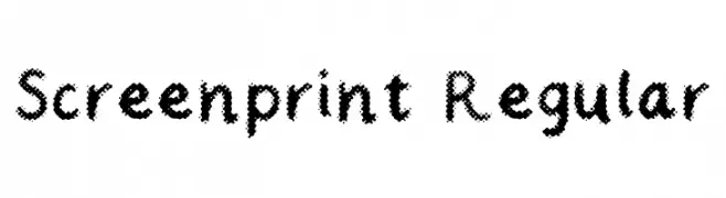
A textured, dotted font with a handcrafted, artistic style.
![Screenprint Regular Frei Schriftart Herunterladen]() Herunterladen 63 Downloads@WebFont
Herunterladen 63 Downloads@WebFont -
( Fonts by Ruangkerja - Rudy Muhardika - Personal-use only. For commercial use please contact owner. )
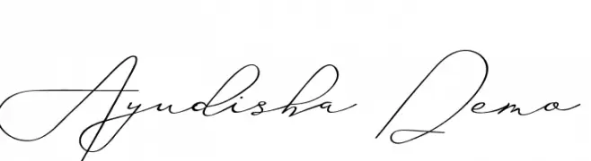
A sophisticated script font with flowing, interconnected strokes and elegant curves.
![Ayudisha Demo Frei Schriftart Herunterladen]() Herunterladen 63 Downloads@WebFont
Herunterladen 63 Downloads@WebFont -
( Fonts by Letterara - Thomas Aradea - Personal-use only. For commercial use please contact owner. )
A bold, rounded font with a playful and friendly style.
![Ferrero Rocker Bold Frei Schriftart Herunterladen]() Herunterladen 63 Downloads@WebFont
Herunterladen 63 Downloads@WebFont -
( Fonts by Typodermic Fonts - Raymond Larabie - Personal-use only. For commercial use please contact owner. )
An elegant italic serif font with moderate contrast and classic style.
![CreditValley-Italic Frei Schriftart Herunterladen]() Herunterladen 63 Downloads@WebFont
Herunterladen 63 Downloads@WebFont -
( Fonts by Peter Wiegel - www.peter-wiegel.de - Personal-use only. For commercial use please contact owner. )
A decorative script font with playful, flowing cursive letterforms.
![NigraScript Frei Schriftart Herunterladen]() Herunterladen 63 Downloads@WebFont
Herunterladen 63 Downloads@WebFont -
( Fonts by Rizka Prayuda - Personal-use only. For commercial use please contact owner. )
A playful, hand-drawn font with a brush stroke style.
![Rockbrush-DEMO Frei Schriftart Herunterladen]() Herunterladen 63 Downloads@WebFont
Herunterladen 63 Downloads@WebFont -
( Iconian Fonts - Daniel Zadorozny - www.iconian.com )
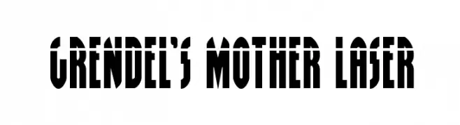
A bold, modern font with sharp angles and geometric shapes.
![Grendel's Mother Laser Frei Schriftart Herunterladen]() Herunterladen 63 Downloads@WebFont
Herunterladen 63 Downloads@WebFont -
( Fonts by Motokiwo - Anton Cahyono - Personal-use only. For commercial use please contact owner. )
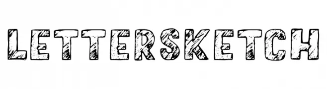
A bold, sketch-style font with a hand-drawn, textured appearance.
![LetterSketch Frei Schriftart Herunterladen]() Herunterladen 63 Downloads@WebFont
Herunterladen 63 Downloads@WebFont -
( Fonts by Vunira Design - Personal-use only. For commercial use please contact owner. )
A playful, bold font with rounded strokes and a friendly appearance.
![Eabigh FREE Frei Schriftart Herunterladen]() Herunterladen 63 Downloads@WebFont
Herunterladen 63 Downloads@WebFont -
( Fonts by Ishmael Studio - Ismail Abdurrasyid - Personal-use only. For commercial use please contact owner. )
A fluid and elegant script font with a natural handwriting style.
![Sharifa Frei Schriftart Herunterladen]() Herunterladen 63 Downloads@WebFont
Herunterladen 63 Downloads@WebFont -
( Fonts by Kat`s Fun Fonts - Personal-use only. For commercial use please contact owner. )
A diverse set of heart designs ranging from simple outlines to intricate patterns.
![KR Heartalicious Frei Schriftart Herunterladen]() Herunterladen 63 Downloads@WebFont
Herunterladen 63 Downloads@WebFont -
( Fonts by Daniel Zadorozny - www.iconian.com - Personal-use only. For commercial use please contact owner. )
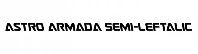
A bold, futuristic font with angular, slanted characters and a geometric design.
![Astro Armada Semi-Leftalic Frei Schriftart Herunterladen]() Herunterladen 63 Downloads@WebFont
Herunterladen 63 Downloads@WebFont -
( Fonts by Forberas Club - Personal-use only. For commercial use please contact owner. )
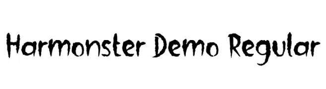
A jagged, horror-themed font with a hand-drawn, distressed appearance.
![Harmonster Demo Regular Frei Schriftart Herunterladen]() Herunterladen 63 Downloads@WebFont
Herunterladen 63 Downloads@WebFont -
( Fonts by Patria Ari Typestudio - Patria Ari - Personal-use only. For commercial use please contact owner. )
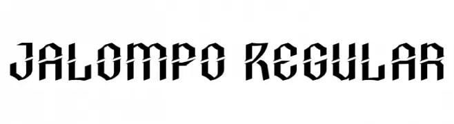
A bold, angular font with a modern, geometric style.
![Jalompo Regular Frei Schriftart Herunterladen]() Herunterladen 63 Downloads@WebFont
Herunterladen 63 Downloads@WebFont -
( Debut Studio - Ari Fadli - creativemarket.com/debutstudio )
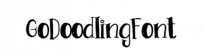
A playful, hand-drawn font with irregular strokes and whimsical serifs.
![GoDoodlingFont Frei Schriftart Herunterladen]() Herunterladen 63 Downloads@WebFont
Herunterladen 63 Downloads@WebFont -
( Fonts by StringLabs - stringlabscreative.com - Personal-use only. For commercial use please contact owner. )
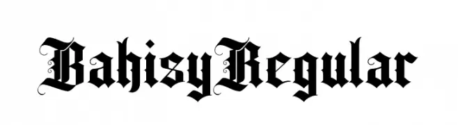
A bold, ornate blackletter font with intricate details and gothic flair.
![Bahisy Regular Frei Schriftart Herunterladen]() Herunterladen 63 Downloads@WebFont
Herunterladen 63 Downloads@WebFont


Welche Schriften sind gerade am populärsten?
Poppins, Roboto, Montserrat, Open Sans und Lato sind wegen ihrer klaren Formen und breiten Einsetzbarkeit sehr gefragt – von Markenauftritt über Landingpages bis hin zu Postern.
Welche Fonts eignen sich für Logos?
Geometrische Sans‑Serifs (z. B. Poppins, Familien im Gotham‑Stil) sind ein häufiger Griff für sauberes, skalierbares Branding. Für eine persönlichere Note bleiben Scripts und Handschrift‑Stile beliebt. Kombinieren Sie einen prägnanten Headline‑Font mit einer neutralen Brotschrift für Wiedererkennung und Harmonie.
Wie oft wird die Top‑Liste aktualisiert?
Regelmäßig – basierend auf realen Downloads und Interaktionen. Schauen Sie öfter vorbei, um aufstrebende Favoriten früh zu entdecken.
💡 Tipp: Seite bookmarken – Trends wechseln schnell, und heutige Top‑Schriften inspirieren morgen vielleicht das Rebranding.