Willkommen bei den Top‑Schriften – hier treffen Beliebtheit und Qualität aufeinander. Das sind die in diesem Jahr am häufigsten heruntergeladenen und genutzten Fonts. Wenn Sie sichere Optionen für Logo, Web oder Social suchen, starten Sie hier.
Jeder Top‑Font überzeugt durch Balance, Lesbarkeit und Vielseitigkeit. Sie finden moderne Sans‑Serifs, elegante Scripts, Vintage‑Serifs und minimalistische Displays.
-
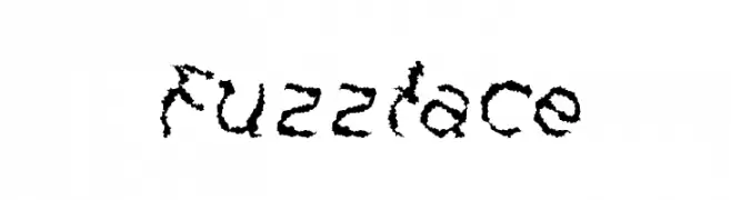
( Harried Type - H.G. Blakeman - harriedtype.com )
A textured, jagged font with an organic, dynamic appearance.
 Herunterladen 59 Downloads@WebFont
 -
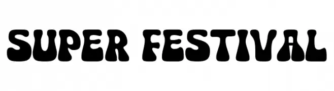
( Fonts by fsuarez913 )
A bold, playful font with rounded, bubbly characters ideal for fun designs.
![Super Festival Frei Schriftart Herunterladen]() Herunterladen 59 Downloads@WebFont
Herunterladen 59 Downloads@WebFont -
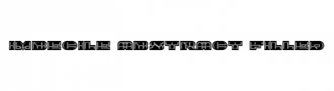
( Fonts by Vladimir Nikolic - https://www.creativefabrica.com/product/educated-deers/ref/144265/ - Personal-use only. For commercial use please contact owner. )
A bold, geometric font with intricate abstract patterns within each character.
![Imbecile Abstract Filled Frei Schriftart Herunterladen]() Herunterladen 59 Downloads@WebFont
Herunterladen 59 Downloads@WebFont -
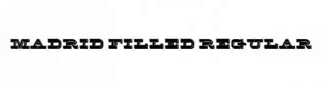
( Fonts by Vladimir Nikolic - www.creativefabrica.com/designer/vladimirnikolic/ - Personal-use only. For commercial use please contact owner. )
A bold, filled, and outlined font with a modern and striking appearance.
![Madrid Filled Regular Frei Schriftart Herunterladen]() Herunterladen 59 Downloads@WebFont
Herunterladen 59 Downloads@WebFont -
( Fonts by Kong Font - Personal-use only. For commercial use please contact owner. )
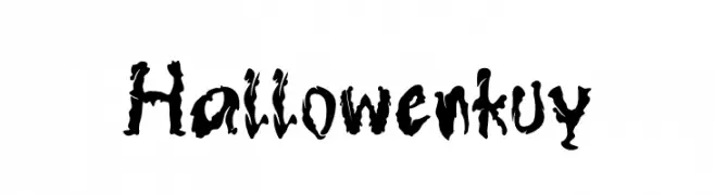
A spooky, jagged font with a dripping effect, perfect for Halloween themes.
![Hallowenkuy Frei Schriftart Herunterladen]() Herunterladen 59 Downloads@WebFont
Herunterladen 59 Downloads@WebFont -
( Fonts by Labastudioid - Lambert Wahang - Personal-use only. For commercial use please contact owner. )
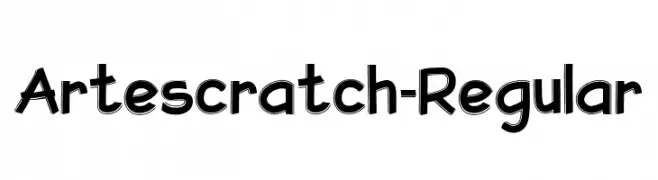
A playful, hand-drawn style font with bold, irregular strokes.
![Artescratch-Regular Frei Schriftart Herunterladen]() Herunterladen 59 Downloads@WebFont
Herunterladen 59 Downloads@WebFont -
( Fonts by Rantautype - Yudi Pratama Chandra - Personal-use only. For commercial use please contact owner. )
A bold, brush-style font with dynamic, hand-painted strokes.
![BlackEra Frei Schriftart Herunterladen]() Herunterladen 59 Downloads@WebFont
Herunterladen 59 Downloads@WebFont -
( Fonts by CalligraphyFonts - Personal-use only. For commercial use please contact owner. )
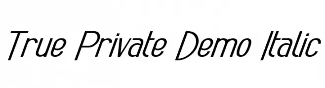
A modern, italicized font with medium contrast and a sleek, professional look.
![True Private Demo Italic Frei Schriftart Herunterladen]() Herunterladen 59 Downloads@WebFont
Herunterladen 59 Downloads@WebFont -
( Fonts by Madatype Studio - Andri Ardianto - Personal-use only. For commercial use please contact owner. )
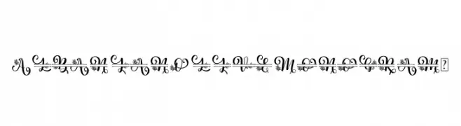
An ornate, floral-decorated font ideal for elegant and artistic projects.
![Albanian Olive Monogram 2 Frei Schriftart Herunterladen]() Herunterladen 59 Downloads@WebFont
Herunterladen 59 Downloads@WebFont -
( Fonts by Mans Greback - Personal-use only. For commercial use please contact owner. )
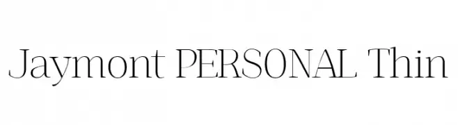
A refined, thin serif font with high contrast and elegant design.
![Jaymont PERSONAL Thin Frei Schriftart Herunterladen]() Herunterladen 59 Downloads@WebFont
Herunterladen 59 Downloads@WebFont -
( Fonts by Billy Argel Fonts ® )
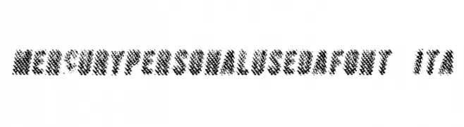
A bold, textured font with a dynamic, brush-like appearance.
![MERCURYPERSONALUSEDAFONT-Ita Frei Schriftart Herunterladen]() Herunterladen 59 Downloads@WebFont
Herunterladen 59 Downloads@WebFont -
( Fonts by Mans Greback - www.mansgreback.com - Personal-use only. For commercial use please contact owner. )
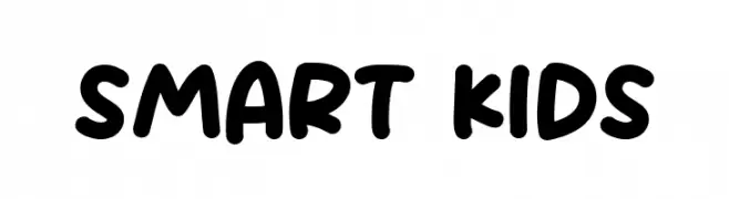
A playful, bold font with rounded, hand-drawn characters.
![Smart Kids Frei Schriftart Herunterladen]() Herunterladen 59 Downloads@WebFont
Herunterladen 59 Downloads@WebFont -
( Fonts by Yoga Letter )
![Holy Easter Demo Frei Schriftart Herunterladen]() Herunterladen 59 Downloads@WebFont
Herunterladen 59 Downloads@WebFont -
( Fonts by Denny Subagja - Personal-use only. For commercial use please contact owner. )
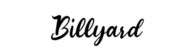
A dynamic and elegant script font with flowing, bold letterforms.
![Billyard Frei Schriftart Herunterladen]() Herunterladen 59 Downloads@WebFont
Herunterladen 59 Downloads@WebFont -
( Fonts by Kat`s Fun Fonts - Personal-use only. For commercial use please contact owner. )
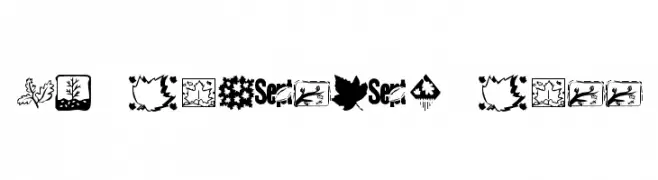
A decorative font with autumn-themed illustrations and motifs.
![KR Fabulous Fall Frei Schriftart Herunterladen]() Herunterladen 59 Downloads@WebFont
Herunterladen 59 Downloads@WebFont -
( Fonts by Madatype Studio - Andri Ardianto - Personal-use only. For commercial use please contact owner. )
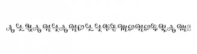
An elegant and decorative font with intricate swirls and flourishes.
![Albanian Olive Monogram 1 Frei Schriftart Herunterladen]() Herunterladen 59 Downloads@WebFont
Herunterladen 59 Downloads@WebFont -
( Fonts by Siti Nurjannah - Personal-use only. For commercial use please contact owner. )
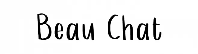
A playful, handwritten font with tall, narrow letters and a casual style.
![Beau Chat Frei Schriftart Herunterladen]() Herunterladen 59 Downloads@WebFont
Herunterladen 59 Downloads@WebFont -
( Iconian Fonts - Daniel Zadorozny - www.iconian.com )
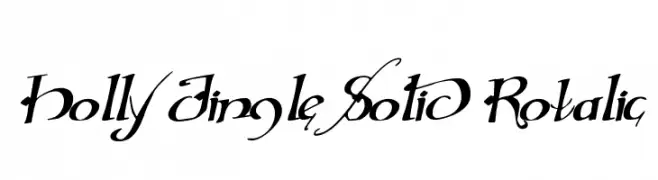
An ornate, calligraphic font with decorative swirls and flourishes.
![Holly Jingle Solid Rotalic Frei Schriftart Herunterladen]() Herunterladen 59 Downloads@WebFont
Herunterladen 59 Downloads@WebFont -
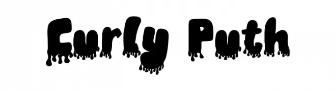
( Fonts by Annisa Afni )
![Curly Puth Frei Schriftart Herunterladen]() Herunterladen 59 Downloads@WebFont
Herunterladen 59 Downloads@WebFont -
( Fonts by Yves Michel - Personal-use only. For commercial use please contact owner. )
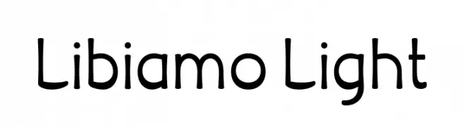
A playful, rounded font with smooth curves and a friendly appearance.
![Libiamo Light Frei Schriftart Herunterladen]() Herunterladen 59 Downloads@WebFont
Herunterladen 59 Downloads@WebFont -
( Iconian Fonts - Daniel Zadorozny - www.iconian.com )
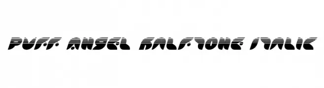
A bold, italicized font with a halftone effect and dynamic, modern style.
![Puff Angel Halftone Italic Frei Schriftart Herunterladen]() Herunterladen 59 Downloads@WebFont
Herunterladen 59 Downloads@WebFont -
( Fonts by erlosDESIGN - Erlangga Suherman - Personal-use only. For commercial use please contact owner. )
A modern, elegant script font with a flowing, handwritten style.
![Misty Gold Frei Schriftart Herunterladen]() Herunterladen 59 Downloads@WebFont
Herunterladen 59 Downloads@WebFont -
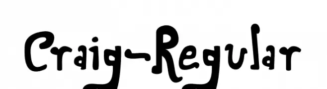
![Craig-Regular Frei Schriftart Herunterladen]() Herunterladen 59 Downloads@WebFont
Herunterladen 59 Downloads@WebFont -
( Fonts by DmLetter31 - Dimas Prasetyo - Personal-use only. For commercial use please contact owner. )
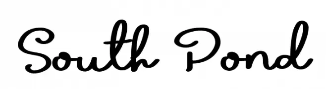
A playful, flowing script font with a casual, handwritten style.
![South Pond Frei Schriftart Herunterladen]() Herunterladen 59 Downloads@WebFont
Herunterladen 59 Downloads@WebFont -
( Fonts by FallenGraphic Studio - Vava Aryanto - Personal-use only. For commercial use please contact owner. )
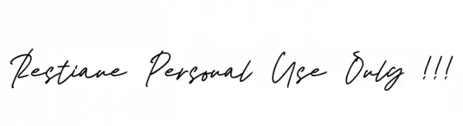
A cursive, handwritten-style font with smooth, connected letters and medium contrast.
![Restiane Personal Use Only !!! Frei Schriftart Herunterladen]() Herunterladen 59 Downloads@WebFont
Herunterladen 59 Downloads@WebFont -
( Fonts by Edric Studio - Personal-use only. For commercial use please contact owner. )
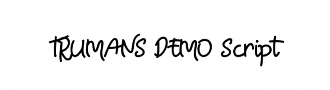
A playful and casual script font with fluid, connected letterforms and a hand-drawn feel.
![TRUMANS DEMO Script Frei Schriftart Herunterladen]() Herunterladen 59 Downloads@WebFont
Herunterladen 59 Downloads@WebFont -
( Fonts by Bearytype - Dian Hadi - Personal-use only. For commercial use please contact owner. )
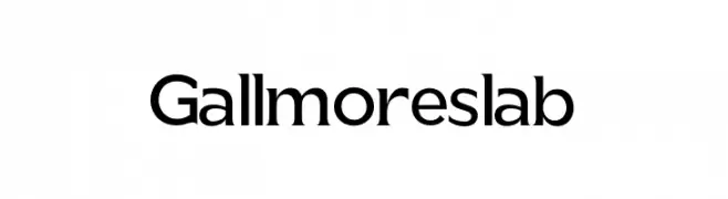
A bold slab serif font with strong, block-like serifs and a balanced structure.
![Gallmore slab Frei Schriftart Herunterladen]() Herunterladen 59 Downloads@WebFont
Herunterladen 59 Downloads@WebFont -
( Fonts by mightype - Personal-use only. For commercial use please contact owner. )
A modern, cursive font with elegant, flowing lines and a handwritten feel.
![Antefand Frei Schriftart Herunterladen]() Herunterladen 59 Downloads@WebFont
Herunterladen 59 Downloads@WebFont -
( Fonts by Kong Font - https://fontkong.com/ - Personal-use only. For commercial use please contact owner. )
A playful, handwritten font with rounded strokes and consistent height.
![StiXuits Frei Schriftart Herunterladen]() Herunterladen 59 Downloads@WebFont
Herunterladen 59 Downloads@WebFont -
( Fonts by Daniel Zadorozny - www.iconian.com - Personal-use only. For commercial use please contact owner. )
A bold, italicized font with a halftone effect, offering a dynamic and modern look.
![Rhinoclops Halftone Italic Frei Schriftart Herunterladen]() Herunterladen 59 Downloads@WebFont
Herunterladen 59 Downloads@WebFont -
( Fonts by Graph Arts - Yanuar Lutfi - Personal-use only. For commercial use please contact owner. )
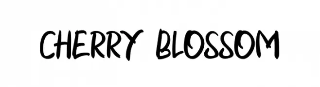
A playful, handwritten font with a casual and dynamic style.
![CHERRY BLOSSOM Frei Schriftart Herunterladen]() Herunterladen 59 Downloads@WebFont
Herunterladen 59 Downloads@WebFont -
( Fonts by vilogsign - Nur Kholis - Personal-use only. For commercial use please contact owner. )
A bold, playful script font with dynamic, flowing characters.
![Blanford Frei Schriftart Herunterladen]() Herunterladen 59 Downloads@WebFont
Herunterladen 59 Downloads@WebFont -
( Fonts by Graphix Line Studio - Personal-use only. For commercial use please contact owner. )
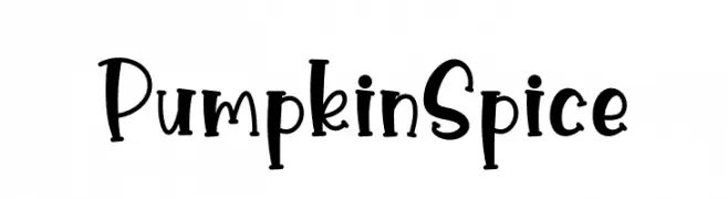
A playful, hand-drawn font with bold, rounded characters and whimsical charm.
![Pumpkin Spice Frei Schriftart Herunterladen]() Herunterladen 59 Downloads@WebFont
Herunterladen 59 Downloads@WebFont -
( Fonts by Perspectype Studio - Personal-use only. For commercial use please contact owner. )
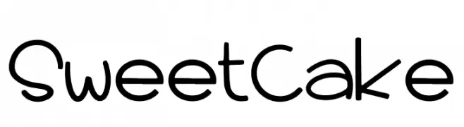
A playful, hand-drawn font with a casual and friendly style.
![Sweet Cake Frei Schriftart Herunterladen]() Herunterladen 59 Downloads@WebFont
Herunterladen 59 Downloads@WebFont -
( Fonts by Giga Typography - GigaType - www.deviantart.com/wolves-fonts - Personal-use only. For commercial use please contact owner. )
Bold, italic sans-serif with a soft, rounded style.
![GT Vice City Sans - Bold Soft Italic Frei Schriftart Herunterladen]() Herunterladen 59 Downloads@WebFont
Herunterladen 59 Downloads@WebFont


Welche Schriften sind gerade am populärsten?
Poppins, Roboto, Montserrat, Open Sans und Lato sind wegen ihrer klaren Formen und breiten Einsetzbarkeit sehr gefragt – von Markenauftritt über Landingpages bis hin zu Postern.
Welche Fonts eignen sich für Logos?
Geometrische Sans‑Serifs (z. B. Poppins, Familien im Gotham‑Stil) sind ein häufiger Griff für sauberes, skalierbares Branding. Für eine persönlichere Note bleiben Scripts und Handschrift‑Stile beliebt. Kombinieren Sie einen prägnanten Headline‑Font mit einer neutralen Brotschrift für Wiedererkennung und Harmonie.
Wie oft wird die Top‑Liste aktualisiert?
Regelmäßig – basierend auf realen Downloads und Interaktionen. Schauen Sie öfter vorbei, um aufstrebende Favoriten früh zu entdecken.
💡 Tipp: Seite bookmarken – Trends wechseln schnell, und heutige Top‑Schriften inspirieren morgen vielleicht das Rebranding.