Willkommen bei den Top‑Schriften – hier treffen Beliebtheit und Qualität aufeinander. Das sind die in diesem Jahr am häufigsten heruntergeladenen und genutzten Fonts. Wenn Sie sichere Optionen für Logo, Web oder Social suchen, starten Sie hier.
Jeder Top‑Font überzeugt durch Balance, Lesbarkeit und Vielseitigkeit. Sie finden moderne Sans‑Serifs, elegante Scripts, Vintage‑Serifs und minimalistische Displays.
-
( Fonts by Tigadestd - Doli Harahap - Personal-use only. For commercial use please contact owner. )
A playful, hand-drawn font with rounded, bold characters.
 Herunterladen 49 Downloads@WebFont
 -
( Fonts by erik5541 - Frederik Aristaputra - Personal-use only. For commercial use please contact owner. )
A playful, hand-drawn font with a casual and friendly vibe.
![DESKETCH Frei Schriftart Herunterladen]() Herunterladen 49 Downloads@WebFont
Herunterladen 49 Downloads@WebFont -
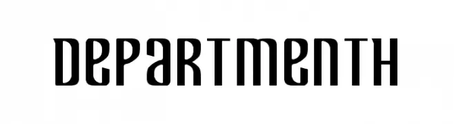
( Fonts by Iconian Fonts - Daniel Zadorozny - Personal-use only. For commercial use please contact owner. )
A bold, modern font with tall, narrow characters and a geometric influence.
![Department H Frei Schriftart Herunterladen]() Herunterladen 49 Downloads@WebFont
Herunterladen 49 Downloads@WebFont -
( Typodermic Fonts - Ray Larabie - www.typodermicfonts.com/ )
A futuristic, geometric font with sharp angles and a modern aesthetic.
![XylitolDown-Regular Frei Schriftart Herunterladen]() Herunterladen 49 Downloads@WebFont
Herunterladen 49 Downloads@WebFont -
( Fonts by DmLetter31 - Dimas Prasetyo - Personal-use only. For commercial use please contact owner. )
A playful, bold handwritten font with a whimsical style.
![Mistletoes Frei Schriftart Herunterladen]() Herunterladen 49 Downloads@WebFont
Herunterladen 49 Downloads@WebFont -
-
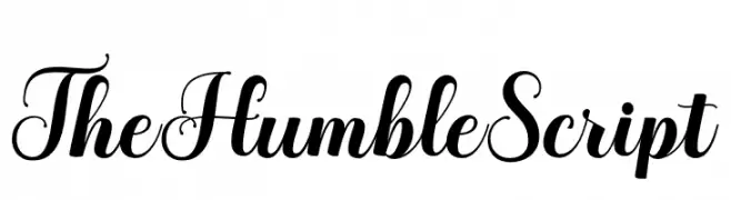
( Fonts by LetterFreshStudio - Rizki Andika - Personal-use only. For commercial use please contact owner. )
An elegant script font with high contrast and ornate flourishes.
![TheHumbleScript Frei Schriftart Herunterladen]() Herunterladen 49 Downloads@WebFont
Herunterladen 49 Downloads@WebFont -
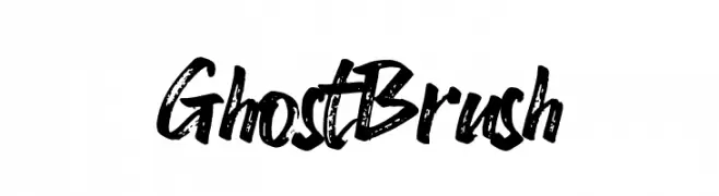
( Fonts by Azetype Studio - Muh. Aswar - Personal-use only. For commercial use please contact owner. )
A bold, expressive brush-style font with dynamic, hand-painted strokes.
![Ghost Brush Frei Schriftart Herunterladen]() Herunterladen 49 Downloads@WebFont
Herunterladen 49 Downloads@WebFont -
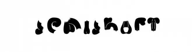
( quadratype - semifont.blogspot.com/ )
A bold, playful font with exaggerated curves and whimsical detailing.
![Semi Shaft Frei Schriftart Herunterladen]() Herunterladen 49 Downloads@WebFont
Herunterladen 49 Downloads@WebFont -
( Fonts by mightype - Personal-use only. For commercial use please contact owner. )
A graceful script font with flowing, interconnected letters and elegant curves.
![Celesta diaz Frei Schriftart Herunterladen]() Herunterladen 49 Downloads@WebFont
Herunterladen 49 Downloads@WebFont -
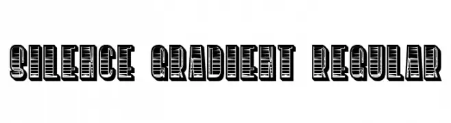
( Fonts by Vladimir Nikolic - https://www.creativefabrica.com/product/educated-deers/ref/144265/ - Personal-use only. For commercial use please contact owner. )
A bold, decorative font with a unique gradient effect and thick outlines.
![Silence Gradient Regular Frei Schriftart Herunterladen]() Herunterladen 49 Downloads@WebFont
Herunterladen 49 Downloads@WebFont -
( Personal-use only. For commercial use please contact owner. )
Playful and vibrant icons with a cartoonish style.
![QwarsIcons Frei Schriftart Herunterladen]() Herunterladen 49 Downloads@WebFont
Herunterladen 49 Downloads@WebFont -
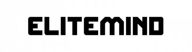
( Fonts by weknow - Wino S Kadir - Personal-use only. For commercial use please contact owner. )
A bold, geometric font with a modern and industrial style.
![ELITE MIND Frei Schriftart Herunterladen]() Herunterladen 49 Downloads@WebFont
Herunterladen 49 Downloads@WebFont -
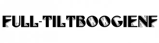
( Fonts by Nick Curtis - Personal-use only. For commercial use please contact owner. )
A bold, geometric font with intricate line patterns and sharp edges.
![Full-TiltBoogieNF Frei Schriftart Herunterladen]() Herunterladen 49 Downloads@WebFont
Herunterladen 49 Downloads@WebFont -
( Fonts by Daniel Zadorozny - www.iconian.com - Personal-use only. For commercial use please contact owner. )
A bold, condensed, and italicized font with a futuristic and dynamic style.
![Combat Droid Condensed Italic Frei Schriftart Herunterladen]() Herunterladen 49 Downloads@WebFont
Herunterladen 49 Downloads@WebFont -
( Fonts by Allouse Studio - Personal-use only. For commercial use please contact owner. )
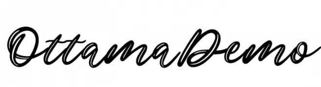
A flowing, cursive font with elegant loops and a dynamic slant.
![Ottama Demo Frei Schriftart Herunterladen]() Herunterladen 49 Downloads@WebFont
Herunterladen 49 Downloads@WebFont -
( Fonts by GFR Creative - Personal-use only. For commercial use please contact owner. )
A lively, cursive script font with medium contrast and fluid strokes.
![Rosta Frei Schriftart Herunterladen]() Herunterladen 49 Downloads@WebFont
Herunterladen 49 Downloads@WebFont -
( AdultHuman - Alex - twitter.com/AdultHumanType )
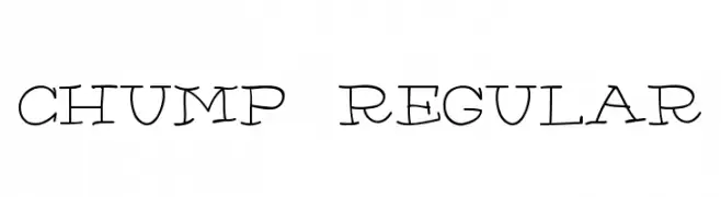
A playful, hand-drawn font with whimsical, irregular strokes.
![Chump-Regular Frei Schriftart Herunterladen]() Herunterladen 49 Downloads@WebFont
Herunterladen 49 Downloads@WebFont -
( weknow - Wino S Kadir - www.creativefabrica.com/designer/weknow/ )
A futuristic and geometric font with rounded edges and consistent line thickness.
![Saint Fighter Aqua Frei Schriftart Herunterladen]() Herunterladen 49 Downloads@WebFont
Herunterladen 49 Downloads@WebFont -
( Dani Foster Herring - dani3d.com/ )
Illustrative display font with Pre-Raphaelite women as characters.
![PreRaphaelites Frei Schriftart Herunterladen]() Herunterladen 49 Downloads@WebFont
Herunterladen 49 Downloads@WebFont -
( Noto is a trademark of Google Inc. Noto fonts are open source. All Noto fonts are published under the SIL Open Font License, Version 1.1 )
A clean, modern sans-serif font with uniform stroke width and high readability.
![Noto Sans Devanagari UI ExtraLight Frei Schriftart Herunterladen]() Herunterladen 49 Downloads@WebFont
Herunterladen 49 Downloads@WebFont -
( Fonts by Amru ID - Personal-use only. For commercial use please contact owner. )
A stylish and elegant script font with flowing, connected letterforms.
![Kupika Frei Schriftart Herunterladen]() Herunterladen 49 Downloads@WebFont
Herunterladen 49 Downloads@WebFont -
( Fonts by Almarkhatype - Abdul Malik Wisnu - Personal-use only. For commercial use please contact owner. )
A bold, modern font with tall, narrow characters and a sleek design.
![Uniser Bold Frei Schriftart Herunterladen]() Herunterladen 49 Downloads@WebFont
Herunterladen 49 Downloads@WebFont -
( Fonts by Bluestype Studio )
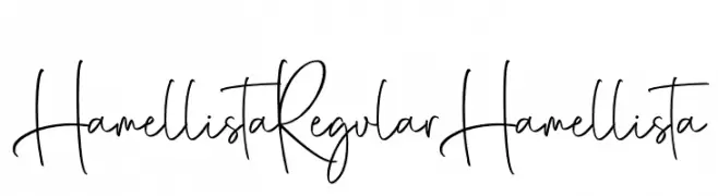
A casual, artistic handwritten font with fluid, connected letters and dynamic strokes.
![Hamellista Regular Hamellista Frei Schriftart Herunterladen]() Herunterladen 49 Downloads@WebFont
Herunterladen 49 Downloads@WebFont -
( Fonts by Maulana Creative - Gilang Maulana - Personal-use only. For commercial use please contact owner. )
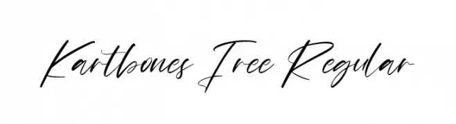
An elegant, flowing script font with interconnected, cursive strokes.
![Kartbones Free Regular Frei Schriftart Herunterladen]() Herunterladen 49 Downloads@WebFont
Herunterladen 49 Downloads@WebFont -
( Fonts by Brittney Murphy Design - Brittney Murphy - Personal-use only. For commercial use please contact owner. )
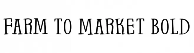
A bold, playful font with a hand-drawn, whimsical style.
![Farm to Market Bold Frei Schriftart Herunterladen]() Herunterladen 49 Downloads@WebFont
Herunterladen 49 Downloads@WebFont -
( Fonts by TypeType Foundry )
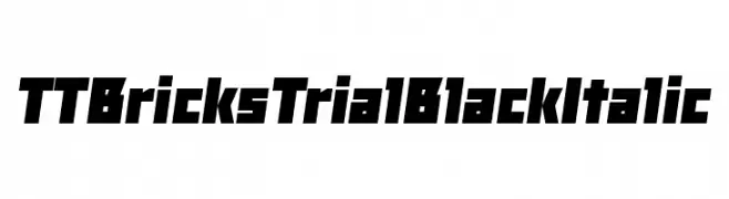
A bold, angular, and italic typeface with a modern, geometric style.
![TT Bricks Trial Black Italic Frei Schriftart Herunterladen]() Herunterladen 49 Downloads@WebFont
Herunterladen 49 Downloads@WebFont -
( Fonts by Daniel Zadorozny - www.iconian.com - Personal-use only. For commercial use please contact owner. )
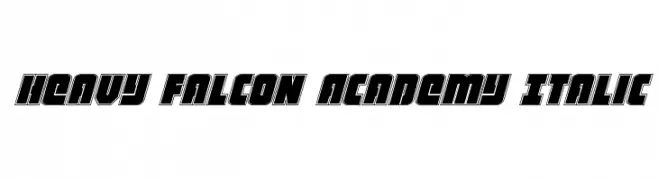
A bold, italic, and geometric font with a dynamic and modern style.
![Heavy Falcon Academy Italic Frei Schriftart Herunterladen]() Herunterladen 49 Downloads@WebFont
Herunterladen 49 Downloads@WebFont -
( Fonts by Vladimir Nikolic - www.creativefabrica.com/designer/vladimirnikolic/ - Personal-use only. For commercial use please contact owner. )
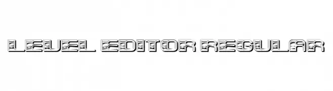
A bold, decorative font with a three-dimensional, layered design.
![Level Editor Regular Frei Schriftart Herunterladen]() Herunterladen 49 Downloads@WebFont
Herunterladen 49 Downloads@WebFont -
( Fonts by Yves Michel - Personal-use only. For commercial use please contact owner. )
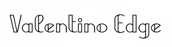
A modern, geometric font with sharp edges and clean lines.
![Valentino Edge Frei Schriftart Herunterladen]() Herunterladen 49 Downloads@WebFont
Herunterladen 49 Downloads@WebFont -
( Vladimir Nikolic - www.coroflot.com/vladimirnikolic )
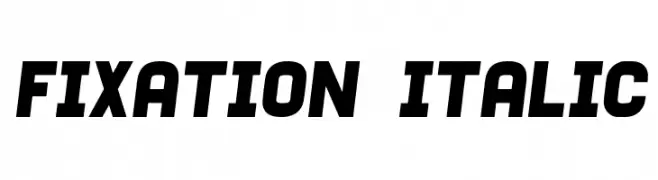
Bold, italicized font with a distressed, vintage texture.
![Fixation Italic Frei Schriftart Herunterladen]() Herunterladen 49 Downloads@WebFont
Herunterladen 49 Downloads@WebFont -
( Vojtech Cizmar - www.bra3cizmar.com )
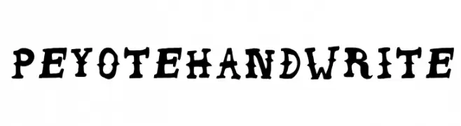
A bold, playful handwritten font with irregular strokes and a whimsical style.
![Peyote Handwrite Frei Schriftart Herunterladen]() Herunterladen 49 Downloads@WebFont
Herunterladen 49 Downloads@WebFont -
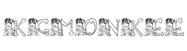
( Katz Fontz - katzfonts.50megs.com/kg.html )
A whimsical, monkey-themed decorative font perfect for playful designs.
![KG MONKEE Frei Schriftart Herunterladen]() Herunterladen 49 Downloads@WebFont
Herunterladen 49 Downloads@WebFont -
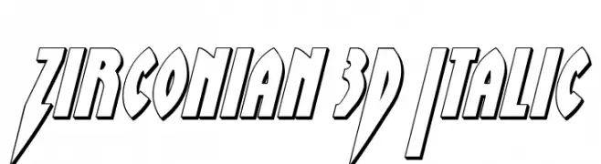
( Fonts by Daniel Zadorozny - www.iconian.com - Personal-use only. For commercial use please contact owner. )
A bold, 3D italic font with a futuristic and dynamic style.
![Zirconian 3D Italic Frei Schriftart Herunterladen]() Herunterladen 49 Downloads@WebFont
Herunterladen 49 Downloads@WebFont -
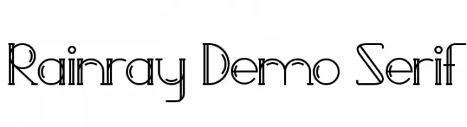
( Fonts by Edric Studio - Personal-use only. For commercial use please contact owner. )
A geometric and decorative font with thin, elongated strokes and intricate detailing.
![Rainray Demo Serif Frei Schriftart Herunterladen]() Herunterladen 49 Downloads@WebFont
Herunterladen 49 Downloads@WebFont -
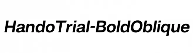
( Fonts by Eko Bimantara - Personal-use only. For commercial use please contact owner. )
A bold, oblique sans-serif font with a modern and dynamic style.
![HandoTrial-BoldOblique Frei Schriftart Herunterladen]() Herunterladen 49 Downloads@WebFont
Herunterladen 49 Downloads@WebFont


Welche Schriften sind gerade am populärsten?
Poppins, Roboto, Montserrat, Open Sans und Lato sind wegen ihrer klaren Formen und breiten Einsetzbarkeit sehr gefragt – von Markenauftritt über Landingpages bis hin zu Postern.
Welche Fonts eignen sich für Logos?
Geometrische Sans‑Serifs (z. B. Poppins, Familien im Gotham‑Stil) sind ein häufiger Griff für sauberes, skalierbares Branding. Für eine persönlichere Note bleiben Scripts und Handschrift‑Stile beliebt. Kombinieren Sie einen prägnanten Headline‑Font mit einer neutralen Brotschrift für Wiedererkennung und Harmonie.
Wie oft wird die Top‑Liste aktualisiert?
Regelmäßig – basierend auf realen Downloads und Interaktionen. Schauen Sie öfter vorbei, um aufstrebende Favoriten früh zu entdecken.
💡 Tipp: Seite bookmarken – Trends wechseln schnell, und heutige Top‑Schriften inspirieren morgen vielleicht das Rebranding.