Willkommen bei den Top‑Schriften – hier treffen Beliebtheit und Qualität aufeinander. Das sind die in diesem Jahr am häufigsten heruntergeladenen und genutzten Fonts. Wenn Sie sichere Optionen für Logo, Web oder Social suchen, starten Sie hier.
Jeder Top‑Font überzeugt durch Balance, Lesbarkeit und Vielseitigkeit. Sie finden moderne Sans‑Serifs, elegante Scripts, Vintage‑Serifs und minimalistische Displays.
-
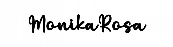
( Fonts by Nirmala Creative - Personal-use only. For commercial use please contact owner. )
Playful handwritten script font.
 Herunterladen 48 Downloads@WebFont
 -
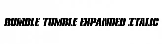
( Fonts by Daniel Zadorozny - www.iconian.com - Personal-use only. For commercial use please contact owner. )
A bold, expanded, and italicized font with a stencil-like effect.
![Rumble Tumble Expanded Italic Frei Schriftart Herunterladen]() Herunterladen 48 Downloads@WebFont
Herunterladen 48 Downloads@WebFont -
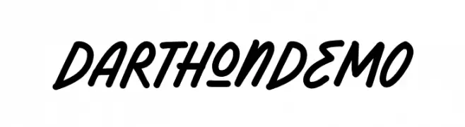
( Fonts by Letterhend Studio - Hendry Juanda - Personal-use only. For commercial use please contact owner. )
A bold, handwritten font with a playful and energetic style.
![DarthonDEMO Frei Schriftart Herunterladen]() Herunterladen 48 Downloads@WebFont
Herunterladen 48 Downloads@WebFont -
( Fonts by Ryan Rivaldo Vierra - Personal-use only. For commercial use please contact owner. )
A bold, geometric font with strong, angular lines and a blocky appearance.
![Link Start Frei Schriftart Herunterladen]() Herunterladen 48 Downloads@WebFont
Herunterladen 48 Downloads@WebFont -
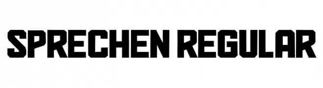
( Fonts by Vladimir Nikolic - Personal-use only. For commercial use please contact owner. )
A bold, geometric font with angular, impactful letterforms.
![Sprechen Regular Frei Schriftart Herunterladen]() Herunterladen 48 Downloads@WebFont
Herunterladen 48 Downloads@WebFont -
-
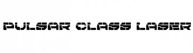
( Iconian Fonts - Daniel Zadorozny - www.iconian.com )
A futuristic, geometric font with bold, angular shapes and a stencil-like appearance.
![Pulsar Class Laser Frei Schriftart Herunterladen]() Herunterladen 48 Downloads@WebFont
Herunterladen 48 Downloads@WebFont -
( Fonts by Twicolabs Fontdation - Fahrizal Tawakkal - Personal-use only. For commercial use please contact owner. )
A bold, Gothic-inspired font with sharp, angular lines and strong serifs.
![Rebute Frei Schriftart Herunterladen]() Herunterladen 48 Downloads@WebFont
Herunterladen 48 Downloads@WebFont -
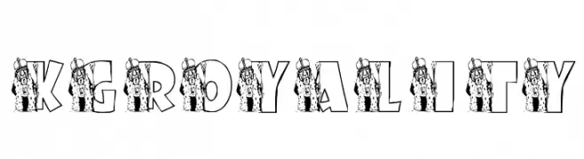
( Katz Fontz - katzfonts.50megs.com/kg.html )
A decorative font with royal-themed illustrations integrated into each letter.
![KGROYALITY Frei Schriftart Herunterladen]() Herunterladen 48 Downloads@WebFont
Herunterladen 48 Downloads@WebFont -
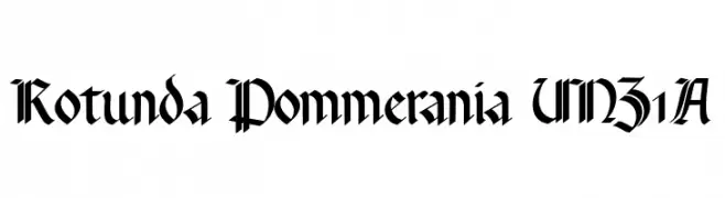
( Fonts by Peter Wiegel - www.peter-wiegel.de - Personal-use only. For commercial use please contact owner. )
A bold, ornate blackletter font with a medieval aesthetic.
![Rotunda Pommerania UNZ1A Frei Schriftart Herunterladen]() Herunterladen 48 Downloads@WebFont
Herunterladen 48 Downloads@WebFont -
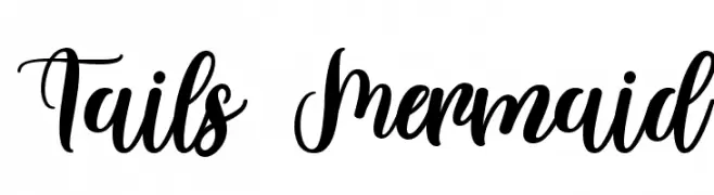
( Fonts by FallenGraphic Studio - Vava Aryanto - Personal-use only. For commercial use please contact owner. )
A lively and elegant script font with flowing, cursive style.
![Tails Mermaid Frei Schriftart Herunterladen]() Herunterladen 48 Downloads@WebFont
Herunterladen 48 Downloads@WebFont -
( Fonts by Graph Arts - Yanuar Lutfi - Personal-use only. For commercial use please contact owner. )
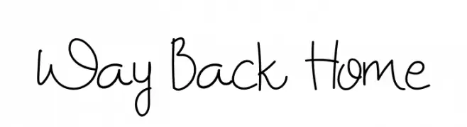
A playful and casual handwritten font with flowing, organic lines.
![Way Back Home Frei Schriftart Herunterladen]() Herunterladen 48 Downloads@WebFont
Herunterladen 48 Downloads@WebFont -
( Fonts by Riki - Personal-use only. For commercial use please contact owner. )
A lively, expressive handwritten font with dynamic strokes.
![Esllieba Frei Schriftart Herunterladen]() Herunterladen 48 Downloads@WebFont
Herunterladen 48 Downloads@WebFont -
( Johannes Siemensmeyer - flickr.com/dergaudens )
A bold, geometric font with sharp angles and a futuristic style.
![Suberp Black Frei Schriftart Herunterladen]() Herunterladen 48 Downloads@WebFont
Herunterladen 48 Downloads@WebFont -
( Fonts by Lettersiro Studio - Muhammad Sirojuddin - Personal-use only. For commercial use please contact owner. )
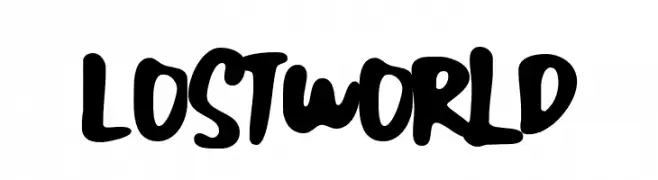
A bold, playful font with rounded strokes and a hand-drawn feel.
![Lost World Frei Schriftart Herunterladen]() Herunterladen 48 Downloads@WebFont
Herunterladen 48 Downloads@WebFont -
( weknow - Wino S Kadir - www.creativefabrica.com/designer/weknow/ )
A geometric, hollow font with sharp angles and a futuristic style.
![The Quick-Hollow Frei Schriftart Herunterladen]() Herunterladen 48 Downloads@WebFont
Herunterladen 48 Downloads@WebFont -
( Fonts by Edric Studio - Personal-use only. For commercial use please contact owner. )
A playful, handwritten font with smooth, flowing lines and a casual style.
![TheBillieMonlly DEMO Sans Frei Schriftart Herunterladen]() Herunterladen 48 Downloads@WebFont
Herunterladen 48 Downloads@WebFont -
( Fonts by Jason NG - Personal-use only. For commercial use please contact owner. )
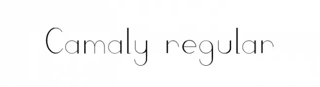
A modern, minimalist font with thin, uniform strokes and excellent readability.
![Camaly regular Frei Schriftart Herunterladen]() Herunterladen 48 Downloads@WebFont
Herunterladen 48 Downloads@WebFont -
( Fonts by Nick Curtis - Personal-use only. For commercial use please contact owner. )
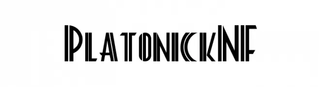
A bold, geometric font with a futuristic and dynamic style.
![PlatonickNF Frei Schriftart Herunterladen]() Herunterladen 48 Downloads@WebFont
Herunterladen 48 Downloads@WebFont -
( Fonts by Bearytype - Dian Hadi - Personal-use only. For commercial use please contact owner. )
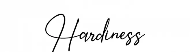
A dynamic and elegant script font with flowing curves and a handwritten feel.
![Hardiness Frei Schriftart Herunterladen]() Herunterladen 48 Downloads@WebFont
Herunterladen 48 Downloads@WebFont -
( Fonts by Etigletters - Afridah Ciputra - Personal-use only. For commercial use please contact owner. )
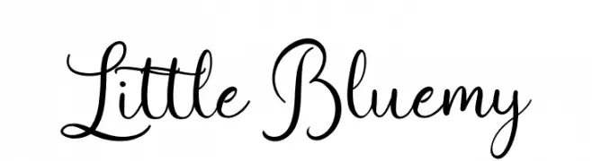
A graceful and elegant script font with flowing, connected strokes.
![Little Bluemy Frei Schriftart Herunterladen]() Herunterladen 48 Downloads@WebFont
Herunterladen 48 Downloads@WebFont -
( London's Letters - www.londonsletters.com/ )
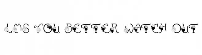
A festive, decorative font with Santa Claus elements on each letter.
![LMS You Better Watch Out Frei Schriftart Herunterladen]() Herunterladen 48 Downloads@WebFont
Herunterladen 48 Downloads@WebFont -
( Fonts by Agni Ardi Rein Prasetyo - Personal-use only. For commercial use please contact owner. )
A bold, expressive font with a hand-drawn, dynamic style.
![Mellorine Frei Schriftart Herunterladen]() Herunterladen 48 Downloads@WebFont
Herunterladen 48 Downloads@WebFont -
( Fonts by Geronimo Font Studios - Anthony - Personal-use only. For commercial use please contact owner. )
A bold, geometric font with rounded edges and a strong, cohesive design.
![Outfield Pro Regular Frei Schriftart Herunterladen]() Herunterladen 48 Downloads@WebFont
Herunterladen 48 Downloads@WebFont -
( Fonts by Ikrar Bey Khubaib - Personal-use only. For commercial use please contact owner. )
A bold, expressive script font with flowing, cursive letterforms.
![Vilanova Frei Schriftart Herunterladen]() Herunterladen 48 Downloads@WebFont
Herunterladen 48 Downloads@WebFont -
( Fonts by dcoxy - Greg Medina - Personal-use only. For commercial use please contact owner. )
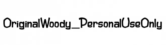
A playful, bold font with a hand-drawn, cartoon-like style.
![Original Woody_PersonalUseOnly Frei Schriftart Herunterladen]() Herunterladen 48 Downloads@WebFont
Herunterladen 48 Downloads@WebFont -
( Fonts by Barbara Jelenkovich - Personal-use only. For commercial use please contact owner. )
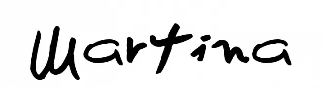
A lively, handwritten-style font with bold, expressive strokes.
![Martina Frei Schriftart Herunterladen]() Herunterladen 48 Downloads@WebFont
Herunterladen 48 Downloads@WebFont -
( Fonts by Design a Lot - Bogdan Casota - Personal-use only. For commercial use please contact owner. )
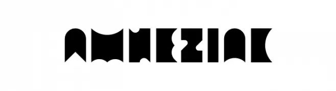
A bold, geometric font with sharp angles and a modern look.
![Amneziak Frei Schriftart Herunterladen]() Herunterladen 48 Downloads@WebFont
Herunterladen 48 Downloads@WebFont -
( Fonts by Letternun - Saeful Bahri - Personal-use only. For commercial use please contact owner. )
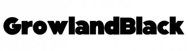
A bold, geometric font with thick strokes and minimal contrast.
![Growland Black Frei Schriftart Herunterladen]() Herunterladen 48 Downloads@WebFont
Herunterladen 48 Downloads@WebFont -
( Fonts by Subectype & Orenari - Rangga Subekti & Ari - Personal-use only. For commercial use please contact owner. )
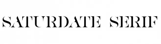
A bold, high-contrast serif font with sharp, angular serifs and dramatic cutouts.
![SATURDATE SERIF Frei Schriftart Herunterladen]() Herunterladen 48 Downloads@WebFont
Herunterladen 48 Downloads@WebFont -
( Fonts by Lettersiro Studio - Muhammad Sirojuddin - Personal-use only. For commercial use please contact owner. )
A bold, hand-painted style font with an expressive and artistic feel.
![Handsome Frei Schriftart Herunterladen]() Herunterladen 48 Downloads@WebFont
Herunterladen 48 Downloads@WebFont -
( Fonts by Studio Indigo - Helena Öhman - Personal-use only. For commercial use please contact owner. )
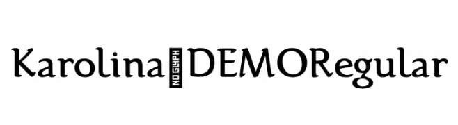
A modern serif font with elegant curves and balanced weight.
![Karolina-DEMO Regular Frei Schriftart Herunterladen]() Herunterladen 48 Downloads@WebFont
Herunterladen 48 Downloads@WebFont -
( imagex - www.imagex-fonts.com )
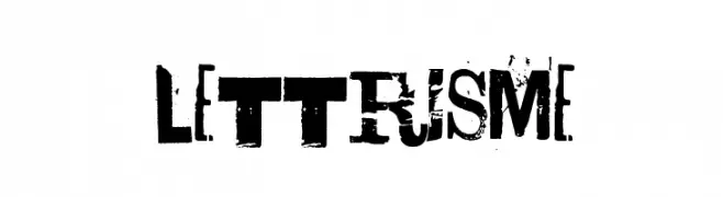
A distressed, grunge-style font with bold, textured characters.
![Lettrisme Frei Schriftart Herunterladen]() Herunterladen 48 Downloads@WebFont
Herunterladen 48 Downloads@WebFont -
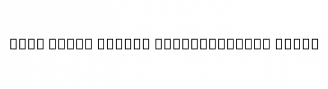
( Noto is a trademark of Google Inc. Noto fonts are open source. All Noto fonts are published under the SIL Open Font License, Version 1.1 )
The image contains placeholder characters, not a valid font.
![Noto Serif Hebrew SemiCondensed Light Frei Schriftart Herunterladen]() Herunterladen 48 Downloads@WebFont
Herunterladen 48 Downloads@WebFont -
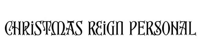
( Fonts by Mans Greback - Personal-use only. For commercial use please contact owner. )
An ornate and decorative Blackletter-style font with intricate details.
![Christmas Reign PERSONAL Frei Schriftart Herunterladen]() Herunterladen 48 Downloads@WebFont
Herunterladen 48 Downloads@WebFont -
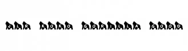
( Fonts by GorillaBlu - Personal-use only. For commercial use please contact owner. )
A playful font with letters embedded in gorilla silhouettes, ideal for decorative use.
![JLR Koko Gorilla Good Frei Schriftart Herunterladen]() Herunterladen 48 Downloads@WebFont
Herunterladen 48 Downloads@WebFont


Welche Schriften sind gerade am populärsten?
Poppins, Roboto, Montserrat, Open Sans und Lato sind wegen ihrer klaren Formen und breiten Einsetzbarkeit sehr gefragt – von Markenauftritt über Landingpages bis hin zu Postern.
Welche Fonts eignen sich für Logos?
Geometrische Sans‑Serifs (z. B. Poppins, Familien im Gotham‑Stil) sind ein häufiger Griff für sauberes, skalierbares Branding. Für eine persönlichere Note bleiben Scripts und Handschrift‑Stile beliebt. Kombinieren Sie einen prägnanten Headline‑Font mit einer neutralen Brotschrift für Wiedererkennung und Harmonie.
Wie oft wird die Top‑Liste aktualisiert?
Regelmäßig – basierend auf realen Downloads und Interaktionen. Schauen Sie öfter vorbei, um aufstrebende Favoriten früh zu entdecken.
💡 Tipp: Seite bookmarken – Trends wechseln schnell, und heutige Top‑Schriften inspirieren morgen vielleicht das Rebranding.