Willkommen bei den Top‑Schriften – hier treffen Beliebtheit und Qualität aufeinander. Das sind die in diesem Jahr am häufigsten heruntergeladenen und genutzten Fonts. Wenn Sie sichere Optionen für Logo, Web oder Social suchen, starten Sie hier.
Jeder Top‑Font überzeugt durch Balance, Lesbarkeit und Vielseitigkeit. Sie finden moderne Sans‑Serifs, elegante Scripts, Vintage‑Serifs und minimalistische Displays.
-
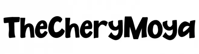
( Fonts by ReyreyBlue - Reyrey Blue - Personal-use only. For commercial use please contact owner. )
A playful, bold, and handwritten-style font with thick, rounded strokes.
 Herunterladen 61 Downloads@WebFont
 -
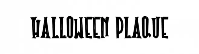
( Fonts by Si Panji )
A bold, jagged font with a spooky, playful Halloween theme.
![Halloween Plaque Frei Schriftart Herunterladen]() Herunterladen 61 Downloads@WebFont
Herunterladen 61 Downloads@WebFont -
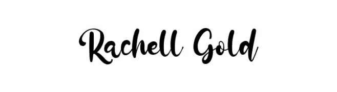
( Fonts by Kong Font - Personal-use only. For commercial use please contact owner. )
A lively, expressive script font with a handwritten feel and elegant curves.
![Rachell Gold Frei Schriftart Herunterladen]() Herunterladen 61 Downloads@WebFont
Herunterladen 61 Downloads@WebFont -
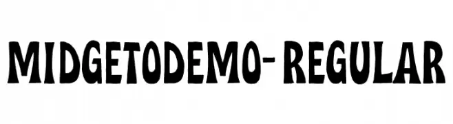
( Fonts by Letterhend Studio - Hendry Juanda - Personal-use only. For commercial use please contact owner. )
A bold, playful font with a hand-drawn, whimsical style.
![MidgetoDEMO-Regular Frei Schriftart Herunterladen]() Herunterladen 61 Downloads@WebFont
Herunterladen 61 Downloads@WebFont -
( Fonts by Meir Sadan - www.sadan.com Sponsoren Schriftart )
A playful, hand-drawn font with a quirky and informal style.
![Geeker Thin Frei Schriftart Herunterladen]() Herunterladen 61 Downloads
Herunterladen 61 Downloads -
( Fonts by pointlab studio - Personal-use only. For commercial use please contact owner. )
A playful, handwritten script font with dynamic strokes.
![MoontelloDemo Frei Schriftart Herunterladen]() Herunterladen 61 Downloads@WebFont
Herunterladen 61 Downloads@WebFont -
( Iconian Fonts - Daniel Zadorozny - www.iconian.com )
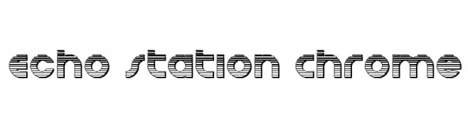
A futuristic, striped font with bold, rounded characters.
![Echo Station Chrome Frei Schriftart Herunterladen]() Herunterladen 61 Downloads@WebFont
Herunterladen 61 Downloads@WebFont -
( Fonts by Rezastudio - Reza Mukhtazar - Personal-use only. For commercial use please contact owner. )
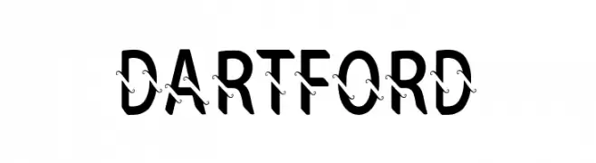
A bold, decorative font with swirling lines intersecting each character.
![DARTFORD Frei Schriftart Herunterladen]() Herunterladen 61 Downloads@WebFont
Herunterladen 61 Downloads@WebFont -
( Fonts by Kotak Kuning Studio - kotakkuning.com - Personal-use only. For commercial use please contact owner. )
A bold, expressive brush script font with dynamic strokes and a hand-painted look.
![The Senom Frei Schriftart Herunterladen]() Herunterladen 61 Downloads@WebFont
Herunterladen 61 Downloads@WebFont -
( Fonts by Adhitya Dwi Cahyo - Personal-use only. For commercial use please contact owner. )
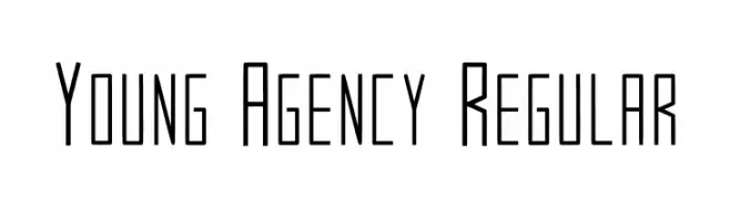
A modern, geometric font with elongated, narrow characters and a sleek design.
![Young Agency Regular Frei Schriftart Herunterladen]() Herunterladen 61 Downloads@WebFont
Herunterladen 61 Downloads@WebFont -
( Fonts by Kong Font - Personal-use only. For commercial use please contact owner. )
An elegant and ornate script font with flowing, decorative letterforms.
![Absollute Frei Schriftart Herunterladen]() Herunterladen 61 Downloads@WebFont
Herunterladen 61 Downloads@WebFont -
( Fonts by Stefani Letter - Stefani Tri Rosa - Personal-use only. For commercial use please contact owner. )
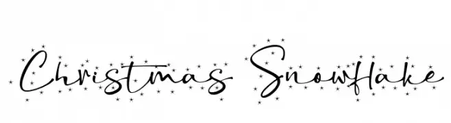
A festive, star-adorned script font with a playful, hand-drawn style.
![Christmas Snowflake Frei Schriftart Herunterladen]() Herunterladen 61 Downloads@WebFont
Herunterladen 61 Downloads@WebFont -
( Fonts by Zetafonts - Personal-use only. For commercial use please contact owner. )
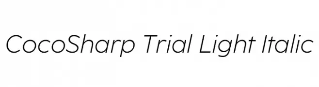
A sleek, modern sans-serif font with a light, italic style.
![CocoSharp Trial Light Italic Frei Schriftart Herunterladen]() Herunterladen 61 Downloads@WebFont
Herunterladen 61 Downloads@WebFont -
( Fonts by Iconian Fonts )
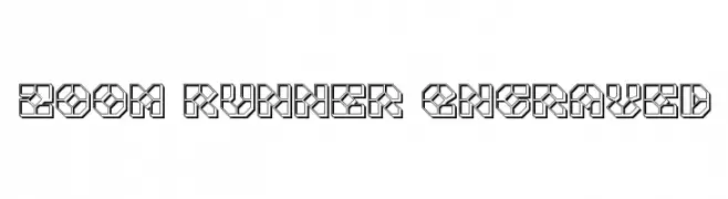
A geometric, 3D font with a futuristic and industrial design.
![Zoom Runner Engraved Frei Schriftart Herunterladen]() Herunterladen 61 Downloads@WebFont
Herunterladen 61 Downloads@WebFont -
( Noto is a trademark of Google Inc. Noto fonts are open source. All Noto fonts are published under the SIL Open Font License, Version 1.1 )
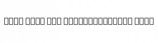
A very thin, extra-condensed sans-serif font with a modern, minimalist look.
![Noto Sans Lao ExtraCondensed Thin Frei Schriftart Herunterladen]() Herunterladen 61 Downloads@WebFont
Herunterladen 61 Downloads@WebFont -
( Fonts by Maulana Creative - Gilang Maulana - Personal-use only. For commercial use please contact owner. )
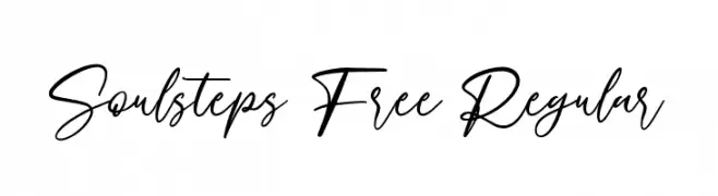
A flowing, cursive script font with elegant, interconnected strokes.
![Soulsteps Free Regular Frei Schriftart Herunterladen]() Herunterladen 61 Downloads@WebFont
Herunterladen 61 Downloads@WebFont -
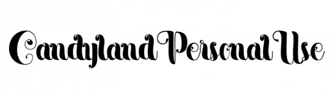
( Fonts by Yumna Family - yumna Type - Personal-use only. For commercial use please contact owner. )
A whimsical and decorative font with bold, curvaceous characters and intricate swirls.
![Candyland Personal Use Frei Schriftart Herunterladen]() Herunterladen 61 Downloads@WebFont
Herunterladen 61 Downloads@WebFont -
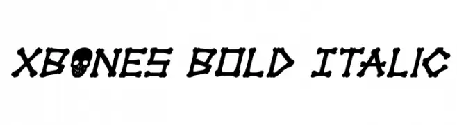
( Iconian Fonts - Daniel Zadorozny - www.iconian.com )
A bold, italic font with characters resembling bones, perfect for spooky themes.
![xBONES Bold Italic Frei Schriftart Herunterladen]() Herunterladen 61 Downloads@WebFont
Herunterladen 61 Downloads@WebFont -
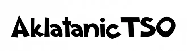
( Fonts by Tomasz Dudziak - Personal-use only. For commercial use please contact owner. )
A bold, playful font with exaggerated, irregular shapes and a whimsical style.
![Aklatanic TSO Frei Schriftart Herunterladen]() Herunterladen 61 Downloads@WebFont
Herunterladen 61 Downloads@WebFont -
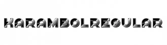
( Fonts by Vladimir Nikolic - www.creativefabrica.com/designer/vladimirnikolic/ - Personal-use only. For commercial use please contact owner. )
A bold, decorative font with a 3D effect and dotted textures.
![Karambol Regular Frei Schriftart Herunterladen]() Herunterladen 61 Downloads@WebFont
Herunterladen 61 Downloads@WebFont -
( Fonts by CalligraphyFonts - Personal-use only. For commercial use please contact owner. )
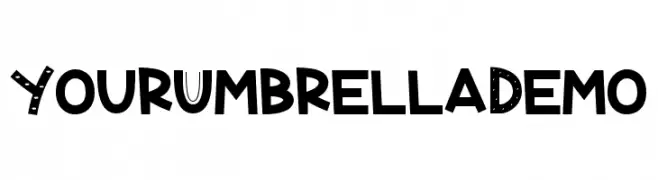
A playful, bold, and decorative font with unique uppercase letter designs.
![Your Umbrella Demo Frei Schriftart Herunterladen]() Herunterladen 61 Downloads@WebFont
Herunterladen 61 Downloads@WebFont -
( Fonts by Craft Supply Co - Personal-use only. For commercial use please contact owner. )
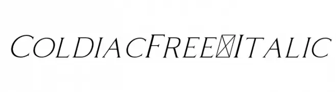
An elegant italic font with smooth, flowing lines and a classic appearance.
![ColdiacFree-Italic Frei Schriftart Herunterladen]() Herunterladen 61 Downloads@WebFont
Herunterladen 61 Downloads@WebFont -
( Fonts by Topan Sofyan - Personal-use only. For commercial use please contact owner. )
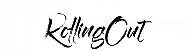
A bold, brush script font with an energetic and artistic style.
![Rolling Out Frei Schriftart Herunterladen]() Herunterladen 61 Downloads@WebFont
Herunterladen 61 Downloads@WebFont -
( Iconian Fonts - Daniel Zadorozny - www.iconian.com )
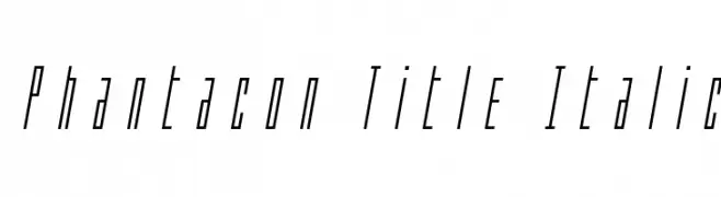
A sleek, italic font with elongated, narrow characters and sharp angles.
![Phantacon Title Italic Frei Schriftart Herunterladen]() Herunterladen 61 Downloads@WebFont
Herunterladen 61 Downloads@WebFont -
( MichaelKoebnick )
A futuristic, geometric font with a digital and sci-fi aesthetic.
![CyberFlix Regular Frei Schriftart Herunterladen]() Herunterladen 61 Downloads@WebFont
Herunterladen 61 Downloads@WebFont -
( Fonts by Syaf Rizal - Khurasan - Personal-use only. For commercial use please contact owner. )
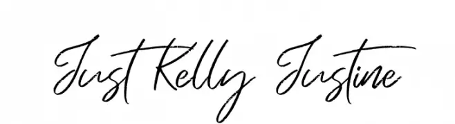
A lively, cursive handwritten font with fluid, interconnected strokes.
![Just Kelly Justine Frei Schriftart Herunterladen]() Herunterladen 61 Downloads@WebFont
Herunterladen 61 Downloads@WebFont -
( Fonts by Edric Studio - Personal-use only. For commercial use please contact owner. )
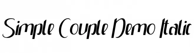
A sleek, modern italic font with high contrast and dynamic slant.
![Simple Couple Demo Italic Frei Schriftart Herunterladen]() Herunterladen 61 Downloads@WebFont
Herunterladen 61 Downloads@WebFont -
( Fonts by Akifatype Studio - Personal-use only. For commercial use please contact owner. )
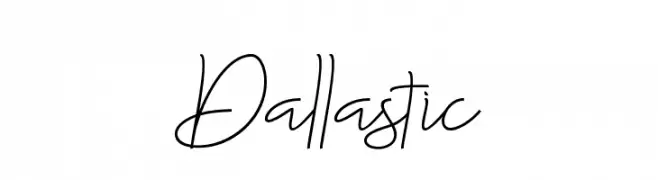
A fluid, cursive font with elegant, connected characters.
![Dallastic Frei Schriftart Herunterladen]() Herunterladen 61 Downloads@WebFont
Herunterladen 61 Downloads@WebFont -
( Fonts by www.junkohanhero.com - Personal-use only. For commercial use please contact owner. )
A bold, hand-drawn font with an energetic and expressive style.
![Muspi Merol Mirg Frei Schriftart Herunterladen]() Herunterladen 61 Downloads@WebFont
Herunterladen 61 Downloads@WebFont -
( Fonts by Pidco Art - Hindro Cholis - Personal-use only. For commercial use please contact owner. )
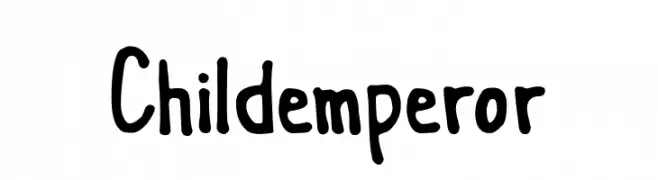
A playful, hand-drawn font with a whimsical, childlike style.
![Childemperor Frei Schriftart Herunterladen]() Herunterladen 61 Downloads@WebFont
Herunterladen 61 Downloads@WebFont -
( Fonts by Wahyu Rahmawan - Personal-use only. For commercial use please contact owner. )
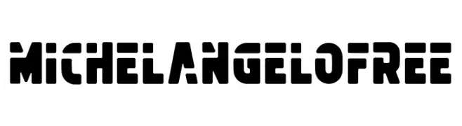
A bold, stencil-style font with geometric shapes and high contrast.
![MichelangeloFREE Frei Schriftart Herunterladen]() Herunterladen 61 Downloads@WebFont
Herunterladen 61 Downloads@WebFont -
( domenico_cristallo - Domenico Cristallo - www.instagram.com/domenico_cristallo/?hl=it )
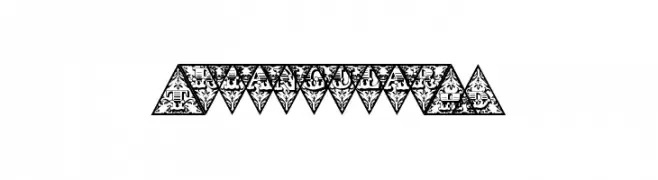
A decorative font with characters enclosed in intricate triangular designs.
![TriangularHD Frei Schriftart Herunterladen]() Herunterladen 61 Downloads@WebFont
Herunterladen 61 Downloads@WebFont -
( Fonts by Mengulirpena - Deny Dwi Kurniawan - Personal-use only. For commercial use please contact owner. )
A graceful script font with flowing, interconnected letters and elegant flourishes.
![allacarte Frei Schriftart Herunterladen]() Herunterladen 61 Downloads@WebFont
Herunterladen 61 Downloads@WebFont -
( Fonts by weknow - Wino S Kadir - Personal-use only. For commercial use please contact owner. )
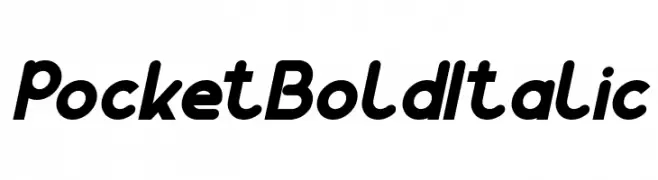
A bold, italicized font with a modern and playful style.
![Pocket Bold Italic Frei Schriftart Herunterladen]() Herunterladen 61 Downloads@WebFont
Herunterladen 61 Downloads@WebFont -
( Saira )
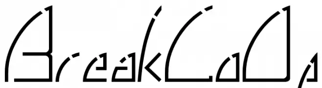
A modern, angular font with a geometric and futuristic style.
![BreakLoOp Frei Schriftart Herunterladen]() Herunterladen 61 Downloads@WebFont
Herunterladen 61 Downloads@WebFont


Welche Schriften sind gerade am populärsten?
Poppins, Roboto, Montserrat, Open Sans und Lato sind wegen ihrer klaren Formen und breiten Einsetzbarkeit sehr gefragt – von Markenauftritt über Landingpages bis hin zu Postern.
Welche Fonts eignen sich für Logos?
Geometrische Sans‑Serifs (z. B. Poppins, Familien im Gotham‑Stil) sind ein häufiger Griff für sauberes, skalierbares Branding. Für eine persönlichere Note bleiben Scripts und Handschrift‑Stile beliebt. Kombinieren Sie einen prägnanten Headline‑Font mit einer neutralen Brotschrift für Wiedererkennung und Harmonie.
Wie oft wird die Top‑Liste aktualisiert?
Regelmäßig – basierend auf realen Downloads und Interaktionen. Schauen Sie öfter vorbei, um aufstrebende Favoriten früh zu entdecken.
💡 Tipp: Seite bookmarken – Trends wechseln schnell, und heutige Top‑Schriften inspirieren morgen vielleicht das Rebranding.