Willkommen bei den Top‑Schriften – hier treffen Beliebtheit und Qualität aufeinander. Das sind die in diesem Jahr am häufigsten heruntergeladenen und genutzten Fonts. Wenn Sie sichere Optionen für Logo, Web oder Social suchen, starten Sie hier.
Jeder Top‑Font überzeugt durch Balance, Lesbarkeit und Vielseitigkeit. Sie finden moderne Sans‑Serifs, elegante Scripts, Vintage‑Serifs und minimalistische Displays.
-
( Fonts by Bonjour Type - Rachma - Personal-use only. For commercial use please contact owner. )
A bold, expressive handwritten font with smooth curves and a modern touch.
 Herunterladen 60 Downloads@WebFont
 -
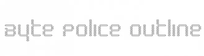
( Iconian Fonts - Daniel Zadorozny - www.iconian.com )
A futuristic, tech-inspired outline font with circular elements and thin line connections.
![Byte Police Outline Frei Schriftart Herunterladen]() Herunterladen 60 Downloads@WebFont
Herunterladen 60 Downloads@WebFont -
( Fonts by Alpaprana - Personal-use only. For commercial use please contact owner. )
A bold, dripping font ideal for horror or Halloween themes.
![Hideous Frei Schriftart Herunterladen]() Herunterladen 60 Downloads@WebFont
Herunterladen 60 Downloads@WebFont -
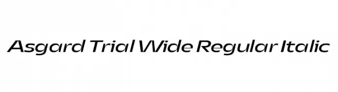
( Fonts by Zetafonts - Personal-use only. For commercial use please contact owner. )
A modern, wide, and italic typeface with a sleek and dynamic appearance.
![Asgard Trial Wide Regular Italic Frei Schriftart Herunterladen]() Herunterladen 60 Downloads@WebFont
Herunterladen 60 Downloads@WebFont -
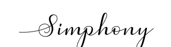
( Fonts by Graphix Line Studio - Personal-use only. For commercial use please contact owner. )
An elegant script font with flowing, cursive letterforms and decorative flourishes.
![Simphony Frei Schriftart Herunterladen]() Herunterladen 60 Downloads@WebFont
Herunterladen 60 Downloads@WebFont -
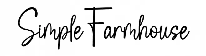
( Fonts by Wahyu Studio )
Tall, narrow, handwritten script with a casual and playful style.
![Simple Farmhouse Frei Schriftart Herunterladen]() Herunterladen 60 Downloads@WebFont
Herunterladen 60 Downloads@WebFont -
( Fonts by HandletterYean - Yean Aguste - Personal-use only. For commercial use please contact owner. )
A graceful, cursive script font with elegant, flowing strokes.
![Gailenia Frei Schriftart Herunterladen]() Herunterladen 60 Downloads@WebFont
Herunterladen 60 Downloads@WebFont -
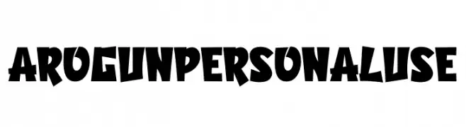
( Fonts by twinletter - Rozikan - Personal-use only. For commercial use please contact owner. )
A bold, playful font with exaggerated angles and a dynamic feel.
![Arogun Personal Use Frei Schriftart Herunterladen]() Herunterladen 60 Downloads@WebFont
Herunterladen 60 Downloads@WebFont -
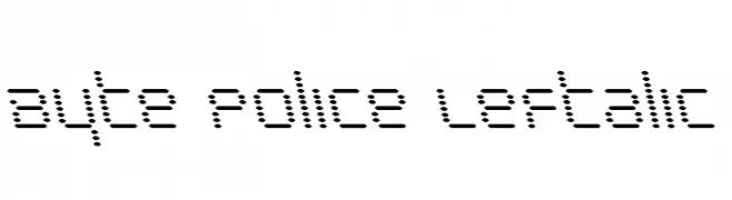
( Iconian Fonts - Daniel Zadorozny - www.iconian.com )
A dot-matrix style font with a retro digital display look.
![Byte Police Leftalic Frei Schriftart Herunterladen]() Herunterladen 60 Downloads@WebFont
Herunterladen 60 Downloads@WebFont -
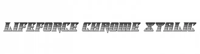
( Iconian Fonts - Daniel Zadorozny - www.iconian.com )
A bold, italicized font with a chrome-like, striped design and a futuristic feel.
![Lifeforce Chrome Italic Frei Schriftart Herunterladen]() Herunterladen 60 Downloads@WebFont
Herunterladen 60 Downloads@WebFont -
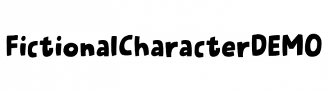
( Fonts by Pizzadude )
A playful, bold, and hand-drawn font with a cartoonish style.
![Fictional Character DEMO Frei Schriftart Herunterladen]() Herunterladen 60 Downloads@WebFont
Herunterladen 60 Downloads@WebFont -
( Fonts by Balev - Balevgraph Studio - Personal-use only. For commercial use please contact owner. )
A playful, bold, and handwritten-style font with rounded characters.
![Kanttelaz Frei Schriftart Herunterladen]() Herunterladen 60 Downloads@WebFont
Herunterladen 60 Downloads@WebFont -
( Fonts by Elevatype Co - Personal-use only. For commercial use please contact owner. )
A whimsical script font with bold, decorative swirls and high contrast.
![Valentine Soulmate Frei Schriftart Herunterladen]() Herunterladen 60 Downloads@WebFont
Herunterladen 60 Downloads@WebFont -
( Fonts by Brittney Murphy Design )
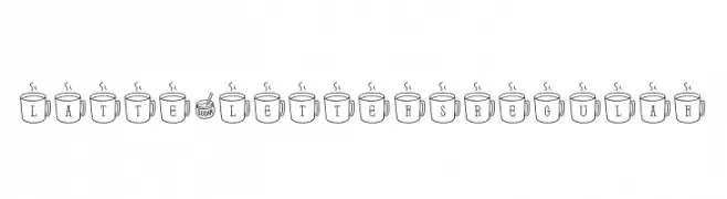
A whimsical font with characters inside steaming coffee mugs.
![Latte*Letters Regular Frei Schriftart Herunterladen]() Herunterladen 60 Downloads@WebFont
Herunterladen 60 Downloads@WebFont -
( Fonts by Daniel Zadorozny - www.iconian.com - Personal-use only. For commercial use please contact owner. )
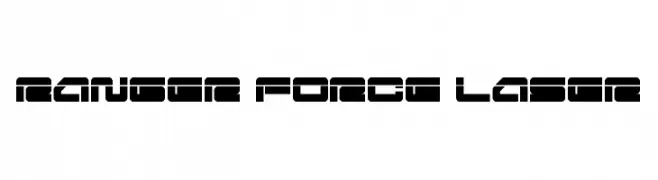
A bold, futuristic font with geometric and digital design elements.
![Ranger Force Laser Frei Schriftart Herunterladen]() Herunterladen 60 Downloads@WebFont
Herunterladen 60 Downloads@WebFont -
( Fonts by Muhammad Zulkifly Suradin - Personal-use only. For commercial use please contact owner. )
Invalid font representation.
![California Swashes Frei Schriftart Herunterladen]() Herunterladen 60 Downloads@WebFont
Herunterladen 60 Downloads@WebFont -
( Fonts by Prioritype Co - Prio Nurokhim Aji - Personal-use only. For commercial use please contact owner. )
A playful, hand-drawn font with rounded, bubbly characters.
![Diltoon Frei Schriftart Herunterladen]() Herunterladen 60 Downloads@WebFont
Herunterladen 60 Downloads@WebFont -
( Fonts by Zetafonts - Personal-use only. For commercial use please contact owner. )
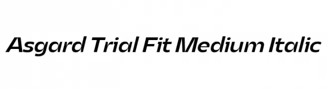
A sleek, modern italic font with medium weight and smooth curves.
![Asgard Trial Fit Medium Italic Frei Schriftart Herunterladen]() Herunterladen 60 Downloads@WebFont
Herunterladen 60 Downloads@WebFont -
( Fonts by Rajinder Singh - Personal-use only. For commercial use please contact owner. )
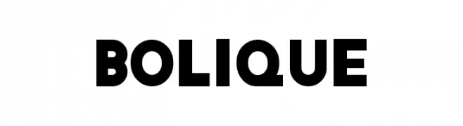
A bold, geometric font with strong, modern letterforms.
![Bolique Frei Schriftart Herunterladen]() Herunterladen 60 Downloads@WebFont
Herunterladen 60 Downloads@WebFont -
( Fonts by 38.lineart - Muhammad Ridha Agusni - Personal-use only. For commercial use please contact owner. )
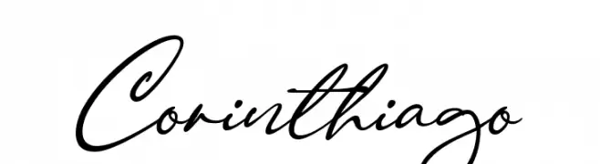
An elegant and flowing script font with a sophisticated cursive style.
![Corinthiago Frei Schriftart Herunterladen]() Herunterladen 60 Downloads@WebFont
Herunterladen 60 Downloads@WebFont -
( Fonts by Abo Daniel Studio - Panggah Laksono - Personal-use only. For commercial use please contact owner. )
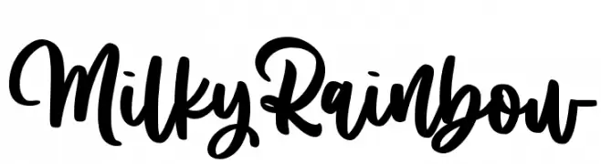
A bold, playful script font with a handwritten style.
![Milky Rainbow Frei Schriftart Herunterladen]() Herunterladen 60 Downloads@WebFont
Herunterladen 60 Downloads@WebFont -
( Fonts by Amin Mustofa - Personal-use only. For commercial use please contact owner. )
A playful, casual handwritten font with dynamic strokes and whimsical flair.
![Southja Frei Schriftart Herunterladen]() Herunterladen 60 Downloads@WebFont
Herunterladen 60 Downloads@WebFont -
( Fonts by Fanastudio - Personal-use only. For commercial use please contact owner. )
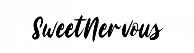
A lively, handwritten script font with bold, expressive strokes.
![Sweet Nervous Frei Schriftart Herunterladen]() Herunterladen 60 Downloads@WebFont
Herunterladen 60 Downloads@WebFont -
( Fonts by Lettersiro Studio - Muhammad Sirojuddin - Personal-use only. For commercial use please contact owner. )
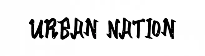
A bold, brush-style font with an urban, graffiti-inspired aesthetic.
![Urban Nation Frei Schriftart Herunterladen]() Herunterladen 60 Downloads@WebFont
Herunterladen 60 Downloads@WebFont -
( Fonts by Bangkit Tri Setiadi )
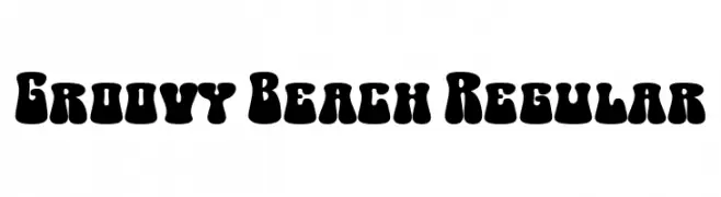
A bold, retro-inspired font with a playful, bubbly design.
![Groovy Beach Regular Frei Schriftart Herunterladen]() Herunterladen 60 Downloads@WebFont
Herunterladen 60 Downloads@WebFont -
( Fonts by Jetsmax.com - Personal-use only. For commercial use please contact owner. )
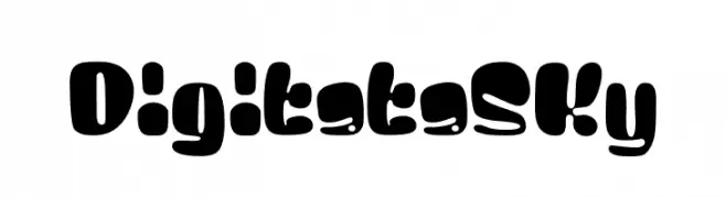
A playful, bold, and rounded font with a cartoonish style.
![Digitata Sky Frei Schriftart Herunterladen]() Herunterladen 60 Downloads@WebFont
Herunterladen 60 Downloads@WebFont -
( Fonts by Andhi Yulianto - Personal-use only. For commercial use please contact owner. )
A lively, brush-style font with dynamic, handcrafted strokes.
![Chamille Frei Schriftart Herunterladen]() Herunterladen 60 Downloads@WebFont
Herunterladen 60 Downloads@WebFont -
( Fonts by Daniel Zadorozny - www.iconian.com - Personal-use only. For commercial use please contact owner. )
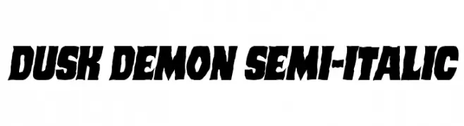
A bold, semi-italic font with a rugged and dynamic style.
![Dusk Demon Semi-Italic Frei Schriftart Herunterladen]() Herunterladen 60 Downloads@WebFont
Herunterladen 60 Downloads@WebFont -
( Fonts by Ahmad Zulfikar Ali - Personal-use only. For commercial use please contact owner. )
A bold, playful font with rounded, interconnected characters.
![Goodbees Frei Schriftart Herunterladen]() Herunterladen 60 Downloads@WebFont
Herunterladen 60 Downloads@WebFont -
( Ruud van den Elzen )
A geometric, futuristic font with angular, intersecting lines and a lattice-like appearance.
![Biohack Frei Schriftart Herunterladen]() Herunterladen 60 Downloads@WebFont
Herunterladen 60 Downloads@WebFont -
( Fonts by Runsell Studio - Personal-use only. For commercial use please contact owner. )
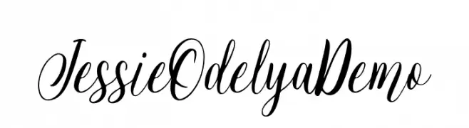
An elegant, flowing script font with high contrast and ornate letterforms.
![JessieOdelyaDemo Frei Schriftart Herunterladen]() Herunterladen 60 Downloads@WebFont
Herunterladen 60 Downloads@WebFont -
( Fonts by Peter Wiegel - www.peter-wiegel.de - Personal-use only. For commercial use please contact owner. )
Abstract and decorative symbols, not a valid font.
![Numikki Frei Schriftart Herunterladen]() Herunterladen 60 Downloads@WebFont
Herunterladen 60 Downloads@WebFont -
( Fonts by Elif Ãœnsever - Personal-use only. For commercial use please contact owner. )
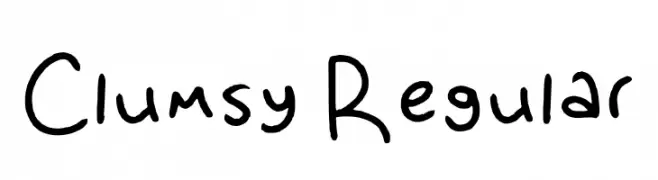
A playful, handwritten font with a whimsical and informal style.
![Clumsy Regular Frei Schriftart Herunterladen]() Herunterladen 60 Downloads@WebFont
Herunterladen 60 Downloads@WebFont -
( Fonts by Dikas Studio - Andika Setiawan - Personal-use only. For commercial use please contact owner. )
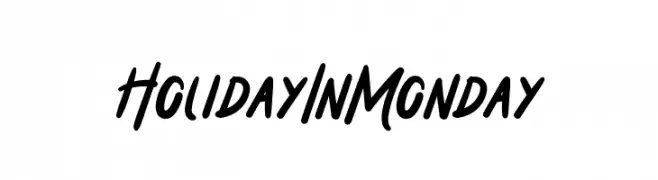
A bold, energetic script font with fluid, cursive strokes.
![Holiday In Monday Frei Schriftart Herunterladen]() Herunterladen 60 Downloads@WebFont
Herunterladen 60 Downloads@WebFont -
( Fonts by wep - Wahyu Eka Prasetya - Personal-use only. For commercial use please contact owner. )
A flowing, cursive font with a handwritten, elegant style.
![a Bators Growth Frei Schriftart Herunterladen]() Herunterladen 60 Downloads@WebFont
Herunterladen 60 Downloads@WebFont


Welche Schriften sind gerade am populärsten?
Poppins, Roboto, Montserrat, Open Sans und Lato sind wegen ihrer klaren Formen und breiten Einsetzbarkeit sehr gefragt – von Markenauftritt über Landingpages bis hin zu Postern.
Welche Fonts eignen sich für Logos?
Geometrische Sans‑Serifs (z. B. Poppins, Familien im Gotham‑Stil) sind ein häufiger Griff für sauberes, skalierbares Branding. Für eine persönlichere Note bleiben Scripts und Handschrift‑Stile beliebt. Kombinieren Sie einen prägnanten Headline‑Font mit einer neutralen Brotschrift für Wiedererkennung und Harmonie.
Wie oft wird die Top‑Liste aktualisiert?
Regelmäßig – basierend auf realen Downloads und Interaktionen. Schauen Sie öfter vorbei, um aufstrebende Favoriten früh zu entdecken.
💡 Tipp: Seite bookmarken – Trends wechseln schnell, und heutige Top‑Schriften inspirieren morgen vielleicht das Rebranding.