Willkommen bei den Top‑Schriften – hier treffen Beliebtheit und Qualität aufeinander. Das sind die in diesem Jahr am häufigsten heruntergeladenen und genutzten Fonts. Wenn Sie sichere Optionen für Logo, Web oder Social suchen, starten Sie hier.
Jeder Top‑Font überzeugt durch Balance, Lesbarkeit und Vielseitigkeit. Sie finden moderne Sans‑Serifs, elegante Scripts, Vintage‑Serifs und minimalistische Displays.
-
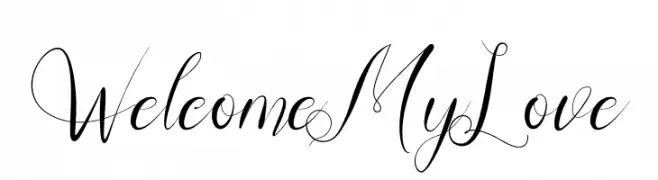
( Fonts by Kateeng Ciu - Personal-use only. For commercial use please contact owner. )
An elegant script font with flowing cursive lines and intricate swashes.
 Herunterladen 60 Downloads@WebFont
 -
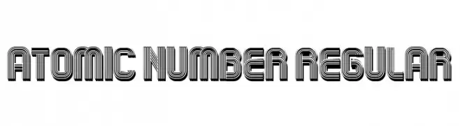
( Fonts by Vladimir Nikolic - Personal-use only. For commercial use please contact owner. )
A bold, geometric font with a layered, futuristic design.
![Atomic Number Regular Frei Schriftart Herunterladen]() Herunterladen 60 Downloads@WebFont
Herunterladen 60 Downloads@WebFont -
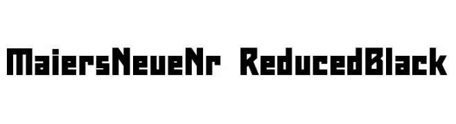
( Fonts by ingoFonts - Ingo Zimmermann - Personal-use only. For commercial use please contact owner. )
A bold, geometric font with strong, angular lines and a modern aesthetic.
![Maiers Neue Nr.8 Reduced Black Frei Schriftart Herunterladen]() Herunterladen 60 Downloads@WebFont
Herunterladen 60 Downloads@WebFont -
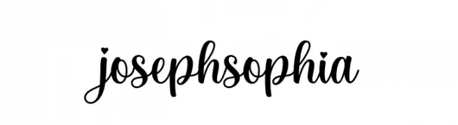
( Fonts by Fargun Studio - Fajar Gunawan - Personal-use only. For commercial use please contact owner. )
A flowing, cursive script font with elegant loops and swashes.
![josephsophia Frei Schriftart Herunterladen]() Herunterladen 60 Downloads@WebFont
Herunterladen 60 Downloads@WebFont -
( Vladimir Nikolic - www.coroflot.com/vladimirnikolic )
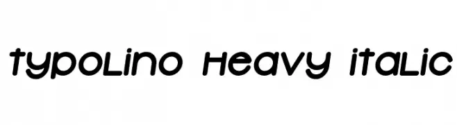
A playful, bold, and italicized font with rounded, smooth letters.
![Typolino Heavy Italic Frei Schriftart Herunterladen]() Herunterladen 60 Downloads@WebFont
Herunterladen 60 Downloads@WebFont -
( Fonts by Iconian Fonts )
A bold, geometric font with a futuristic, digital aesthetic.
![Capitol City Laser Straight Frei Schriftart Herunterladen]() Herunterladen 60 Downloads@WebFont
Herunterladen 60 Downloads@WebFont -
( Fonts by Lettering Mom )
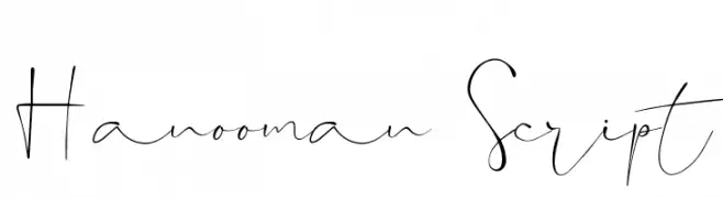
Elegant handwritten script font.
![Hanooman Script Frei Schriftart Herunterladen]() Herunterladen 60 Downloads@WebFont
Herunterladen 60 Downloads@WebFont -
( Fonts by Daniel Zadorozny - www.iconian.com - Personal-use only. For commercial use please contact owner. )
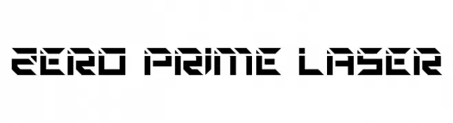
A futuristic, angular font with a bold, geometric design.
![Zero Prime Laser Frei Schriftart Herunterladen]() Herunterladen 60 Downloads@WebFont
Herunterladen 60 Downloads@WebFont -
( Fonts by Al Ghul - Personal-use only. For commercial use please contact owner. )
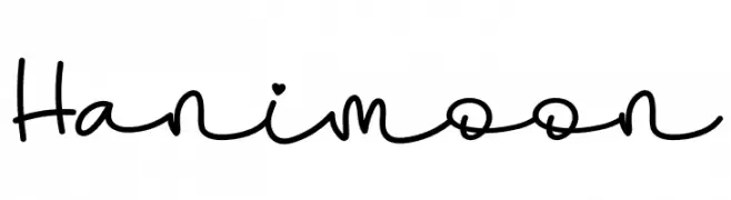
A playful, handwritten font with a casual and friendly style.
![Hanimoon Frei Schriftart Herunterladen]() Herunterladen 60 Downloads@WebFont
Herunterladen 60 Downloads@WebFont -
( Fonts by Kurnia Setyadi - Personal-use only. For commercial use please contact owner. )
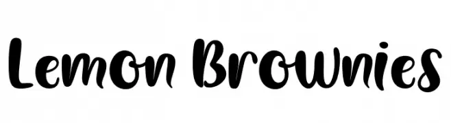
A playful, bold script font with smooth curves and rounded edges.
![Lemon Brownies Frei Schriftart Herunterladen]() Herunterladen 60 Downloads@WebFont
Herunterladen 60 Downloads@WebFont -
( Fonts by Kevin Richey - Personal-use only. For commercial use please contact owner. )
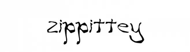
A whimsical, hand-drawn font with irregular, organic shapes and dynamic strokes.
![zippittey Frei Schriftart Herunterladen]() Herunterladen 60 Downloads@WebFont
Herunterladen 60 Downloads@WebFont -
( Fonts by Pablo Impallari - Personal-use only. For commercial use please contact owner. )
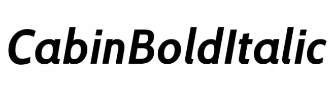
A bold, italicized font with a modern and dynamic style.
![Cabin Bold Italic Frei Schriftart Herunterladen]() Herunterladen 60 Downloads@WebFont
Herunterladen 60 Downloads@WebFont -
( Fonts by Nico Muslib )
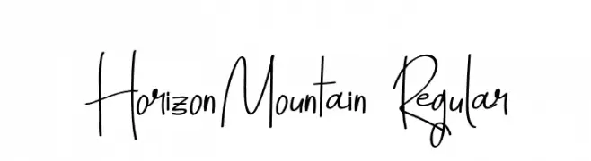
A playful, handwritten font with tall, narrow characters and a lively, informal style.
![HorizonMountain-Regular Frei Schriftart Herunterladen]() Herunterladen 60 Downloads@WebFont
Herunterladen 60 Downloads@WebFont -
( Fonts by Daniel Zadorozny - www.iconian.com - Personal-use only. For commercial use please contact owner. )
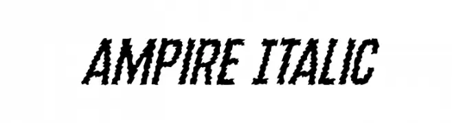
A bold, jagged italic font with a dynamic, hand-drawn appearance.
![Ampire Italic Frei Schriftart Herunterladen]() Herunterladen 60 Downloads@WebFont
Herunterladen 60 Downloads@WebFont -
( Fonts by Daniel Zadorozny - www.iconian.com - Personal-use only. For commercial use please contact owner. )
A bold, italicized font with a halftone effect, perfect for dynamic and modern designs.
![Grendel's Mother Halftone Ital Frei Schriftart Herunterladen]() Herunterladen 60 Downloads@WebFont
Herunterladen 60 Downloads@WebFont -
( Fonts by Iconian Fonts - Daniel Zadorozny - Personal-use only. For commercial use please contact owner. )
A bold, geometric font with sharp angles and a futuristic style.
![Walk The Moon Expanded Frei Schriftart Herunterladen]() Herunterladen 60 Downloads@WebFont
Herunterladen 60 Downloads@WebFont -
( Fonts by VPcreativeshop - Vladimir Fedotov - Personal-use only. For commercial use please contact owner. )
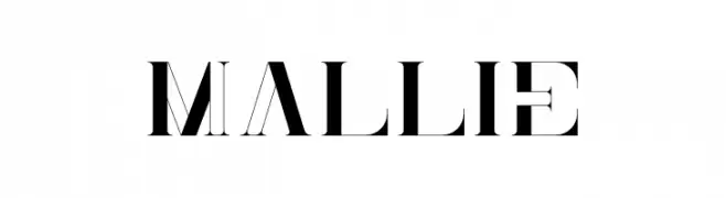
A high-contrast, modern font with sharp angles and bold strokes.
![Mallie Frei Schriftart Herunterladen]() Herunterladen 60 Downloads@WebFont
Herunterladen 60 Downloads@WebFont -
( Fonts by ingoFonts - Ingo Zimmermann - Personal-use only. For commercial use please contact owner. )
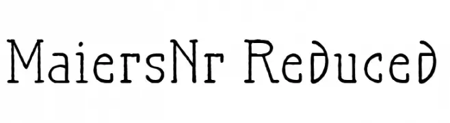
A handcrafted, artistic font with a vintage flair and modern twist.
![MaiersNr.Reduced Frei Schriftart Herunterladen]() Herunterladen 60 Downloads@WebFont
Herunterladen 60 Downloads@WebFont -
( weknow - Wino S Kadir - www.creativefabrica.com/designer/weknow/ )
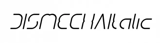
A futuristic, geometric italic font with sharp lines and dynamic style.
![DISMECHA Italic Frei Schriftart Herunterladen]() Herunterladen 60 Downloads@WebFont
Herunterladen 60 Downloads@WebFont -
( Fonts by Noah Type - noahtype.com - Personal-use only. For commercial use please contact owner. )
A bold, italicized font with a brush-like texture and dynamic style.
![Switch One Demo Italic Frei Schriftart Herunterladen]() Herunterladen 60 Downloads@WebFont
Herunterladen 60 Downloads@WebFont -
( Fonts by Scratchones )
Playful handwritten script with tall uppercase and rounded lowercase letters.
![Winter Signature Frei Schriftart Herunterladen]() Herunterladen 60 Downloads@WebFont
Herunterladen 60 Downloads@WebFont -
( Fonts by AEN Creative Studio - Personal-use only. For commercial use please contact owner. )
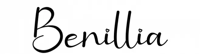
A playful and elegant handwritten script font.
![Benillia Frei Schriftart Herunterladen]() Herunterladen 60 Downloads@WebFont
Herunterladen 60 Downloads@WebFont -
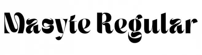
( Personal-use only. For commercial use please contact owner. )
![Masyte Regular Frei Schriftart Herunterladen]() Herunterladen 60 Downloads@WebFont
Herunterladen 60 Downloads@WebFont -
Schriftart von Sayfont. For commercial use please contact the owner.
( Dinamika DEMO )
![Dinamika DEMO Regular Frei Schriftart Herunterladen]() Herunterladen 60 Downloads@WebFont
Herunterladen 60 Downloads@WebFont -
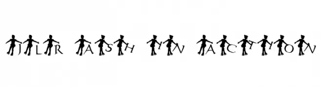
( Fonts by GorillaBlu - Personal-use only. For commercial use please contact owner. )
A decorative font featuring dancer silhouettes integrated with each letter.
![JLR Ash in Action Frei Schriftart Herunterladen]() Herunterladen 60 Downloads@WebFont
Herunterladen 60 Downloads@WebFont -
( Fonts by selawetype - Personal-use only. For commercial use please contact owner. )
A graceful and elegant script font with flowing, cursive letterforms.
![Winda Frei Schriftart Herunterladen]() Herunterladen 60 Downloads@WebFont
Herunterladen 60 Downloads@WebFont -
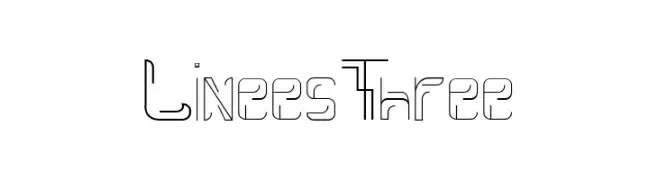
( Fonts by Irfan Hidayat - Personal-use only. For commercial use please contact owner. )
A modern, geometric font with a unique outlined style and sharp angles.
![Linees Three Frei Schriftart Herunterladen]() Herunterladen 60 Downloads@WebFont
Herunterladen 60 Downloads@WebFont -
( Fonts by Inermedia Studio - Personal-use only. For commercial use please contact owner. )
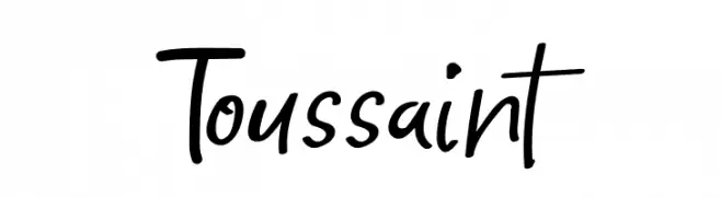
A dynamic handwritten font with fluid, expressive strokes and a casual appearance.
![Toussaint Frei Schriftart Herunterladen]() Herunterladen 60 Downloads@WebFont
Herunterladen 60 Downloads@WebFont -
( Fonts by Mans Greback - Personal-use only. For commercial use please contact owner. )
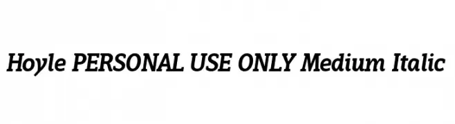
A medium weight, italic serif font with a modern and elegant style.
![Hoyle PERSONAL USE ONLY Medium Italic Frei Schriftart Herunterladen]() Herunterladen 60 Downloads@WebFont
Herunterladen 60 Downloads@WebFont -
( Fonts by Juha Korhonen )
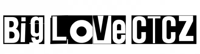
A bold, high-contrast font with a modern and dynamic style.
![Big Love CTCZ Frei Schriftart Herunterladen]() Herunterladen 60 Downloads@WebFont
Herunterladen 60 Downloads@WebFont -
( London's Letters - www.londonsletters.com/ )
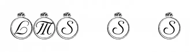
An elegant, decorative font with cursive letters inside ornate rings, ideal for luxury themes.
![LMS Solitary Stone Frei Schriftart Herunterladen]() Herunterladen 60 Downloads@WebFont
Herunterladen 60 Downloads@WebFont -
( Fonts by Typefactoryco )
A bold, playful font with exaggerated, elongated characters for a dynamic look.
![PHILIPA Free Trial Frei Schriftart Herunterladen]() Herunterladen 60 Downloads@WebFont
Herunterladen 60 Downloads@WebFont -
( Fonts by Brithos Type - Personal-use only. For commercial use please contact owner. )
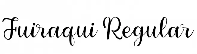
An elegant, flowing script font with graceful curves and a handwritten appeal.
![Fuiraqui Regular Frei Schriftart Herunterladen]() Herunterladen 60 Downloads@WebFont
Herunterladen 60 Downloads@WebFont -
( Fonts by Wahyu Eka Prasetya - wepfont.com - Personal-use only. For commercial use please contact owner. )
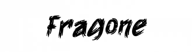
A bold, brushstroke font with a dynamic and expressive style.
![Fragone Frei Schriftart Herunterladen]() Herunterladen 60 Downloads@WebFont
Herunterladen 60 Downloads@WebFont -
( Fonts by Omotu Studio - Ibnu Utomo - Personal-use only. For commercial use please contact owner. )
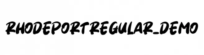
A bold, expressive handwritten font with dynamic strokes and a brush-like texture.
![Rhodeport Regular_DEMO Frei Schriftart Herunterladen]() Herunterladen 60 Downloads@WebFont
Herunterladen 60 Downloads@WebFont


Welche Schriften sind gerade am populärsten?
Poppins, Roboto, Montserrat, Open Sans und Lato sind wegen ihrer klaren Formen und breiten Einsetzbarkeit sehr gefragt – von Markenauftritt über Landingpages bis hin zu Postern.
Welche Fonts eignen sich für Logos?
Geometrische Sans‑Serifs (z. B. Poppins, Familien im Gotham‑Stil) sind ein häufiger Griff für sauberes, skalierbares Branding. Für eine persönlichere Note bleiben Scripts und Handschrift‑Stile beliebt. Kombinieren Sie einen prägnanten Headline‑Font mit einer neutralen Brotschrift für Wiedererkennung und Harmonie.
Wie oft wird die Top‑Liste aktualisiert?
Regelmäßig – basierend auf realen Downloads und Interaktionen. Schauen Sie öfter vorbei, um aufstrebende Favoriten früh zu entdecken.
💡 Tipp: Seite bookmarken – Trends wechseln schnell, und heutige Top‑Schriften inspirieren morgen vielleicht das Rebranding.