Willkommen bei den Top‑Schriften – hier treffen Beliebtheit und Qualität aufeinander. Das sind die in diesem Jahr am häufigsten heruntergeladenen und genutzten Fonts. Wenn Sie sichere Optionen für Logo, Web oder Social suchen, starten Sie hier.
Jeder Top‑Font überzeugt durch Balance, Lesbarkeit und Vielseitigkeit. Sie finden moderne Sans‑Serifs, elegante Scripts, Vintage‑Serifs und minimalistische Displays.
-
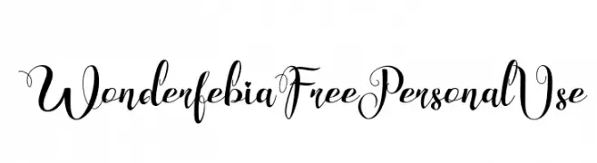
( Fonts by FHFont - Ferry Hadriyan - Personal-use only. For commercial use please contact owner. )
An elegant script font with ornate, flowing letterforms.
 Herunterladen 50 Downloads@WebFont
 -
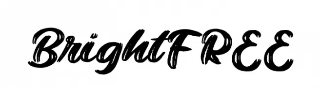
( Fonts by Vunira Design - Personal-use only. For commercial use please contact owner. )
A bold, brush script font with dynamic strokes and high contrast.
![BrightFREE Frei Schriftart Herunterladen]() Herunterladen 50 Downloads@WebFont
Herunterladen 50 Downloads@WebFont -
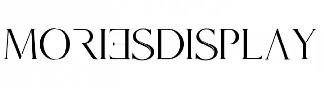
( Fonts by mlkwsn - www.mlkwsn.com - Personal-use only. For commercial use please contact owner. )
A high-contrast, elegant serif font with sharp serifs and modern style.
![Mories Display Frei Schriftart Herunterladen]() Herunterladen 50 Downloads@WebFont
Herunterladen 50 Downloads@WebFont -
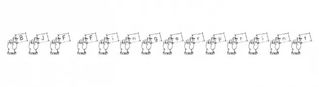
( Blue Jay Font Studio - katzfonts.50megs.com/bj1.html )
A playful font with characters held by a hand, offering a unique and artistic style.
![BJF Fingerprint Frei Schriftart Herunterladen]() Herunterladen 50 Downloads@WebFont
Herunterladen 50 Downloads@WebFont -
( Fonts by Elbanadha Creative - Personal-use only. For commercial use please contact owner. )
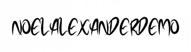
A dynamic and expressive font with flowing, cursive-like strokes and varying line thickness.
![NOELALEXANDER DEMO Frei Schriftart Herunterladen]() Herunterladen 50 Downloads@WebFont
Herunterladen 50 Downloads@WebFont -
( Fonts by AminMario - Amin Mario - Personal-use only. For commercial use please contact owner. )
A fluid and elegant script font with a handwritten style.
![Tangerang Frei Schriftart Herunterladen]() Herunterladen 50 Downloads@WebFont
Herunterladen 50 Downloads@WebFont -
( Fonts by Kong Font - Personal-use only. For commercial use please contact owner. )
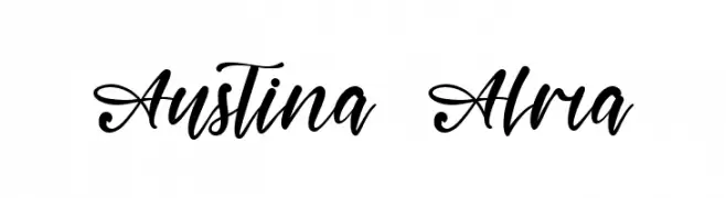
An elegant and flowing script font with graceful curves and bold flourishes.
![Austina Alma Frei Schriftart Herunterladen]() Herunterladen 50 Downloads@WebFont
Herunterladen 50 Downloads@WebFont -
( Fonts by Ahwe Project - Dida Ahluddin - Personal-use only. For commercial use please contact owner. )
A smooth, flowing script font with elegant curves and a handwritten aesthetic.
![HigherMonday-Regular Frei Schriftart Herunterladen]() Herunterladen 50 Downloads@WebFont
Herunterladen 50 Downloads@WebFont -
( Fonts by zone108.main.jp - Personal-use only. For commercial use please contact owner. )
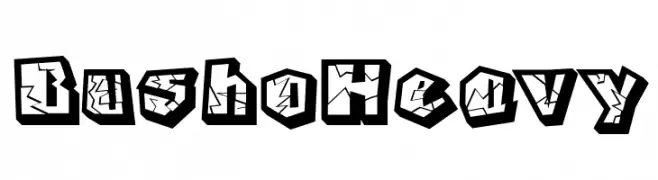
A bold, three-dimensional font with a shattered glass effect.
![Busho Heavy Frei Schriftart Herunterladen]() Herunterladen 50 Downloads@WebFont
Herunterladen 50 Downloads@WebFont -
( Fonts by CBRTEXT Studio - Muhammad Khoirul Amal - Personal-use only. For commercial use please contact owner. )
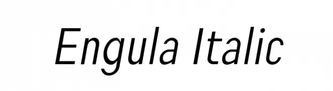
A modern italic font with clean lines and smooth curves.
![Engula Italic Frei Schriftart Herunterladen]() Herunterladen 50 Downloads@WebFont
Herunterladen 50 Downloads@WebFont -
( Iconian Fonts - Daniel Zadorozny - www.iconian.com )
A bold, italicized font with a retro-futuristic halftone effect.
![Disco Duck Halftone Italic Frei Schriftart Herunterladen]() Herunterladen 50 Downloads@WebFont
Herunterladen 50 Downloads@WebFont -
( Fonts by Green Adventure Studio - Ardi Parwito - Personal-use only. For commercial use please contact owner. )
A playful, handwritten-style font with bold, energetic characters.
![Zippy Frei Schriftart Herunterladen]() Herunterladen 50 Downloads@WebFont
Herunterladen 50 Downloads@WebFont -
( Fonts by Royaltype - Darwinoo - Personal-use only. For commercial use please contact owner. )
An elegant script font with flowing, interconnected letters and ornate swashes.
![SantaRose Frei Schriftart Herunterladen]() Herunterladen 50 Downloads@WebFont
Herunterladen 50 Downloads@WebFont -
( Fonts by CannotIntoSpaceFonts - KineticPlasma Fonts - Personal-use only. For commercial use please contact owner. )
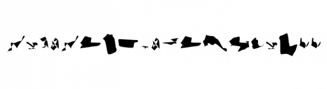
An abstract, fragmented font with a camouflage-like appearance.
![CiSf CamouflageKit II Frei Schriftart Herunterladen]() Herunterladen 50 Downloads@WebFont
Herunterladen 50 Downloads@WebFont -
( Fonts by Font People - Personal-use only. For commercial use please contact owner. )
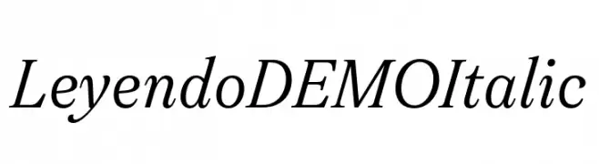
An elegant italic serif font with smooth, flowing lines and moderate contrast.
![Leyendo DEMO Italic Frei Schriftart Herunterladen]() Herunterladen 50 Downloads@WebFont
Herunterladen 50 Downloads@WebFont -
( Fonts by Letterena Studios - letterena.com - Personal-use only. For commercial use please contact owner. )
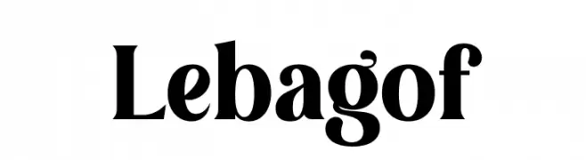
A bold, high-contrast serif font with dramatic strokes and elegant curves.
![Lebagof Frei Schriftart Herunterladen]() Herunterladen 50 Downloads@WebFont
Herunterladen 50 Downloads@WebFont -
( Fonts by Masanis Studio - Naufal Anis - Personal-use only. For commercial use please contact owner. )
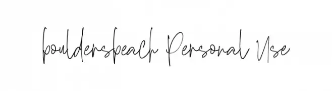
A dynamic handwritten font with fluid, irregular strokes and a creative flair.
![bouldersbeach Personal Use Frei Schriftart Herunterladen]() Herunterladen 50 Downloads@WebFont
Herunterladen 50 Downloads@WebFont -
( Fonts by UI Creative - Personal-use only. For commercial use please contact owner. )
A playful and whimsical font with rounded, consistent strokes and a friendly appearance.
![Palomas Frei Schriftart Herunterladen]() Herunterladen 50 Downloads@WebFont
Herunterladen 50 Downloads@WebFont -
( Fonts by Vz Type - Personal-use only. For commercial use please contact owner. )
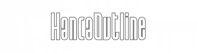
A modern, outline-style font with tall, narrow characters and consistent stroke width.
![Hanca Outline Frei Schriftart Herunterladen]() Herunterladen 50 Downloads@WebFont
Herunterladen 50 Downloads@WebFont -
( Fonts by Dirt2.com - SickCapital - Andrew Hart - Personal-use only. For commercial use please contact owner. )
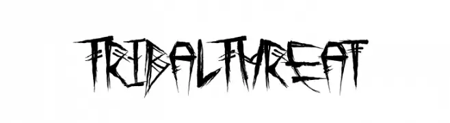
A bold, jagged font with a tribal, hand-drawn aesthetic.
![Tribal Threat Frei Schriftart Herunterladen]() Herunterladen 50 Downloads@WebFont
Herunterladen 50 Downloads@WebFont -
( Fonts by Mans Greback - www.mansgreback.com - Personal-use only. For commercial use please contact owner. )
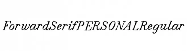
A classic serif font with elegant, slightly slanted characters and medium contrast.
![Forward Serif PERSONAL Regular Frei Schriftart Herunterladen]() Herunterladen 50 Downloads@WebFont
Herunterladen 50 Downloads@WebFont -
( Fonts by Jimtype Studio )
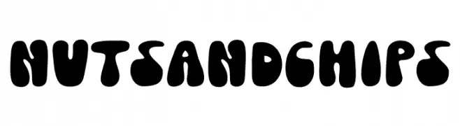
A bold, playful typeface with rounded, bubbly characters.
![Nuts And Chips Frei Schriftart Herunterladen]() Herunterladen 50 Downloads@WebFont
Herunterladen 50 Downloads@WebFont -
( Fonts by Vladimir Nikolic - www.creativefabrica.com/designer/vladimirnikolic/ - Personal-use only. For commercial use please contact owner. )
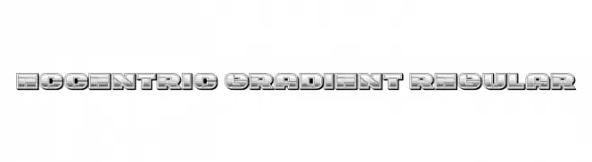
A bold, decorative font with a vintage gradient effect and three-dimensional style.
![Eccentric Gradient Regular Frei Schriftart Herunterladen]() Herunterladen 50 Downloads@WebFont
Herunterladen 50 Downloads@WebFont -
( Fonts by Edric Studio - Personal-use only. For commercial use please contact owner. )
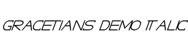
A sleek, italicized font with a modern and dynamic style.
![GRACETIANS DEMO Italic Frei Schriftart Herunterladen]() Herunterladen 50 Downloads@WebFont
Herunterladen 50 Downloads@WebFont -
( Fonts by Vultype - Candra Hamdani - Personal-use only. For commercial use please contact owner. )
An elegant, flowing script font with smooth, cursive strokes and graceful curves.
![Acelire Rosse Frei Schriftart Herunterladen]() Herunterladen 50 Downloads@WebFont
Herunterladen 50 Downloads@WebFont -
( Fonts by Kong Font - fontkong.com - Personal-use only. For commercial use please contact owner. )
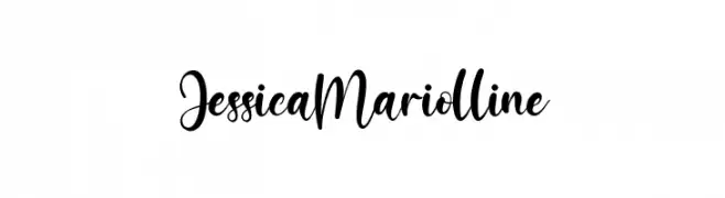
A flowing, cursive font with elegant, interconnected characters.
![JessicaMariolline Frei Schriftart Herunterladen]() Herunterladen 50 Downloads@WebFont
Herunterladen 50 Downloads@WebFont -
( Fonts by Your Own Font - Ellinor Rapp - Personal-use only. For commercial use please contact owner. )
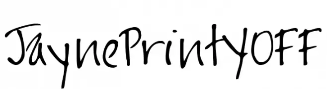
A casual, handwritten font with a playful and informal style.
![JaynePrintYOFF Frei Schriftart Herunterladen]() Herunterladen 50 Downloads@WebFont
Herunterladen 50 Downloads@WebFont -
( Fonts by Vladimir Nikolic - www.creativefabrica.com/designer/vladimirnikolic/ - Personal-use only. For commercial use please contact owner. )
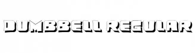
A bold, three-dimensional font with a strong, impactful presence and shadow effect.
![Dumbbell Regular Frei Schriftart Herunterladen]() Herunterladen 50 Downloads@WebFont
Herunterladen 50 Downloads@WebFont -
( Fonts by Jee Shu - Personal-use only. For commercial use please contact owner. )
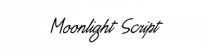
A graceful script font with fluid, connected strokes and a natural handwriting style.
![Moonlight Script Frei Schriftart Herunterladen]() Herunterladen 50 Downloads@WebFont
Herunterladen 50 Downloads@WebFont -
( Fonts by weknow - Wino S Kadir - Personal-use only. For commercial use please contact owner. )
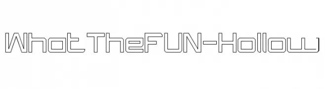
A hollow, geometric font with a modern and playful design.
![What The FUN-Hollow Frei Schriftart Herunterladen]() Herunterladen 50 Downloads@WebFont
Herunterladen 50 Downloads@WebFont -
( Jay Mann )
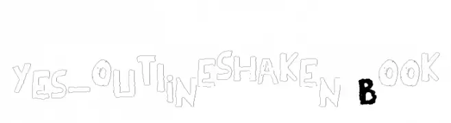
A playful, hand-drawn outline font with a quirky and informal style.
![YES_outlineshaken Book Frei Schriftart Herunterladen]() Herunterladen 50 Downloads@WebFont
Herunterladen 50 Downloads@WebFont -
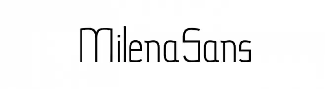
( Milena Gajovic - www.behance.net/milenagajovic )
A modern, geometric font with clean lines and a minimalist style.
![MilenaSans Frei Schriftart Herunterladen]() Herunterladen 50 Downloads@WebFont
Herunterladen 50 Downloads@WebFont -
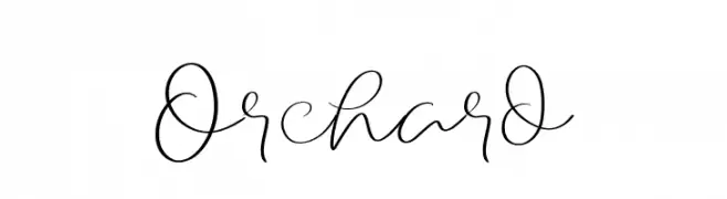
( Fonts by LetterStock - Guguh Gumantoro - Personal-use only. For commercial use please contact owner. )
A whimsical and elegant script font with fluid, interconnected strokes.
![Orchard Frei Schriftart Herunterladen]() Herunterladen 50 Downloads@WebFont
Herunterladen 50 Downloads@WebFont -
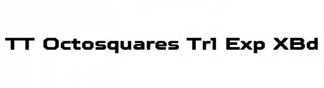
( Fonts by TypeType Foundry )
A bold, geometric font with a modern, futuristic style.
![TT Octosquares Trl Exp XBd Frei Schriftart Herunterladen]() Herunterladen 50 Downloads@WebFont
Herunterladen 50 Downloads@WebFont -
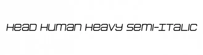
( Fonts by Daniel Zadorozny - www.iconian.com - Personal-use only. For commercial use please contact owner. )
A modern, semi-italic font with geometric precision and clean lines.
![Head Human Heavy Semi-Italic Frei Schriftart Herunterladen]() Herunterladen 50 Downloads@WebFont
Herunterladen 50 Downloads@WebFont


Welche Schriften sind gerade am populärsten?
Poppins, Roboto, Montserrat, Open Sans und Lato sind wegen ihrer klaren Formen und breiten Einsetzbarkeit sehr gefragt – von Markenauftritt über Landingpages bis hin zu Postern.
Welche Fonts eignen sich für Logos?
Geometrische Sans‑Serifs (z. B. Poppins, Familien im Gotham‑Stil) sind ein häufiger Griff für sauberes, skalierbares Branding. Für eine persönlichere Note bleiben Scripts und Handschrift‑Stile beliebt. Kombinieren Sie einen prägnanten Headline‑Font mit einer neutralen Brotschrift für Wiedererkennung und Harmonie.
Wie oft wird die Top‑Liste aktualisiert?
Regelmäßig – basierend auf realen Downloads und Interaktionen. Schauen Sie öfter vorbei, um aufstrebende Favoriten früh zu entdecken.
💡 Tipp: Seite bookmarken – Trends wechseln schnell, und heutige Top‑Schriften inspirieren morgen vielleicht das Rebranding.