Willkommen bei den Top‑Schriften – hier treffen Beliebtheit und Qualität aufeinander. Das sind die in diesem Jahr am häufigsten heruntergeladenen und genutzten Fonts. Wenn Sie sichere Optionen für Logo, Web oder Social suchen, starten Sie hier.
Jeder Top‑Font überzeugt durch Balance, Lesbarkeit und Vielseitigkeit. Sie finden moderne Sans‑Serifs, elegante Scripts, Vintage‑Serifs und minimalistische Displays.
-
( Noto is a trademark of Google Inc. Noto fonts are open source. All Noto fonts are published under the SIL Open Font License, Version 1.1 )
A clean, semi-condensed, extra light serif font with balanced spacing.
 Herunterladen 60 Downloads@WebFont
 -
( Fonts by Vladimir Nikolic - www.creativefabrica.com/designer/vladimirnikolic/ - Personal-use only. For commercial use please contact owner. )
An ornate blackletter font with bold, decorative elements and a gothic style.
![Easy Pawns Regular Frei Schriftart Herunterladen]() Herunterladen 60 Downloads@WebFont
Herunterladen 60 Downloads@WebFont -
( Fonts by Jetsmax Studio - Khairil Anwar - Personal-use only. For commercial use please contact owner. )
A playful and energetic script font with fluid, connected letterforms.
![Malino Candy Frei Schriftart Herunterladen]() Herunterladen 60 Downloads@WebFont
Herunterladen 60 Downloads@WebFont -
( Christian Munk - fontstruct.com/fontstructors/25776/cmunk )
A bold, modern decorative font with high contrast and geometric shapes.
![Infix Regular Frei Schriftart Herunterladen]() Herunterladen 60 Downloads@WebFont
Herunterladen 60 Downloads@WebFont -
( weknow - Wino S Kadir - www.creativefabrica.com/designer/weknow/ )
A modern, fluid font with thin lines and elegant curves, perfect for contemporary designs.
![karitza-Inverse Frei Schriftart Herunterladen]() Herunterladen 60 Downloads@WebFont
Herunterladen 60 Downloads@WebFont -
( Fonts by Kong Font - https://fontkong.com/ - Personal-use only. For commercial use please contact owner. )
A bold, rounded font with a modern and playful style.
![Donaldson demo Frei Schriftart Herunterladen]() Herunterladen 60 Downloads@WebFont
Herunterladen 60 Downloads@WebFont -
( LingDong Huang )
Monochrome pixel art illustrations of firearms in a retro digital style.
![FirearmEncyclope Frei Schriftart Herunterladen]() Herunterladen 60 Downloads@WebFont
Herunterladen 60 Downloads@WebFont -
( Fonts by Edric Studio - Personal-use only. For commercial use please contact owner. )
A dynamic, brush-style font with bold, expressive strokes.
![Xander Bruce Demo Frei Schriftart Herunterladen]() Herunterladen 60 Downloads@WebFont
Herunterladen 60 Downloads@WebFont -
( Fonts by ToniStudio - Fatoni Nurman - Personal-use only. For commercial use please contact owner. )
A classic serif font with high contrast and elegant, elongated letterforms.
![SIMPLE CANDY Frei Schriftart Herunterladen]() Herunterladen 60 Downloads@WebFont
Herunterladen 60 Downloads@WebFont -
( Fonts by Awanstudioz - Personal-use only. For commercial use please contact owner. )
A modern, handwritten font with a playful and casual style.
![Melatti Frei Schriftart Herunterladen]() Herunterladen 60 Downloads@WebFont
Herunterladen 60 Downloads@WebFont -
( Fonts by Iconian Fonts - Daniel Zadorozny - Personal-use only. For commercial use please contact owner. )
A bold, 3D geometric font with outlined characters and a strong visual impact.
![Fortune Soldier 3D Frei Schriftart Herunterladen]() Herunterladen 60 Downloads@WebFont
Herunterladen 60 Downloads@WebFont -
( Fonts by Letterara - Thomas Aradea - Personal-use only. For commercial use please contact owner. )
A lively, expressive handwritten font with fluid cursive letterforms.
![onlyone Frei Schriftart Herunterladen]() Herunterladen 60 Downloads@WebFont
Herunterladen 60 Downloads@WebFont -
( Fonts by Zkhai Creative - Personal-use only. For commercial use please contact owner. )
A playful handwritten font with tall, narrow letterforms and smooth strokes.
![KickQuestions Frei Schriftart Herunterladen]() Herunterladen 60 Downloads@WebFont
Herunterladen 60 Downloads@WebFont -
( Fonts by Brithos Type - Personal-use only. For commercial use please contact owner. )
A playful, handwritten font with smooth, rounded edges and a casual style.
![Junior Prince Regular Frei Schriftart Herunterladen]() Herunterladen 60 Downloads@WebFont
Herunterladen 60 Downloads@WebFont -
( Carolina Valtuille - www.carolinavaltuille.com/ )
A playful, handwritten font with a casual and friendly style.
![loBe Regular Frei Schriftart Herunterladen]() Herunterladen 60 Downloads@WebFont
Herunterladen 60 Downloads@WebFont -
( Fonts by One Design - Personal-use only. For commercial use please contact owner. )
A bold, distressed font with a jagged, grungy appearance.
![ZOMBIE Frei Schriftart Herunterladen]() Herunterladen 60 Downloads@WebFont
Herunterladen 60 Downloads@WebFont -
( Fonts by Tebaltipis Studio )
A bold, cursive script font with dynamic and fluid letterforms.
![HockieScript Frei Schriftart Herunterladen]() Herunterladen 60 Downloads@WebFont
Herunterladen 60 Downloads@WebFont -
( Fonts by ToniStudio - Fatoni Nurman - Personal-use only. For commercial use please contact owner. )
A high-contrast, elegant serif font with sharp serifs and a modern aesthetic.
![Claster Oleander Frei Schriftart Herunterladen]() Herunterladen 60 Downloads@WebFont
Herunterladen 60 Downloads@WebFont -
( Fonts by DumadiStyle )
Bold, rounded handwritten font with a playful and casual style.
![Umkm Frei Schriftart Herunterladen]() Herunterladen 60 Downloads@WebFont
Herunterladen 60 Downloads@WebFont -
( Fonts by Pen Culture - Revo Farisky - Personal-use only. For commercial use please contact owner. )
An elegant and fluid script font with a handwritten appearance.
![Scotland Frei Schriftart Herunterladen]() Herunterladen 60 Downloads@WebFont
Herunterladen 60 Downloads@WebFont -
( Fonts by Iconian Fonts - Daniel Zadorozny - Personal-use only. For commercial use please contact owner. )
A bold, expanded, and italicized font with a modern, dynamic style.
![Rogue Hero Expanded Italic Frei Schriftart Herunterladen]() Herunterladen 60 Downloads@WebFont
Herunterladen 60 Downloads@WebFont -
( Mikrojihad Font - fontbundles.net/mikrojihad )
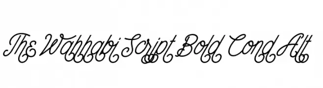
An elegant, bold script font with intricate, flowing characters.
![The Wahhabi Script Bold Cond Alt Frei Schriftart Herunterladen]() Herunterladen 60 Downloads@WebFont
Herunterladen 60 Downloads@WebFont -
( Noto is a trademark of Google Inc. Noto fonts are open source. All Noto fonts are published under the SIL Open Font License, Version 1.1 )
A highly condensed, extra bold font with a modern and clean design.
![Noto Sans Lao ExtraCondensed ExtraBold Frei Schriftart Herunterladen]() Herunterladen 60 Downloads@WebFont
Herunterladen 60 Downloads@WebFont -
( Fonts by Kotak Kuning Studio - kotakkuning.com - Personal-use only. For commercial use please contact owner. )
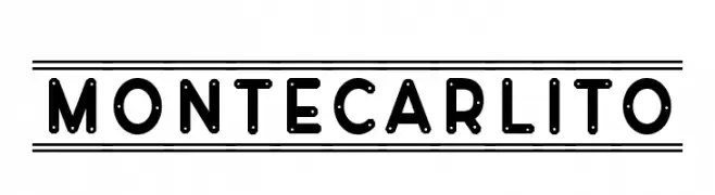
A bold, geometric font with industrial and playful elements.
![Montecarlito Frei Schriftart Herunterladen]() Herunterladen 60 Downloads@WebFont
Herunterladen 60 Downloads@WebFont -
( Fonts by AZ Std - Muh Aswar - Personal-use only. For commercial use please contact owner. )
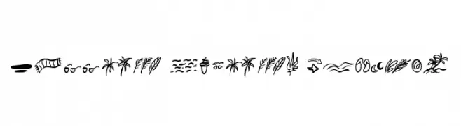
A playful and whimsical dingbat set capturing the essence of summer with hand-drawn elements.
![Summer Lovers Dingbat Frei Schriftart Herunterladen]() Herunterladen 60 Downloads@WebFont
Herunterladen 60 Downloads@WebFont -
( Fonts by Axara Type - Personal-use only. For commercial use please contact owner. )
A cursive script font with elegant, interconnected letters and a classic calligraphic style.
![Francaise Regular [demo] Frei Schriftart Herunterladen]() Herunterladen 60 Downloads@WebFont
Herunterladen 60 Downloads@WebFont -
( Fonts by Hatf Type - Personal-use only. For commercial use please contact owner. )
A modern, cursive font with elegant, flowing letterforms and dynamic stroke contrast.
![Maidstone Frei Schriftart Herunterladen]() Herunterladen 60 Downloads@WebFont
Herunterladen 60 Downloads@WebFont -
( Fonts by Iconian Fonts - Daniel Zadorozny - Personal-use only. For commercial use please contact owner. )
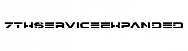
A bold, futuristic font with geometric shapes and sharp angles.
![7th Service Expanded Frei Schriftart Herunterladen]() Herunterladen 60 Downloads@WebFont
Herunterladen 60 Downloads@WebFont -
( Fonts by Aksarangga Studio - Personal-use only. For commercial use please contact owner. )
A playful and elegant script font with smooth, flowing lines and a handwritten feel.
![Talita Frei Schriftart Herunterladen]() Herunterladen 60 Downloads@WebFont
Herunterladen 60 Downloads@WebFont -
( Fonts by Joseph Dawson - Personal-use only. For commercial use please contact owner. )
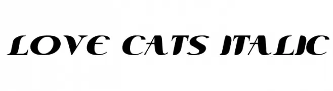
A bold, italic font with sweeping curves and a modern calligraphic style.
![Love Cats Italic Frei Schriftart Herunterladen]() Herunterladen 60 Downloads@WebFont
Herunterladen 60 Downloads@WebFont -
( Fonts by Kong Font - Personal-use only. For commercial use please contact owner. )
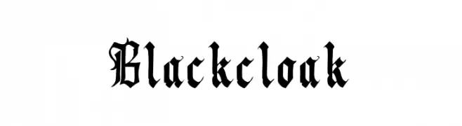
A bold, ornate Blackletter font with intricate, angular letterforms.
![Blackcloak Frei Schriftart Herunterladen]() Herunterladen 60 Downloads@WebFont
Herunterladen 60 Downloads@WebFont -
( Fonts by Utopia 19 - Ayah Phoen - Personal-use only. For commercial use please contact owner. )
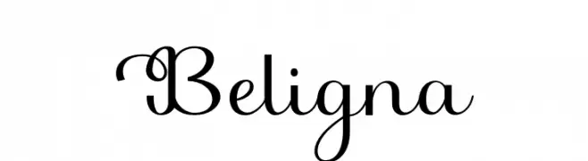
A decorative cursive font with elegant swashes and smooth, connected letters.
![Beligna Frei Schriftart Herunterladen]() Herunterladen 60 Downloads@WebFont
Herunterladen 60 Downloads@WebFont -
( Fonts by Carolina Bettencourt - Personal-use only. For commercial use please contact owner. )
A modern, geometric font with a sleek and technical appearance.
![RADIUS Frei Schriftart Herunterladen]() Herunterladen 60 Downloads@WebFont
Herunterladen 60 Downloads@WebFont -
( Fonts by DenderType Studio - Personal-use only. For commercial use please contact owner. )
An elegant script font with flowing, continuous strokes and graceful curves.
![Astamaya Frei Schriftart Herunterladen]() Herunterladen 60 Downloads@WebFont
Herunterladen 60 Downloads@WebFont -
( Fonts by Mabhal Studio - Abdullah - Personal-use only. For commercial use please contact owner. )
A dynamic and fluid script font with elegant, flowing letterforms.
![Engind Frei Schriftart Herunterladen]() Herunterladen 60 Downloads@WebFont
Herunterladen 60 Downloads@WebFont


![Francaise Regular [demo] Frei Schriftart Herunterladen](https://d144mzi0q5mijx.cloudfront.net/img/F/R/Francaise-Regular-demo.webp)


Welche Schriften sind gerade am populärsten?
Poppins, Roboto, Montserrat, Open Sans und Lato sind wegen ihrer klaren Formen und breiten Einsetzbarkeit sehr gefragt – von Markenauftritt über Landingpages bis hin zu Postern.
Welche Fonts eignen sich für Logos?
Geometrische Sans‑Serifs (z. B. Poppins, Familien im Gotham‑Stil) sind ein häufiger Griff für sauberes, skalierbares Branding. Für eine persönlichere Note bleiben Scripts und Handschrift‑Stile beliebt. Kombinieren Sie einen prägnanten Headline‑Font mit einer neutralen Brotschrift für Wiedererkennung und Harmonie.
Wie oft wird die Top‑Liste aktualisiert?
Regelmäßig – basierend auf realen Downloads und Interaktionen. Schauen Sie öfter vorbei, um aufstrebende Favoriten früh zu entdecken.
💡 Tipp: Seite bookmarken – Trends wechseln schnell, und heutige Top‑Schriften inspirieren morgen vielleicht das Rebranding.