Willkommen bei den Top‑Schriften – hier treffen Beliebtheit und Qualität aufeinander. Das sind die in diesem Jahr am häufigsten heruntergeladenen und genutzten Fonts. Wenn Sie sichere Optionen für Logo, Web oder Social suchen, starten Sie hier.
Jeder Top‑Font überzeugt durch Balance, Lesbarkeit und Vielseitigkeit. Sie finden moderne Sans‑Serifs, elegante Scripts, Vintage‑Serifs und minimalistische Displays.
-
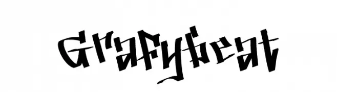
( Fonts by Creaditive Design )
A bold, graffiti-inspired font with sharp, angular lines and dynamic movement.
 Herunterladen 58 Downloads@WebFont
 -
( Fonts by Daniel Zadorozny - www.iconian.com - Personal-use only. For commercial use please contact owner. )
A bold, outlined, semi-italic font with a modern, dynamic style.
![Blizzard Shaft Outline SemItal Frei Schriftart Herunterladen]() Herunterladen 58 Downloads@WebFont
Herunterladen 58 Downloads@WebFont -
( Fonts by DmLetter31 - Dimas Prasetyo - Personal-use only. For commercial use please contact owner. )
A dynamic and flowing script font with elegant cursive letterforms.
![Omarta Frei Schriftart Herunterladen]() Herunterladen 58 Downloads@WebFont
Herunterladen 58 Downloads@WebFont -
( Fonts by twinletter - Rozikan - Personal-use only. For commercial use please contact owner. )
A bold, rounded font with a strong and friendly appearance.
![Jreng Frei Schriftart Herunterladen]() Herunterladen 58 Downloads@WebFont
Herunterladen 58 Downloads@WebFont -
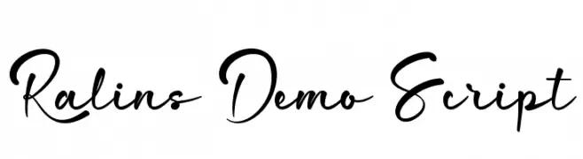
( Fonts by CalligraphyFonts - Personal-use only. For commercial use please contact owner. )
A flowing, elegant script font with a modern calligraphic style.
![Ralins Demo Script Frei Schriftart Herunterladen]() Herunterladen 58 Downloads@WebFont
Herunterladen 58 Downloads@WebFont -
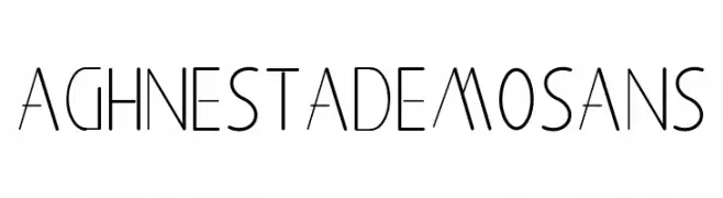
( Fonts by Edric Studio - Personal-use only. For commercial use please contact owner. )
A modern, geometric font with clean lines and a minimalist style.
![Aghnestademo Sans Frei Schriftart Herunterladen]() Herunterladen 58 Downloads@WebFont
Herunterladen 58 Downloads@WebFont -
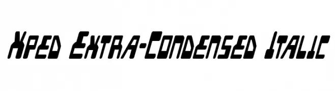
( Iconian Fonts - Daniel Zadorozny - www.iconian.com )
A modern, extra-condensed italic font with bold, angular strokes.
![Xped Extra-Condensed Italic Frei Schriftart Herunterladen]() Herunterladen 58 Downloads@WebFont
Herunterladen 58 Downloads@WebFont -
( Typodermic Fonts - Ray Larabie - www.typodermicfonts.com/ )
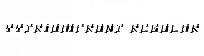
A bold, angular font with a futuristic and edgy style.
![YytriumFront-Regular Frei Schriftart Herunterladen]() Herunterladen 58 Downloads@WebFont
Herunterladen 58 Downloads@WebFont -
( Noto is a trademark of Google Inc. Noto fonts are open source. All Noto fonts are published under the SIL Open Font License, Version 1.1 )
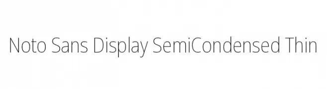
A modern, thin sans-serif font with a semi-condensed style.
![Noto Sans Display SemiCondensed Thin Frei Schriftart Herunterladen]() Herunterladen 58 Downloads@WebFont
Herunterladen 58 Downloads@WebFont -
( Fonts by Esa Nugroho - Esa Prasetio Nugroho - Personal-use only. For commercial use please contact owner. )
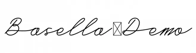
A refined, cursive script font with elegant, flowing lines.
![Basella-Demo Frei Schriftart Herunterladen]() Herunterladen 58 Downloads@WebFont
Herunterladen 58 Downloads@WebFont -
( Iconian Fonts - Daniel Zadorozny - www.iconian.com )
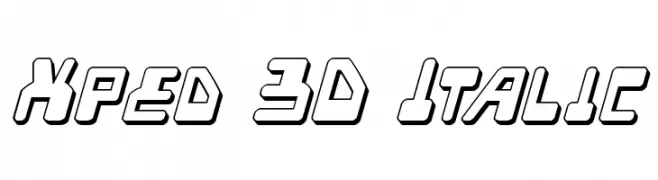
A bold, 3D italic font with a futuristic and dynamic style.
![Xped 3D Italic Frei Schriftart Herunterladen]() Herunterladen 58 Downloads@WebFont
Herunterladen 58 Downloads@WebFont -
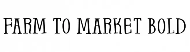
( Fonts by Brittney Murphy Design - Brittney Murphy - Personal-use only. For commercial use please contact owner. )
A bold, playful font with a hand-drawn, whimsical style.
![Farm to Market Bold Frei Schriftart Herunterladen]() Herunterladen 58 Downloads@WebFont
Herunterladen 58 Downloads@WebFont -
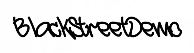
( Fonts by Esa Nugroho - Esa Prasetio Nugroho - Personal-use only. For commercial use please contact owner. )
A bold, graffiti-inspired font with dynamic and playful strokes.
![BlackStreet Demo Frei Schriftart Herunterladen]() Herunterladen 58 Downloads@WebFont
Herunterladen 58 Downloads@WebFont -
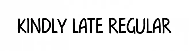
( Fonts by Hugefonts - Personal-use only. For commercial use please contact owner. )
A playful, handwritten font with smooth curves and a friendly appearance.
![kindly late Regular Frei Schriftart Herunterladen]() Herunterladen 58 Downloads@WebFont
Herunterladen 58 Downloads@WebFont -
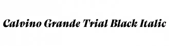
( Fonts by Zetafonts - Personal-use only. For commercial use please contact owner. )
A bold, italic font with high contrast and sharp serifs, exuding elegance and dynamism.
![Calvino Grande Trial Black Italic Frei Schriftart Herunterladen]() Herunterladen 58 Downloads@WebFont
Herunterladen 58 Downloads@WebFont -
( Iconian Fonts - Daniel Zadorozny - www.iconian.com )
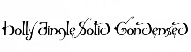
An ornate and decorative font with intricate swirls and flourishes.
![Holly Jingle Solid Condensed Frei Schriftart Herunterladen]() Herunterladen 58 Downloads@WebFont
Herunterladen 58 Downloads@WebFont -
( Fonts by Typotopia Studio - Personal-use only. For commercial use please contact owner. )
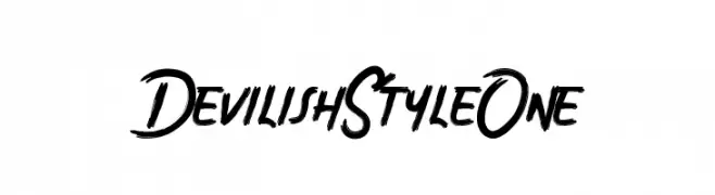
A bold, edgy font with sharp, angular strokes and a dynamic feel.
![Devilish Style One Frei Schriftart Herunterladen]() Herunterladen 58 Downloads@WebFont
Herunterladen 58 Downloads@WebFont -
( Fonts by FallenGraphic Studio - Vava Aryanto - Personal-use only. For commercial use please contact owner. )
An elegant, flowing script font with intricate loops and swirls.
![Rottrydam Wargna Personal Use Frei Schriftart Herunterladen]() Herunterladen 58 Downloads@WebFont
Herunterladen 58 Downloads@WebFont -
( Fonts by Wahyu Studio - Wahyu Setiyawan - Personal-use only. For commercial use please contact owner. )
A playful, handwritten script font with decorative swashes and loops.
![Wallflowers Frei Schriftart Herunterladen]() Herunterladen 58 Downloads@WebFont
Herunterladen 58 Downloads@WebFont -
( Fonts by Daniel Zadorozny - www.iconian.com - Personal-use only. For commercial use please contact owner. )
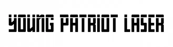
A bold, geometric font with a futuristic and industrial style.
![Young Patriot Laser Frei Schriftart Herunterladen]() Herunterladen 58 Downloads@WebFont
Herunterladen 58 Downloads@WebFont -
( weknow - Wino S Kadir - www.creativefabrica.com/designer/weknow/ )
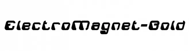
A bold, futuristic font with geometric shapes and smooth curves.
![ElectroMagnet-Bold Frei Schriftart Herunterladen]() Herunterladen 58 Downloads@WebFont
Herunterladen 58 Downloads@WebFont -
![Right Hand Hairline Dash Frei Schriftart Herunterladen]() Herunterladen 58 Downloads@WebFont
Herunterladen 58 Downloads@WebFont -
( Fonts by Daniel Zadorozny - www.iconian.com - Personal-use only. For commercial use please contact owner. )
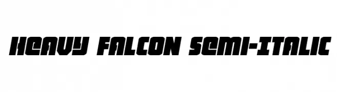
A bold, semi-italic font with a modern and dynamic style.
![Heavy Falcon Semi-Italic Frei Schriftart Herunterladen]() Herunterladen 58 Downloads@WebFont
Herunterladen 58 Downloads@WebFont -
( Fonts by Aglap - awan - Personal-use only. For commercial use please contact owner. )
A modern, elegant script font with flowing, cursive characters.
![manoe Frei Schriftart Herunterladen]() Herunterladen 58 Downloads@WebFont
Herunterladen 58 Downloads@WebFont -
( Fonts by Siti Nurjannah - Personal-use only. For commercial use please contact owner. )
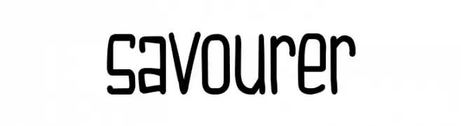
A playful, handwritten font with rounded, uniform strokes.
![Savourer Frei Schriftart Herunterladen]() Herunterladen 58 Downloads@WebFont
Herunterladen 58 Downloads@WebFont -
( Fonts by Tigadestd - Doli Harahap - Personal-use only. For commercial use please contact owner. )
A playful, handwritten font with a casual and friendly style.
![Quick Note Frei Schriftart Herunterladen]() Herunterladen 58 Downloads@WebFont
Herunterladen 58 Downloads@WebFont -
( Fonts by Ana - Personal-use only. For commercial use please contact owner. )
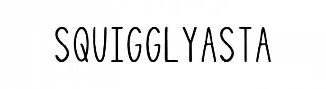
A playful, handwritten font with tall, narrow letters and consistent stroke width.
![Squiggly Asta Frei Schriftart Herunterladen]() Herunterladen 58 Downloads@WebFont
Herunterladen 58 Downloads@WebFont -
( Fonts by Bagas Ardiatma - Personal-use only. For commercial use please contact owner. )
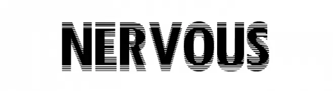
A bold, modern font with a glitch effect and high contrast.
![Nervous Frei Schriftart Herunterladen]() Herunterladen 58 Downloads@WebFont
Herunterladen 58 Downloads@WebFont -
( Fonts by Polah Type - Personal-use only. For commercial use please contact owner. )
A playful, bold font with rounded, bubbly characters.
![Go Mocha Frei Schriftart Herunterladen]() Herunterladen 58 Downloads@WebFont
Herunterladen 58 Downloads@WebFont -
( weknow - Wino S Kadir - www.creativefabrica.com/designer/weknow/ )
A bold, italicized font with a futuristic and dynamic style.
![SPIDER Bold Italic Frei Schriftart Herunterladen]() Herunterladen 58 Downloads@WebFont
Herunterladen 58 Downloads@WebFont -
( Fonts by Alpaprana - Personal-use only. For commercial use please contact owner. )
A bold, textured font with a playful, hand-drawn style and a snowy effect.
![Snow Candy Snow Frei Schriftart Herunterladen]() Herunterladen 58 Downloads@WebFont
Herunterladen 58 Downloads@WebFont -
( Noto is a trademark of Google Inc. Noto fonts are open source. All Noto fonts are published under the SIL Open Font License, Version 1.1 )
A thin, condensed, and modern sans-serif font with tight spacing.
![Noto Sans Thai Condensed Thin Frei Schriftart Herunterladen]() Herunterladen 58 Downloads@WebFont
Herunterladen 58 Downloads@WebFont -
( Fonts by ingoFonts - Ingo Zimmermann - Personal-use only. For commercial use please contact owner. )
A bold, italicized font with a modern and dynamic style.
![Josef Reduced Bold Italic Frei Schriftart Herunterladen]() Herunterladen 58 Downloads@WebFont
Herunterladen 58 Downloads@WebFont -
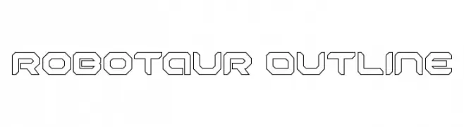
( Fonts by Iconian Fonts - Daniel Zadorozny - Personal-use only. For commercial use please contact owner. )
A futuristic, geometric outline font with a robotic aesthetic.
![Robotaur Outline Frei Schriftart Herunterladen]() Herunterladen 58 Downloads@WebFont
Herunterladen 58 Downloads@WebFont -
( Fonts by Jujun Gag - Personal-use only. For commercial use please contact owner. )
A playful, hand-drawn font with bold, irregular strokes and a whimsical style.
![Scout Kind Frei Schriftart Herunterladen]() Herunterladen 58 Downloads@WebFont
Herunterladen 58 Downloads@WebFont


Welche Schriften sind gerade am populärsten?
Poppins, Roboto, Montserrat, Open Sans und Lato sind wegen ihrer klaren Formen und breiten Einsetzbarkeit sehr gefragt – von Markenauftritt über Landingpages bis hin zu Postern.
Welche Fonts eignen sich für Logos?
Geometrische Sans‑Serifs (z. B. Poppins, Familien im Gotham‑Stil) sind ein häufiger Griff für sauberes, skalierbares Branding. Für eine persönlichere Note bleiben Scripts und Handschrift‑Stile beliebt. Kombinieren Sie einen prägnanten Headline‑Font mit einer neutralen Brotschrift für Wiedererkennung und Harmonie.
Wie oft wird die Top‑Liste aktualisiert?
Regelmäßig – basierend auf realen Downloads und Interaktionen. Schauen Sie öfter vorbei, um aufstrebende Favoriten früh zu entdecken.
💡 Tipp: Seite bookmarken – Trends wechseln schnell, und heutige Top‑Schriften inspirieren morgen vielleicht das Rebranding.