Willkommen bei den Top‑Schriften – hier treffen Beliebtheit und Qualität aufeinander. Das sind die in diesem Jahr am häufigsten heruntergeladenen und genutzten Fonts. Wenn Sie sichere Optionen für Logo, Web oder Social suchen, starten Sie hier.
Jeder Top‑Font überzeugt durch Balance, Lesbarkeit und Vielseitigkeit. Sie finden moderne Sans‑Serifs, elegante Scripts, Vintage‑Serifs und minimalistische Displays.
-
( Fonts by Levi Szekeres - Personal-use only. For commercial use please contact owner. )
A bold, distressed font with a vintage, industrial feel.
 Herunterladen 58 Downloads@WebFont
 -
( Fonts by Weape Studio - Wahyu Andi - Personal-use only. For commercial use please contact owner. )
A bold, brush-style font with dynamic, high-contrast strokes.
![Balleho Frei Schriftart Herunterladen]() Herunterladen 58 Downloads@WebFont
Herunterladen 58 Downloads@WebFont -
( Fonts by ingoFonts - Ingo Zimmermann - Personal-use only. For commercial use please contact owner. )
A bold, rounded font with smooth curves and a modern, friendly appearance.
![Josefa Rounded Reduced Bold Frei Schriftart Herunterladen]() Herunterladen 58 Downloads@WebFont
Herunterladen 58 Downloads@WebFont -
( Fonts by Subectype & Orenari - Rangga Subekti & Ari - Personal-use only. For commercial use please contact owner. )
A playful, handwritten font with a casual and dynamic style.
![Sunday Mood Frei Schriftart Herunterladen]() Herunterladen 58 Downloads@WebFont
Herunterladen 58 Downloads@WebFont -
( Iconian Fonts - Daniel Zadorozny - www.iconian.com )
A bold, italicized font with a halftone effect, offering a dynamic and futuristic style.
![Nightwraith Halftone Italic Frei Schriftart Herunterladen]() Herunterladen 58 Downloads@WebFont
Herunterladen 58 Downloads@WebFont -
( Fonts by Alexandre Liziard & Etienne Ozeary - Personal-use only. For commercial use please contact owner. )
A dot matrix style font with a retro digital appearance.
![ManifontGroteskBookDot Frei Schriftart Herunterladen]() Herunterladen 58 Downloads@WebFont
Herunterladen 58 Downloads@WebFont -
( Fonts by Muhammad Novianto - Personal-use only. For commercial use please contact owner. )
A cursive, handwritten font with elegant, flowing strokes.
![Westhamp Frei Schriftart Herunterladen]() Herunterladen 58 Downloads@WebFont
Herunterladen 58 Downloads@WebFont -
( Fonts by PutraCetol Studio - www.putracetol.com - Personal-use only. For commercial use please contact owner. )
A dynamic and elegant script font with flowing curves and artistic flair.
![Micayla Frei Schriftart Herunterladen]() Herunterladen 58 Downloads@WebFont
Herunterladen 58 Downloads@WebFont -
( Fonts by StringLabs - stringlabscreative.com - Personal-use only. For commercial use please contact owner. )
A bold, expressive handwritten font with fluid, dynamic strokes.
![Ahmad Sutomi Frei Schriftart Herunterladen]() Herunterladen 58 Downloads@WebFont
Herunterladen 58 Downloads@WebFont -
( Fonts by Vunira Design - Personal-use only. For commercial use please contact owner. )
A bold, geometric font with a futuristic and dynamic style.
![StarforceFREE Frei Schriftart Herunterladen]() Herunterladen 58 Downloads@WebFont
Herunterladen 58 Downloads@WebFont -
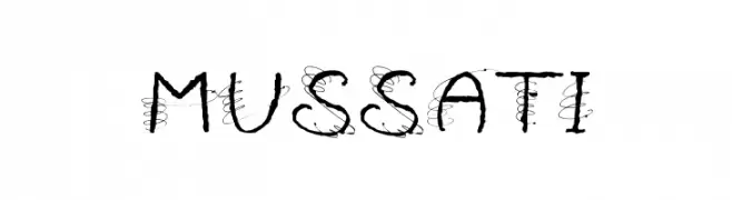
( Walter Paggioro - www.raptuscreativi.com/site/fields/type-design/ )
A whimsical, hand-drawn font with intricate, swirling embellishments.
![MUSSATI Frei Schriftart Herunterladen]() Herunterladen 58 Downloads@WebFont
Herunterladen 58 Downloads@WebFont -
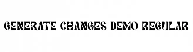
( Fonts by 177Studio )
A bold, decorative font with sharp angles and thick strokes.
![Generate Changes Demo Regular Frei Schriftart Herunterladen]() Herunterladen 58 Downloads@WebFont
Herunterladen 58 Downloads@WebFont -
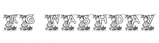
( Katz Fontz - katzfonts.50megs.com/kg.html )
A playful, decorative font with letters hanging on a clothesline, ideal for creative projects.
![KG WASHDAY Frei Schriftart Herunterladen]() Herunterladen 58 Downloads@WebFont
Herunterladen 58 Downloads@WebFont -
( Noto is a trademark of Google Inc. Noto fonts are open source. All Noto fonts are published under the SIL Open Font License, Version 1.1 )
A sleek, extra condensed font with thin strokes and a modern aesthetic.
![Noto Serif Lao ExtraCondensed Thin Frei Schriftart Herunterladen]() Herunterladen 58 Downloads@WebFont
Herunterladen 58 Downloads@WebFont -
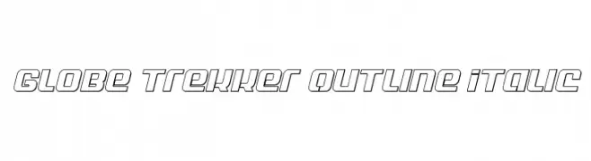
( Fonts by Daniel Zadorozny - www.iconian.com - Personal-use only. For commercial use please contact owner. )
A bold, outlined, italic font with a modern and dynamic style.
![Globe Trekker Outline Italic Frei Schriftart Herunterladen]() Herunterladen 58 Downloads@WebFont
Herunterladen 58 Downloads@WebFont -
( Fonts by Daniel Zadorozny - www.iconian.com - Personal-use only. For commercial use please contact owner. )
A bold, condensed, and italicized futuristic font with high contrast and geometric shapes.
![Yamagachi 2050 Condensed Italic Frei Schriftart Herunterladen]() Herunterladen 58 Downloads@WebFont
Herunterladen 58 Downloads@WebFont -
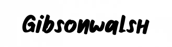
( Fonts by LetterStock - Guguh Gumantoro - Personal-use only. For commercial use please contact owner. )
A bold, handwritten-style font with a playful and energetic appearance.
![Gibsonwalsh Frei Schriftart Herunterladen]() Herunterladen 58 Downloads@WebFont
Herunterladen 58 Downloads@WebFont -
( Fonts by Letterative Studio - Personal-use only. For commercial use please contact owner. )
A graceful and elegant script font with flowing, cursive letterforms.
![Oriental Dream Frei Schriftart Herunterladen]() Herunterladen 58 Downloads@WebFont
Herunterladen 58 Downloads@WebFont -
( Fonts by Iconian Fonts - Daniel Zadorozny - Personal-use only. For commercial use please contact owner. )
A bold, geometric font with angular lines and a modern, digital aesthetic.
![Commonwealth Frei Schriftart Herunterladen]() Herunterladen 58 Downloads@WebFont
Herunterladen 58 Downloads@WebFont -
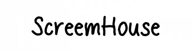
( Fonts by Mans Greback - www.mansgreback.com - Personal-use only. For commercial use please contact owner. )
A playful, handwritten font with an informal and friendly style.
![Screem House Frei Schriftart Herunterladen]() Herunterladen 58 Downloads@WebFont
Herunterladen 58 Downloads@WebFont -
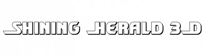
( Fonts by Daniel Zadorozny - www.iconian.com - Personal-use only. For commercial use please contact owner. )
A bold, 3D font with geometric lines and a modern, futuristic style.
![Shining Herald 3D Frei Schriftart Herunterladen]() Herunterladen 58 Downloads@WebFont
Herunterladen 58 Downloads@WebFont -
( Fonts by Mans Greback - Personal-use only. For commercial use please contact owner. )
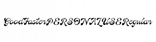
A bold, flowing script font with elegant, cursive letterforms.
![Good Faster PERSONAL USE Regular Frei Schriftart Herunterladen]() Herunterladen 58 Downloads@WebFont
Herunterladen 58 Downloads@WebFont -
( Fonts by Minetype Studio - Personal-use only. For commercial use please contact owner. )
A playful and elegant handwritten script font with smooth, flowing curves.
![Elfizha Frei Schriftart Herunterladen]() Herunterladen 58 Downloads@WebFont
Herunterladen 58 Downloads@WebFont -
( Fonts by Riki - Personal-use only. For commercial use please contact owner. )
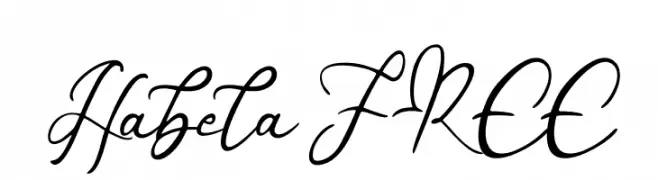
An elegant, flowing script font with a cursive, handwritten style.
![Habela FREE Frei Schriftart Herunterladen]() Herunterladen 58 Downloads@WebFont
Herunterladen 58 Downloads@WebFont -
( Iconian Fonts - Daniel Zadorozny - www.iconian.com )
A bold, futuristic font with angular, geometric shapes and a semi-italic style.
![Pulsar Class Solid Semi-Italic Frei Schriftart Herunterladen]() Herunterladen 58 Downloads@WebFont
Herunterladen 58 Downloads@WebFont -
( Fonts by dcoxy - Greg Medina - Personal-use only. For commercial use please contact owner. )
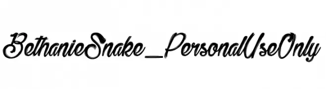
A bold, dynamic brush script font with sweeping strokes and fluid motion.
![Bethanie Snake_PersonalUseOnly Frei Schriftart Herunterladen]() Herunterladen 58 Downloads@WebFont
Herunterladen 58 Downloads@WebFont -
( Fonts by NendesKombet )
![Salmanda Frei Schriftart Herunterladen]() Herunterladen 58 Downloads@WebFont
Herunterladen 58 Downloads@WebFont -
( Fonts by InksTypia Studio - Andi Winarno - Personal-use only. For commercial use please contact owner. )
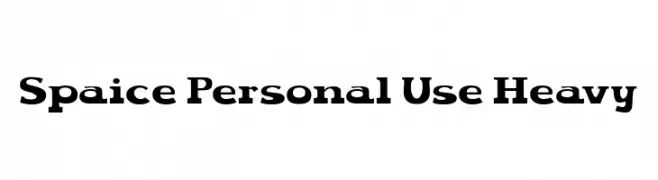
A bold, heavy font with strong strokes and a modern aesthetic.
![Spaice Personal Use Heavy Frei Schriftart Herunterladen]() Herunterladen 58 Downloads@WebFont
Herunterladen 58 Downloads@WebFont -
( Fonts by Ryul Davidson - Personal-use only. For commercial use please contact owner. )
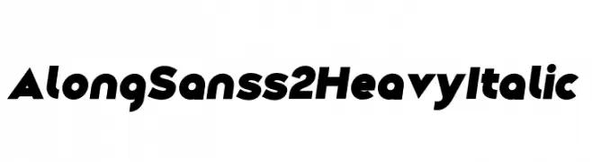
A bold, italicized font with a modern and dynamic style.
![Along Sans s2 HeavyItalic Frei Schriftart Herunterladen]() Herunterladen 58 Downloads@WebFont
Herunterladen 58 Downloads@WebFont -
( Fonts by Zetafonts - Personal-use only. For commercial use please contact owner. )
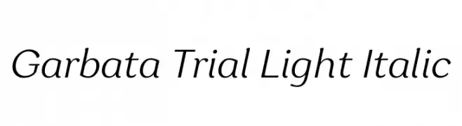
A sleek, light, and italicized font with a modern and elegant style.
![Garbata Trial Light Italic Frei Schriftart Herunterladen]() Herunterladen 58 Downloads@WebFont
Herunterladen 58 Downloads@WebFont -
( Fonts by Kotak Kuning Studio - kotakkuning.com - Personal-use only. For commercial use please contact owner. )
A fluid and elegant script font with a handwritten signature style.
![Raymond Signature Frei Schriftart Herunterladen]() Herunterladen 58 Downloads@WebFont
Herunterladen 58 Downloads@WebFont -
( Fonts by Typodermic Fonts - Raymond Larabie - Personal-use only. For commercial use please contact owner. )
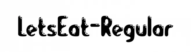
A playful, bold font with a dripping, textured appearance.
![LetsEat-Regular Frei Schriftart Herunterladen]() Herunterladen 58 Downloads@WebFont
Herunterladen 58 Downloads@WebFont -
( Fonts by StringLabs - stringlabscreative.com - Personal-use only. For commercial use please contact owner. )
An elegant script font with flowing, cursive letters and intricate flourishes.
![TheSaily Frei Schriftart Herunterladen]() Herunterladen 58 Downloads@WebFont
Herunterladen 58 Downloads@WebFont -
( Fonts by Letterena Studios - letterena.com - Personal-use only. For commercial use please contact owner. )
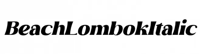
A bold, italic font with strong curves and a modern, dynamic style.
![Beach Lombok Italic Frei Schriftart Herunterladen]() Herunterladen 58 Downloads@WebFont
Herunterladen 58 Downloads@WebFont -
( Fonts by Symbiotic Design - Doug Peters - Personal-use only. For commercial use please contact owner. )
A bold, angular font with a futuristic and edgy design.
![Anticipatio Frei Schriftart Herunterladen]() Herunterladen 58 Downloads@WebFont
Herunterladen 58 Downloads@WebFont


Welche Schriften sind gerade am populärsten?
Poppins, Roboto, Montserrat, Open Sans und Lato sind wegen ihrer klaren Formen und breiten Einsetzbarkeit sehr gefragt – von Markenauftritt über Landingpages bis hin zu Postern.
Welche Fonts eignen sich für Logos?
Geometrische Sans‑Serifs (z. B. Poppins, Familien im Gotham‑Stil) sind ein häufiger Griff für sauberes, skalierbares Branding. Für eine persönlichere Note bleiben Scripts und Handschrift‑Stile beliebt. Kombinieren Sie einen prägnanten Headline‑Font mit einer neutralen Brotschrift für Wiedererkennung und Harmonie.
Wie oft wird die Top‑Liste aktualisiert?
Regelmäßig – basierend auf realen Downloads und Interaktionen. Schauen Sie öfter vorbei, um aufstrebende Favoriten früh zu entdecken.
💡 Tipp: Seite bookmarken – Trends wechseln schnell, und heutige Top‑Schriften inspirieren morgen vielleicht das Rebranding.