Willkommen bei den Top‑Schriften – hier treffen Beliebtheit und Qualität aufeinander. Das sind die in diesem Jahr am häufigsten heruntergeladenen und genutzten Fonts. Wenn Sie sichere Optionen für Logo, Web oder Social suchen, starten Sie hier.
Jeder Top‑Font überzeugt durch Balance, Lesbarkeit und Vielseitigkeit. Sie finden moderne Sans‑Serifs, elegante Scripts, Vintage‑Serifs und minimalistische Displays.
-
( Fonts by SheillaType - Muhammad Taufiq - Personal-use only. For commercial use please contact owner. )
A modern, geometric font with clean lines and balanced spacing.
 Herunterladen 58 Downloads@WebFont
 -
( Fonts by FHFont - Ferry Hadriyan - Personal-use only. For commercial use please contact owner. )
A lively and expressive handwritten font with dynamic strokes.
![SaluteRichesFree Frei Schriftart Herunterladen]() Herunterladen 58 Downloads@WebFont
Herunterladen 58 Downloads@WebFont -
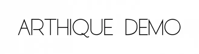
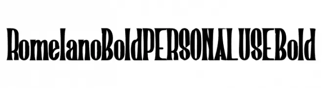
( Fonts by Mans Greback - www.mansgreback.com - Personal-use only. For commercial use please contact owner. )
A bold, dynamic font with tall, slightly condensed characters and a strong presence.
![Romelano Bold PERSONAL USE Bold Frei Schriftart Herunterladen]() Herunterladen 58 Downloads@WebFont
Herunterladen 58 Downloads@WebFont -
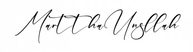
( Fonts by Letterena Studios )
A decorative, high-contrast script with expressive, handwritten flair.
![Marttha Unsllah Frei Schriftart Herunterladen]() Herunterladen 58 Downloads@WebFont
Herunterladen 58 Downloads@WebFont -
( Fonts by Rajman - Personal-use only. For commercial use please contact owner. )
A modern, geometric font with sharp angles and decorative elements.
![abdun Frei Schriftart Herunterladen]() Herunterladen 58 Downloads@WebFont
Herunterladen 58 Downloads@WebFont -
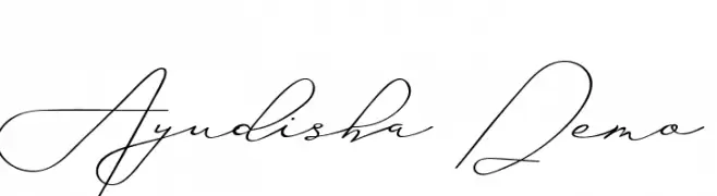
( Fonts by Ruangkerja - Rudy Muhardika - Personal-use only. For commercial use please contact owner. )
A sophisticated script font with flowing, interconnected strokes and elegant curves.
![Ayudisha Demo Frei Schriftart Herunterladen]() Herunterladen 58 Downloads@WebFont
Herunterladen 58 Downloads@WebFont -
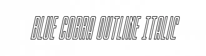
( Fonts by Daniel Zadorozny - www.iconian.com - Personal-use only. For commercial use please contact owner. )
A bold, italicized outline font with a modern and dynamic style.
![Blue Cobra Outline Italic Frei Schriftart Herunterladen]() Herunterladen 58 Downloads@WebFont
Herunterladen 58 Downloads@WebFont -
( Fonts by ijem - Ferdiansyah Ferdiansyah - Personal-use only. For commercial use please contact owner. )
A bold, handwritten-style font with a playful and artistic flair.
![ONFRENDS Frei Schriftart Herunterladen]() Herunterladen 58 Downloads@WebFont
Herunterladen 58 Downloads@WebFont -
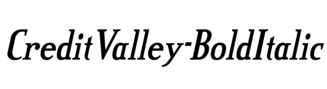
( Fonts by Typodermic Fonts - Raymond Larabie - Personal-use only. For commercial use please contact owner. )
A bold, italicized font with a modern yet classic style.
![CreditValley-BoldItalic Frei Schriftart Herunterladen]() Herunterladen 58 Downloads@WebFont
Herunterladen 58 Downloads@WebFont -
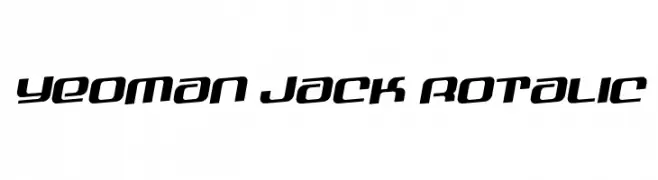
( Fonts by Daniel Zadorozny - www.iconian.com - Personal-use only. For commercial use please contact owner. )
A bold, slanted font with a futuristic and sporty design.
![Yeoman Jack Rotalic Frei Schriftart Herunterladen]() Herunterladen 58 Downloads@WebFont
Herunterladen 58 Downloads@WebFont -
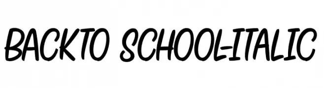
( Fonts by Cat.B - Agathe M.Joyce - Personal-use only. For commercial use please contact owner. )
A playful, handwritten italic font with bold, rounded strokes.
![BACKTO SCHOOL-Italic Frei Schriftart Herunterladen]() Herunterladen 58 Downloads@WebFont
Herunterladen 58 Downloads@WebFont -
( Fonts by Mans Greback - Personal-use only. For commercial use please contact owner. )
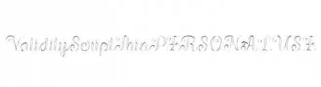
A delicate and elegant script font with thin, flowing lines and subtle flourishes.
![ValidityScriptThinPERSONALUSE Frei Schriftart Herunterladen]() Herunterladen 58 Downloads@WebFont
Herunterladen 58 Downloads@WebFont -
( Fonts by Mans Greback - Personal-use only. For commercial use please contact owner. )
An ornate, medieval-inspired font with sharp serifs and intricate detailing.
![Fourth Reign PERSONAL USE ONLY Regular Frei Schriftart Herunterladen]() Herunterladen 58 Downloads@WebFont
Herunterladen 58 Downloads@WebFont -
( Fonts by Vunira Design - Personal-use only. For commercial use please contact owner. )
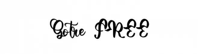
A bold, decorative script font with flowing, interconnected letters.
![Gotre FREE Frei Schriftart Herunterladen]() Herunterladen 58 Downloads@WebFont
Herunterladen 58 Downloads@WebFont -
( Chequered Ink - chequered.ink/ )
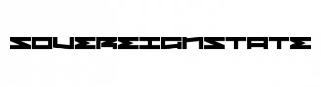
A bold, geometric font with a futuristic and angular design.
![Sovereign State Frei Schriftart Herunterladen]() Herunterladen 58 Downloads@WebFont
Herunterladen 58 Downloads@WebFont -
( Fonts by Rangkai Aksara - Personal-use only. For commercial use please contact owner. )
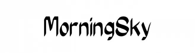
A bold, modern font with angular uppercase and rounded lowercase letters.
![Morning Sky Frei Schriftart Herunterladen]() Herunterladen 58 Downloads@WebFont
Herunterladen 58 Downloads@WebFont -
( Fonts by Origin Type )
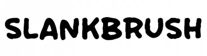
A bold, playful brush-style font with a hand-drawn aesthetic.
![Slank Brush Frei Schriftart Herunterladen]() Herunterladen 58 Downloads@WebFont
Herunterladen 58 Downloads@WebFont -
( Fonts by Haksen Studio - Sarwo Edhi Prayitno - Personal-use only. For commercial use please contact owner. )
A dynamic, handwritten brush-style font with expressive strokes.
![FontBlade Frei Schriftart Herunterladen]() Herunterladen 58 Downloads@WebFont
Herunterladen 58 Downloads@WebFont -
( Fonts by Rudhi Sasmito - Personal-use only. For commercial use please contact owner. )
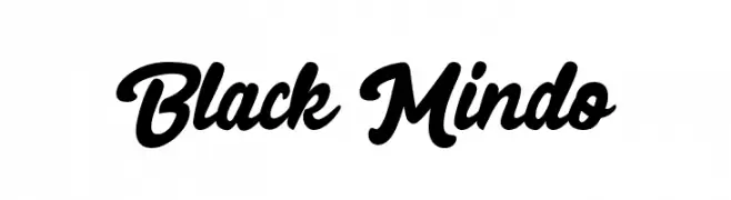
A bold, dynamic script font with fluid, connected letterforms.
![Black Mindo Frei Schriftart Herunterladen]() Herunterladen 58 Downloads@WebFont
Herunterladen 58 Downloads@WebFont -
( Fonts by Mans Greback - www.mansgreback.com - Personal-use only. For commercial use please contact owner. )
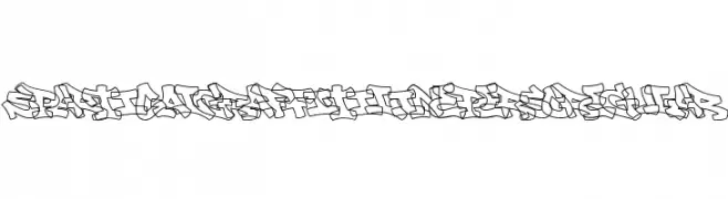
A bold, graffiti-inspired font with dynamic, flowing lines and an urban street art aesthetic.
![Spartical Graffiti Line PERSO Regular Frei Schriftart Herunterladen]() Herunterladen 58 Downloads@WebFont
Herunterladen 58 Downloads@WebFont -
( Noto is a trademark of Google Inc. Noto fonts are open source. All Noto fonts are published under the SIL Open Font License, Version 1.1 )
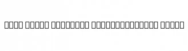
A sleek, extra condensed serif font with a light weight and elegant style.
![Noto Serif Armenian ExtraCondensed Light Frei Schriftart Herunterladen]() Herunterladen 58 Downloads@WebFont
Herunterladen 58 Downloads@WebFont -
( Fonts by Inermedia Studio - Personal-use only. For commercial use please contact owner. )
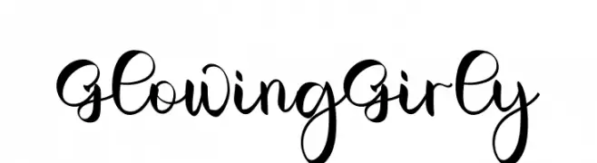
A playful and elegant script font with flowing, cursive design and decorative flourishes.
![Glowing Girly Frei Schriftart Herunterladen]() Herunterladen 58 Downloads@WebFont
Herunterladen 58 Downloads@WebFont -
( Fonts by Star Studio - Personal-use only. For commercial use please contact owner. )
A modern, elegant script font with flowing cursive letters and stylish swashes.
![gabylia Frei Schriftart Herunterladen]() Herunterladen 58 Downloads@WebFont
Herunterladen 58 Downloads@WebFont -
( Fonts by Alif Ryan Zulfikar - Personal-use only. For commercial use please contact owner. )
A festive, elegant script font with flowing, calligraphic strokes and decorative flourishes.
![Christmas Queen - Personal Use Frei Schriftart Herunterladen]() Herunterladen 58 Downloads@WebFont
Herunterladen 58 Downloads@WebFont -
( Fonts by selawetype - Personal-use only. For commercial use please contact owner. )
A bold, decorative font with a dotted, marquee-style design.
![LANDOT Frei Schriftart Herunterladen]() Herunterladen 58 Downloads@WebFont
Herunterladen 58 Downloads@WebFont -
( Fonts by Daniel Zadorozny - www.iconian.com - Personal-use only. For commercial use please contact owner. )
A bold, geometric font with a 3D effect and outlined characters.
![Blue Cobra 3D Frei Schriftart Herunterladen]() Herunterladen 58 Downloads@WebFont
Herunterladen 58 Downloads@WebFont -
( Fonts by Daniel Zadorozny - www.iconian.com - Personal-use only. For commercial use please contact owner. )
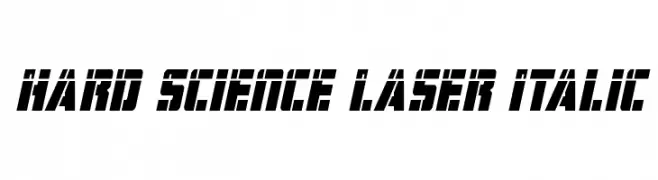
A bold, italicized font with a futuristic and angular design.
![Hard Science Laser Italic Frei Schriftart Herunterladen]() Herunterladen 58 Downloads@WebFont
Herunterladen 58 Downloads@WebFont -
( Fonts by Darrell Flood - Personal-use only. For commercial use please contact owner. )
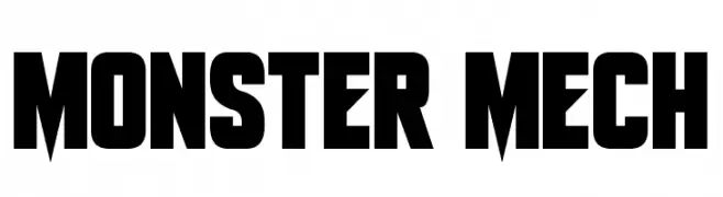
A bold, geometric font with a modern and impactful design.
![Monster Mech Frei Schriftart Herunterladen]() Herunterladen 58 Downloads@WebFont
Herunterladen 58 Downloads@WebFont -
( Fonts by Iconian Fonts - Daniel Zadorozny - Personal-use only. For commercial use please contact owner. )
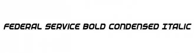
A bold, condensed, and italic font with a modern and dynamic style.
![Federal Service Bold Condensed Italic Frei Schriftart Herunterladen]() Herunterladen 58 Downloads@WebFont
Herunterladen 58 Downloads@WebFont -
( Fonts by Linecreative - ARI JUANDA - Personal-use only. For commercial use please contact owner. )
A modern, crossline decorative font with thin, elongated letterforms.
![Chokie Crossline Style Frei Schriftart Herunterladen]() Herunterladen 58 Downloads@WebFont
Herunterladen 58 Downloads@WebFont -
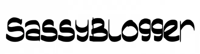
( Ohab Tbj )
A bold, dynamic font with geometric forms and playful curves.
![SassyBlogger Frei Schriftart Herunterladen]() Herunterladen 58 Downloads@WebFont
Herunterladen 58 Downloads@WebFont -
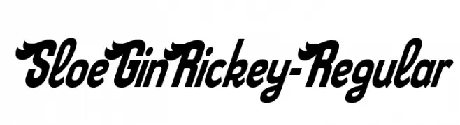
( Fonts by Typodermic Fonts - Raymond Larabie - Personal-use only. For commercial use please contact owner. )
A bold, dynamic font with sharp serifs and a slight slant, perfect for impactful designs.
![SloeGinRickey-Regular Frei Schriftart Herunterladen]() Herunterladen 58 Downloads@WebFont
Herunterladen 58 Downloads@WebFont -
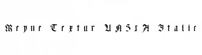
( Fonts by Peter Wiegel - www.peter-wiegel.de - Personal-use only. For commercial use please contact owner. )
A bold, intricate Blackletter font with a gothic, medieval aesthetic.
![Meyne Textur UNZ1A Italic Frei Schriftart Herunterladen]() Herunterladen 58 Downloads@WebFont
Herunterladen 58 Downloads@WebFont -
( Fonts by Haksen Studio - Sarwo Edhi Prayitno - Personal-use only. For commercial use please contact owner. )
An elegant, flowing script font with a handwritten appearance.
![hellena Frei Schriftart Herunterladen]() Herunterladen 58 Downloads@WebFont
Herunterladen 58 Downloads@WebFont -
( Fonts by Daniel Zadorozny - www.iconian.com - Personal-use only. For commercial use please contact owner. )
A bold, italic font with a dynamic and energetic style.
![Charmling Italic Frei Schriftart Herunterladen]() Herunterladen 58 Downloads@WebFont
Herunterladen 58 Downloads@WebFont


Welche Schriften sind gerade am populärsten?
Poppins, Roboto, Montserrat, Open Sans und Lato sind wegen ihrer klaren Formen und breiten Einsetzbarkeit sehr gefragt – von Markenauftritt über Landingpages bis hin zu Postern.
Welche Fonts eignen sich für Logos?
Geometrische Sans‑Serifs (z. B. Poppins, Familien im Gotham‑Stil) sind ein häufiger Griff für sauberes, skalierbares Branding. Für eine persönlichere Note bleiben Scripts und Handschrift‑Stile beliebt. Kombinieren Sie einen prägnanten Headline‑Font mit einer neutralen Brotschrift für Wiedererkennung und Harmonie.
Wie oft wird die Top‑Liste aktualisiert?
Regelmäßig – basierend auf realen Downloads und Interaktionen. Schauen Sie öfter vorbei, um aufstrebende Favoriten früh zu entdecken.
💡 Tipp: Seite bookmarken – Trends wechseln schnell, und heutige Top‑Schriften inspirieren morgen vielleicht das Rebranding.