Willkommen bei den Top‑Schriften – hier treffen Beliebtheit und Qualität aufeinander. Das sind die in diesem Jahr am häufigsten heruntergeladenen und genutzten Fonts. Wenn Sie sichere Optionen für Logo, Web oder Social suchen, starten Sie hier.
Jeder Top‑Font überzeugt durch Balance, Lesbarkeit und Vielseitigkeit. Sie finden moderne Sans‑Serifs, elegante Scripts, Vintage‑Serifs und minimalistische Displays.
-
( Fonts by Joel Maker Studio - Zulfikar - Personal-use only. For commercial use please contact owner. )
An elegant script font with intricate loops and flourishes, exuding luxury and refinement.
 Herunterladen 57 Downloads@WebFont
 -
( Fonts by VinType )
![Startup Life Demo Frei Schriftart Herunterladen]() Herunterladen 57 Downloads@WebFont
Herunterladen 57 Downloads@WebFont -
( Fonts by Roselle P'ng )
Bold, playful handwritten font with rounded, energetic strokes.
![Relentless Frei Schriftart Herunterladen]() Herunterladen 57 Downloads@WebFont
Herunterladen 57 Downloads@WebFont -
( Fonts by Daniel Zadorozny - www.iconian.com - Personal-use only. For commercial use please contact owner. )
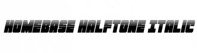
A bold, italicized font with a halftone effect, ideal for dynamic designs.
![Homebase Halftone Italic Frei Schriftart Herunterladen]() Herunterladen 57 Downloads@WebFont
Herunterladen 57 Downloads@WebFont -
( Fonts by Edric Studio - Personal-use only. For commercial use please contact owner. )
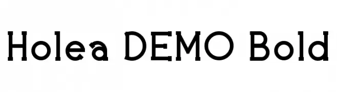
A bold, modern serif font with clean lines and subtle curves.
![Holea DEMO Bold Frei Schriftart Herunterladen]() Herunterladen 57 Downloads@WebFont
Herunterladen 57 Downloads@WebFont -
( Fonts by Iconian Fonts - Daniel Zadorozny - Personal-use only. For commercial use please contact owner. )
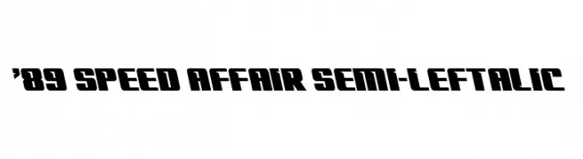
A bold, angular font with a dynamic, italicized style.
!['89 Speed Affair Semi-Leftalic Frei Schriftart Herunterladen]() Herunterladen 57 Downloads@WebFont
Herunterladen 57 Downloads@WebFont -
( Fonts by wep - Wahyu Eka Prasetya - Personal-use only. For commercial use please contact owner. )
A bold, calligraphic font with dynamic curves and expressive strokes.
![Aihao Frei Schriftart Herunterladen]() Herunterladen 57 Downloads@WebFont
Herunterladen 57 Downloads@WebFont -
( Fonts by Woodcutter )
A bold, distressed font with a rugged, grunge-like texture.
![Merluza Company Frei Schriftart Herunterladen]() Herunterladen 57 Downloads@WebFont
Herunterladen 57 Downloads@WebFont -
( Fonts by Agni Ardi Rein Prasetyo - Personal-use only. For commercial use please contact owner. )
A bold, expressive font with a hand-drawn, dynamic style.
![Mellorine Frei Schriftart Herunterladen]() Herunterladen 57 Downloads@WebFont
Herunterladen 57 Downloads@WebFont -
( Fonts by Amru ID - Personal-use only. For commercial use please contact owner. )
An elegant script font with flowing, calligraphic strokes and a modern touch.
![Helendia Script Frei Schriftart Herunterladen]() Herunterladen 57 Downloads@WebFont
Herunterladen 57 Downloads@WebFont -
( Fonts by Geronimo Font Studios - Anthony - Personal-use only. For commercial use please contact owner. )
A bold, geometric font with rounded edges and a strong, cohesive design.
![Outfield Pro Regular Frei Schriftart Herunterladen]() Herunterladen 57 Downloads@WebFont
Herunterladen 57 Downloads@WebFont -
( Fonts by Tigadestd - Doli Harahap - Personal-use only. For commercial use please contact owner. )
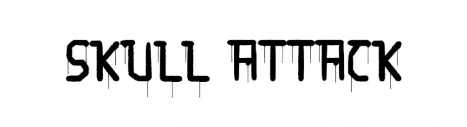
A bold, dripping graffiti-style font with a rebellious edge.
![Skull Attack Frei Schriftart Herunterladen]() Herunterladen 57 Downloads@WebFont
Herunterladen 57 Downloads@WebFont -
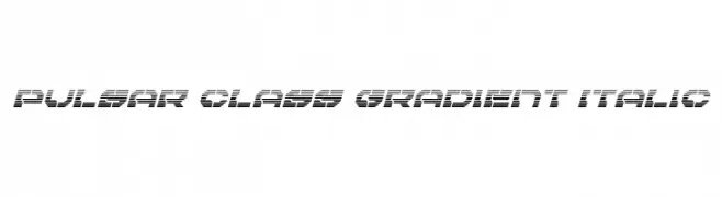
( Iconian Fonts - Daniel Zadorozny - www.iconian.com )
A futuristic, italicized font with a gradient effect and striped pattern.
![Pulsar Class Gradient Italic Frei Schriftart Herunterladen]() Herunterladen 57 Downloads@WebFont
Herunterladen 57 Downloads@WebFont -
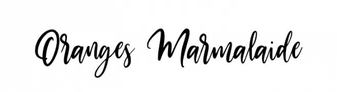
( Fonts by Damarletter - Ardian Nuvianto - Personal-use only. For commercial use please contact owner. )
A lively and expressive script font with dynamic strokes and a handwritten appeal.
![Oranges Marmalaide Frei Schriftart Herunterladen]() Herunterladen 57 Downloads@WebFont
Herunterladen 57 Downloads@WebFont -
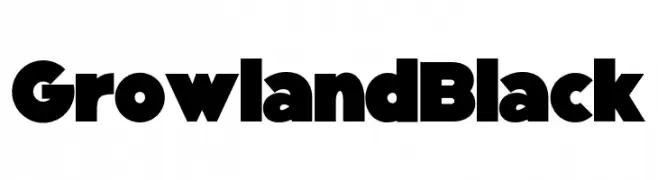
( Fonts by Letternun - Saeful Bahri - Personal-use only. For commercial use please contact owner. )
A bold, geometric font with thick strokes and minimal contrast.
![Growland Black Frei Schriftart Herunterladen]() Herunterladen 57 Downloads@WebFont
Herunterladen 57 Downloads@WebFont -
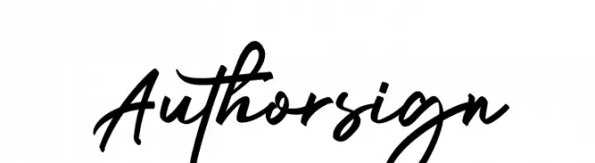
( Fonts by Rantautype - Yudi Pratama Chandra - Personal-use only. For commercial use please contact owner. )
A dynamic, fluid handwritten script with elegant, flowing characters.
![Authorsign Frei Schriftart Herunterladen]() Herunterladen 57 Downloads@WebFont
Herunterladen 57 Downloads@WebFont -
( Fonts by Daniel Zadorozny - www.iconian.com - Personal-use only. For commercial use please contact owner. )
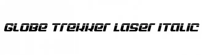
A bold, italic, futuristic font with wide, angular characters.
![Globe Trekker Laser Italic Frei Schriftart Herunterladen]() Herunterladen 57 Downloads@WebFont
Herunterladen 57 Downloads@WebFont -
( Fonts by Colative Studio - Personal-use only. For commercial use please contact owner. )
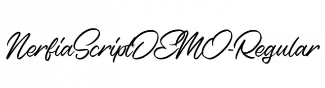
A dynamic and fluid cursive script font with elegant, interconnected strokes.
![NerfiaScriptDEMO-Regular Frei Schriftart Herunterladen]() Herunterladen 57 Downloads@WebFont
Herunterladen 57 Downloads@WebFont -
( Fonts by Din Studio - Donis Miftahudin - Personal-use only. For commercial use please contact owner. )
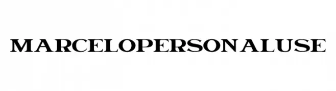
A bold serif font with thick strokes and sharp serifs, offering a modern twist on classic design.
![Marcelo Personal Use Frei Schriftart Herunterladen]() Herunterladen 57 Downloads@WebFont
Herunterladen 57 Downloads@WebFont -
( Fonts by Letterative Studio - Personal-use only. For commercial use please contact owner. )
A playful and elegant script font with flowing, interconnected letters.
![Bright Violet Frei Schriftart Herunterladen]() Herunterladen 57 Downloads@WebFont
Herunterladen 57 Downloads@WebFont -
( Fonts by Rantautype - Yudi Pratama Chandra - Personal-use only. For commercial use please contact owner. )
A dynamic and fluid script font with elegant, flowing letterforms.
![Holdington Frei Schriftart Herunterladen]() Herunterladen 57 Downloads@WebFont
Herunterladen 57 Downloads@WebFont -
( Lander De Wandel - www.facebook.com/LanderDeWandelArts )
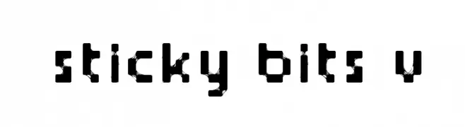
A pixelated, geometric font with a bold, modern style.
![Sticky bits v2 Frei Schriftart Herunterladen]() Herunterladen 57 Downloads@WebFont
Herunterladen 57 Downloads@WebFont -
( Fonts by Aditya Rezki Apriyadi - Personal-use only. For commercial use please contact owner. )
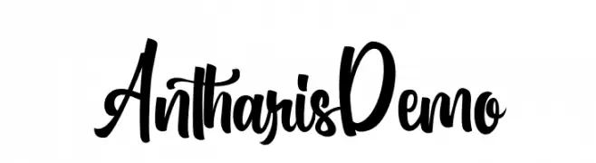
A bold, flowing script font with a modern and playful style.
![AntharisDemo Frei Schriftart Herunterladen]() Herunterladen 57 Downloads@WebFont
Herunterladen 57 Downloads@WebFont -
( Fonts by Daniel Zadorozny - www.iconian.com - Personal-use only. For commercial use please contact owner. )
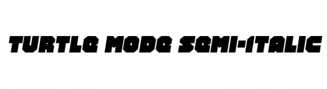
A bold, angular font with a semi-italic slant and geometric design.
![Turtle Mode Semi-Italic Frei Schriftart Herunterladen]() Herunterladen 57 Downloads@WebFont
Herunterladen 57 Downloads@WebFont -
( Fonts by Alpaprana - Personal-use only. For commercial use please contact owner. )
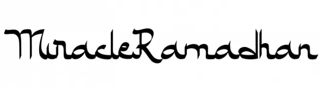
A modern, calligraphic font with flowing, interconnected letterforms.
![Miracle Ramadhan Frei Schriftart Herunterladen]() Herunterladen 57 Downloads@WebFont
Herunterladen 57 Downloads@WebFont -
( Fonts by Des Gomez - Personal-use only. For commercial use please contact owner. )
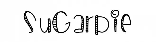
A playful, hand-drawn font with quirky decorative elements.
![SugarPie Frei Schriftart Herunterladen]() Herunterladen 57 Downloads@WebFont
Herunterladen 57 Downloads@WebFont -
( Fonts by Hugefonts - Personal-use only. For commercial use please contact owner. )
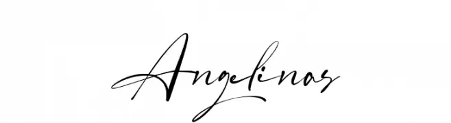
A modern, elegant script font with flowing, cursive strokes.
![Angelinas Frei Schriftart Herunterladen]() Herunterladen 57 Downloads@WebFont
Herunterladen 57 Downloads@WebFont -
( imagex - www.imagex-fonts.com )
A diverse set of bold, geometric, and illustrative logo glyphs.
![Logos I love Frei Schriftart Herunterladen]() Herunterladen 57 Downloads@WebFont
Herunterladen 57 Downloads@WebFont -
( Fonts by 177Studio )
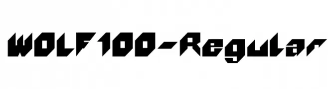
A bold, geometric font with sharp angles and a modern, edgy style.
![WOLF100-Regular Frei Schriftart Herunterladen]() Herunterladen 57 Downloads@WebFont
Herunterladen 57 Downloads@WebFont -
( Iconian Fonts - Daniel Zadorozny - www.iconian.com )
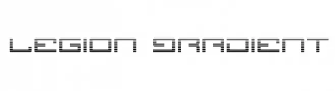
A futuristic, segmented font with a digital and modern aesthetic.
![Legion Gradient Frei Schriftart Herunterladen]() Herunterladen 57 Downloads@WebFont
Herunterladen 57 Downloads@WebFont -
( Fonts by Lafontype - Anugrah Pasau - Personal-use only. For commercial use please contact owner. )
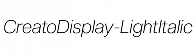
A sleek, modern, light italic sans-serif font with elegant elongation.
![CreatoDisplay-LightItalic Frei Schriftart Herunterladen]() Herunterladen 57 Downloads@WebFont
Herunterladen 57 Downloads@WebFont -
( Fonts by Pollem Studio - Muhammad Nur - Personal-use only. For commercial use please contact owner. )
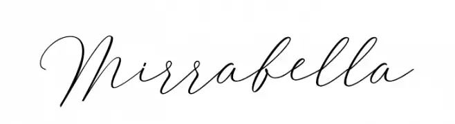
An elegant script font with flowing, interconnected letters and graceful curves.
![Mirrabella Frei Schriftart Herunterladen]() Herunterladen 57 Downloads@WebFont
Herunterladen 57 Downloads@WebFont -
( Fonts by Peter Wiegel - www.peter-wiegel.de - Personal-use only. For commercial use please contact owner. )
A flowing, cursive font with elegant curves and a classic style.
![JuniorCAT Frei Schriftart Herunterladen]() Herunterladen 57 Downloads@WebFont
Herunterladen 57 Downloads@WebFont -
( Fonts by wep - Wahyu Eka Prasetya - Personal-use only. For commercial use please contact owner. )
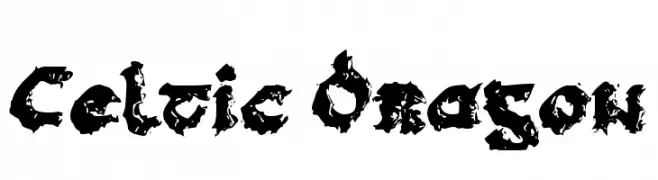
A bold, intricate font with Celtic and dragon-inspired designs.
![Celtic Dragon Frei Schriftart Herunterladen]() Herunterladen 57 Downloads@WebFont
Herunterladen 57 Downloads@WebFont -
( Fonts by Hugefonts - Personal-use only. For commercial use please contact owner. )
A fluid and elegant script font with smooth, flowing lines and cursive letterforms.
![Amstroms Frei Schriftart Herunterladen]() Herunterladen 57 Downloads@WebFont
Herunterladen 57 Downloads@WebFont


Welche Schriften sind gerade am populärsten?
Poppins, Roboto, Montserrat, Open Sans und Lato sind wegen ihrer klaren Formen und breiten Einsetzbarkeit sehr gefragt – von Markenauftritt über Landingpages bis hin zu Postern.
Welche Fonts eignen sich für Logos?
Geometrische Sans‑Serifs (z. B. Poppins, Familien im Gotham‑Stil) sind ein häufiger Griff für sauberes, skalierbares Branding. Für eine persönlichere Note bleiben Scripts und Handschrift‑Stile beliebt. Kombinieren Sie einen prägnanten Headline‑Font mit einer neutralen Brotschrift für Wiedererkennung und Harmonie.
Wie oft wird die Top‑Liste aktualisiert?
Regelmäßig – basierend auf realen Downloads und Interaktionen. Schauen Sie öfter vorbei, um aufstrebende Favoriten früh zu entdecken.
💡 Tipp: Seite bookmarken – Trends wechseln schnell, und heutige Top‑Schriften inspirieren morgen vielleicht das Rebranding.