Willkommen bei den Top‑Schriften – hier treffen Beliebtheit und Qualität aufeinander. Das sind die in diesem Jahr am häufigsten heruntergeladenen und genutzten Fonts. Wenn Sie sichere Optionen für Logo, Web oder Social suchen, starten Sie hier.
Jeder Top‑Font überzeugt durch Balance, Lesbarkeit und Vielseitigkeit. Sie finden moderne Sans‑Serifs, elegante Scripts, Vintage‑Serifs und minimalistische Displays.
-
( Fonts by www.sweeep.fr - Damien Gosset )
A bold, stencil-style font with sharp serifs and industrial appeal.
 Herunterladen 1448 Downloads@WebFont
 -
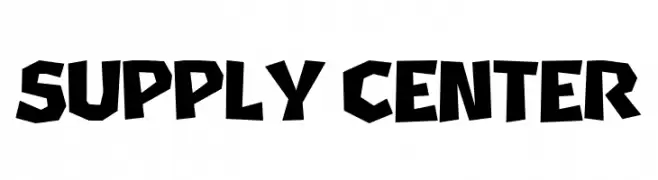
( Fonts by Niskala Huruf )
A bold, angular font with a geometric and dynamic style.
![Supply Center Frei Schriftart Herunterladen]() Herunterladen 1447 Downloads@WebFont
Herunterladen 1447 Downloads@WebFont -
( Fonts by Google - Personal-use only. For commercial use please contact owner. )
A clean, modern sans-serif font with balanced proportions and high legibility.
![Franko Regular Frei Schriftart Herunterladen]() Herunterladen 1447 Downloads@WebFont
Herunterladen 1447 Downloads@WebFont -
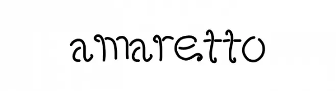
![amaretto Frei Schriftart Herunterladen]() Herunterladen 1447 Downloads@WebFont
Herunterladen 1447 Downloads@WebFont -
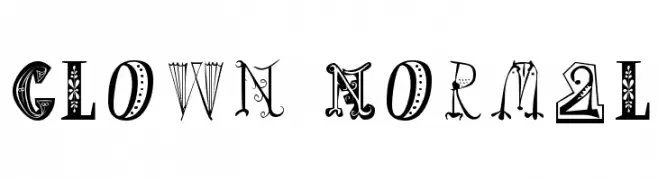
( Fonts by Manfred Klein. Free for private and charity use. Free for commercial with donation to organizations )
A whimsical and decorative font with playful, unique characters.
![Clown Normal Frei Schriftart Herunterladen]() Herunterladen 1447 Downloads@WebFont
Herunterladen 1447 Downloads@WebFont -
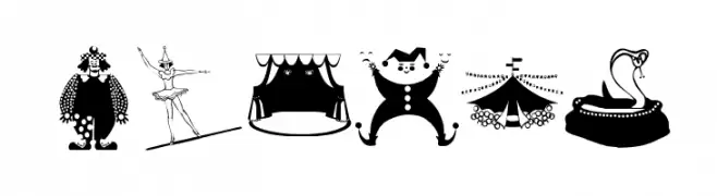
( Fonts by Manfred Klein. Free for private and charity use. Free for commercial with donation to organizations )
Circus-themed dingbat font with playful illustrations.
![Circus Frei Schriftart Herunterladen]() Herunterladen 1447 Downloads@WebFont
Herunterladen 1447 Downloads@WebFont -
![Corners 1 Frei Schriftart Herunterladen]() Herunterladen 1447 Downloads@WebFont
Herunterladen 1447 Downloads@WebFont -
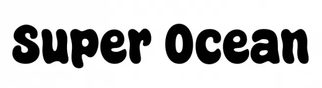
( Fonts by fsuarez913 )
A bold, playful font with thick, rounded strokes and a whimsical style.
![Super Ocean Frei Schriftart Herunterladen]() Herunterladen 1446 Downloads@WebFont
Herunterladen 1446 Downloads@WebFont -
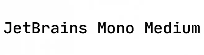
( Fonts by Philipp Nurullin )
A modern, monospaced font designed for clarity and readability.
![JetBrains Mono Medium Frei Schriftart Herunterladen]() Herunterladen 1446 Downloads@WebFont
Herunterladen 1446 Downloads@WebFont -
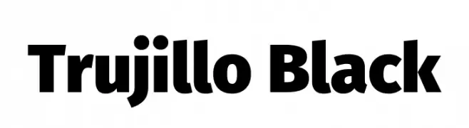
( Fonts by Fira Sans original fonts by bBox Type GmbH, Carrois Corporate GbR, & Edenspiekermann AG / Changes by Cristiano Sobral - Personal-use only. For commercial use please contact owner. )
A bold, impactful typeface with thick, uniform strokes.
![Trujillo Black Frei Schriftart Herunterladen]() Herunterladen 1446 Downloads@WebFont
Herunterladen 1446 Downloads@WebFont -
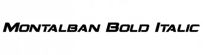
( Fonts by a Neale Davidson - www.pixelsagas.com. Personal-use only. For commercial use please contact owner. )
A bold, italicized font with a modern and dynamic slant.
![Montalban Bold Italic Frei Schriftart Herunterladen]() Herunterladen 1446 Downloads@WebFont
Herunterladen 1446 Downloads@WebFont -
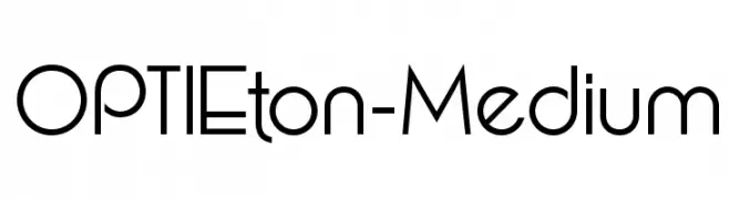
( Fonts by Castcraft Software - opti.netii.net - check the website before use )
A modern, geometric font with consistent stroke width and a clean design.
![OPTIEton-Medium Frei Schriftart Herunterladen]() Herunterladen 1446 Downloads@WebFont
Herunterladen 1446 Downloads@WebFont -
![Charpentier Renaissance Pro Demi Frei Schriftart Herunterladen]() Herunterladen 1446 Downloads@WebFont
Herunterladen 1446 Downloads@WebFont -
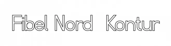
( Fonts by www.peter-wiegel.de. Personal-use only. For commercial use please contact owner. )
A modern, outline-style font with a clean, geometric design.
![Fibel Nord Kontur Frei Schriftart Herunterladen]() Herunterladen 1446 Downloads@WebFont
Herunterladen 1446 Downloads@WebFont -
( Fonts by Daniel Zadorozny - www.iconian.com )
A bold, italic font with a dynamic and modern style.
![Bummer Italic Frei Schriftart Herunterladen]() Herunterladen 1446 Downloads@WebFont
Herunterladen 1446 Downloads@WebFont -
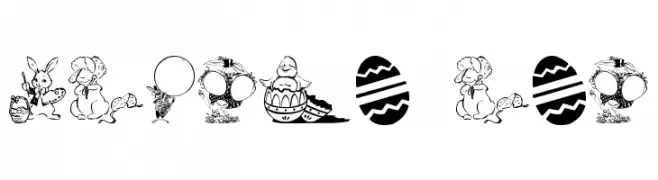
( Fonts by Graham Meade - GemFonts )
Easter-themed decorative display font with illustrated glyphs.
![Easter art Frei Schriftart Herunterladen]() Herunterladen 1446 Downloads@WebFont
Herunterladen 1446 Downloads@WebFont -
![Grungerocker Frei Schriftart Herunterladen]() Herunterladen 1446 Downloads@WebFont
Herunterladen 1446 Downloads@WebFont -
( Fonts by Iconian Fonts - Daniel Zadorozny - Personal-use only. For commercial use please contact owner. )
A bold, condensed italic font with a modern and dynamic style.
![Whiskey Girls Condensed Italic Frei Schriftart Herunterladen]() Herunterladen 1445 Downloads@WebFont
Herunterladen 1445 Downloads@WebFont -
( Woodcutter - woodcutter Manero - www.woodcutter.es )
A bold, rugged font with a classic biker aesthetic.
![Free Biker Frei Schriftart Herunterladen]() Herunterladen 1445 Downloads@WebFont
Herunterladen 1445 Downloads@WebFont -
![H4 Ketan Font Regular Frei Schriftart Herunterladen]() Herunterladen 1445 Downloads@WebFont
Herunterladen 1445 Downloads@WebFont -
( Fonts by Anthem Type - Joey Nelson )
A bold, distressed font with a vintage, grunge aesthetic.
![Decade Frei Schriftart Herunterladen]() Herunterladen 1445 Downloads@WebFont
Herunterladen 1445 Downloads@WebFont -
( Fonts by Perspectype Studio - Letterena.com - Personal-use only. For commercial use please contact owner. )
A playful, bold font with rounded, thick strokes and a hand-drawn feel.
![SALTED LEMONS Frei Schriftart Herunterladen]() Herunterladen 1444 Downloads@WebFont
Herunterladen 1444 Downloads@WebFont -
( Zetafonts - www.zetafonts.com )
A bold, heavy serif font with a strong, impactful presence.
![Radcliffe Display Heavy Frei Schriftart Herunterladen]() Herunterladen 1444 Downloads@WebFont
Herunterladen 1444 Downloads@WebFont -
( Fonts by Elementype )
A graceful and elegant cursive font with high contrast strokes.
![Hallelujah Frei Schriftart Herunterladen]() Herunterladen 1444 Downloads@WebFont
Herunterladen 1444 Downloads@WebFont -
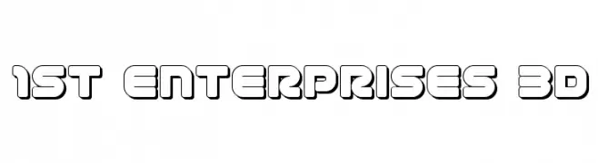
( Fonts by Iconian Fonts )
A bold, 3D outlined font with a rounded, blocky style.
![1st Enterprises 3D Frei Schriftart Herunterladen]() Herunterladen 1444 Downloads@WebFont
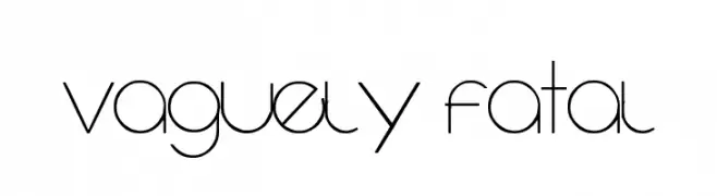
Herunterladen 1444 Downloads@WebFont -
![Vaguely Fatal Frei Schriftart Herunterladen]() Herunterladen 1444 Downloads@WebFont
Herunterladen 1444 Downloads@WebFont -
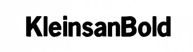
( Fonts by Manfred Klein. Free for private and charity use. Free for commercial with donation to organizations )
A bold, rounded font with a modern and impactful style.
![KleinsanBold Frei Schriftart Herunterladen]() Herunterladen 1444 Downloads@WebFont
Herunterladen 1444 Downloads@WebFont -
( Fonts by Daniel Zadorozny - www.iconian.com - Free for personal use )
A bold, calligraphic font with sharp, angular strokes and dynamic movement.
![Bushido Frei Schriftart Herunterladen]() Herunterladen 1444 Downloads@WebFont
Herunterladen 1444 Downloads@WebFont -
( Fonts by www.fontalicious.com )
A bold, geometric font with a futuristic and modern style.
![Planet Frei Schriftart Herunterladen]() Herunterladen 1444 Downloads@WebFont
Herunterladen 1444 Downloads@WebFont -
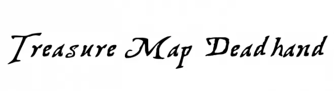
( Fonts by Graham Meade - GemFonts )
A rugged, hand-drawn font with a mysterious, adventurous style.
![Treasure Map Deadhand Frei Schriftart Herunterladen]() Herunterladen 1444 Downloads@WebFont
Herunterladen 1444 Downloads@WebFont -
![Stentiga Frei Schriftart Herunterladen]() Herunterladen 1444 Downloads@WebFont
Herunterladen 1444 Downloads@WebFont -
![Raven Frei Schriftart Herunterladen]() Herunterladen 1444 Downloads@WebFont
Herunterladen 1444 Downloads@WebFont -
( Fonts by Muhammad Sirojuddin - lettersiro.com - Personal-use only. For commercial use please contact owner. )
A flowing, cursive script font with elegant, looping strokes.
![Silhouette Frei Schriftart Herunterladen]() Herunterladen 1443 Downloads@WebFont
Herunterladen 1443 Downloads@WebFont -
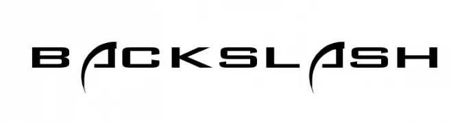
( Baja La Luna Producciones - www.consultoragua.com/bajolaluna/fonts/ Sponsoren Schriftart )
A futuristic, angular font with a sleek and modern design.
![Backslash Frei Schriftart Herunterladen]() Herunterladen 1443 Downloads
Herunterladen 1443 Downloads -
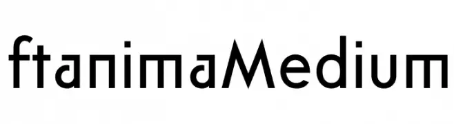
( Igor Kosinsky - www.behance.net/Pj154 )
A modern, geometric sans-serif font with a clean and professional look.
![ft anima Medium Frei Schriftart Herunterladen]() Herunterladen 1443 Downloads@WebFont
Herunterladen 1443 Downloads@WebFont


Welche Schriften sind gerade am populärsten?
Poppins, Roboto, Montserrat, Open Sans und Lato sind wegen ihrer klaren Formen und breiten Einsetzbarkeit sehr gefragt – von Markenauftritt über Landingpages bis hin zu Postern.
Welche Fonts eignen sich für Logos?
Geometrische Sans‑Serifs (z. B. Poppins, Familien im Gotham‑Stil) sind ein häufiger Griff für sauberes, skalierbares Branding. Für eine persönlichere Note bleiben Scripts und Handschrift‑Stile beliebt. Kombinieren Sie einen prägnanten Headline‑Font mit einer neutralen Brotschrift für Wiedererkennung und Harmonie.
Wie oft wird die Top‑Liste aktualisiert?
Regelmäßig – basierend auf realen Downloads und Interaktionen. Schauen Sie öfter vorbei, um aufstrebende Favoriten früh zu entdecken.
💡 Tipp: Seite bookmarken – Trends wechseln schnell, und heutige Top‑Schriften inspirieren morgen vielleicht das Rebranding.