Willkommen bei den Top‑Schriften – hier treffen Beliebtheit und Qualität aufeinander. Das sind die in diesem Jahr am häufigsten heruntergeladenen und genutzten Fonts. Wenn Sie sichere Optionen für Logo, Web oder Social suchen, starten Sie hier.
Jeder Top‑Font überzeugt durch Balance, Lesbarkeit und Vielseitigkeit. Sie finden moderne Sans‑Serifs, elegante Scripts, Vintage‑Serifs und minimalistische Displays.
-
( Fonts by Kat`s Fun Fonts - Personal-use only. For commercial use please contact owner. )
A playful font with letters on skateboards, perfect for sporty or youthful designs.
 Herunterladen 57 Downloads@WebFont
 -
( Fonts by Mozyen Studio - Personal-use only. For commercial use please contact owner. )
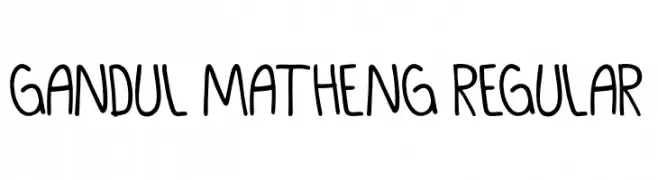
A playful, casual handwritten font with smooth, rounded edges.
![GANDUL MATHENG Regular Frei Schriftart Herunterladen]() Herunterladen 57 Downloads@WebFont
Herunterladen 57 Downloads@WebFont -
( Fonts by HansCo - Burhan Afif - Personal-use only. For commercial use please contact owner. )
A bold, angular font with a futuristic and dynamic style.
![Flash Frei Schriftart Herunterladen]() Herunterladen 57 Downloads@WebFont
Herunterladen 57 Downloads@WebFont -
( Kat's Fun Fonts - www.katsfunfonts.com/ )
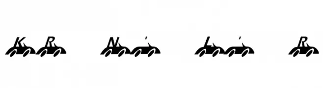
A playful, car-themed decorative font with bold, italicized letters.
![KR Nick's Lil' Racer Frei Schriftart Herunterladen]() Herunterladen 57 Downloads@WebFont
Herunterladen 57 Downloads@WebFont -
( Fonts by Kong Font - https://fontkong.com/ - Personal-use only. For commercial use please contact owner. )
A bold, rounded font with a modern and playful style.
![Orcef Bold Frei Schriftart Herunterladen]() Herunterladen 57 Downloads@WebFont
Herunterladen 57 Downloads@WebFont -
( Fonts by Jadatype - Jada Akbal - Personal-use only. For commercial use please contact owner. )
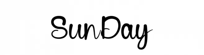
A playful, casual handwritten font with smooth curves and irregular letterforms.
![Sun Day Frei Schriftart Herunterladen]() Herunterladen 57 Downloads@WebFont
Herunterladen 57 Downloads@WebFont -
( Fonts by Darno Wiyanto - Personal-use only. For commercial use please contact owner. )
An elegant and decorative script font with ornate loops and swirls.
![Brunella Frei Schriftart Herunterladen]() Herunterladen 57 Downloads@WebFont
Herunterladen 57 Downloads@WebFont -
( Fonts by Intellecta Design - Paulo W - Personal-use only. For commercial use please contact owner. )
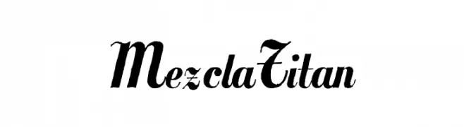
A bold, decorative font with elegant flourishes and high contrast.
![MezclaTitan Frei Schriftart Herunterladen]() Herunterladen 57 Downloads@WebFont
Herunterladen 57 Downloads@WebFont -
( Fonts by Tony Thai )
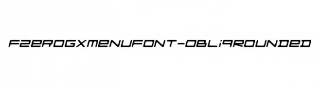
A futuristic, oblique font with rounded edges and a sleek, modern design.
![FZeroGXMenuFont-ObliqRounded Frei Schriftart Herunterladen]() Herunterladen 57 Downloads@WebFont
Herunterladen 57 Downloads@WebFont -
( Noto is a trademark of Google Inc. Noto fonts are open source. All Noto fonts are published under the SIL Open Font License, Version 1.1 )
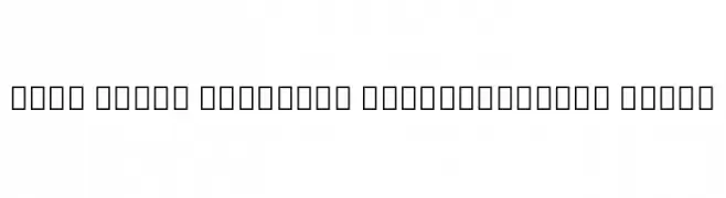
A bold, semi-condensed serif font with a modern yet classic style.
![Noto Serif Georgian SemiCondensed Black Frei Schriftart Herunterladen]() Herunterladen 57 Downloads@WebFont
Herunterladen 57 Downloads@WebFont -
( Fonts by Peter Wiegel - www.peter-wiegel.de - Personal-use only. For commercial use please contact owner. )
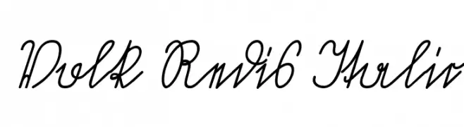
A flowing, cursive script with a handwritten, italicized style.
![Volk Redis Italic Frei Schriftart Herunterladen]() Herunterladen 57 Downloads@WebFont
Herunterladen 57 Downloads@WebFont -
( Fonts by Bangkit Tri Setiadi - Personal-use only. For commercial use please contact owner. )
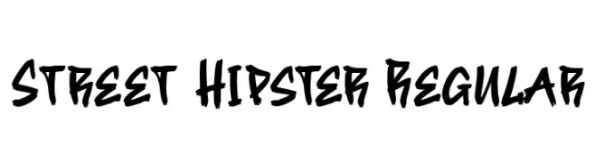
A bold, hand-drawn font with a street art vibe.
![Street Hipster Regular Frei Schriftart Herunterladen]() Herunterladen 57 Downloads@WebFont
Herunterladen 57 Downloads@WebFont -
( Fonts by Iconian Fonts - Daniel Zadorozny - Personal-use only. For commercial use please contact owner. )
A bold, italicized font with a gradient effect and dynamic, futuristic style.
![Fortune Soldier Gradient Italic Frei Schriftart Herunterladen]() Herunterladen 57 Downloads@WebFont
Herunterladen 57 Downloads@WebFont -
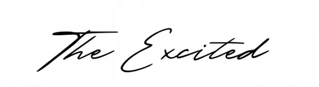
( Fonts by PutraCetol Studio - www.putracetol.com - Personal-use only. For commercial use please contact owner. )
A fluid and elegant script font with a handwritten style.
![The Excited Frei Schriftart Herunterladen]() Herunterladen 57 Downloads@WebFont
Herunterladen 57 Downloads@WebFont -
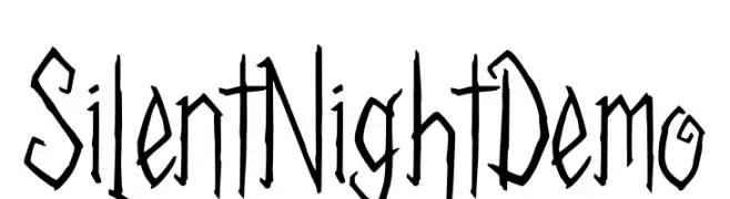
( Fonts by tkztype - Askar Fadhilah - Personal-use only. For commercial use please contact owner. )
A jagged, hand-drawn font with a gothic, artistic style.
![Silent Night Demo Frei Schriftart Herunterladen]() Herunterladen 57 Downloads@WebFont
Herunterladen 57 Downloads@WebFont -
( imagex - www.imagex-fonts.com )
A bold, distressed font with a textured, grunge appearance.
![Super Modern Frei Schriftart Herunterladen]() Herunterladen 57 Downloads@WebFont
Herunterladen 57 Downloads@WebFont -
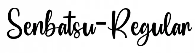
( Fonts by Lettersweet Studio )
Casual handwritten script with tall, narrow forms and decorative swashes.
![Senbatsu-Regular Frei Schriftart Herunterladen]() Herunterladen 57 Downloads@WebFont
Herunterladen 57 Downloads@WebFont -
( Fonts by Woodcutter Manero - www.woodcutter.es - Personal-use only. For commercial use please contact owner. )
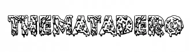
A bold, dripping decorative font with a horror or slime effect.
![The Matadero Frei Schriftart Herunterladen]() Herunterladen 57 Downloads@WebFont
Herunterladen 57 Downloads@WebFont -
( Fonts by Omotu Studio - Ibnu Utomo - Personal-use only. For commercial use please contact owner. )
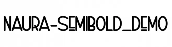
A playful, rounded semi-bold font with a modern and friendly appearance.
![Naura-SemiBold_DEMO Frei Schriftart Herunterladen]() Herunterladen 57 Downloads@WebFont
Herunterladen 57 Downloads@WebFont -
( Fonts by Vunira Design - Personal-use only. For commercial use please contact owner. )
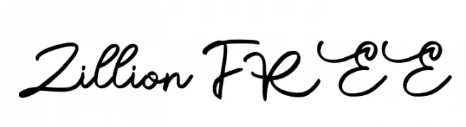
A flowing, elegant cursive font with smooth curves and moderate contrast.
![Zillion FREE Frei Schriftart Herunterladen]() Herunterladen 57 Downloads@WebFont
Herunterladen 57 Downloads@WebFont -
( Fonts by Letterara - Thomas Aradea - Personal-use only. For commercial use please contact owner. )
A lively and expressive script font with bold, sweeping curves and playful flourishes.
![Merlyn Frei Schriftart Herunterladen]() Herunterladen 57 Downloads@WebFont
Herunterladen 57 Downloads@WebFont -
( Fonts by Daniel Zadorozny - www.iconian.com - Personal-use only. For commercial use please contact owner. )
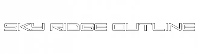
A futuristic, geometric outline font with sharp, clean lines.
![Sky Ridge Outline Frei Schriftart Herunterladen]() Herunterladen 57 Downloads@WebFont
Herunterladen 57 Downloads@WebFont -
( Fonts by Eifetstype - Stefie Justprince - Personal-use only. For commercial use please contact owner. )
A bold, playful script font with smooth, rounded edges and consistent stroke width.
![WispyNight Frei Schriftart Herunterladen]() Herunterladen 57 Downloads@WebFont
Herunterladen 57 Downloads@WebFont -
( Fonts by Mabhal Studio - Abdullah - Personal-use only. For commercial use please contact owner. )
A dynamic and elegant script font with flowing, cursive letterforms.
![Firnaily Frei Schriftart Herunterladen]() Herunterladen 57 Downloads@WebFont
Herunterladen 57 Downloads@WebFont -
( Fonts by Perspectype Studio - Personal-use only. For commercial use please contact owner. )
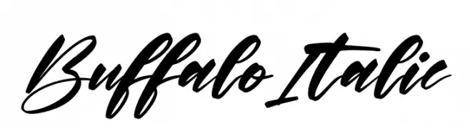
A dynamic and elegant script font with fluid, connected characters.
![Buffalo Italic Frei Schriftart Herunterladen]() Herunterladen 57 Downloads@WebFont
Herunterladen 57 Downloads@WebFont -
( Fonts by Rezastudio - Reza Mukhtazar - Personal-use only. For commercial use please contact owner. )
An elegant and playful script font with bold, expressive characters.
![Bridga Frei Schriftart Herunterladen]() Herunterladen 57 Downloads@WebFont
Herunterladen 57 Downloads@WebFont -
( Fonts by Topan Sofyan - Personal-use only. For commercial use please contact owner. )
A bold, brush script font with dynamic and expressive strokes.
![Cellotype Frei Schriftart Herunterladen]() Herunterladen 57 Downloads@WebFont
Herunterladen 57 Downloads@WebFont -
( Reema Chhabra - www.facebook.com/artistic.reema )
A playful, handwritten font with tall, narrow letters and a whimsical style.
![what ~ fish Frei Schriftart Herunterladen]() Herunterladen 57 Downloads@WebFont
Herunterladen 57 Downloads@WebFont -
( Fonts by Richie Mx - Ricardo Saul Castellanos Pabello - Personal-use only. For commercial use please contact owner. )
A geometric, angular font with a modern and edgy style.
![Deadline Frei Schriftart Herunterladen]() Herunterladen 57 Downloads@WebFont
Herunterladen 57 Downloads@WebFont -
( Fonts by Syaf Rizal - Khurasan - Personal-use only. For commercial use please contact owner. )
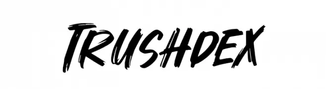
A bold, brush-style font with dynamic, expressive strokes.
![Trushdex Frei Schriftart Herunterladen]() Herunterladen 57 Downloads@WebFont
Herunterladen 57 Downloads@WebFont -
( Fonts by CalligraphyFonts - Personal-use only. For commercial use please contact owner. )
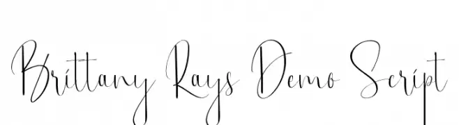
An elegant and sophisticated cursive font with fluid, graceful strokes.
![Brittany Rays Demo Script Frei Schriftart Herunterladen]() Herunterladen 57 Downloads@WebFont
Herunterladen 57 Downloads@WebFont -
( Fonts by Four Lines - zain Fahroni - Personal-use only. For commercial use please contact owner. )
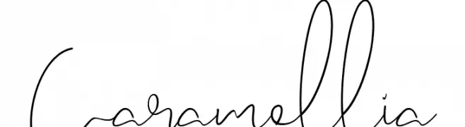
A playful, handwritten-style font with fluid, continuous strokes.
![Caramellia Frei Schriftart Herunterladen]() Herunterladen 57 Downloads@WebFont
Herunterladen 57 Downloads@WebFont -
( Fonts by Katario Studio - Rioniga Zandy - Personal-use only. For commercial use please contact owner. )
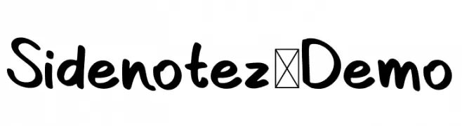
A playful, bold handwritten font with a casual and friendly style.
![Sidenotez-Demo Frei Schriftart Herunterladen]() Herunterladen 57 Downloads@WebFont
Herunterladen 57 Downloads@WebFont -
( Fonts by Wahyu Eka Prasetya - wepfont.com - Personal-use only. For commercial use please contact owner. )
A bold, textured font with an organic, rugged appearance.
![Dempo Frei Schriftart Herunterladen]() Herunterladen 57 Downloads@WebFont
Herunterladen 57 Downloads@WebFont -
( Fonts by Typebae Foundry )
![Balgend Script Frei Schriftart Herunterladen]() Herunterladen 57 Downloads@WebFont
Herunterladen 57 Downloads@WebFont


Welche Schriften sind gerade am populärsten?
Poppins, Roboto, Montserrat, Open Sans und Lato sind wegen ihrer klaren Formen und breiten Einsetzbarkeit sehr gefragt – von Markenauftritt über Landingpages bis hin zu Postern.
Welche Fonts eignen sich für Logos?
Geometrische Sans‑Serifs (z. B. Poppins, Familien im Gotham‑Stil) sind ein häufiger Griff für sauberes, skalierbares Branding. Für eine persönlichere Note bleiben Scripts und Handschrift‑Stile beliebt. Kombinieren Sie einen prägnanten Headline‑Font mit einer neutralen Brotschrift für Wiedererkennung und Harmonie.
Wie oft wird die Top‑Liste aktualisiert?
Regelmäßig – basierend auf realen Downloads und Interaktionen. Schauen Sie öfter vorbei, um aufstrebende Favoriten früh zu entdecken.
💡 Tipp: Seite bookmarken – Trends wechseln schnell, und heutige Top‑Schriften inspirieren morgen vielleicht das Rebranding.