Willkommen bei den Top‑Schriften – hier treffen Beliebtheit und Qualität aufeinander. Das sind die in diesem Jahr am häufigsten heruntergeladenen und genutzten Fonts. Wenn Sie sichere Optionen für Logo, Web oder Social suchen, starten Sie hier.
Jeder Top‑Font überzeugt durch Balance, Lesbarkeit und Vielseitigkeit. Sie finden moderne Sans‑Serifs, elegante Scripts, Vintage‑Serifs und minimalistische Displays.
-
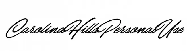
( Fonts by Billy Argel - www.billyargel.com - Personal-use only. For commercial use please contact owner. )
A bold, cursive font with elegant, flowing strokes.
 Herunterladen 391 Downloads@WebFont
 -
![Delano-Caps-Regular Frei Schriftart Herunterladen]() Herunterladen 391 Downloads@WebFont
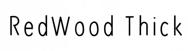
Herunterladen 391 Downloads@WebFont -
![RedWood Thick Frei Schriftart Herunterladen]() Herunterladen 391 Downloads@WebFont
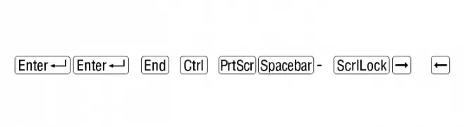
Herunterladen 391 Downloads@WebFont -
![RRKeyCaps-Normal Frei Schriftart Herunterladen]() Herunterladen 391 Downloads
Herunterladen 391 Downloads -
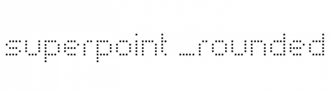
( Font by Sven Stuber - www.superlooper.de )
A modern, dotted font with a rounded, digital aesthetic.
![superpoint _rounded Frei Schriftart Herunterladen]() Herunterladen 391 Downloads@WebFont
Herunterladen 391 Downloads@WebFont -
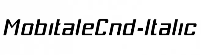
-
![MobitaleCnd-Italic Frei Schriftart Herunterladen]() Herunterladen 391 Downloads@WebFont
Herunterladen 391 Downloads@WebFont -
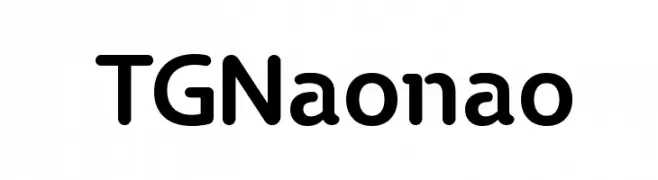
( Fonts by Timothy Gao - Personal-use only. For commercial use please contact owner. )
A modern sans-serif font with rounded edges and a friendly appearance.
![TGNaonao Frei Schriftart Herunterladen]() Herunterladen 391 Downloads@WebFont
Herunterladen 391 Downloads@WebFont -
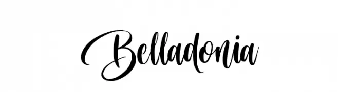
( Fonts by Octotype - www.foundmyfont.com - Personal-use only. For commercial use please contact owner. )
An elegant and flowing script font with ornate, cursive strokes.
![Belladonia Frei Schriftart Herunterladen]() Herunterladen 391 Downloads@WebFont
Herunterladen 391 Downloads@WebFont -
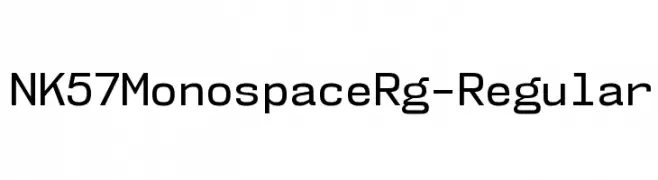
( Fonts by Typodermic Fonts )
A modern, monospaced font with geometric precision and uniformity.
![NK57MonospaceRg-Regular Frei Schriftart Herunterladen]() Herunterladen 391 Downloads@WebFont
Herunterladen 391 Downloads@WebFont -
( Fonts by Wahyu Eka Prasetya - wepfont.com - Personal-use only. For commercial use please contact owner. )
A bold, playful script font with a handwritten style.
![Dumaten Frei Schriftart Herunterladen]() Herunterladen 391 Downloads@WebFont
Herunterladen 391 Downloads@WebFont


Welche Schriften sind gerade am populärsten?
Poppins, Roboto, Montserrat, Open Sans und Lato sind wegen ihrer klaren Formen und breiten Einsetzbarkeit sehr gefragt – von Markenauftritt über Landingpages bis hin zu Postern.
Welche Fonts eignen sich für Logos?
Geometrische Sans‑Serifs (z. B. Poppins, Familien im Gotham‑Stil) sind ein häufiger Griff für sauberes, skalierbares Branding. Für eine persönlichere Note bleiben Scripts und Handschrift‑Stile beliebt. Kombinieren Sie einen prägnanten Headline‑Font mit einer neutralen Brotschrift für Wiedererkennung und Harmonie.
Wie oft wird die Top‑Liste aktualisiert?
Regelmäßig – basierend auf realen Downloads und Interaktionen. Schauen Sie öfter vorbei, um aufstrebende Favoriten früh zu entdecken.
💡 Tipp: Seite bookmarken – Trends wechseln schnell, und heutige Top‑Schriften inspirieren morgen vielleicht das Rebranding.