Willkommen bei den Top‑Schriften – hier treffen Beliebtheit und Qualität aufeinander. Das sind die in diesem Jahr am häufigsten heruntergeladenen und genutzten Fonts. Wenn Sie sichere Optionen für Logo, Web oder Social suchen, starten Sie hier.
Jeder Top‑Font überzeugt durch Balance, Lesbarkeit und Vielseitigkeit. Sie finden moderne Sans‑Serifs, elegante Scripts, Vintage‑Serifs und minimalistische Displays.
-
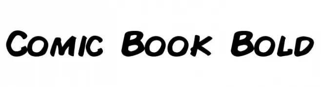
( Fonts by a Neale Davidson - www.pixelsagas.com. Personal-use only. For commercial use please contact owner. )
A bold, playful font with a comic book style and hand-drawn feel.
 Herunterladen 1437 Downloads@WebFont
 -
( Fonts by Arkandis Digital Foundry )
A bold, modern sans-serif font with clean lines and excellent readability.
![UniversalisADFStd-Bold Frei Schriftart Herunterladen]() Herunterladen 1437 Downloads@WebFont
Herunterladen 1437 Downloads@WebFont -
( Fonts by Bartek Nowak - www.nowak.tv/fontoholic/ )
A modern, barcode-inspired font with vertical line patterns.
![Paskowy Frei Schriftart Herunterladen]() Herunterladen 1437 Downloads@WebFont
Herunterladen 1437 Downloads@WebFont -
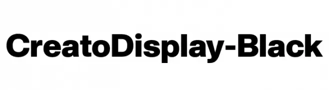
( Fonts by Lafontype - Anugrah Pasau - Personal-use only. For commercial use please contact owner. )
A bold, modern font with thick strokes and strong presence.
![CreatoDisplay-Black Frei Schriftart Herunterladen]() Herunterladen 1436 Downloads@WebFont
Herunterladen 1436 Downloads@WebFont -
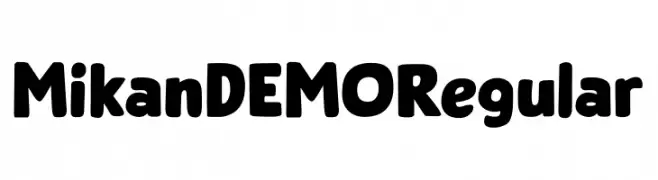
( Fonts by Hanoded )
A bold, playful font with rounded strokes and decorative elements.
![Mikan DEMO Regular Frei Schriftart Herunterladen]() Herunterladen 1436 Downloads@WebFont
Herunterladen 1436 Downloads@WebFont -
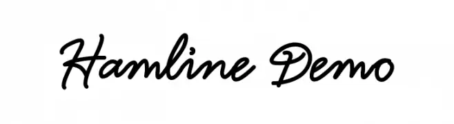
( Typia Nesia - www.myfonts.com/foundry/Typia_Nesia/ )
A flowing, cursive font with smooth, connected strokes and a casual elegance.
![Hamline Demo Frei Schriftart Herunterladen]() Herunterladen 1436 Downloads@WebFont
Herunterladen 1436 Downloads@WebFont -
( Fonts by Måns Grebäck )
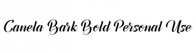
An elegant, flowing script font with bold, cursive letterforms.
![Canela Bark Bold Personal Use Frei Schriftart Herunterladen]() Herunterladen 1436 Downloads@WebFont
Herunterladen 1436 Downloads@WebFont -
( Copyright (c) 2015 by Rosetta Type Foundry s.r.o. (info@rosettatype.com). )
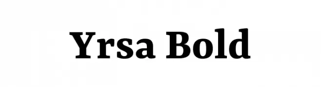
A bold serif typeface with strong strokes and classic elements.
![Yrsa Bold Frei Schriftart Herunterladen]() Herunterladen 1436 Downloads@WebFont
Herunterladen 1436 Downloads@WebFont -
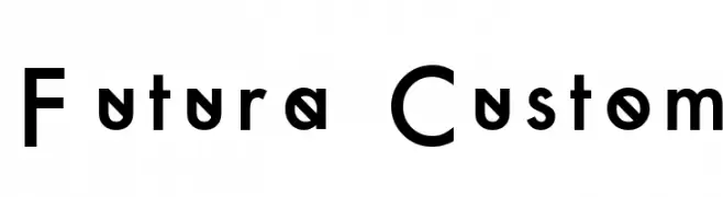
![Futura Custom Frei Schriftart Herunterladen]() Herunterladen 1436 Downloads@WebFont
Herunterladen 1436 Downloads@WebFont -
( Fonts by Andrew McCluskey - nalgames.com. Personal-use only. For commercial use please contact owner. )
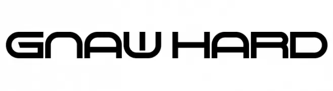
A futuristic, geometric font with bold, angular letterforms and unique cutouts.
![Gnaw Hard Frei Schriftart Herunterladen]() Herunterladen 1436 Downloads@WebFont
Herunterladen 1436 Downloads@WebFont -
( Free for Personal Use. To use commercially please visit the www.bvfonts.com )
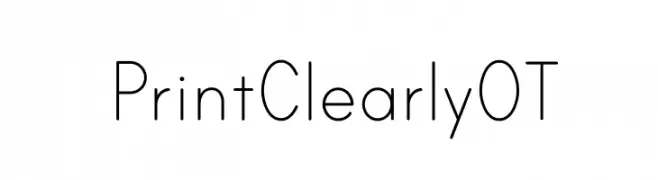
A clean, geometric sans-serif font with balanced spacing and clear readability.
![PrintClearlyOT Frei Schriftart Herunterladen]() Herunterladen 1436 Downloads@WebFont
Herunterladen 1436 Downloads@WebFont -
( Copyright (c) 2010, Santiago Orozco (hi@typemade.mx) )
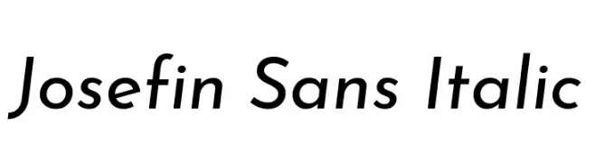
A modern, italic sans-serif font with a geometric touch and elegant style.
![Josefin Sans Italic Frei Schriftart Herunterladen]() Herunterladen 1436 Downloads@WebFont
Herunterladen 1436 Downloads@WebFont -
![Boredom Frei Schriftart Herunterladen]() Herunterladen 1436 Downloads@WebFont
Herunterladen 1436 Downloads@WebFont -
![Crush47 Frei Schriftart Herunterladen]() Herunterladen 1436 Downloads@WebFont
Herunterladen 1436 Downloads@WebFont -
( Fonts by LeFly Fonts - lefly.vepar.nl )
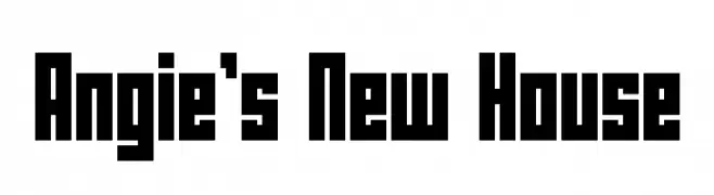
A bold, geometric font with a strong, block-like appearance.
![Angie's New House Frei Schriftart Herunterladen]() Herunterladen 1436 Downloads@WebFont
Herunterladen 1436 Downloads@WebFont -
![Reaver Frei Schriftart Herunterladen]() Herunterladen 1436 Downloads@WebFont
Herunterladen 1436 Downloads@WebFont -
( Fonts by Jacob Fisher - www.pizzadude.dk )
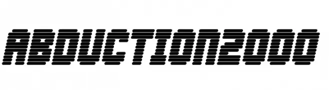
A futuristic, segmented font with a bold, digital aesthetic.
![Abduction2000 Frei Schriftart Herunterladen]() Herunterladen 1436 Downloads@WebFont
Herunterladen 1436 Downloads@WebFont -
![gutenberg bibelschrift Frei Schriftart Herunterladen]() Herunterladen 1436 Downloads@WebFont
Herunterladen 1436 Downloads@WebFont -
![Sunflower Highway Frei Schriftart Herunterladen]() Herunterladen 1435 Downloads@WebFont
Herunterladen 1435 Downloads@WebFont -
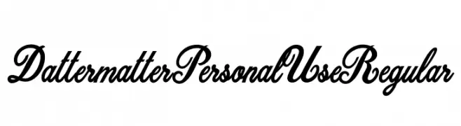
![Dattermatter Personal Use Regular Frei Schriftart Herunterladen]() Herunterladen 1435 Downloads@WebFont
Herunterladen 1435 Downloads@WebFont -
![Anachronism Frei Schriftart Herunterladen]() Herunterladen 1435 Downloads@WebFont
Herunterladen 1435 Downloads@WebFont -
( Fonts by a Neale Davidson - www.pixelsagas.com. Personal-use only. For commercial use please contact owner. )
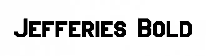
A bold, geometric font with a futuristic and industrial style.
![Jefferies Bold Frei Schriftart Herunterladen]() Herunterladen 1435 Downloads@WebFont
Herunterladen 1435 Downloads@WebFont -
![Pullstar Frei Schriftart Herunterladen]() Herunterladen 1435 Downloads@WebFont
Herunterladen 1435 Downloads@WebFont -
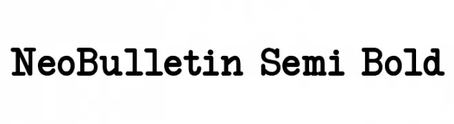
![NeoBulletin Semi Bold Frei Schriftart Herunterladen]() Herunterladen 1435 Downloads@WebFont
Herunterladen 1435 Downloads@WebFont -
![Reed Regular Frei Schriftart Herunterladen]() Herunterladen 1435 Downloads@WebFont
Herunterladen 1435 Downloads@WebFont -
![Bergmark Frei Schriftart Herunterladen]() Herunterladen 1435 Downloads@WebFont
Herunterladen 1435 Downloads@WebFont -
![24 LED Bright Frei Schriftart Herunterladen]() Herunterladen 1435 Downloads@WebFont
Herunterladen 1435 Downloads@WebFont -
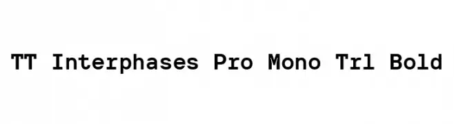
( Fonts by TypeType Foundry )
A bold, modern monospaced font with clear, uniform characters.
![TT Interphases Pro Mono Trl Bold Frei Schriftart Herunterladen]() Herunterladen 1434 Downloads@WebFont
Herunterladen 1434 Downloads@WebFont -
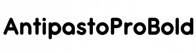
( Fonts by Zetafonts - Personal-use only. For commercial use please contact owner. )
A bold, rounded sans-serif font with smooth curves and a modern look.
![Antipasto Pro Bold Frei Schriftart Herunterladen]() Herunterladen 1434 Downloads@WebFont
Herunterladen 1434 Downloads@WebFont -
( Fonts by www.chequered.ink - Chequered Ink - Personal-use only. For commercial use please contact owner. )
A bold, distressed font with a rugged, textured appearance.
![Punishment Frei Schriftart Herunterladen]() Herunterladen 1434 Downloads@WebFont
Herunterladen 1434 Downloads@WebFont -
( Fonts by a www.fontfabric.com. Personal-use only. For commercial use please contact owner. )
A bold, hand-painted style font with a dynamic and rebellious look.
![GUERRILLA Normal Frei Schriftart Herunterladen]() Herunterladen 1434 Downloads@WebFont
Herunterladen 1434 Downloads@WebFont -
( Fonts by Castcraft Software - opti.netii.net - check the website before use )
A classic serif font with elegant, sharp serifs and a traditional appearance.
![OPTICloister Frei Schriftart Herunterladen]() Herunterladen 1434 Downloads@WebFont
Herunterladen 1434 Downloads@WebFont -
( www.redbubble.com/people/anfa/portfolio )
A bold, dripping font with a rebellious and edgy style.
![Anti Everything Frei Schriftart Herunterladen]() Herunterladen 1434 Downloads@WebFont
Herunterladen 1434 Downloads@WebFont -
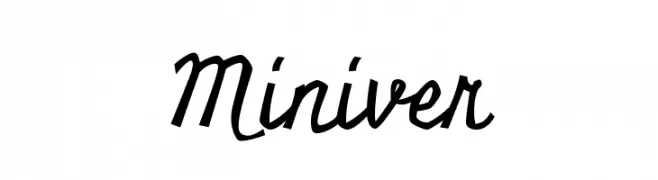
( Copyright (c) 2011, Open Window (https://profiles.google.com/openwindowfonts/about) )
A bold, dynamic script font with fluid, connected letterforms and a playful style.
![Miniver Frei Schriftart Herunterladen]() Herunterladen 1434 Downloads@WebFont
Herunterladen 1434 Downloads@WebFont -
![Trendy Pornography Frei Schriftart Herunterladen]() Herunterladen 1434 Downloads@WebFont
Herunterladen 1434 Downloads@WebFont


Welche Schriften sind gerade am populärsten?
Poppins, Roboto, Montserrat, Open Sans und Lato sind wegen ihrer klaren Formen und breiten Einsetzbarkeit sehr gefragt – von Markenauftritt über Landingpages bis hin zu Postern.
Welche Fonts eignen sich für Logos?
Geometrische Sans‑Serifs (z. B. Poppins, Familien im Gotham‑Stil) sind ein häufiger Griff für sauberes, skalierbares Branding. Für eine persönlichere Note bleiben Scripts und Handschrift‑Stile beliebt. Kombinieren Sie einen prägnanten Headline‑Font mit einer neutralen Brotschrift für Wiedererkennung und Harmonie.
Wie oft wird die Top‑Liste aktualisiert?
Regelmäßig – basierend auf realen Downloads und Interaktionen. Schauen Sie öfter vorbei, um aufstrebende Favoriten früh zu entdecken.
💡 Tipp: Seite bookmarken – Trends wechseln schnell, und heutige Top‑Schriften inspirieren morgen vielleicht das Rebranding.