Willkommen bei den Top‑Schriften – hier treffen Beliebtheit und Qualität aufeinander. Das sind die in diesem Jahr am häufigsten heruntergeladenen und genutzten Fonts. Wenn Sie sichere Optionen für Logo, Web oder Social suchen, starten Sie hier.
Jeder Top‑Font überzeugt durch Balance, Lesbarkeit und Vielseitigkeit. Sie finden moderne Sans‑Serifs, elegante Scripts, Vintage‑Serifs und minimalistische Displays.
-
Schriftart von danny91194. For commercial use please contact the owner.
( r )
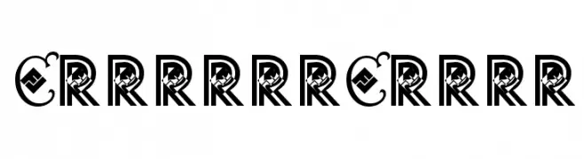
A decorative font with ornate, stylized letterforms and high contrast.
 Herunterladen 389 Downloads@WebFont
 -
![AtamGurmukhi Frei Schriftart Herunterladen]() Herunterladen 389 Downloads@WebFont
Herunterladen 389 Downloads@WebFont -
( Fonts by Mozarella Art )
A decorative font with intricate floral patterns within bold uppercase letters.
![KEYZHA Frei Schriftart Herunterladen]() Herunterladen 389 Downloads@WebFont
Herunterladen 389 Downloads@WebFont -
( Fonts by Mytype Studio - Mhd Husaini - Personal-use only. For commercial use please contact owner. )
A dynamic and elegant script font with flowing, cursive letterforms.
![Atarashi Frei Schriftart Herunterladen]() Herunterladen 389 Downloads@WebFont
Herunterladen 389 Downloads@WebFont -
( Fonts by Geronimo )
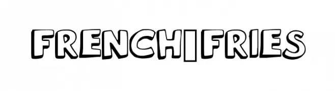
A bold, playful font with rounded, outlined characters and a cartoonish style.
![French_Fries Frei Schriftart Herunterladen]() Herunterladen 389 Downloads@WebFont
Herunterladen 389 Downloads@WebFont -
-
( Fonts by EssentialsStudio - Personal-use only. For commercial use please contact owner. )
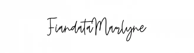
A playful and elegant handwritten font with fluid, connected letterforms.
![Fiandata Marlyne Frei Schriftart Herunterladen]() Herunterladen 389 Downloads@WebFont
Herunterladen 389 Downloads@WebFont -
( Fonts by Apostrophic Lab )
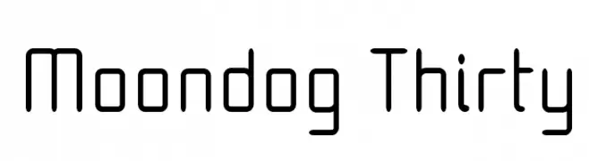
A modern, geometric font with rounded edges and a minimalist style.
![Moondog Thirty Frei Schriftart Herunterladen]() Herunterladen 389 Downloads@WebFont
Herunterladen 389 Downloads@WebFont -
( Fonts by Graphix Line Studio )
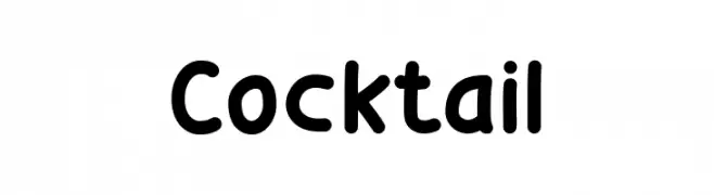
A playful, rounded font with smooth curves and a friendly appearance.
![Cocktail Frei Schriftart Herunterladen]() Herunterladen 389 Downloads@WebFont
Herunterladen 389 Downloads@WebFont -
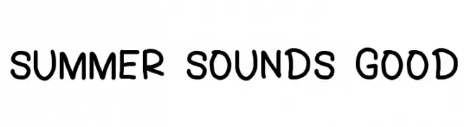
![SUMMER SOUNDS GOOD Frei Schriftart Herunterladen]() Herunterladen 389 Downloads@WebFont
Herunterladen 389 Downloads@WebFont -
( Fonts by Elleanor Vickery )
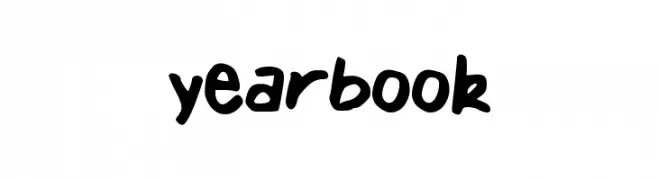
A bold, playful handwritten font with rounded, casual letterforms.
![yearbook Frei Schriftart Herunterladen]() Herunterladen 389 Downloads@WebFont
Herunterladen 389 Downloads@WebFont


Welche Schriften sind gerade am populärsten?
Poppins, Roboto, Montserrat, Open Sans und Lato sind wegen ihrer klaren Formen und breiten Einsetzbarkeit sehr gefragt – von Markenauftritt über Landingpages bis hin zu Postern.
Welche Fonts eignen sich für Logos?
Geometrische Sans‑Serifs (z. B. Poppins, Familien im Gotham‑Stil) sind ein häufiger Griff für sauberes, skalierbares Branding. Für eine persönlichere Note bleiben Scripts und Handschrift‑Stile beliebt. Kombinieren Sie einen prägnanten Headline‑Font mit einer neutralen Brotschrift für Wiedererkennung und Harmonie.
Wie oft wird die Top‑Liste aktualisiert?
Regelmäßig – basierend auf realen Downloads und Interaktionen. Schauen Sie öfter vorbei, um aufstrebende Favoriten früh zu entdecken.
💡 Tipp: Seite bookmarken – Trends wechseln schnell, und heutige Top‑Schriften inspirieren morgen vielleicht das Rebranding.