Willkommen bei den Top‑Schriften – hier treffen Beliebtheit und Qualität aufeinander. Das sind die in diesem Jahr am häufigsten heruntergeladenen und genutzten Fonts. Wenn Sie sichere Optionen für Logo, Web oder Social suchen, starten Sie hier.
Jeder Top‑Font überzeugt durch Balance, Lesbarkeit und Vielseitigkeit. Sie finden moderne Sans‑Serifs, elegante Scripts, Vintage‑Serifs und minimalistische Displays.
-
( Fonts by allsuperfont.com - Personal-use only. For commercial use please contact owner. )
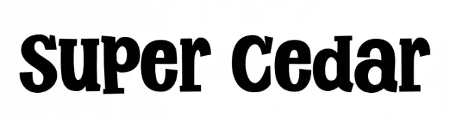
A bold, playful font with thick, rounded serifs and a strong presence.
 Herunterladen 385 Downloads@WebFont
 -
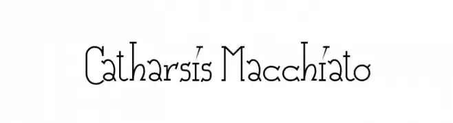
![Catharsis Macchiato Frei Schriftart Herunterladen]() Herunterladen 385 Downloads@WebFont
Herunterladen 385 Downloads@WebFont -
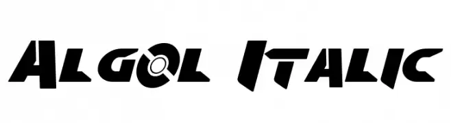
![Algol Italic Frei Schriftart Herunterladen]() Herunterladen 385 Downloads@WebFont
Herunterladen 385 Downloads@WebFont -
( Fonts by Daniel Zadorozny - www.iconian.com )
A bold, futuristic font with geometric and angular design elements.
![Judge Frei Schriftart Herunterladen]() Herunterladen 385 Downloads@WebFont
Herunterladen 385 Downloads@WebFont -
( Fonts by Kurdz - vividbluezz.weebly.com )
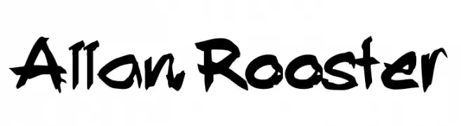
A bold, graffiti-inspired font with dynamic, hand-drawn characters.
![Allan Rooster Frei Schriftart Herunterladen]() Herunterladen 385 Downloads@WebFont
Herunterladen 385 Downloads@WebFont -
-
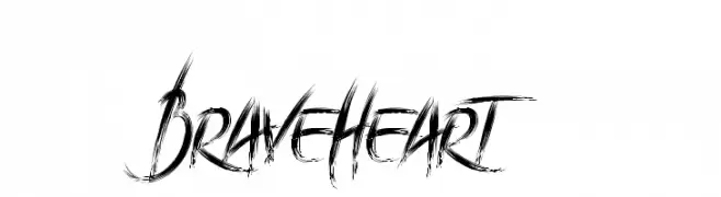
( Motokiwo - Anton Cahyono - creativemarket.com/Motokiwo?u=Motokiwo )
A dynamic, brush-textured font with sharp, angular strokes and a bold, artistic style.
![BraveHeart Frei Schriftart Herunterladen]() Herunterladen 385 Downloads@WebFont
Herunterladen 385 Downloads@WebFont -
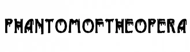
( Fonts by Woodcutter )
A bold, dripping font with a gothic and theatrical style.
![Phantom of the Opera Frei Schriftart Herunterladen]() Herunterladen 385 Downloads@WebFont
Herunterladen 385 Downloads@WebFont -
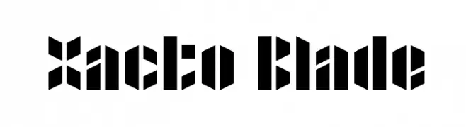
( Fonts by Rich Gast - www.greywolfwebworks.com Sponsoren Schriftart )
A bold, geometric font with sharp, angular edges and a stencil-like appearance.
![Xacto Blade Frei Schriftart Herunterladen]() Herunterladen 385 Downloads
Herunterladen 385 Downloads -
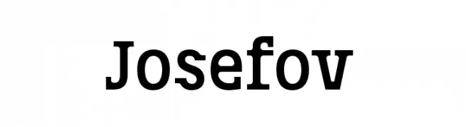
( Fonts by ingoFonts. http://www.ingofonts.de )
A bold, robust slab serif font with strong, block-like serifs.
![Josefov Frei Schriftart Herunterladen]() Herunterladen 385 Downloads@WebFont
Herunterladen 385 Downloads@WebFont -
( Fonts by Graham Meade - GemFonts )
A modern, geometric, and condensed font with thin lines and a minimalist style.
![Elgethy Est Condensed Frei Schriftart Herunterladen]() Herunterladen 385 Downloads@WebFont
Herunterladen 385 Downloads@WebFont

Welche Schriften sind gerade am populärsten?
Poppins, Roboto, Montserrat, Open Sans und Lato sind wegen ihrer klaren Formen und breiten Einsetzbarkeit sehr gefragt – von Markenauftritt über Landingpages bis hin zu Postern.
Welche Fonts eignen sich für Logos?
Geometrische Sans‑Serifs (z. B. Poppins, Familien im Gotham‑Stil) sind ein häufiger Griff für sauberes, skalierbares Branding. Für eine persönlichere Note bleiben Scripts und Handschrift‑Stile beliebt. Kombinieren Sie einen prägnanten Headline‑Font mit einer neutralen Brotschrift für Wiedererkennung und Harmonie.
Wie oft wird die Top‑Liste aktualisiert?
Regelmäßig – basierend auf realen Downloads und Interaktionen. Schauen Sie öfter vorbei, um aufstrebende Favoriten früh zu entdecken.
💡 Tipp: Seite bookmarken – Trends wechseln schnell, und heutige Top‑Schriften inspirieren morgen vielleicht das Rebranding.