Willkommen bei den Top‑Schriften – hier treffen Beliebtheit und Qualität aufeinander. Das sind die in diesem Jahr am häufigsten heruntergeladenen und genutzten Fonts. Wenn Sie sichere Optionen für Logo, Web oder Social suchen, starten Sie hier.
Jeder Top‑Font überzeugt durch Balance, Lesbarkeit und Vielseitigkeit. Sie finden moderne Sans‑Serifs, elegante Scripts, Vintage‑Serifs und minimalistische Displays.
-
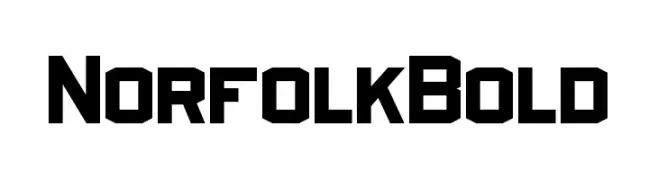
( Pixel Sagas - Neale and Shayna Davidson - www.pixelsagas.com )
A bold, geometric font with a modern, industrial style.
 Herunterladen 384 Downloads@WebFont
 -
( Fonts by Green Adventure Studio - Ardi Parwito - Personal-use only. For commercial use please contact owner. )
A bold, dynamic brush-style font with expressive strokes.
![Forza Frei Schriftart Herunterladen]() Herunterladen 384 Downloads@WebFont
Herunterladen 384 Downloads@WebFont -
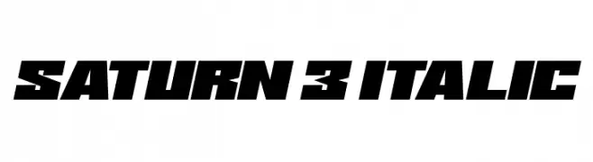
![Saturn 3 Italic Frei Schriftart Herunterladen]() Herunterladen 384 Downloads@WebFont
Herunterladen 384 Downloads@WebFont -
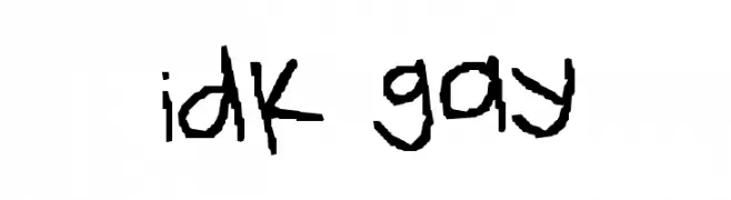
![idk gay Frei Schriftart Herunterladen]() Herunterladen 384 Downloads@WebFont
Herunterladen 384 Downloads@WebFont -
( Fonts by a Max Infeld - XEROGRAPHER FONTS - xerographer.blogspot.com . Personal-use only. For commercial use please contact owner. )
A bold, textured font with a gritty, vintage appearance.
![FinalRelief Frei Schriftart Herunterladen]() Herunterladen 384 Downloads@WebFont
Herunterladen 384 Downloads@WebFont -
-
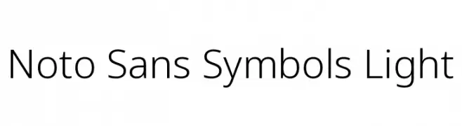
( Noto is a trademark of Google Inc. Noto fonts are open source. All Noto fonts are published under the SIL Open Font License, Version 1.1 )
A clean, modern sans-serif typeface with a light weight and balanced design.
![Noto Sans Symbols Light Frei Schriftart Herunterladen]() Herunterladen 384 Downloads@WebFont
Herunterladen 384 Downloads@WebFont -
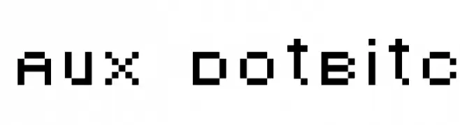
![AuX DotBitC Frei Schriftart Herunterladen]() Herunterladen 384 Downloads@WebFont
Herunterladen 384 Downloads@WebFont -
( Fonts by Haslinda Adnan )
A playful, rounded font with a whimsical and friendly appearance.
![kiddy Frei Schriftart Herunterladen]() Herunterladen 384 Downloads@WebFont
Herunterladen 384 Downloads@WebFont -
( Fonts by Anke Arnold - www.anke-art.de )
A playful, dotted cursive font with a whimsical and airy design.
![Pffft Frei Schriftart Herunterladen]() Herunterladen 384 Downloads@WebFont
Herunterladen 384 Downloads@WebFont -
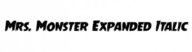
( Fonts by Daniel Zadorozny - www.iconian.com - Free for personal use )
A bold, expanded, and italicized font with a jagged, distressed style.
![Mrs. Monster Expanded Italic Frei Schriftart Herunterladen]() Herunterladen 384 Downloads@WebFont
Herunterladen 384 Downloads@WebFont


Welche Schriften sind gerade am populärsten?
Poppins, Roboto, Montserrat, Open Sans und Lato sind wegen ihrer klaren Formen und breiten Einsetzbarkeit sehr gefragt – von Markenauftritt über Landingpages bis hin zu Postern.
Welche Fonts eignen sich für Logos?
Geometrische Sans‑Serifs (z. B. Poppins, Familien im Gotham‑Stil) sind ein häufiger Griff für sauberes, skalierbares Branding. Für eine persönlichere Note bleiben Scripts und Handschrift‑Stile beliebt. Kombinieren Sie einen prägnanten Headline‑Font mit einer neutralen Brotschrift für Wiedererkennung und Harmonie.
Wie oft wird die Top‑Liste aktualisiert?
Regelmäßig – basierend auf realen Downloads und Interaktionen. Schauen Sie öfter vorbei, um aufstrebende Favoriten früh zu entdecken.
💡 Tipp: Seite bookmarken – Trends wechseln schnell, und heutige Top‑Schriften inspirieren morgen vielleicht das Rebranding.