Willkommen bei den Top‑Schriften – hier treffen Beliebtheit und Qualität aufeinander. Das sind die in diesem Jahr am häufigsten heruntergeladenen und genutzten Fonts. Wenn Sie sichere Optionen für Logo, Web oder Social suchen, starten Sie hier.
Jeder Top‑Font überzeugt durch Balance, Lesbarkeit und Vielseitigkeit. Sie finden moderne Sans‑Serifs, elegante Scripts, Vintage‑Serifs und minimalistische Displays.
-
 Herunterladen 382 Downloads@WebFont
 -
( Fonts by billyargel.blogspot.com - Billy Argel )
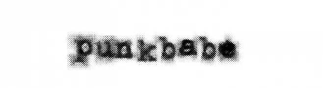
A bold, distressed font with a grunge, spray-painted aesthetic.
![PUNKBABE Frei Schriftart Herunterladen]() Herunterladen 382 Downloads@WebFont
Herunterladen 382 Downloads@WebFont -
( Fonts by Kat`s Fun Fonts - Personal-use only. For commercial use please contact owner. )
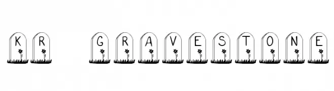
A decorative font with letters inside gravestone shapes, ideal for spooky themes.
![KR Gravestone Frei Schriftart Herunterladen]() Herunterladen 382 Downloads@WebFont
Herunterladen 382 Downloads@WebFont -
( Fonts by weknow - Wino S Kadir )
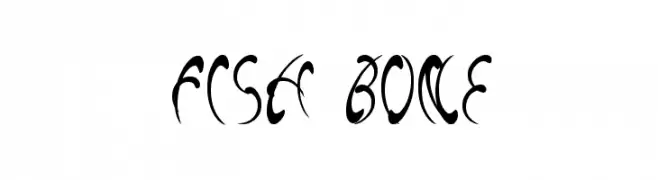
A decorative font with flowing, fish bone-like curves and sharp edges.
![fish bone Frei Schriftart Herunterladen]() Herunterladen 382 Downloads@WebFont
Herunterladen 382 Downloads@WebFont -
( Fonts by Fabrika De Typos - Marcio Hirosse - fabrikadetypos.blogspot.com )
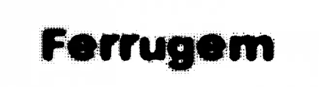
A bold, textured font with a playful, vintage feel.
![Ferrugem Frei Schriftart Herunterladen]() Herunterladen 382 Downloads@WebFont
Herunterladen 382 Downloads@WebFont -
-
( Fonts by Jeff Levine. FREEWARE )
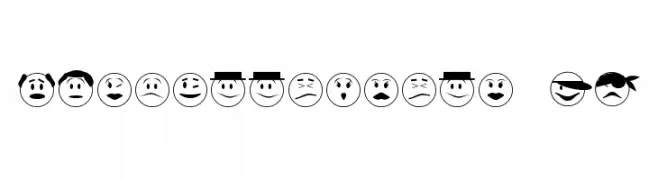
Cartoon emoticon dingbat font with diverse facial expressions.
![Expressionism JL Frei Schriftart Herunterladen]() Herunterladen 382 Downloads@WebFont
Herunterladen 382 Downloads@WebFont -
( Fonts by Alejo Bergmann )
A bold, geometric font with a modern and clean design.
![Cunia Frei Schriftart Herunterladen]() Herunterladen 382 Downloads@WebFont
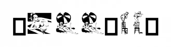
Herunterladen 382 Downloads@WebFont -
![Dollybat Frei Schriftart Herunterladen]() Herunterladen 382 Downloads@WebFont
Herunterladen 382 Downloads@WebFont -
( Fonts by Vanessa Bays - bythebutterfly.com )
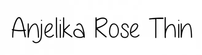
A playful, thin handwritten font with a whimsical and casual style.
![Anjelika Rose Thin Frei Schriftart Herunterladen]() Herunterladen 382 Downloads@WebFont
Herunterladen 382 Downloads@WebFont -
( Fonts by wepfont - Wahyu Eka Prasetya - Personal-use only. For commercial use please contact owner. )
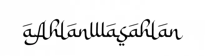
An elegant, script-like font with flowing curves and a calligraphic style.
![a Ahlan Wasahlan Frei Schriftart Herunterladen]() Herunterladen 382 Downloads@WebFont
Herunterladen 382 Downloads@WebFont

Welche Schriften sind gerade am populärsten?
Poppins, Roboto, Montserrat, Open Sans und Lato sind wegen ihrer klaren Formen und breiten Einsetzbarkeit sehr gefragt – von Markenauftritt über Landingpages bis hin zu Postern.
Welche Fonts eignen sich für Logos?
Geometrische Sans‑Serifs (z. B. Poppins, Familien im Gotham‑Stil) sind ein häufiger Griff für sauberes, skalierbares Branding. Für eine persönlichere Note bleiben Scripts und Handschrift‑Stile beliebt. Kombinieren Sie einen prägnanten Headline‑Font mit einer neutralen Brotschrift für Wiedererkennung und Harmonie.
Wie oft wird die Top‑Liste aktualisiert?
Regelmäßig – basierend auf realen Downloads und Interaktionen. Schauen Sie öfter vorbei, um aufstrebende Favoriten früh zu entdecken.
💡 Tipp: Seite bookmarken – Trends wechseln schnell, und heutige Top‑Schriften inspirieren morgen vielleicht das Rebranding.