Willkommen bei den Top‑Schriften – hier treffen Beliebtheit und Qualität aufeinander. Das sind die in diesem Jahr am häufigsten heruntergeladenen und genutzten Fonts. Wenn Sie sichere Optionen für Logo, Web oder Social suchen, starten Sie hier.
Jeder Top‑Font überzeugt durch Balance, Lesbarkeit und Vielseitigkeit. Sie finden moderne Sans‑Serifs, elegante Scripts, Vintage‑Serifs und minimalistische Displays.
-
( Fonts by Nick Curtis - www.nicksfonts.com )
A playful and whimsical font with curly serifs and rounded edges.
 Herunterladen 1401 Downloads@WebFont
 -
( Fonts by Cumberland Fontworks - http://www222.pair.com/sjohn/fonts.htm - S. John Ross )
A playful, hand-drawn font with irregular, wavy strokes and a whimsical style.
![Apple Butter Frei Schriftart Herunterladen]() Herunterladen 1401 Downloads@WebFont
Herunterladen 1401 Downloads@WebFont -
( Fonts by Type Forward Foundry - Personal-use only. For commercial use please contact owner. )
A bold, modern sans-serif font with uniform strokes and a strong presence.
![Garet Heavy Frei Schriftart Herunterladen]() Herunterladen 1400 Downloads@WebFont
Herunterladen 1400 Downloads@WebFont -
Schriftart von spideraysfonts. For commercial use please contact the owner.
( DEAD ON TIME )
A bold, geometric font with angular shapes and strong visual impact.
![DEAD ON TIME Frei Schriftart Herunterladen]() Herunterladen 1400 Downloads@WebFont
Herunterladen 1400 Downloads@WebFont -
( Fonts by Cristiano Sobral - Personal-use only. For commercial use please contact owner. )
A bold serif font with classic elegance and strong readability.
![Avrile Serif Bold Frei Schriftart Herunterladen]() Herunterladen 1400 Downloads@WebFont
Herunterladen 1400 Downloads@WebFont -
( Peter Bielous )
A bold blackletter font with sharp, angular lines and dramatic strokes.
![Bad Boys Frei Schriftart Herunterladen]() Herunterladen 1400 Downloads@WebFont
Herunterladen 1400 Downloads@WebFont -
( Fonts by CannotIntoSpaceFonts - KineticPlasma Fonts - Personal-use only. For commercial use please contact owner. )
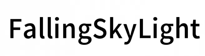
A clean, modern sans-serif font with uniform stroke width and excellent readability.
![Falling Sky Light Frei Schriftart Herunterladen]() Herunterladen 1400 Downloads@WebFont
Herunterladen 1400 Downloads@WebFont -
( Fonts by www.someshinzz.com )
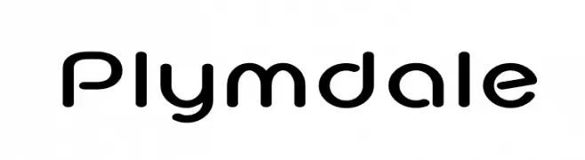
A modern, rounded sans-serif font with smooth curves and balanced spacing.
![Plymdale Frei Schriftart Herunterladen]() Herunterladen 1400 Downloads@WebFont
Herunterladen 1400 Downloads@WebFont -
( Fonts by a cenz qobbal - www.facebook.com/cenzqobbalfonts. Personal-use only. For commercial use please contact owner. )
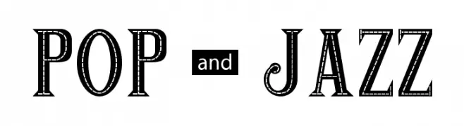
A bold, decorative font with vintage flair and intricate detailing.
![POP & JAZZ Frei Schriftart Herunterladen]() Herunterladen 1400 Downloads@WebFont
Herunterladen 1400 Downloads@WebFont -
( Fonts by Ingo Zimmermann - www.ingofonts.com )
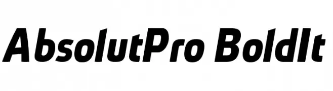
A bold, italic font with a modern and dynamic style.
![AbsolutPro-BoldIt Frei Schriftart Herunterladen]() Herunterladen 1400 Downloads@WebFont
Herunterladen 1400 Downloads@WebFont -
( Fonts by Tobias Benjamin Kohler - www.uncia.de )
A modern, monospaced typeface with rounded edges and a playful style.
![monofur Frei Schriftart Herunterladen]() Herunterladen 1400 Downloads@WebFont
Herunterladen 1400 Downloads@WebFont -
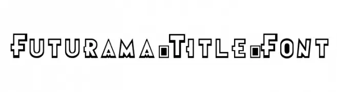
![Futurama-Title-Font Frei Schriftart Herunterladen]() Herunterladen 1400 Downloads@WebFont
Herunterladen 1400 Downloads@WebFont -
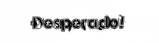
( Fonts by Jonathan Paquette - www.jonathanpaquette.com )
A bold, distressed font with a rugged, vintage aesthetic.
![Desperado! Frei Schriftart Herunterladen]() Herunterladen 1400 Downloads@WebFont
Herunterladen 1400 Downloads@WebFont -
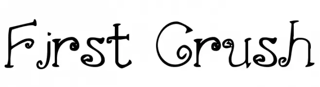
( Fonts by www.stimuleyefonts.com )
A whimsical decorative font with curly and swirly elements.
![First Crush Frei Schriftart Herunterladen]() Herunterladen 1400 Downloads@WebFont
Herunterladen 1400 Downloads@WebFont -
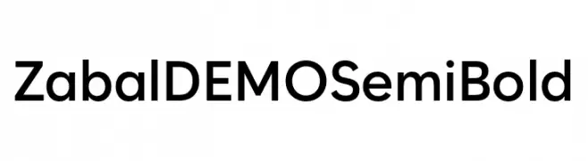
( Fonts by Font People - Personal-use only. For commercial use please contact owner. )
A modern sans-serif font with a semi-bold weight, offering clarity and professionalism.
![Zabal DEMO SemiBold Frei Schriftart Herunterladen]() Herunterladen 1399 Downloads@WebFont
Herunterladen 1399 Downloads@WebFont -
( Fonts by casualized )
A playful, bubbly font with a hand-drawn, whimsical style.
![Little Jelly Frei Schriftart Herunterladen]() Herunterladen 1399 Downloads@WebFont
Herunterladen 1399 Downloads@WebFont -
Schriftart von ryanmartinson. For commercial use please contact the owner.
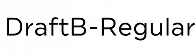
( The complete 144-font Draftâ„¢ superfamily is available here: https://www.myfonts.com/fonts/yellow-design/draft/ Thanks! )
A modern, geometric sans-serif font with clean lines and uniform strokes.
![DraftB-Regular Frei Schriftart Herunterladen]() Herunterladen 1399 Downloads@WebFont
Herunterladen 1399 Downloads@WebFont -
( Fonts by Oriol Esparraguera - Personal-use only. For commercial use please contact owner. )
A modern, clean sans-serif typeface with a minimalistic design.
![Aftasans Frei Schriftart Herunterladen]() Herunterladen 1399 Downloads@WebFont
Herunterladen 1399 Downloads@WebFont -
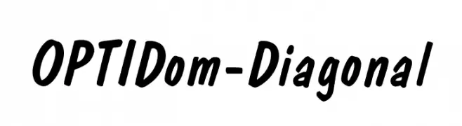
( Fonts by Castcraft Software - opti.netii.net - check the website before use )
A bold, slanted font with rounded characters and a dynamic, energetic style.
![OPTIDom-Diagonal Frei Schriftart Herunterladen]() Herunterladen 1399 Downloads@WebFont
Herunterladen 1399 Downloads@WebFont -
![Calendary Hands PERSONAL USE DEMO Frei Schriftart Herunterladen]() Herunterladen 1399 Downloads@WebFont
Herunterladen 1399 Downloads@WebFont -
![OdaBalloon Bold Frei Schriftart Herunterladen]() Herunterladen 1399 Downloads@WebFont
Herunterladen 1399 Downloads@WebFont -
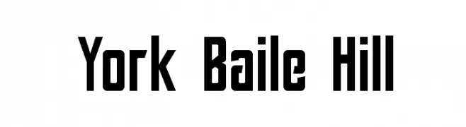
( Fonts by Pilaster Davy )
A bold, geometric font with uniform stroke width and modern appeal.
![York Baile Hill Frei Schriftart Herunterladen]() Herunterladen 1398 Downloads@WebFont
Herunterladen 1398 Downloads@WebFont -
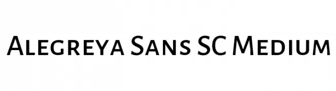
( Copyright 2013 The Alegreya Sans Project Authors (https://github.com/huertatipografica/Alegreya-Sans) )
A modern sans-serif font with medium weight, offering clarity and versatility.
![Alegreya Sans SC Medium Frei Schriftart Herunterladen]() Herunterladen 1398 Downloads@WebFont
Herunterladen 1398 Downloads@WebFont -
![Comic Block DEMO by Marta van Eck Frei Schriftart Herunterladen]() Herunterladen 1398 Downloads@WebFont
Herunterladen 1398 Downloads@WebFont -
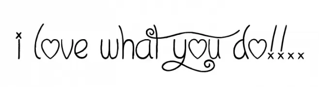
( Font by Jonathan Harris - www.tattoowoo.com )
A whimsical, decorative font with playful swirls and heart motifs.
![I Love What You Do!!.. Frei Schriftart Herunterladen]() Herunterladen 1398 Downloads@WebFont
Herunterladen 1398 Downloads@WebFont -
( Copyright 2016 The Rokkit Project Authors (contact@sansoxygen.com) )
A modern, light serif font with elegant proportions and excellent readability.
![Rokkitt Light Frei Schriftart Herunterladen]() Herunterladen 1398 Downloads@WebFont
Herunterladen 1398 Downloads@WebFont -
![Pompadour Black Frei Schriftart Herunterladen]() Herunterladen 1398 Downloads@WebFont
Herunterladen 1398 Downloads@WebFont -
( Fonts by Galdino Otten Fonts - www.galdinootten.com - Personal-use only. For commercial use please contact owner. )
A bold, distressed font with a vintage letterpress style.
![Press Style Frei Schriftart Herunterladen]() Herunterladen 1397 Downloads@WebFont
Herunterladen 1397 Downloads@WebFont -
( Fonts by Google - Personal-use only. For commercial use please contact owner. )
A bold, clean sans-serif typeface with geometric shapes and uniform strokes.
![Franko Bold Frei Schriftart Herunterladen]() Herunterladen 1397 Downloads@WebFont
Herunterladen 1397 Downloads@WebFont -
![FREAKY HALLOWEEN Frei Schriftart Herunterladen]() Herunterladen 1397 Downloads@WebFont
Herunterladen 1397 Downloads@WebFont -
( Copyright 2017 The Gemunu Libre Project Authors (https://github.com/mooniak/gemunu-libre-font) )
A bold, modern sans-serif font with clean lines and strong presence.
![Gemunu Libre Bold Frei Schriftart Herunterladen]() Herunterladen 1397 Downloads@WebFont
Herunterladen 1397 Downloads@WebFont -
( Copyright (c) 2011, Cyreal (www.cyreal.org) )
A modern, geometric sans-serif font with clean lines and uniform stroke width.
![Rationale Frei Schriftart Herunterladen]() Herunterladen 1397 Downloads@WebFont
Herunterladen 1397 Downloads@WebFont -
![Trek Movie Frei Schriftart Herunterladen]() Herunterladen 1397 Downloads@WebFont
Herunterladen 1397 Downloads@WebFont -
( Free for a personal use. For a commercial use please visit www.kevinandamanda.com )
A bold, playful font with a vintage flair and rounded characters.
![My Own Topher Frei Schriftart Herunterladen]() Herunterladen 1397 Downloads@WebFont
Herunterladen 1397 Downloads@WebFont -
( Fonts by www.aenigmafonts.com )
A modern, geometric font with rounded edges and a clean, streamlined appearance.
![36 days ago BRK Frei Schriftart Herunterladen]() Herunterladen 1397 Downloads@WebFont
Herunterladen 1397 Downloads@WebFont


Welche Schriften sind gerade am populärsten?
Poppins, Roboto, Montserrat, Open Sans und Lato sind wegen ihrer klaren Formen und breiten Einsetzbarkeit sehr gefragt – von Markenauftritt über Landingpages bis hin zu Postern.
Welche Fonts eignen sich für Logos?
Geometrische Sans‑Serifs (z. B. Poppins, Familien im Gotham‑Stil) sind ein häufiger Griff für sauberes, skalierbares Branding. Für eine persönlichere Note bleiben Scripts und Handschrift‑Stile beliebt. Kombinieren Sie einen prägnanten Headline‑Font mit einer neutralen Brotschrift für Wiedererkennung und Harmonie.
Wie oft wird die Top‑Liste aktualisiert?
Regelmäßig – basierend auf realen Downloads und Interaktionen. Schauen Sie öfter vorbei, um aufstrebende Favoriten früh zu entdecken.
💡 Tipp: Seite bookmarken – Trends wechseln schnell, und heutige Top‑Schriften inspirieren morgen vielleicht das Rebranding.