Willkommen bei den Top‑Schriften – hier treffen Beliebtheit und Qualität aufeinander. Das sind die in diesem Jahr am häufigsten heruntergeladenen und genutzten Fonts. Wenn Sie sichere Optionen für Logo, Web oder Social suchen, starten Sie hier.
Jeder Top‑Font überzeugt durch Balance, Lesbarkeit und Vielseitigkeit. Sie finden moderne Sans‑Serifs, elegante Scripts, Vintage‑Serifs und minimalistische Displays.
-
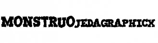
( Fonts by jedalias mendez - jeda - Personal-use only. For commercial use please contact owner. )
A bold, distressed font with a rugged, hand-carved appearance.
 Herunterladen 377 Downloads@WebFont
 -
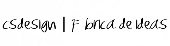
![CSDESIGN | Fábrica de ideas Frei Schriftart Herunterladen]() Herunterladen 377 Downloads@WebFont
Herunterladen 377 Downloads@WebFont -
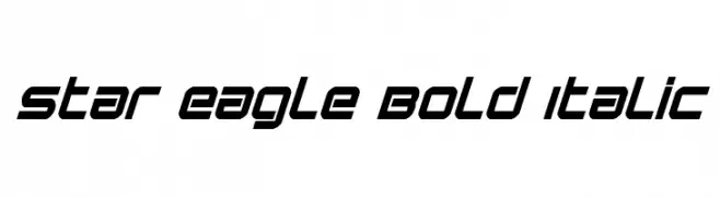
( Fonts by Daniel Zadorozny - www.iconian.com )
A bold, italicized font with a futuristic and dynamic style.
![Star Eagle Bold Italic Frei Schriftart Herunterladen]() Herunterladen 377 Downloads@WebFont
Herunterladen 377 Downloads@WebFont -
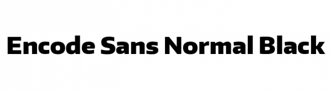
( Fonts by Impallari Type - Personal-use only. For commercial use please contact owner. )
A bold, modern sans-serif font with strong, clean lines.
![Encode Sans Normal Black Frei Schriftart Herunterladen]() Herunterladen 377 Downloads@WebFont
Herunterladen 377 Downloads@WebFont -
( Fonts by Vladimir Nikolic - https://www.creativefabrica.com/product/educated-deers/ref/144265/ - Personal-use only. For commercial use please contact owner. )
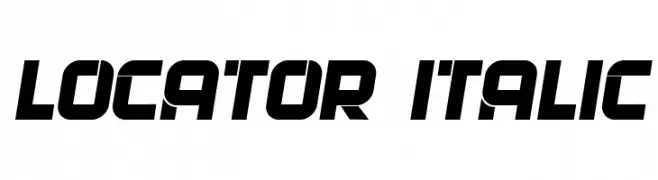
A bold, italicized font with a futuristic and dynamic design.
![Locator Italic Frei Schriftart Herunterladen]() Herunterladen 377 Downloads@WebFont
Herunterladen 377 Downloads@WebFont -
-
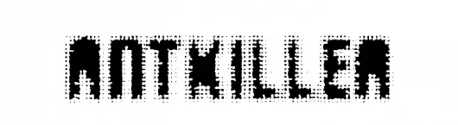
![AntKiller Frei Schriftart Herunterladen]() Herunterladen 377 Downloads@WebFont
Herunterladen 377 Downloads@WebFont -
( Fonts by Mans Greback - www.mawns.com )
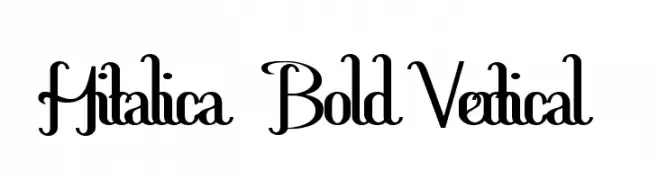
A bold, decorative font with intertwined uppercase letters and elegant curves.
![Hitalica Bold Vertical Frei Schriftart Herunterladen]() Herunterladen 377 Downloads@WebFont
Herunterladen 377 Downloads@WebFont -
( koeiekat - koeiekat.com )
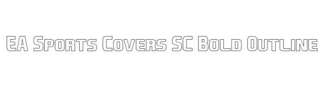
A bold, outlined font with a modern and geometric style.
![EA Sports Covers SC Bold Outline Frei Schriftart Herunterladen]() Herunterladen 377 Downloads@WebFont
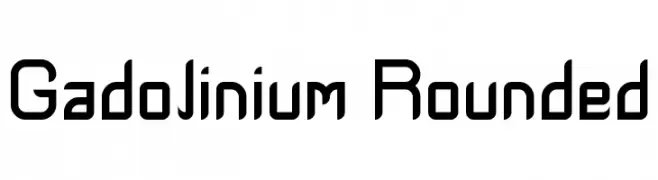
Herunterladen 377 Downloads@WebFont -
![Gadolinium Rounded Frei Schriftart Herunterladen]() Herunterladen 377 Downloads@WebFont
Herunterladen 377 Downloads@WebFont -
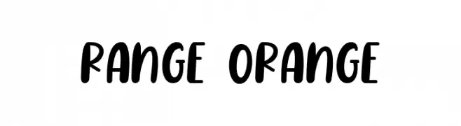
( Fonts by FallenGraphic Studio )
A playful, bold, and rounded handwritten font.
![Range Orange Frei Schriftart Herunterladen]() Herunterladen 377 Downloads@WebFont
Herunterladen 377 Downloads@WebFont
Welche Schriften sind gerade am populärsten?
Poppins, Roboto, Montserrat, Open Sans und Lato sind wegen ihrer klaren Formen und breiten Einsetzbarkeit sehr gefragt – von Markenauftritt über Landingpages bis hin zu Postern.
Welche Fonts eignen sich für Logos?
Geometrische Sans‑Serifs (z. B. Poppins, Familien im Gotham‑Stil) sind ein häufiger Griff für sauberes, skalierbares Branding. Für eine persönlichere Note bleiben Scripts und Handschrift‑Stile beliebt. Kombinieren Sie einen prägnanten Headline‑Font mit einer neutralen Brotschrift für Wiedererkennung und Harmonie.
Wie oft wird die Top‑Liste aktualisiert?
Regelmäßig – basierend auf realen Downloads und Interaktionen. Schauen Sie öfter vorbei, um aufstrebende Favoriten früh zu entdecken.
💡 Tipp: Seite bookmarken – Trends wechseln schnell, und heutige Top‑Schriften inspirieren morgen vielleicht das Rebranding.