Willkommen bei den Top‑Schriften – hier treffen Beliebtheit und Qualität aufeinander. Das sind die in diesem Jahr am häufigsten heruntergeladenen und genutzten Fonts. Wenn Sie sichere Optionen für Logo, Web oder Social suchen, starten Sie hier.
Jeder Top‑Font überzeugt durch Balance, Lesbarkeit und Vielseitigkeit. Sie finden moderne Sans‑Serifs, elegante Scripts, Vintage‑Serifs und minimalistische Displays.
-
( Fonts by Daniel Zadorozny - www.iconian.com - Personal-use only. For commercial use please contact owner. )
A bold, futuristic font with a geometric, slanted design.
 Herunterladen 52 Downloads@WebFont
 -
( Fonts by AVType - Personal-use only. For commercial use please contact owner. )
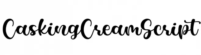
A playful and elegant cursive script with bold, flowing characters.
![Casking Cream Script Frei Schriftart Herunterladen]() Herunterladen 52 Downloads@WebFont
Herunterladen 52 Downloads@WebFont -
( Fonts by Alex Pol - Personal-use only. For commercial use please contact owner. )
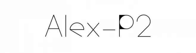
A modern, geometric font with clean lines and a minimalist aesthetic.
![Alex-P2 Frei Schriftart Herunterladen]() Herunterladen 52 Downloads@WebFont
Herunterladen 52 Downloads@WebFont -
( Fonts by StringLabs - stringlabscreative.com - Personal-use only. For commercial use please contact owner. )
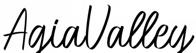
A lively, flowing script font with elegant curves and a handwritten feel.
![Agia Valley Frei Schriftart Herunterladen]() Herunterladen 52 Downloads@WebFont
Herunterladen 52 Downloads@WebFont -
( Fonts by Typodermic Fonts - Raymond Larabie - Personal-use only. For commercial use please contact owner. )
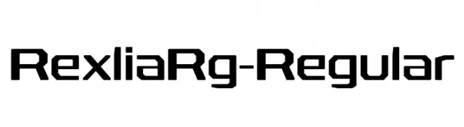
A bold, geometric font with a modern, tech-inspired design.
![RexliaRg-Regular Frei Schriftart Herunterladen]() Herunterladen 52 Downloads@WebFont
Herunterladen 52 Downloads@WebFont -
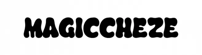
( Fonts by Tri Sakti Oktaviano )
A bold, playful font with thick, rounded characters and high contrast.
![MAGICCHEZE Frei Schriftart Herunterladen]() Herunterladen 52 Downloads@WebFont
Herunterladen 52 Downloads@WebFont -
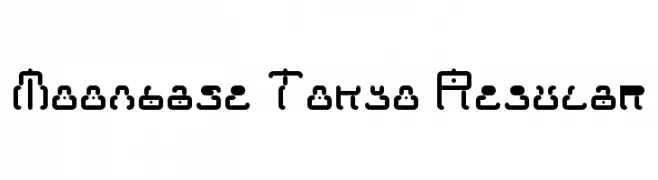
( Anthony Robinson - www.redbubble.com/people/anfa/portfolio )
A futuristic, geometric font with rounded edges and modular design.
![Moonbase Tokyo Regular Frei Schriftart Herunterladen]() Herunterladen 52 Downloads@WebFont
Herunterladen 52 Downloads@WebFont -
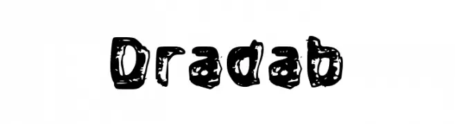
( Fonts by wep - Wahyu Eka Prasetya - Personal-use only. For commercial use please contact owner. )
A bold, playful font with an irregular, splattered texture.
![Dradab Frei Schriftart Herunterladen]() Herunterladen 52 Downloads@WebFont
Herunterladen 52 Downloads@WebFont -
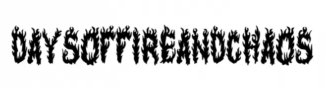
( Fonts by Woodcutter )
A bold, fiery font with characters designed to resemble flickering flames.
![Days of Fire and Chaos Frei Schriftart Herunterladen]() Herunterladen 52 Downloads@WebFont
Herunterladen 52 Downloads@WebFont -
( Fonts by weknow - Wino S Kadir - Personal-use only. For commercial use please contact owner. )
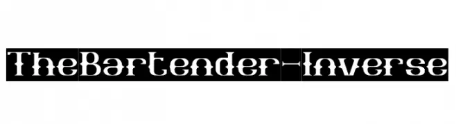
A bold, decorative font with high contrast and a stencil-like appearance.
![The Bartender-Inverse Frei Schriftart Herunterladen]() Herunterladen 52 Downloads@WebFont
Herunterladen 52 Downloads@WebFont -
( Fonts by Peter Wiegel - www.peter-wiegel.de - Personal-use only. For commercial use please contact owner. )
A traditional blackletter font with intricate, ornate letterforms and a historical aesthetic.
![TypographerFraktur UNZ1 Medium Frei Schriftart Herunterladen]() Herunterladen 52 Downloads@WebFont
Herunterladen 52 Downloads@WebFont -
( Fonts by Vladimir Nikolic - www.creativefabrica.com/designer/vladimirnikolic/ - Personal-use only. For commercial use please contact owner. )
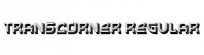
A bold, geometric font with a 3D effect and sharp, angular lines.
![Transcorner Regular Frei Schriftart Herunterladen]() Herunterladen 52 Downloads@WebFont
Herunterladen 52 Downloads@WebFont -
( Fonts by Vladimir Nikolic - www.creativefabrica.com/designer/vladimirnikolic/ - Personal-use only. For commercial use please contact owner. )
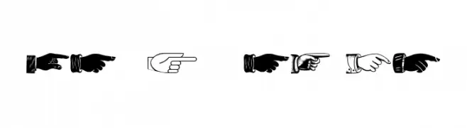
Decorative font with assorted pointing hand illustrations.
![The Point Regular Frei Schriftart Herunterladen]() Herunterladen 52 Downloads@WebFont
Herunterladen 52 Downloads@WebFont -
( Fonts by Colative Studio - Personal-use only. For commercial use please contact owner. )
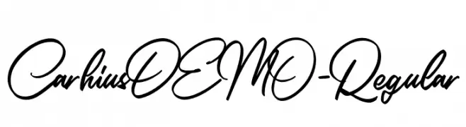
A dynamic, flowing script font with elegant cursive letterforms.
![CarhiusDEMO-Regular Frei Schriftart Herunterladen]() Herunterladen 52 Downloads@WebFont
Herunterladen 52 Downloads@WebFont -
( Fonts by Letterena Studios - letterena.com - Personal-use only. For commercial use please contact owner. )
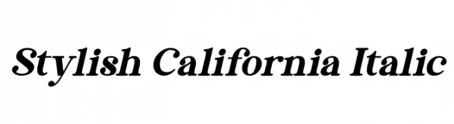
A classic italic serif font with elegant, flowing lines and moderate contrast.
![Stylish California Italic Frei Schriftart Herunterladen]() Herunterladen 52 Downloads@WebFont
Herunterladen 52 Downloads@WebFont -
( Fonts by fana merah jambu - Personal-use only. For commercial use please contact owner. )
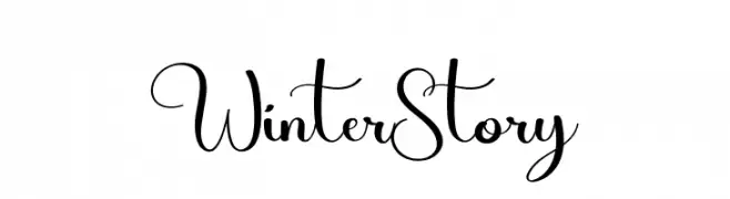
An elegant and flowing script font with charming cursive details.
![Winter Story Frei Schriftart Herunterladen]() Herunterladen 52 Downloads@WebFont
Herunterladen 52 Downloads@WebFont -
( Fonts by ingoFonts - Ingo Zimmermann - Personal-use only. For commercial use please contact owner. )
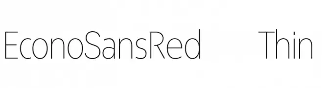
A modern, thin sans-serif font with clean lines and a minimalist design.
![EconoSansRed-35Thin Frei Schriftart Herunterladen]() Herunterladen 52 Downloads@WebFont
Herunterladen 52 Downloads@WebFont -
( Fonts by twinletter - Rozikan - Personal-use only. For commercial use please contact owner. )
A bold, expressive handwritten font with dynamic strokes and playful swashes.
![Bigswash Frei Schriftart Herunterladen]() Herunterladen 52 Downloads@WebFont
Herunterladen 52 Downloads@WebFont -
( Fonts by share font )
![Quetes Signature Frei Schriftart Herunterladen]() Herunterladen 52 Downloads@WebFont
Herunterladen 52 Downloads@WebFont -
( Fonts by Eko Bimantara - Personal-use only. For commercial use please contact owner. )
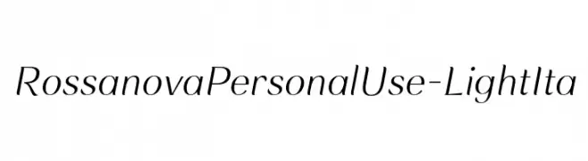
A light, italicized typeface with elegant, thin strokes and a modern, sophisticated style.
![RossanovaPersonalUse-LightIta Frei Schriftart Herunterladen]() Herunterladen 52 Downloads@WebFont
Herunterladen 52 Downloads@WebFont -
( Fonts by FallenGraphic Studio - Vava Aryanto - Personal-use only. For commercial use please contact owner. )
A bold, flowing script font with interconnected characters and a playful style.
![Minoila Frei Schriftart Herunterladen]() Herunterladen 52 Downloads@WebFont
Herunterladen 52 Downloads@WebFont -
( Fonts by Letterative Studio - Personal-use only. For commercial use please contact owner. )
A playful, handwritten font with a casual and energetic style.
![Blackfeast Frei Schriftart Herunterladen]() Herunterladen 52 Downloads@WebFont
Herunterladen 52 Downloads@WebFont -
( Fonts by Marco Milone - Personal-use only. For commercial use please contact owner. )
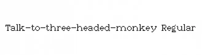
A pixelated, retro-style font with a digital, grid-like appearance.
![Talk-to-three-headed-monkey Regular Frei Schriftart Herunterladen]() Herunterladen 52 Downloads@WebFont
Herunterladen 52 Downloads@WebFont -
( Fonts by Rantautype - Yudi Pratama Chandra - Personal-use only. For commercial use please contact owner. )
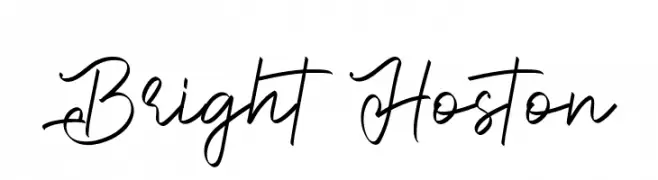
A lively handwritten script font with fluid, connected strokes.
![Bright Hoston Frei Schriftart Herunterladen]() Herunterladen 52 Downloads@WebFont
Herunterladen 52 Downloads@WebFont -
( Fonts by JOEBOB graphics - Joe vanderHam - Personal-use only. For commercial use please contact owner. )
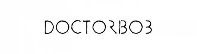
A whimsical, hand-drawn font with a playful and artistic style.
![DoctorBob Frei Schriftart Herunterladen]() Herunterladen 52 Downloads@WebFont
Herunterladen 52 Downloads@WebFont -
( Fonts by Misti Hammers - mistifonts.com - Personal-use only. For commercial use please contact owner. )
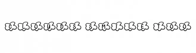
A playful, cloud-themed font with bold, rounded characters.
![Clouds Smile Too Frei Schriftart Herunterladen]() Herunterladen 52 Downloads@WebFont
Herunterladen 52 Downloads@WebFont -
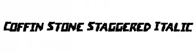
( Fonts by Daniel Zadorozny - www.iconian.com - Personal-use only. For commercial use please contact owner. )
A bold, jagged, and staggered font with an edgy and rugged style.
![Coffin Stone Staggered Italic Frei Schriftart Herunterladen]() Herunterladen 52 Downloads@WebFont
Herunterladen 52 Downloads@WebFont -
( Fonts by Hugefonts - Personal-use only. For commercial use please contact owner. )
A modern, elegant script font with fluid strokes and decorative flourishes.
![alandef Frei Schriftart Herunterladen]() Herunterladen 52 Downloads@WebFont
Herunterladen 52 Downloads@WebFont -
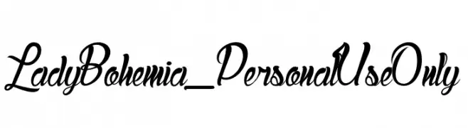
( Fonts by dcoxy - Greg Medina - Personal-use only. For commercial use please contact owner. )
An elegant, flowing script font with ornate flourishes and smooth, connected letters.
![Lady Bohemia_PersonalUseOnly Frei Schriftart Herunterladen]() Herunterladen 52 Downloads@WebFont
Herunterladen 52 Downloads@WebFont -
( Fonts by ingoFonts - Ingo Zimmermann - Personal-use only. For commercial use please contact owner. )
A geometric, angular font with a modern and technical aesthetic.
![Maiers Neue Nr.8 Reduced Expanded Frei Schriftart Herunterladen]() Herunterladen 52 Downloads@WebFont
Herunterladen 52 Downloads@WebFont -
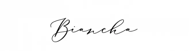
( Fonts by Sizimon.id - Personal-use only. For commercial use please contact owner. )
An elegant, flowing script font with interconnected cursive letters.
![Biancha Frei Schriftart Herunterladen]() Herunterladen 52 Downloads@WebFont
Herunterladen 52 Downloads@WebFont -
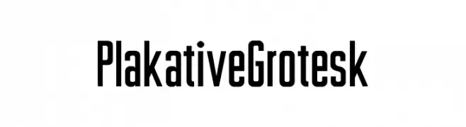
( Fonts by Uwe Borchert - Personal-use only. For commercial use please contact owner. )
A bold, tall, and narrow font with a modern, geometric style.
![Plakative Grotesk Frei Schriftart Herunterladen]() Herunterladen 52 Downloads@WebFont
Herunterladen 52 Downloads@WebFont -
( Noto is a trademark of Google Inc. Noto fonts are open source. All Noto fonts are published under the SIL Open Font License, Version 1.1 )
No valid font is visible.
![Noto Sans Lao SemiCondensed Light Frei Schriftart Herunterladen]() Herunterladen 52 Downloads@WebFont
Herunterladen 52 Downloads@WebFont -
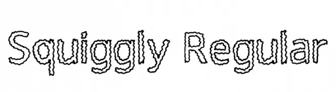
( Fonts by Maren Holden - Personal-use only. For commercial use please contact owner. )
A playful, squiggly outline font with a hand-drawn aesthetic.
![Squiggly Regular Frei Schriftart Herunterladen]() Herunterladen 52 Downloads@WebFont
Herunterladen 52 Downloads@WebFont -
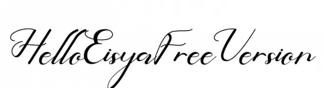
( Fonts by PutraCetol Studio - www.putracetol.com - Personal-use only. For commercial use please contact owner. )
An elegant script font with flowing, interconnected letters and a classic calligraphic style.
![Hello Eisya Free Version Frei Schriftart Herunterladen]() Herunterladen 52 Downloads@WebFont
Herunterladen 52 Downloads@WebFont


Welche Schriften sind gerade am populärsten?
Poppins, Roboto, Montserrat, Open Sans und Lato sind wegen ihrer klaren Formen und breiten Einsetzbarkeit sehr gefragt – von Markenauftritt über Landingpages bis hin zu Postern.
Welche Fonts eignen sich für Logos?
Geometrische Sans‑Serifs (z. B. Poppins, Familien im Gotham‑Stil) sind ein häufiger Griff für sauberes, skalierbares Branding. Für eine persönlichere Note bleiben Scripts und Handschrift‑Stile beliebt. Kombinieren Sie einen prägnanten Headline‑Font mit einer neutralen Brotschrift für Wiedererkennung und Harmonie.
Wie oft wird die Top‑Liste aktualisiert?
Regelmäßig – basierend auf realen Downloads und Interaktionen. Schauen Sie öfter vorbei, um aufstrebende Favoriten früh zu entdecken.
💡 Tipp: Seite bookmarken – Trends wechseln schnell, und heutige Top‑Schriften inspirieren morgen vielleicht das Rebranding.