Willkommen bei den Top‑Schriften – hier treffen Beliebtheit und Qualität aufeinander. Das sind die in diesem Jahr am häufigsten heruntergeladenen und genutzten Fonts. Wenn Sie sichere Optionen für Logo, Web oder Social suchen, starten Sie hier.
Jeder Top‑Font überzeugt durch Balance, Lesbarkeit und Vielseitigkeit. Sie finden moderne Sans‑Serifs, elegante Scripts, Vintage‑Serifs und minimalistische Displays.
-
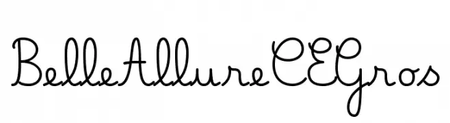
( JBFoundry - Jean Boyault - jean.boyault.pagesperso-orange.fr/ )
A playful, handwritten script font with fluid, connected letters.
 Herunterladen 372 Downloads@WebFont
 -
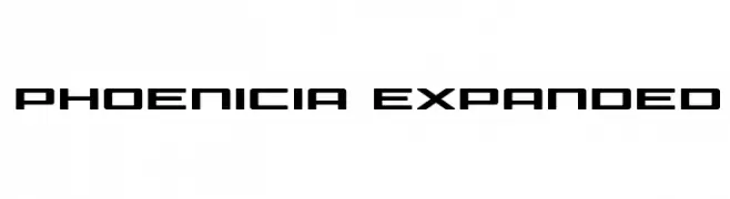
( Fonts by Daniel Zadorozny - www.iconian.com - Free for personal use )
A bold, geometric font with a futuristic and expanded style.
![Phoenicia Expanded Frei Schriftart Herunterladen]() Herunterladen 372 Downloads@WebFont
Herunterladen 372 Downloads@WebFont -
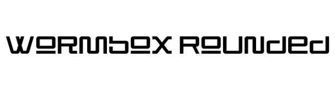
( Fonts by NimaVisual )
A modern, geometric font with rounded edges and consistent stroke width.
![Wormbox Rounded Frei Schriftart Herunterladen]() Herunterladen 372 Downloads@WebFont
Herunterladen 372 Downloads@WebFont -
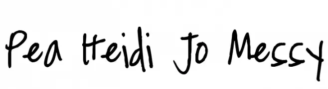
( Free for a personal use. For a commercial use please visit www.kevinandamanda.com )
A playful, handwritten font with a casual and informal style.
![Pea Heidi Jo Messy Frei Schriftart Herunterladen]() Herunterladen 371 Downloads@WebFont
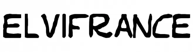
Herunterladen 371 Downloads@WebFont -
![Elvifrance Frei Schriftart Herunterladen]() Herunterladen 371 Downloads@WebFont
Herunterladen 371 Downloads@WebFont -
-
Schriftart von subotype. For commercial use please contact the owner.
( Grap it here just $1 limited time only: https://thehungryjpeg.com/product/3504910-happy-marlyana-font-trio/ )
A sophisticated script font with elegant loops and swashes, ideal for formal and decorative use.
![Marlyana Frei Schriftart Herunterladen]() Herunterladen 371 Downloads@WebFont
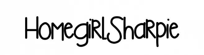
Herunterladen 371 Downloads@WebFont -
![HomegirlSharpie Frei Schriftart Herunterladen]() Herunterladen 371 Downloads@WebFont
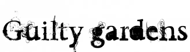
Herunterladen 371 Downloads@WebFont -
![Guilty gardens Frei Schriftart Herunterladen]() Herunterladen 371 Downloads@WebFont
Herunterladen 371 Downloads@WebFont -
![EASY TROUBLE Frei Schriftart Herunterladen]() Herunterladen 371 Downloads@WebFont
Herunterladen 371 Downloads@WebFont -
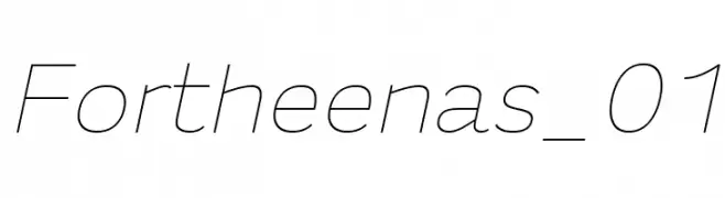
( Fonts by a Situjuh Nazara - c7n1.wordpress.com. Personal-use only. For commercial use please contact owner. )
A sleek, modern font with clean, geometric lines and a slightly condensed style.
![Fortheenas_01 Frei Schriftart Herunterladen]() Herunterladen 371 Downloads@WebFont
Herunterladen 371 Downloads@WebFont


Welche Schriften sind gerade am populärsten?
Poppins, Roboto, Montserrat, Open Sans und Lato sind wegen ihrer klaren Formen und breiten Einsetzbarkeit sehr gefragt – von Markenauftritt über Landingpages bis hin zu Postern.
Welche Fonts eignen sich für Logos?
Geometrische Sans‑Serifs (z. B. Poppins, Familien im Gotham‑Stil) sind ein häufiger Griff für sauberes, skalierbares Branding. Für eine persönlichere Note bleiben Scripts und Handschrift‑Stile beliebt. Kombinieren Sie einen prägnanten Headline‑Font mit einer neutralen Brotschrift für Wiedererkennung und Harmonie.
Wie oft wird die Top‑Liste aktualisiert?
Regelmäßig – basierend auf realen Downloads und Interaktionen. Schauen Sie öfter vorbei, um aufstrebende Favoriten früh zu entdecken.
💡 Tipp: Seite bookmarken – Trends wechseln schnell, und heutige Top‑Schriften inspirieren morgen vielleicht das Rebranding.