Willkommen bei den Top‑Schriften – hier treffen Beliebtheit und Qualität aufeinander. Das sind die in diesem Jahr am häufigsten heruntergeladenen und genutzten Fonts. Wenn Sie sichere Optionen für Logo, Web oder Social suchen, starten Sie hier.
Jeder Top‑Font überzeugt durch Balance, Lesbarkeit und Vielseitigkeit. Sie finden moderne Sans‑Serifs, elegante Scripts, Vintage‑Serifs und minimalistische Displays.
-
 Herunterladen 374 Downloads@WebFont
 -
![DEEnoch Frei Schriftart Herunterladen]() Herunterladen 374 Downloads@WebFont
Herunterladen 374 Downloads@WebFont -
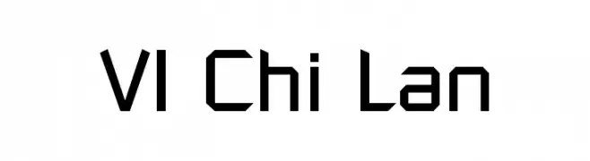
( Fonts by Kreative Korporation - www.kreativekorp.com )
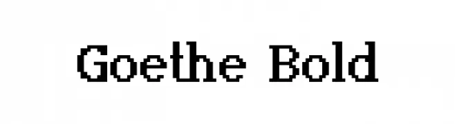
A bold serif font with strong vertical strokes and classic proportions.
![Goethe Bold Frei Schriftart Herunterladen]() Herunterladen 374 Downloads@WebFont
Herunterladen 374 Downloads@WebFont -
( Fonts by Billy Argel Fonts - www.billyargel.com - Personal-use only. For commercial use please contact owner. )
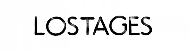
A bold, textured font with a retro, playful style.
![LOST AGES Frei Schriftart Herunterladen]() Herunterladen 374 Downloads@WebFont
Herunterladen 374 Downloads@WebFont -
( Fonts by Rob HIndley )
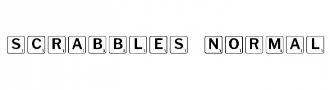
A playful font resembling Scrabble tiles with bold letters and numbers in square borders.
![Scrabbles normal Frei Schriftart Herunterladen]() Herunterladen 374 Downloads@WebFont
Herunterladen 374 Downloads@WebFont -
-
( Fonts by dartcanada.tripod.com - Darren Rigby )
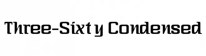
A bold, condensed font with a modern and dynamic style.
![Three-Sixty Condensed Frei Schriftart Herunterladen]() Herunterladen 374 Downloads@WebFont
Herunterladen 374 Downloads@WebFont -
( Copyright (c) 2012-2015, The Mozilla Foundation and Telefonica S.A. )
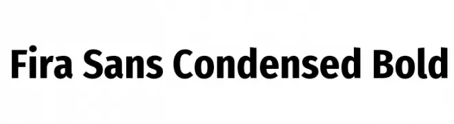
A bold, condensed sans-serif font with a modern and clean design.
![Fira Sans Condensed Bold Frei Schriftart Herunterladen]() Herunterladen 374 Downloads@WebFont
Herunterladen 374 Downloads@WebFont -
( Fonts by www.chequered.ink - Chequered Ink - Personal-use only. For commercial use please contact owner. )
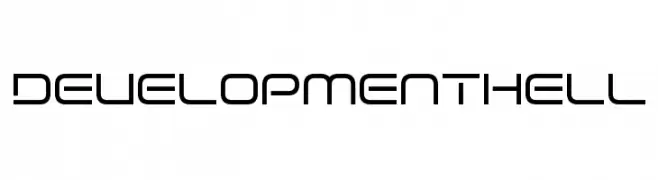
A modern, geometric font with a sleek and minimalistic design.
![Development Hell Frei Schriftart Herunterladen]() Herunterladen 374 Downloads@WebFont
Herunterladen 374 Downloads@WebFont -
( Fonts by wep - Wahyu Eka Prasetya - Personal-use only. For commercial use please contact owner. )
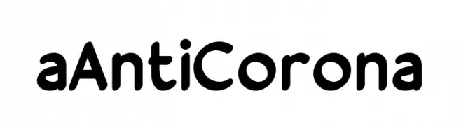
A modern, rounded font with a friendly and approachable style.
![a Anti Corona Frei Schriftart Herunterladen]() Herunterladen 374 Downloads@WebFont
Herunterladen 374 Downloads@WebFont -
![PrintedCircuitBoard-Italic Frei Schriftart Herunterladen]() Herunterladen 374 Downloads@WebFont
Herunterladen 374 Downloads@WebFont


Welche Schriften sind gerade am populärsten?
Poppins, Roboto, Montserrat, Open Sans und Lato sind wegen ihrer klaren Formen und breiten Einsetzbarkeit sehr gefragt – von Markenauftritt über Landingpages bis hin zu Postern.
Welche Fonts eignen sich für Logos?
Geometrische Sans‑Serifs (z. B. Poppins, Familien im Gotham‑Stil) sind ein häufiger Griff für sauberes, skalierbares Branding. Für eine persönlichere Note bleiben Scripts und Handschrift‑Stile beliebt. Kombinieren Sie einen prägnanten Headline‑Font mit einer neutralen Brotschrift für Wiedererkennung und Harmonie.
Wie oft wird die Top‑Liste aktualisiert?
Regelmäßig – basierend auf realen Downloads und Interaktionen. Schauen Sie öfter vorbei, um aufstrebende Favoriten früh zu entdecken.
💡 Tipp: Seite bookmarken – Trends wechseln schnell, und heutige Top‑Schriften inspirieren morgen vielleicht das Rebranding.