Willkommen bei den Top‑Schriften – hier treffen Beliebtheit und Qualität aufeinander. Das sind die in diesem Jahr am häufigsten heruntergeladenen und genutzten Fonts. Wenn Sie sichere Optionen für Logo, Web oder Social suchen, starten Sie hier.
Jeder Top‑Font überzeugt durch Balance, Lesbarkeit und Vielseitigkeit. Sie finden moderne Sans‑Serifs, elegante Scripts, Vintage‑Serifs und minimalistische Displays.
-
( Fonts by Inermedia Studio - Personal-use only. For commercial use please contact owner. )
A playful, bold handwritten font with rounded, friendly letterforms.
 Herunterladen 52 Downloads@WebFont
 -
( Fonts by Kurnia Setyadi - Personal-use only. For commercial use please contact owner. )
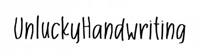
A playful, casual handwritten font with uneven strokes and a whimsical style.
![Unlucky Handwriting Frei Schriftart Herunterladen]() Herunterladen 52 Downloads@WebFont
Herunterladen 52 Downloads@WebFont -
( Fonts by Roland Huse Design - Roland Huse - Personal-use only. For commercial use please contact owner. )
A bold, brush-style font with an expressive and artistic appearance.
![And so Hello Regular Frei Schriftart Herunterladen]() Herunterladen 52 Downloads@WebFont
Herunterladen 52 Downloads@WebFont -
( Fonts by Amarlettering - Takiy - Amarlettering - Takiy - Personal-use only. For commercial use please contact owner. )
A playful and elegant handwritten font with dynamic strokes.
![Rasendrya Frei Schriftart Herunterladen]() Herunterladen 52 Downloads@WebFont
Herunterladen 52 Downloads@WebFont -
( Fonts by Lauren Ashpole )
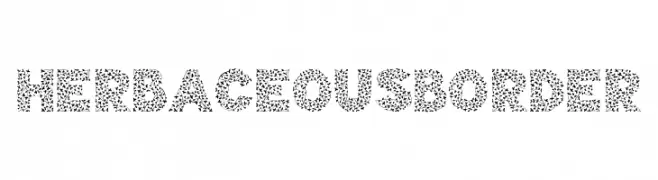
A decorative font filled with leaf-like patterns, offering a playful and organic style.
![Herbaceous Border Frei Schriftart Herunterladen]() Herunterladen 52 Downloads@WebFont
Herunterladen 52 Downloads@WebFont -
( Fonts by AZ Std - Muh Aswar - Personal-use only. For commercial use please contact owner. )
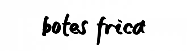
A bold, handwritten font with playful curves and a casual, dynamic style.
![botes frica Frei Schriftart Herunterladen]() Herunterladen 52 Downloads@WebFont
Herunterladen 52 Downloads@WebFont -
( Fonts by Faldy Kudo - Personal-use only. For commercial use please contact owner. )
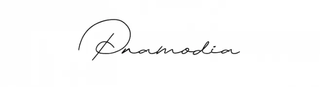
A graceful script font with flowing, interconnected letters and elegant curves.
![Pramodia Frei Schriftart Herunterladen]() Herunterladen 52 Downloads@WebFont
Herunterladen 52 Downloads@WebFont -
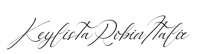
( Fonts by Letterena Studios - letterena.com - Personal-use only. For commercial use please contact owner. )
A graceful and flowing script font with elegant, interconnected strokes.
![Keylista Robin Italic Frei Schriftart Herunterladen]() Herunterladen 52 Downloads@WebFont
Herunterladen 52 Downloads@WebFont -
( Fonts by Kong Font - Personal-use only. For commercial use please contact owner. )
A bold, dramatic Blackletter-style font with sharp, angular lines.
![Humingson Frei Schriftart Herunterladen]() Herunterladen 52 Downloads@WebFont
Herunterladen 52 Downloads@WebFont -
( Fonts by Mans Greback - www.mansgreback.com - Personal-use only. For commercial use please contact owner. )
A bold, playful handwritten font with rounded, dynamic characters.
![COMODO DRAGON Frei Schriftart Herunterladen]() Herunterladen 52 Downloads@WebFont
Herunterladen 52 Downloads@WebFont -
( Fonts by Daniel Zadorozny - www.iconian.com - Personal-use only. For commercial use please contact owner. )
A bold, italic font with a dynamic and modern style.
![Wave Warrior Super-Italic Frei Schriftart Herunterladen]() Herunterladen 52 Downloads@WebFont
Herunterladen 52 Downloads@WebFont -
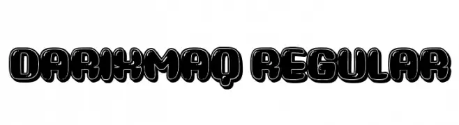
( Fonts by Vladimir Nikolic - www.creativefabrica.com/designer/vladimirnikolic/ - Personal-use only. For commercial use please contact owner. )
A bold, rounded font with a playful, graffiti-like style.
![Darixmaq Regular Frei Schriftart Herunterladen]() Herunterladen 52 Downloads@WebFont
Herunterladen 52 Downloads@WebFont -
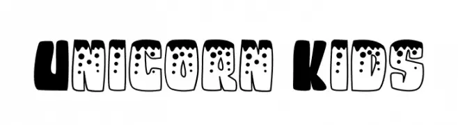
( Fonts by Rusd - Personal-use only. For commercial use please contact owner. )
A playful, bold font with rounded, whimsical characters perfect for fun projects.
![Unicorn Kids Frei Schriftart Herunterladen]() Herunterladen 52 Downloads@WebFont
Herunterladen 52 Downloads@WebFont -
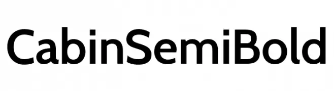
( Fonts by Pablo Impallari - Personal-use only. For commercial use please contact owner. )
A modern, semi-bold sans-serif typeface with clean lines and balanced proportions.
![Cabin SemiBold Frei Schriftart Herunterladen]() Herunterladen 52 Downloads@WebFont
Herunterladen 52 Downloads@WebFont -
( Fonts by Faldy Kudo - Personal-use only. For commercial use please contact owner. )
A lively, cursive handwritten font with smooth, flowing strokes.
![Honey&Lovely Frei Schriftart Herunterladen]() Herunterladen 52 Downloads@WebFont
Herunterladen 52 Downloads@WebFont -
( Fonts by Harit Rohitasoon )
Expressive graffiti-style font with bold, angular strokes.
![Gang Frei Schriftart Herunterladen]() Herunterladen 52 Downloads@WebFont
Herunterladen 52 Downloads@WebFont -
( Fonts by Hallotudio - Ahmad Fatkhul Munib - Personal-use only. For commercial use please contact owner. )
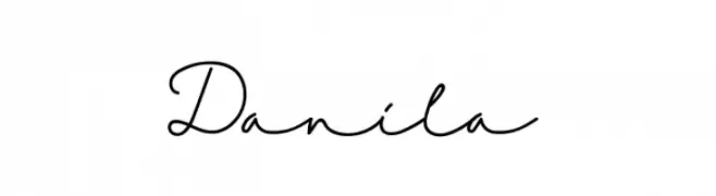
An elegant, flowing script font with interconnected characters and a sophisticated appearance.
![Danila Frei Schriftart Herunterladen]() Herunterladen 52 Downloads@WebFont
Herunterladen 52 Downloads@WebFont -
( Fonts by Rangkai Aksara - Personal-use only. For commercial use please contact owner. )
A dynamic, brush-style font with fluid strokes and a sense of movement.
![Rainy Season Frei Schriftart Herunterladen]() Herunterladen 52 Downloads@WebFont
Herunterladen 52 Downloads@WebFont -
( Fonts by Vunira Design - Personal-use only. For commercial use please contact owner. )
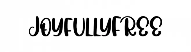
A playful, bold script font with smooth, flowing curves and thick strokes.
![JoyfullyFREE Frei Schriftart Herunterladen]() Herunterladen 52 Downloads@WebFont
Herunterladen 52 Downloads@WebFont -
( Fonts by Yumna Family - yumna Type - Personal-use only. For commercial use please contact owner. )
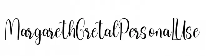
A modern, elegant script font with flowing, handwritten style.
![Margareth Gretal PersonaL Use Frei Schriftart Herunterladen]() Herunterladen 52 Downloads@WebFont
Herunterladen 52 Downloads@WebFont -
( Fonts by weknow - Wino S Kadir - Personal-use only. For commercial use please contact owner. )
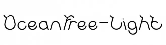
A whimsical, hand-drawn font with fluid, wave-like strokes.
![Ocean Free-Light Frei Schriftart Herunterladen]() Herunterladen 52 Downloads@WebFont
Herunterladen 52 Downloads@WebFont -
( Fonts by Toto - Personal-use only. For commercial use please contact owner. )
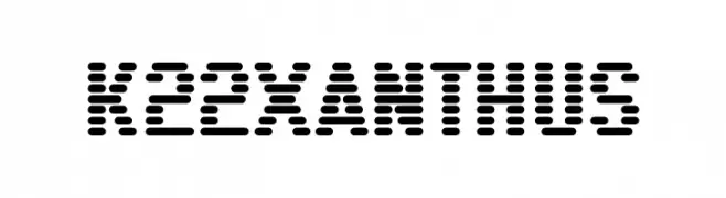
A bold, dotted font with a modern, digital aesthetic.
![K22 Xanthus Frei Schriftart Herunterladen]() Herunterladen 52 Downloads@WebFont
Herunterladen 52 Downloads@WebFont -
( Fonts by weknow - Wino S Kadir - Personal-use only. For commercial use please contact owner. )
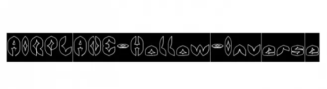
A futuristic, geometric font with hollow, outlined characters and sharp edges.
![AIRPLANE-Hollow-Inverse Frei Schriftart Herunterladen]() Herunterladen 52 Downloads@WebFont
Herunterladen 52 Downloads@WebFont -
( Noto is a trademark of Google Inc. Noto fonts are open source. All Noto fonts are published under the SIL Open Font License, Version 1.1 )
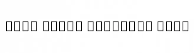
A thin, elegant serif font with a classic and refined appearance.
![Noto Serif Ethiopic Thin Frei Schriftart Herunterladen]() Herunterladen 52 Downloads@WebFont
Herunterladen 52 Downloads@WebFont -
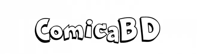
![Comica BD Frei Schriftart Herunterladen]() Herunterladen 52 Downloads@WebFont
Herunterladen 52 Downloads@WebFont -
( Fonts by Gassstype - Anang Fibriyanto - www.gassstype.com - Personal-use only. For commercial use please contact owner. )
A bold, playful font with a hand-drawn, whimsical style.
![Trust Issue Frei Schriftart Herunterladen]() Herunterladen 52 Downloads@WebFont
Herunterladen 52 Downloads@WebFont -
( Fonts by Vladimir Nikolic - Personal-use only. For commercial use please contact owner. )
A bold, extended, and geometric font with a futuristic style.
![Progress Extended Bold Frei Schriftart Herunterladen]() Herunterladen 52 Downloads@WebFont
Herunterladen 52 Downloads@WebFont -
( Fonts by ingoFonts - Ingo Zimmermann - Personal-use only. For commercial use please contact owner. )
A classic, oblique serif font with a Renaissance-inspired elegance.
![Charpentier Renaissance Reduced Oblique Frei Schriftart Herunterladen]() Herunterladen 52 Downloads@WebFont
Herunterladen 52 Downloads@WebFont -
( Fonts by AZ Std - Muh Aswar - Personal-use only. For commercial use please contact owner. )
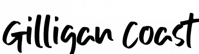
A bold, expressive handwritten font with fluid strokes and a modern, playful style.
![Gilligan Coast Frei Schriftart Herunterladen]() Herunterladen 52 Downloads@WebFont
Herunterladen 52 Downloads@WebFont -
( Fonts by Kong Font - Personal-use only. For commercial use please contact owner. )
A flowing, cursive script font with elegant, connected strokes.
![Barattiel Frei Schriftart Herunterladen]() Herunterladen 52 Downloads@WebFont
Herunterladen 52 Downloads@WebFont -
( Fonts by Miftah Locare - Personal-use only. For commercial use please contact owner. )
A flowing, cursive handwritten font with elegant, connected letters.
![Hendyka Frei Schriftart Herunterladen]() Herunterladen 52 Downloads@WebFont
Herunterladen 52 Downloads@WebFont -
( Fonts by HighUpNorth LLC - Personal-use only. For commercial use please contact owner. )
A bold, splattered font with a dynamic, grunge-like texture.
![SPLAT Frei Schriftart Herunterladen]() Herunterladen 52 Downloads@WebFont
Herunterladen 52 Downloads@WebFont -
( Fonts by Iconian Fonts - Daniel Zadorozny - Personal-use only. For commercial use please contact owner. )
A modern, geometric outline font with an italic slant and sharp, angular lines.
![Wildcard Outline Italic Frei Schriftart Herunterladen]() Herunterladen 52 Downloads@WebFont
Herunterladen 52 Downloads@WebFont -
( Fonts by WDfont - WD font - Personal-use only. For commercial use please contact owner. )
A lively, handwritten script font with bold strokes and fluid connections.
![mottas Frei Schriftart Herunterladen]() Herunterladen 52 Downloads@WebFont
Herunterladen 52 Downloads@WebFont -
( Fonts by weknow - Wino S Kadir - Personal-use only. For commercial use please contact owner. )
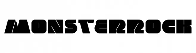
A bold, geometric font with angular shapes and a modern style.
![MONSTER ROCK Frei Schriftart Herunterladen]() Herunterladen 52 Downloads@WebFont
Herunterladen 52 Downloads@WebFont


Welche Schriften sind gerade am populärsten?
Poppins, Roboto, Montserrat, Open Sans und Lato sind wegen ihrer klaren Formen und breiten Einsetzbarkeit sehr gefragt – von Markenauftritt über Landingpages bis hin zu Postern.
Welche Fonts eignen sich für Logos?
Geometrische Sans‑Serifs (z. B. Poppins, Familien im Gotham‑Stil) sind ein häufiger Griff für sauberes, skalierbares Branding. Für eine persönlichere Note bleiben Scripts und Handschrift‑Stile beliebt. Kombinieren Sie einen prägnanten Headline‑Font mit einer neutralen Brotschrift für Wiedererkennung und Harmonie.
Wie oft wird die Top‑Liste aktualisiert?
Regelmäßig – basierend auf realen Downloads und Interaktionen. Schauen Sie öfter vorbei, um aufstrebende Favoriten früh zu entdecken.
💡 Tipp: Seite bookmarken – Trends wechseln schnell, und heutige Top‑Schriften inspirieren morgen vielleicht das Rebranding.