Willkommen bei den Top‑Schriften – hier treffen Beliebtheit und Qualität aufeinander. Das sind die in diesem Jahr am häufigsten heruntergeladenen und genutzten Fonts. Wenn Sie sichere Optionen für Logo, Web oder Social suchen, starten Sie hier.
Jeder Top‑Font überzeugt durch Balance, Lesbarkeit und Vielseitigkeit. Sie finden moderne Sans‑Serifs, elegante Scripts, Vintage‑Serifs und minimalistische Displays.
-
( Fonts by copypaste - Personal-use only. For commercial use please contact owner. )
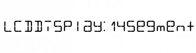
A geometric, segmented font inspired by 14-segment LCD displays.
 Herunterladen 1372 Downloads@WebFont
 -
( Letterhend Studio - Hendry Juanda - creativemarket.com/letterhend )
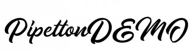
A bold, cursive script font with elegant, flowing curves.
![PipettonDEMO Frei Schriftart Herunterladen]() Herunterladen 1372 Downloads@WebFont
Herunterladen 1372 Downloads@WebFont -
( Fonts by Natalia Lopez Chaux. Personal-use only. For commercial use please contact owner. )
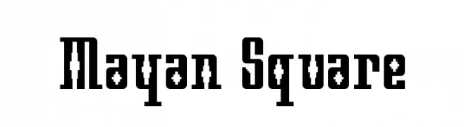
A bold, decorative font with geometric and tribal influences, featuring intricate cut-out patterns.
![Mayan Square Frei Schriftart Herunterladen]() Herunterladen 1372 Downloads@WebFont
Herunterladen 1372 Downloads@WebFont -
( Copyright (c) 2015, Christian Thalmann and the Cormorant Project Authors (github.com/CatharsisFonts/Cormorant) )
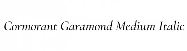
A classic, elegant serif font with a refined italic style and medium weight.
![Cormorant Garamond Medium Italic Frei Schriftart Herunterladen]() Herunterladen 1372 Downloads@WebFont
Herunterladen 1372 Downloads@WebFont -
( Fonts by Fran Fernandez - Personal-use only. For commercial use please contact owner. )
A bold, modern sans-serif font with geometric precision.
![A Cure For Wellness Frei Schriftart Herunterladen]() Herunterladen 1372 Downloads@WebFont
Herunterladen 1372 Downloads@WebFont -
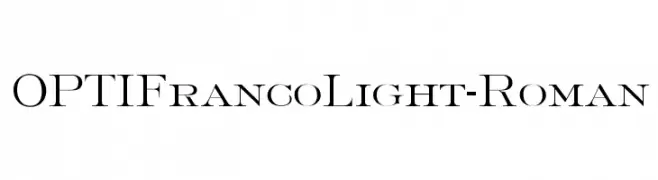
( Fonts by Castcraft Software - opti.netii.net - check the website before use )
A classic serif font with elegant, refined strokes and thin serifs.
![OPTIFrancoLight-Roman Frei Schriftart Herunterladen]() Herunterladen 1372 Downloads@WebFont
Herunterladen 1372 Downloads@WebFont -
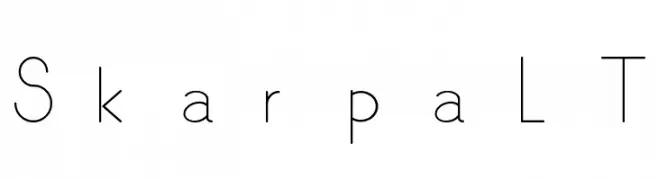
![SkarpaLT Frei Schriftart Herunterladen]() Herunterladen 1372 Downloads@WebFont
Herunterladen 1372 Downloads@WebFont -
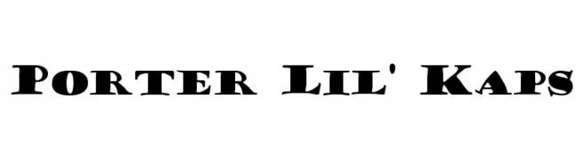
![Porter Lil' Kaps Frei Schriftart Herunterladen]() Herunterladen 1372 Downloads@WebFont
Herunterladen 1372 Downloads@WebFont -
( Fonts by Debut Studio - Ari Fadli - creativemarket.com/debutstudio - Personal-use only. For commercial use please contact owner. )
A dynamic, brush-style script font with expressive strokes.
![Panterick Frei Schriftart Herunterladen]() Herunterladen 1371 Downloads@WebFont
Herunterladen 1371 Downloads@WebFont -
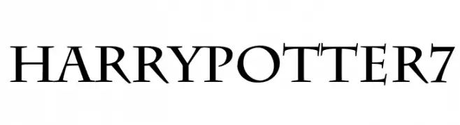
( Fonts by Fran Fernandez - Personal-use only. For commercial use please contact owner. )
A dramatic serif font with sharp, pointed serifs and a medieval flair.
![HarryPotter7 Frei Schriftart Herunterladen]() Herunterladen 1371 Downloads@WebFont
Herunterladen 1371 Downloads@WebFont -
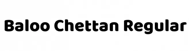
( Copyright (c) 2015 Ek Type (www.ektype.in) )
A bold, rounded, and playful font with a modern and friendly appearance.
![Baloo Chettan Regular Frei Schriftart Herunterladen]() Herunterladen 1371 Downloads@WebFont
Herunterladen 1371 Downloads@WebFont -
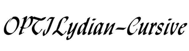
( Fonts by Castcraft Software - opti.netii.net - check the website before use )
A sophisticated cursive font with flowing, high-contrast strokes and elegant curves.
![OPTILydian-Cursive Frei Schriftart Herunterladen]() Herunterladen 1371 Downloads@WebFont
Herunterladen 1371 Downloads@WebFont -
( Fonts by www.crudfactory.com )
A classic serif font with elegant strokes and refined style.
![Juvelo Regular Frei Schriftart Herunterladen]() Herunterladen 1371 Downloads@WebFont
Herunterladen 1371 Downloads@WebFont -
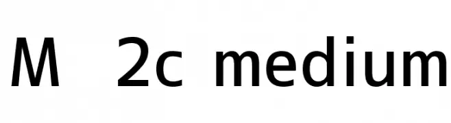
![M+ 2c medium Frei Schriftart Herunterladen]() Herunterladen 1371 Downloads@WebFont
Herunterladen 1371 Downloads@WebFont -
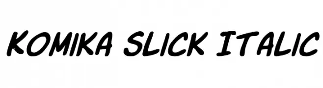
( Fonts by Apostrophic Lab )
A bold, italicized font with a playful, cartoonish style.
![Komika Slick Italic Frei Schriftart Herunterladen]() Herunterladen 1371 Downloads@WebFont
Herunterladen 1371 Downloads@WebFont -
( Free for non-commercial use. www.johnmartz.com )
A bold, hand-drawn font with a playful and artistic style.
![Glue Frei Schriftart Herunterladen]() Herunterladen 1371 Downloads@WebFont
Herunterladen 1371 Downloads@WebFont -
( Fonts by Jacob Fisher - www.pizzadude.dk )
A lively, handwritten font with brush-like strokes and dynamic character.
![Good Foot Frei Schriftart Herunterladen]() Herunterladen 1371 Downloads@WebFont
Herunterladen 1371 Downloads@WebFont -
( Fonts by Jester Font Studio )
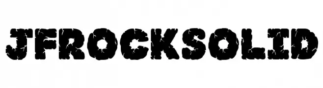
A bold, textured font with a rugged, stone-like appearance.
![JFRockSolid Frei Schriftart Herunterladen]() Herunterladen 1371 Downloads@WebFont
Herunterladen 1371 Downloads@WebFont -
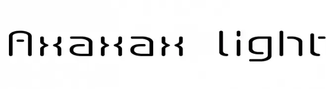
![Axaxax light Frei Schriftart Herunterladen]() Herunterladen 1371 Downloads@WebFont
Herunterladen 1371 Downloads@WebFont -
( Fonts by AV Type )
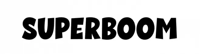
A bold, dynamic font with playful, exaggerated strokes and a cartoonish style.
![Super Boom Frei Schriftart Herunterladen]() Herunterladen 1370 Downloads@WebFont
Herunterladen 1370 Downloads@WebFont -
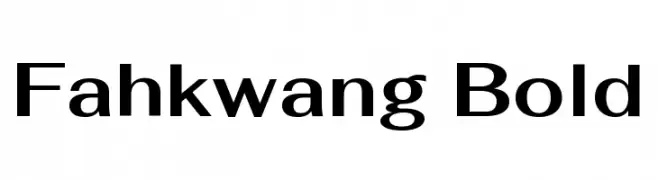
( Copyright 2018 The Fahkwang Project Authors (https://github.com/cadsondemak/Fah-Kwang) )
A bold, modern sans-serif font with clean lines and balanced proportions.
![Fahkwang Bold Frei Schriftart Herunterladen]() Herunterladen 1370 Downloads@WebFont
Herunterladen 1370 Downloads@WebFont -
( Heber X. Arroyo Arce - www.artechni.com )
A modern, rounded sans-serif font with a clean and approachable style.
![AR Techni Frei Schriftart Herunterladen]() Herunterladen 1370 Downloads@WebFont
Herunterladen 1370 Downloads@WebFont -
![ROBOTECH GP Frei Schriftart Herunterladen]() Herunterladen 1370 Downloads@WebFont
Herunterladen 1370 Downloads@WebFont -
( Fonts by 7NTypes )
A playful, bold font with rounded edges and a hand-drawn style.
![Chesan Frei Schriftart Herunterladen]() Herunterladen 1370 Downloads@WebFont
Herunterladen 1370 Downloads@WebFont -
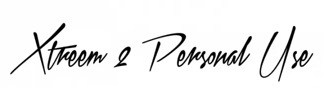
( www.aringtypeface.com )
A dynamic script font with a fluid, handwritten style.
![Xtreem 2 Personal Use Frei Schriftart Herunterladen]() Herunterladen 1370 Downloads@WebFont
Herunterladen 1370 Downloads@WebFont -
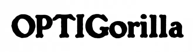
( Fonts by Castcraft Software - opti.netii.net - check the website before use )
A bold, playful font with a hand-drawn, whimsical style.
![OPTIGorilla Frei Schriftart Herunterladen]() Herunterladen 1370 Downloads@WebFont
Herunterladen 1370 Downloads@WebFont -
( Fonts by a Neale Davidson - www.pixelsagas.com. Personal-use only. For commercial use please contact owner. )
Bold, italicized font with a dynamic and modern style.
![Stark Italic Frei Schriftart Herunterladen]() Herunterladen 1370 Downloads@WebFont
Herunterladen 1370 Downloads@WebFont -
![20db Frei Schriftart Herunterladen]() Herunterladen 1370 Downloads@WebFont
Herunterladen 1370 Downloads@WebFont -
![Costura Light Frei Schriftart Herunterladen]() Herunterladen 1370 Downloads@WebFont
Herunterladen 1370 Downloads@WebFont -
( Fonts by Manfred Klein - manfred-klein.ina-mar.com )
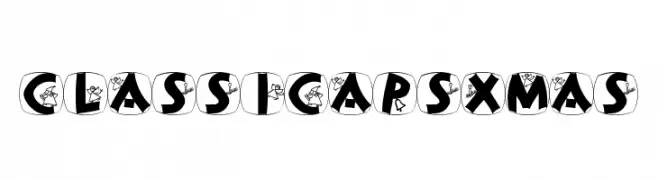
A festive, decorative font with holiday-themed illustrations in each character.
![ClassiCapsXmas Frei Schriftart Herunterladen]() Herunterladen 1370 Downloads@WebFont
Herunterladen 1370 Downloads@WebFont -
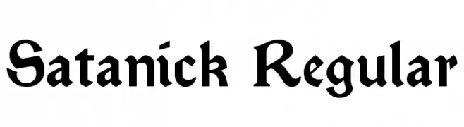
![Satanick Regular Frei Schriftart Herunterladen]() Herunterladen 1370 Downloads@WebFont
Herunterladen 1370 Downloads@WebFont -
![Reverb Frei Schriftart Herunterladen]() Herunterladen 1370 Downloads@WebFont
Herunterladen 1370 Downloads@WebFont -
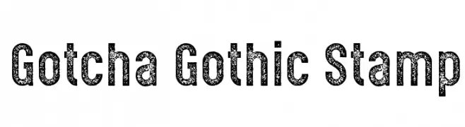
( Levi Szekeres - www.loremipsum.ro )
A bold, distressed font with a stamped, textured appearance.
![Gotcha Gothic Stamp Frei Schriftart Herunterladen]() Herunterladen 1369 Downloads@WebFont
Herunterladen 1369 Downloads@WebFont -
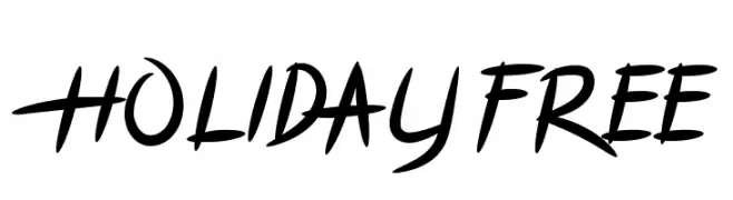
( Graphix Line Studio )
A playful and dynamic handwritten font with fluid strokes.
![HOLIDAY FREE Frei Schriftart Herunterladen]() Herunterladen 1369 Downloads@WebFont
Herunterladen 1369 Downloads@WebFont -
( Fonts by Fran Fernandez - Personal-use only. For commercial use please contact owner. )
A bold, playful font with chunky, uneven letterforms and a whimsical style.
![Ice Age Movie Font Frei Schriftart Herunterladen]() Herunterladen 1369 Downloads@WebFont
Herunterladen 1369 Downloads@WebFont


Welche Schriften sind gerade am populärsten?
Poppins, Roboto, Montserrat, Open Sans und Lato sind wegen ihrer klaren Formen und breiten Einsetzbarkeit sehr gefragt – von Markenauftritt über Landingpages bis hin zu Postern.
Welche Fonts eignen sich für Logos?
Geometrische Sans‑Serifs (z. B. Poppins, Familien im Gotham‑Stil) sind ein häufiger Griff für sauberes, skalierbares Branding. Für eine persönlichere Note bleiben Scripts und Handschrift‑Stile beliebt. Kombinieren Sie einen prägnanten Headline‑Font mit einer neutralen Brotschrift für Wiedererkennung und Harmonie.
Wie oft wird die Top‑Liste aktualisiert?
Regelmäßig – basierend auf realen Downloads und Interaktionen. Schauen Sie öfter vorbei, um aufstrebende Favoriten früh zu entdecken.
💡 Tipp: Seite bookmarken – Trends wechseln schnell, und heutige Top‑Schriften inspirieren morgen vielleicht das Rebranding.