Willkommen bei den Top‑Schriften – hier treffen Beliebtheit und Qualität aufeinander. Das sind die in diesem Jahr am häufigsten heruntergeladenen und genutzten Fonts. Wenn Sie sichere Optionen für Logo, Web oder Social suchen, starten Sie hier.
Jeder Top‑Font überzeugt durch Balance, Lesbarkeit und Vielseitigkeit. Sie finden moderne Sans‑Serifs, elegante Scripts, Vintage‑Serifs und minimalistische Displays.
-
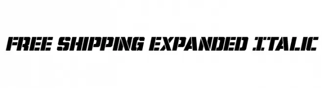
( Fonts by Iconian Fonts - Daniel Zadorozny - Personal-use only. For commercial use please contact owner. )
A bold, expanded, and italicized font with a modern, dynamic style.
 Herunterladen 50 Downloads@WebFont
 -
( Fonts by Katario Studio - Rioniga Zandy - Personal-use only. For commercial use please contact owner. )
A playful, flowing script font with smooth, continuous strokes.
![Serenatta Frei Schriftart Herunterladen]() Herunterladen 50 Downloads@WebFont
Herunterladen 50 Downloads@WebFont -
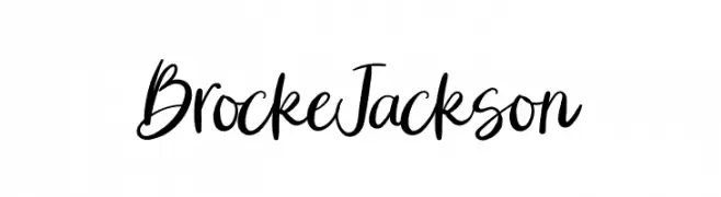
( Fonts by ReyreyBlue - Reyrey Blue - Personal-use only. For commercial use please contact owner. )
A dynamic handwritten font with fluid strokes and elegant style.
![Brocke Jackson Frei Schriftart Herunterladen]() Herunterladen 50 Downloads@WebFont
Herunterladen 50 Downloads@WebFont -
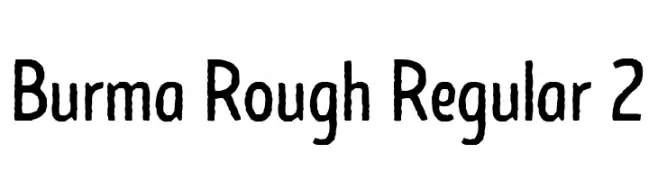
( Fonts by Runsell Studio - Personal-use only. For commercial use please contact owner. )
A rough, hand-drawn font with bold, textured characters.
![Burma Rough Regular 2 Frei Schriftart Herunterladen]() Herunterladen 50 Downloads@WebFont
Herunterladen 50 Downloads@WebFont -
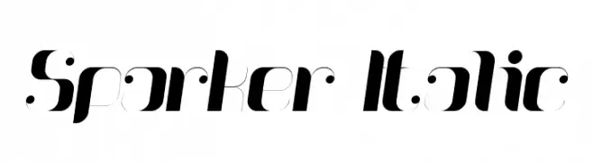
( Fonts by Mans Greback - www.mansgreback.com - Personal-use only. For commercial use please contact owner. )
A modern, high-contrast italic font with a sleek and futuristic design.
![Sparker Italic Frei Schriftart Herunterladen]() Herunterladen 50 Downloads@WebFont
Herunterladen 50 Downloads@WebFont -
( Fonts by Figuree Studio - Icep Fadhil - Personal-use only. For commercial use please contact owner. )
A bold, playful font with rounded characters and whimsical curls.
![Thankies Frei Schriftart Herunterladen]() Herunterladen 50 Downloads@WebFont
Herunterladen 50 Downloads@WebFont -
( Fonts by Four Lines - zain Fahroni - Personal-use only. For commercial use please contact owner. )
A bold, expressive handwritten font with dynamic strokes and playful curves.
![Butters Mine Frei Schriftart Herunterladen]() Herunterladen 50 Downloads@WebFont
Herunterladen 50 Downloads@WebFont -
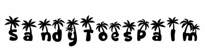
( Fonts by PutraCetol Studio )
A playful, palm tree-topped decorative font with a tropical vibe.
![Sandy Toes Palm Frei Schriftart Herunterladen]() Herunterladen 50 Downloads@WebFont
Herunterladen 50 Downloads@WebFont -
( Fonts by Shiddiq Art - Personal-use only. For commercial use please contact owner. )
A playful, outlined script font with a hand-drawn, whimsical style.
![Baby Mommy Frei Schriftart Herunterladen]() Herunterladen 50 Downloads@WebFont
Herunterladen 50 Downloads@WebFont -
( Fonts by Typodermic Fonts - Raymond Larabie - Personal-use only. For commercial use please contact owner. )
A clean, geometric font with a modern and balanced design.
![Stentiga-Regular Frei Schriftart Herunterladen]() Herunterladen 50 Downloads@WebFont
Herunterladen 50 Downloads@WebFont -
( Fonts by Aisyah - Nur Aisyah Amalia - Personal-use only. For commercial use please contact owner. )
A playful, hand-drawn font with a whimsical and friendly style.
![Ammah-Ucha Frei Schriftart Herunterladen]() Herunterladen 50 Downloads@WebFont
Herunterladen 50 Downloads@WebFont -
( Fonts by niyos - Nur Huda - Personal-use only. For commercial use please contact owner. )
An elegant and sophisticated script font with intricate swirls and flowing curves.
![belladeya Frei Schriftart Herunterladen]() Herunterladen 50 Downloads@WebFont
Herunterladen 50 Downloads@WebFont -
( Fonts by Johan Waldenström - Personal-use only. For commercial use please contact owner. )
A bold, handwritten font with a playful and dynamic style.
![5 cent Frei Schriftart Herunterladen]() Herunterladen 50 Downloads@WebFont
Herunterladen 50 Downloads@WebFont -
( Fonts by TypeType Foundry )
A modern, geometric font with a clean and structured appearance.
![TT Mussels Trl Regular Frei Schriftart Herunterladen]() Herunterladen 50 Downloads@WebFont
Herunterladen 50 Downloads@WebFont -
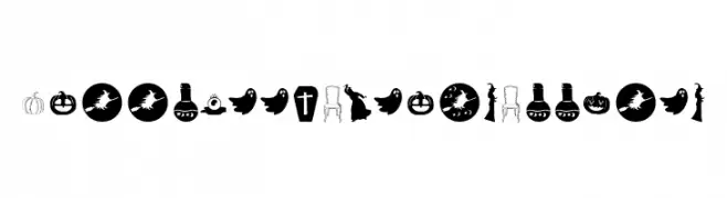
( Fonts by Fikryal studio - Fikry Alif - Personal-use only. For commercial use please contact owner. )
Halloween-themed doodle icons in a decorative dingbat style.
![Halloween Dreams Doodles Frei Schriftart Herunterladen]() Herunterladen 50 Downloads@WebFont
Herunterladen 50 Downloads@WebFont -
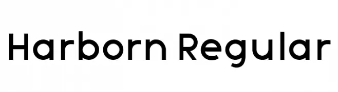
( Fonts by Vladimir Nikolic - Personal-use only. For commercial use please contact owner. )
A modern sans-serif font with geometric influences and balanced proportions.
![Harborn Regular Frei Schriftart Herunterladen]() Herunterladen 50 Downloads@WebFont
Herunterladen 50 Downloads@WebFont -
( Fonts by Woodcutter - woodcutter Manero - Personal-use only. For commercial use please contact owner. )
Hand-drawn, bold skull icon set with playful and edgy styles.
![Skulls Party Icons Frei Schriftart Herunterladen]() Herunterladen 50 Downloads@WebFont
Herunterladen 50 Downloads@WebFont -
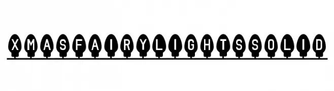
( Chequered Ink - chequered.ink/ )
A playful, festive font with characters encased in Christmas light shapes.
![Xmas Fairy Lights Solid Frei Schriftart Herunterladen]() Herunterladen 50 Downloads@WebFont
Herunterladen 50 Downloads@WebFont -
( Fonts by Chairul Art - Personal-use only. For commercial use please contact owner. )
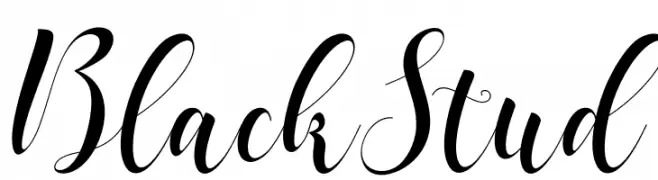
A flowing, elegant script font with decorative flourishes.
![BlackStud Frei Schriftart Herunterladen]() Herunterladen 50 Downloads@WebFont
Herunterladen 50 Downloads@WebFont -
( Fonts by Manuel Ramos - Personal-use only. For commercial use please contact owner. )
A modern, elegant font with tall, slender uppercase characters and a geometric structure.
![Idilica Frei Schriftart Herunterladen]() Herunterladen 50 Downloads@WebFont
Herunterladen 50 Downloads@WebFont -
( Fonts by Asd Studio - Ghazi Humam Fauzan - Personal-use only. For commercial use please contact owner. )
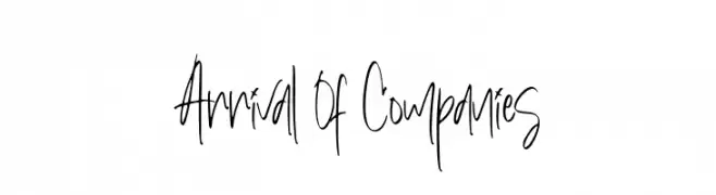
A dynamic handwritten font with fluid, cursive strokes and a playful appearance.
![Arrival Of Companies Frei Schriftart Herunterladen]() Herunterladen 50 Downloads@WebFont
Herunterladen 50 Downloads@WebFont -
( Fonts by Ditatype - Personal-use only. For commercial use please contact owner. )
A dynamic, expressive handwritten font with fluid, elongated strokes.
![Le Barche Personal Use Frei Schriftart Herunterladen]() Herunterladen 50 Downloads@WebFont
Herunterladen 50 Downloads@WebFont -
( Fonts by Jetsmax Studio - Khairil Anwar - Personal-use only. For commercial use please contact owner. )
A whimsical handwritten font with thin strokes and rounded edges.
![Hunian Frei Schriftart Herunterladen]() Herunterladen 50 Downloads@WebFont
Herunterladen 50 Downloads@WebFont -
( Fonts by Sabrcreative - Personal-use only. For commercial use please contact owner. )
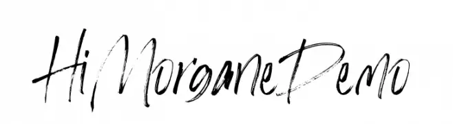
A dynamic, expressive handwritten font with brush-like strokes.
![HiMorganeDemo Frei Schriftart Herunterladen]() Herunterladen 50 Downloads@WebFont
Herunterladen 50 Downloads@WebFont -
( Fonts by ToniStudio - Fatoni Nurman - Personal-use only. For commercial use please contact owner. )
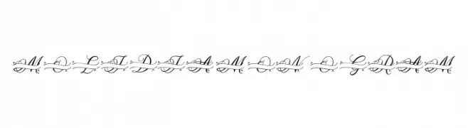
An elegant script font with intricate swirls and flourishes, perfect for decorative projects.
![MOLIDIA MONOGRAM Frei Schriftart Herunterladen]() Herunterladen 50 Downloads@WebFont
Herunterladen 50 Downloads@WebFont -
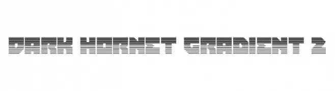
( Fonts by Daniel Zadorozny - www.iconian.com - Personal-use only. For commercial use please contact owner. )
A bold, geometric font with a futuristic, line-patterned design.
![Dark Hornet Gradient 2 Frei Schriftart Herunterladen]() Herunterladen 50 Downloads@WebFont
Herunterladen 50 Downloads@WebFont -
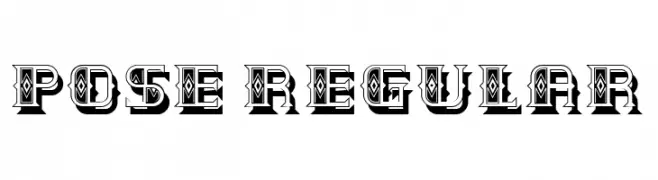
( Fonts by Vladimir Nikolic - www.creativefabrica.com/designer/vladimirnikolic/ - Personal-use only. For commercial use please contact owner. )
A bold, decorative font with intricate patterns and a vintage aesthetic.
![Pose Regular Frei Schriftart Herunterladen]() Herunterladen 50 Downloads@WebFont
Herunterladen 50 Downloads@WebFont -
( Fonts by Debut Studio - Ari Fadli - Personal-use only. For commercial use please contact owner. )
A bold, expressive script font with fluid, interconnected strokes and a handcrafted feel.
![Millea Frei Schriftart Herunterladen]() Herunterladen 50 Downloads@WebFont
Herunterladen 50 Downloads@WebFont -
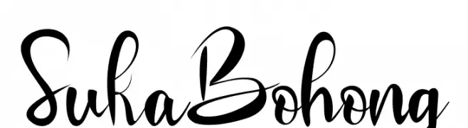
( Fonts by Inermedia Studio - Personal-use only. For commercial use please contact owner. )
A lively and expressive script font with flowing, interconnected letters.
![Suka Bohong Frei Schriftart Herunterladen]() Herunterladen 50 Downloads@WebFont
Herunterladen 50 Downloads@WebFont -
( Fonts by MJB Letters - Muhammad Mujibulloh - Personal-use only. For commercial use please contact owner. )
A graceful, cursive font with a handwritten style.
![Photomark Signature Frei Schriftart Herunterladen]() Herunterladen 50 Downloads@WebFont
Herunterladen 50 Downloads@WebFont -
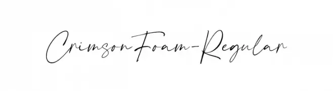
( Fonts by Typetemp Studio - Personal-use only. For commercial use please contact owner. )
An elegant, cursive handwritten font with smooth, flowing strokes.
![CrimsonFoam-Regular Frei Schriftart Herunterladen]() Herunterladen 50 Downloads@WebFont
Herunterladen 50 Downloads@WebFont -
( Fonts by Vunira Design - Personal-use only. For commercial use please contact owner. )
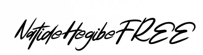
A dynamic, cursive script font with bold, fluid strokes and a modern calligraphic style.
![NatideHegibeFREE Frei Schriftart Herunterladen]() Herunterladen 50 Downloads@WebFont
Herunterladen 50 Downloads@WebFont -
( Fonts by Sambogo Creative - Personal-use only. For commercial use please contact owner. )
A bold, dynamic font with sharp, angular strokes and a playful slant.
![Japon Frei Schriftart Herunterladen]() Herunterladen 50 Downloads@WebFont
Herunterladen 50 Downloads@WebFont -
( Fonts by kntype.co )
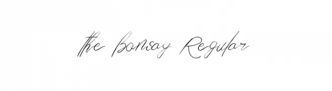
An elegant, flowing script font with cursive and handwritten characteristics.
![the bonsay Regular Frei Schriftart Herunterladen]() Herunterladen 50 Downloads@WebFont
Herunterladen 50 Downloads@WebFont -
( Fonts by Nirmana Visual - Sigit Dwipa - Personal-use only. For commercial use please contact owner. )
A dynamic, brush-style font with bold, expressive strokes.
![YavatoDemoVersionRegular Frei Schriftart Herunterladen]() Herunterladen 50 Downloads@WebFont
Herunterladen 50 Downloads@WebFont


Welche Schriften sind gerade am populärsten?
Poppins, Roboto, Montserrat, Open Sans und Lato sind wegen ihrer klaren Formen und breiten Einsetzbarkeit sehr gefragt – von Markenauftritt über Landingpages bis hin zu Postern.
Welche Fonts eignen sich für Logos?
Geometrische Sans‑Serifs (z. B. Poppins, Familien im Gotham‑Stil) sind ein häufiger Griff für sauberes, skalierbares Branding. Für eine persönlichere Note bleiben Scripts und Handschrift‑Stile beliebt. Kombinieren Sie einen prägnanten Headline‑Font mit einer neutralen Brotschrift für Wiedererkennung und Harmonie.
Wie oft wird die Top‑Liste aktualisiert?
Regelmäßig – basierend auf realen Downloads und Interaktionen. Schauen Sie öfter vorbei, um aufstrebende Favoriten früh zu entdecken.
💡 Tipp: Seite bookmarken – Trends wechseln schnell, und heutige Top‑Schriften inspirieren morgen vielleicht das Rebranding.