Willkommen bei den Top‑Schriften – hier treffen Beliebtheit und Qualität aufeinander. Das sind die in diesem Jahr am häufigsten heruntergeladenen und genutzten Fonts. Wenn Sie sichere Optionen für Logo, Web oder Social suchen, starten Sie hier.
Jeder Top‑Font überzeugt durch Balance, Lesbarkeit und Vielseitigkeit. Sie finden moderne Sans‑Serifs, elegante Scripts, Vintage‑Serifs und minimalistische Displays.
-
( Fonts by halofandi - Fandi Ahmad - Personal-use only. For commercial use please contact owner. )
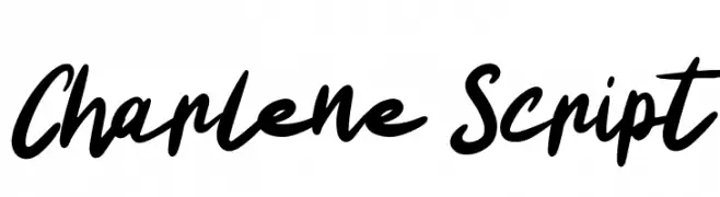
A bold, lively script font with fluid, natural handwriting style.
 Herunterladen 49 Downloads@WebFont
 -
( Fonts by Abo Daniel Studio )
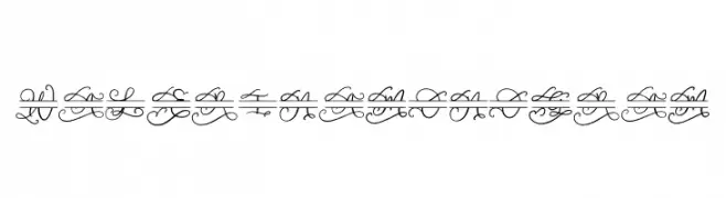
An ornate and decorative script font with intricate swirls and flourishes.
![Walerina Monogram Frei Schriftart Herunterladen]() Herunterladen 49 Downloads@WebFont
Herunterladen 49 Downloads@WebFont -
( Fonts by Teenage Foundry )
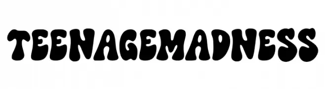
A bold, bubbly, and psychedelic display font with irregular, rounded shapes.
![Teenage Madness Frei Schriftart Herunterladen]() Herunterladen 49 Downloads@WebFont
Herunterladen 49 Downloads@WebFont -
( Fonts by Airotype Studio - Personal-use only. For commercial use please contact owner. )
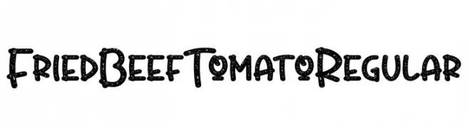
A playful, textured font with a hand-drawn, speckled appearance.
![FriedBeefTomatoRegular Frei Schriftart Herunterladen]() Herunterladen 49 Downloads@WebFont
Herunterladen 49 Downloads@WebFont -
( Fonts by Konstantine Studio - Personal-use only. For commercial use please contact owner. )
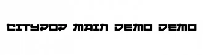
A bold, geometric font with a futuristic and modern style.
![Citypop Main DEMO DEMO Frei Schriftart Herunterladen]() Herunterladen 49 Downloads@WebFont
Herunterladen 49 Downloads@WebFont -
( Fonts by Soft Creative - Personal-use only. For commercial use please contact owner. )
An elegant script font with flowing, cursive letters and high contrast strokes.
![Willgets Frei Schriftart Herunterladen]() Herunterladen 49 Downloads@WebFont
Herunterladen 49 Downloads@WebFont -
( weknow - Wino S Kadir - www.creativefabrica.com/designer/weknow/ )
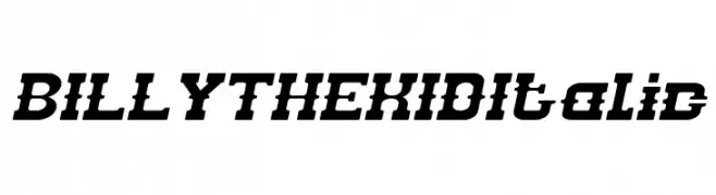
A bold, italic font with a vintage western style and strong visual impact.
![BILLY THE KID Italic Frei Schriftart Herunterladen]() Herunterladen 49 Downloads@WebFont
Herunterladen 49 Downloads@WebFont -
( Fonts by Darrell Flood - Personal-use only. For commercial use please contact owner. )
A bold, futuristic font with sharp angles and geometric shapes, ideal for sci-fi themes.
![Alien Realities Frei Schriftart Herunterladen]() Herunterladen 49 Downloads@WebFont
Herunterladen 49 Downloads@WebFont -
( Fonts by Dav studio - Dimas Aji Virgiawan - Personal-use only. For commercial use please contact owner. )
A flowing, handwritten script font with a casual elegance.
![Estillon Frei Schriftart Herunterladen]() Herunterladen 49 Downloads@WebFont
Herunterladen 49 Downloads@WebFont -
( Fonts by Ibram Syah - Personal-use only. For commercial use please contact owner. )
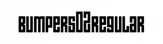
A bold, geometric font with a modern, industrial style.
![Bumpers 02 Regular Frei Schriftart Herunterladen]() Herunterladen 49 Downloads@WebFont
Herunterladen 49 Downloads@WebFont -
( Fonts by Iconian Fonts - Daniel Zadorozny - Personal-use only. For commercial use please contact owner. )
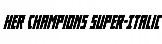
A bold, italicized font with sharp angles and a dynamic, modern style.
![Her Champions Super-Italic Frei Schriftart Herunterladen]() Herunterladen 49 Downloads@WebFont
Herunterladen 49 Downloads@WebFont -
( Fonts by Maulana Creative - Gilang Maulana - Personal-use only. For commercial use please contact owner. )
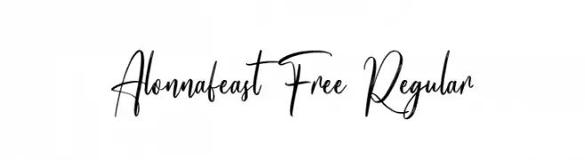
A modern, elegant handwritten font with fluid, graceful strokes.
![Alonnafeast Free Regular Frei Schriftart Herunterladen]() Herunterladen 49 Downloads@WebFont
Herunterladen 49 Downloads@WebFont -
( Fonts by Md Shohail Bhuian - Personal-use only. For commercial use please contact owner. )
A bold, handwritten font with a playful and energetic style.
![Love Radiate Frei Schriftart Herunterladen]() Herunterladen 49 Downloads@WebFont
Herunterladen 49 Downloads@WebFont -
( Fonts by StringLabs - stringlabscreative.com - Personal-use only. For commercial use please contact owner. )
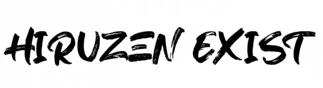
A bold, brush-style font with dynamic and expressive strokes.
![Hiruzen Exist Frei Schriftart Herunterladen]() Herunterladen 49 Downloads@WebFont
Herunterladen 49 Downloads@WebFont -
( Fonts by Andrimada Creative - Personal-use only. For commercial use please contact owner. )
A bold, cursive script font with elegant, flowing curves and a handwritten style.
![Hynata Frei Schriftart Herunterladen]() Herunterladen 49 Downloads@WebFont
Herunterladen 49 Downloads@WebFont -
( Fonts by Haksen Studio - Sarwo Edhi Prayitno - Personal-use only. For commercial use please contact owner. )
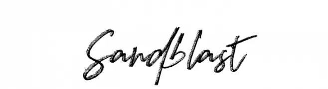
A bold, textured script font with a dynamic, hand-drawn style.
![Sandblast Frei Schriftart Herunterladen]() Herunterladen 49 Downloads@WebFont
Herunterladen 49 Downloads@WebFont -
( Fonts by Irfan Hidayat - Personal-use only. For commercial use please contact owner. )
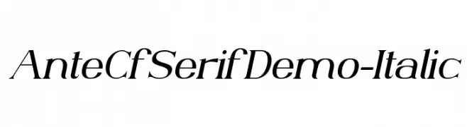
An elegant serif typeface with a refined italic style and graceful curves.
![AnteCfSerifDemo-Italic Frei Schriftart Herunterladen]() Herunterladen 49 Downloads@WebFont
Herunterladen 49 Downloads@WebFont -
( Fonts by Linafis Studio - Ahmad Fashihullisan - Personal-use only. For commercial use please contact owner. )
A playful and dynamic script font with fluid, connected letterforms.
![Ellie Magdalena Frei Schriftart Herunterladen]() Herunterladen 49 Downloads@WebFont
Herunterladen 49 Downloads@WebFont -
( Fonts by Sudarman Mulka - Personal-use only. For commercial use please contact owner. )
A bold, dynamic script font with flowing, cursive letters.
![Delighters Frei Schriftart Herunterladen]() Herunterladen 49 Downloads@WebFont
Herunterladen 49 Downloads@WebFont -
( Fonts by Vunira Design - Personal-use only. For commercial use please contact owner. )
A bold, expressive script font with flowing cursive letters.
![WhenPlantsFREE Frei Schriftart Herunterladen]() Herunterladen 49 Downloads@WebFont
Herunterladen 49 Downloads@WebFont -
( Fonts by Riyadh Rahman - Personal-use only. For commercial use please contact owner. )
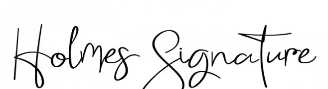
An elegant, cursive handwritten font with flowing lines and sophisticated curves.
![Holmes Signature Frei Schriftart Herunterladen]() Herunterladen 49 Downloads@WebFont
Herunterladen 49 Downloads@WebFont -
( Fonts by Typegenic Studio - Personal-use only. For commercial use please contact owner. )
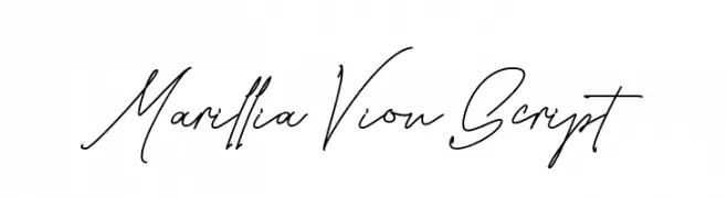
A graceful and flowing script font with elegant, continuous strokes.
![Marillia Vion Script Frei Schriftart Herunterladen]() Herunterladen 49 Downloads@WebFont
Herunterladen 49 Downloads@WebFont -
( Fonts by FontGrube AH - Andreas Höfeld - Personal-use only. For commercial use please contact owner. )
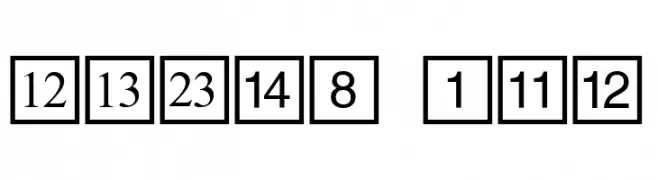
Bold, geometric font with characters in square boxes for a modern look.
![CD Numbers Frei Schriftart Herunterladen]() Herunterladen 49 Downloads@WebFont
Herunterladen 49 Downloads@WebFont -
( Fonts by Jen Jones - Personal-use only. For commercial use please contact owner. )
A playful, casual handwritten font with tall, narrow letters and smooth edges.
![HelloCasual Frei Schriftart Herunterladen]() Herunterladen 49 Downloads@WebFont
Herunterladen 49 Downloads@WebFont -
( Fonts by Youthlabs Studio - Personal-use only. For commercial use please contact owner. )
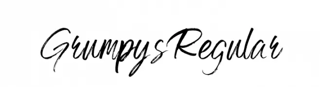
A bold, expressive handwritten font with dynamic brush strokes.
![Grumpys Regular Frei Schriftart Herunterladen]() Herunterladen 49 Downloads@WebFont
Herunterladen 49 Downloads@WebFont -
( Fonts by Wahyu Eka Prasetya - wepfont.com - Personal-use only. For commercial use please contact owner. )
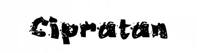
A bold, distressed font with a splattered, grunge texture.
![Cipratan Frei Schriftart Herunterladen]() Herunterladen 49 Downloads@WebFont
Herunterladen 49 Downloads@WebFont -
( Fonts by Daniel Zadorozny - www.iconian.com - Personal-use only. For commercial use please contact owner. )
A bold, dripping 3D font with an eerie, fluid appearance.
![Blood Drenched 3D Frei Schriftart Herunterladen]() Herunterladen 49 Downloads@WebFont
Herunterladen 49 Downloads@WebFont -
( Fonts by Joohn Fonts - Personal-use only. For commercial use please contact owner. )
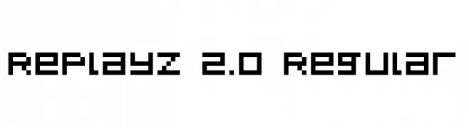
A pixelated, retro-style font inspired by classic 8-bit video games.
![RePlayz 2.0 Regular Frei Schriftart Herunterladen]() Herunterladen 49 Downloads@WebFont
Herunterladen 49 Downloads@WebFont -
( Fonts by Motokiwo - Anton Cahyono - Personal-use only. For commercial use please contact owner. )
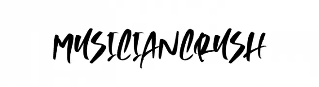
A bold, expressive brush-style font with dynamic and fluid strokes.
![MusicianCrush Frei Schriftart Herunterladen]() Herunterladen 49 Downloads@WebFont
Herunterladen 49 Downloads@WebFont -
( Fonts by wep - Wahyu Eka Prasetya - Personal-use only. For commercial use please contact owner. )
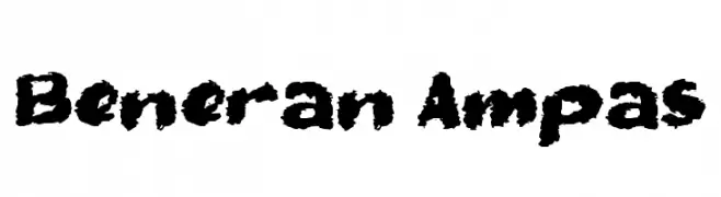
A bold, textured font with a rugged, distressed style.
![Beneran Ampas Frei Schriftart Herunterladen]() Herunterladen 49 Downloads@WebFont
Herunterladen 49 Downloads@WebFont -
( Fonts by Creatype Studio - Rian Rahardi - Personal-use only. For commercial use please contact owner. )
A dynamic, handwritten script font with fluid, expressive strokes.
![Clattering Frei Schriftart Herunterladen]() Herunterladen 49 Downloads@WebFont
Herunterladen 49 Downloads@WebFont -
( Fonts by Woodcutter Manero - www.woodcutter.es - Personal-use only. For commercial use please contact owner. )
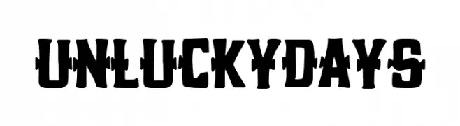
A bold, distressed display font with jagged cutouts and a horror vibe.
![Unlucky Days Frei Schriftart Herunterladen]() Herunterladen 49 Downloads@WebFont
Herunterladen 49 Downloads@WebFont -
( Fonts by Vladimir Nikolic - www.creativefabrica.com/designer/vladimirnikolic/ - Personal-use only. For commercial use please contact owner. )
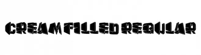
A bold, three-dimensional font with a graffiti-inspired style.
![Cream Filled Regular Frei Schriftart Herunterladen]() Herunterladen 49 Downloads@WebFont
Herunterladen 49 Downloads@WebFont -
( Fonts by Edric Studio - Personal-use only. For commercial use please contact owner. )
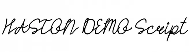
A fluid, elegant script font with interconnected, cursive letters.
![HASTON DEMO Script Frei Schriftart Herunterladen]() Herunterladen 49 Downloads@WebFont
Herunterladen 49 Downloads@WebFont -
( Fonts by Joohn Fonts - Personal-use only. For commercial use please contact owner. )
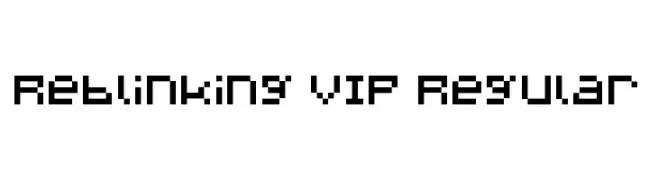
A pixelated, retro-style font with a uniform grid structure.
![Reblinking VIP Regular Frei Schriftart Herunterladen]() Herunterladen 49 Downloads@WebFont
Herunterladen 49 Downloads@WebFont


Welche Schriften sind gerade am populärsten?
Poppins, Roboto, Montserrat, Open Sans und Lato sind wegen ihrer klaren Formen und breiten Einsetzbarkeit sehr gefragt – von Markenauftritt über Landingpages bis hin zu Postern.
Welche Fonts eignen sich für Logos?
Geometrische Sans‑Serifs (z. B. Poppins, Familien im Gotham‑Stil) sind ein häufiger Griff für sauberes, skalierbares Branding. Für eine persönlichere Note bleiben Scripts und Handschrift‑Stile beliebt. Kombinieren Sie einen prägnanten Headline‑Font mit einer neutralen Brotschrift für Wiedererkennung und Harmonie.
Wie oft wird die Top‑Liste aktualisiert?
Regelmäßig – basierend auf realen Downloads und Interaktionen. Schauen Sie öfter vorbei, um aufstrebende Favoriten früh zu entdecken.
💡 Tipp: Seite bookmarken – Trends wechseln schnell, und heutige Top‑Schriften inspirieren morgen vielleicht das Rebranding.