Willkommen bei den Top‑Schriften – hier treffen Beliebtheit und Qualität aufeinander. Das sind die in diesem Jahr am häufigsten heruntergeladenen und genutzten Fonts. Wenn Sie sichere Optionen für Logo, Web oder Social suchen, starten Sie hier.
Jeder Top‑Font überzeugt durch Balance, Lesbarkeit und Vielseitigkeit. Sie finden moderne Sans‑Serifs, elegante Scripts, Vintage‑Serifs und minimalistische Displays.
-
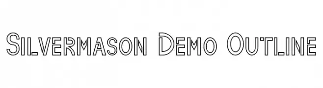
( Fonts by Edric Studio - Personal-use only. For commercial use please contact owner. )
A bold, geometric outline font with a modern and clean aesthetic.
 Herunterladen 49 Downloads@WebFont
 -
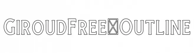
( Fonts by Craft Supply Co - Personal-use only. For commercial use please contact owner. )
A modern outline font with geometric, symmetrical letterforms and balanced spacing.
![GiroudFree-Outline Frei Schriftart Herunterladen]() Herunterladen 49 Downloads@WebFont
Herunterladen 49 Downloads@WebFont -
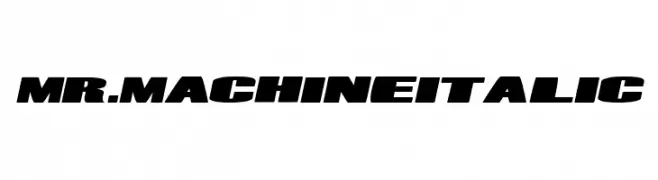
( Fonts by Joseph Dawson - Personal-use only. For commercial use please contact owner. )
A bold, italic font with a modern, industrial feel and strong presence.
![Mr. Machine Italic Frei Schriftart Herunterladen]() Herunterladen 49 Downloads@WebFont
Herunterladen 49 Downloads@WebFont -
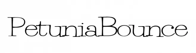
( Fonts by Mario Arturo - Personal-use only. For commercial use please contact owner. )
A playful, handwritten-style font with a bouncy baseline and thin strokes.
![PetuniaBounce Frei Schriftart Herunterladen]() Herunterladen 49 Downloads@WebFont
Herunterladen 49 Downloads@WebFont -
( Fonts by Allouse Studio - Personal-use only. For commercial use please contact owner. )
A flowing, elegant script font with a sophisticated, handwritten style.
![Queensouthy Frei Schriftart Herunterladen]() Herunterladen 49 Downloads@WebFont
Herunterladen 49 Downloads@WebFont -
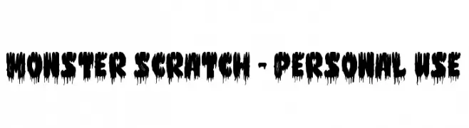
( Fonts by Letterara - Thomas Aradea - Personal-use only. For commercial use please contact owner. )
A bold, dripping font with a monstrous, eerie style.
![Monster Scratch - Personal use Frei Schriftart Herunterladen]() Herunterladen 49 Downloads@WebFont
Herunterladen 49 Downloads@WebFont -
( Fonts by Runsell Studio - Personal-use only. For commercial use please contact owner. )
A bold, brush-style font with dynamic, expressive strokes.
![Rolingline Frei Schriftart Herunterladen]() Herunterladen 49 Downloads@WebFont
Herunterladen 49 Downloads@WebFont -
( Fonts by Gilar Studio - Personal-use only. For commercial use please contact owner. )
A bold, decorative font with a checkered pattern, ideal for eye-catching designs.
![Pandora Frei Schriftart Herunterladen]() Herunterladen 49 Downloads@WebFont
Herunterladen 49 Downloads@WebFont -
( Fonts by Suzuran San )
A dynamic and elegant handwritten font with fluid, cursive strokes.
![White Pen Frei Schriftart Herunterladen]() Herunterladen 49 Downloads@WebFont
Herunterladen 49 Downloads@WebFont -
( Fonts by Jetsmax Studio - Khairil Anwar - Personal-use only. For commercial use please contact owner. )
A modern, angular italic font with a futuristic and geometric style.
![Hundred Wars Italic Frei Schriftart Herunterladen]() Herunterladen 49 Downloads@WebFont
Herunterladen 49 Downloads@WebFont -
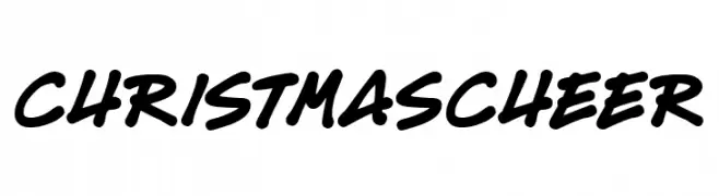
( Fonts by Darrell Flood - Personal-use only. For commercial use please contact owner. )
A bold, playful script font with smooth, flowing curves.
![Christmas Cheer Frei Schriftart Herunterladen]() Herunterladen 49 Downloads@WebFont
Herunterladen 49 Downloads@WebFont -
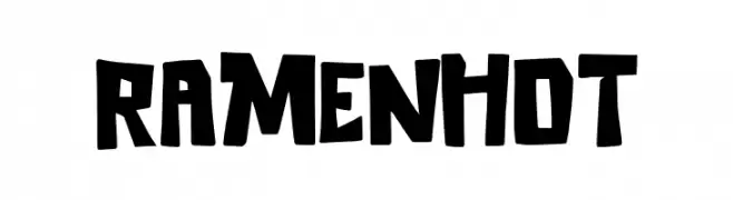
( Fonts by Khurasan - Syaf Rizal - Personal-use only. For commercial use please contact owner. )
A bold, hand-drawn font with an energetic and playful style.
![Ramen Hot Frei Schriftart Herunterladen]() Herunterladen 49 Downloads@WebFont
Herunterladen 49 Downloads@WebFont -
( Fonts by Vladimir Nikolic - www.creativefabrica.com/designer/vladimirnikolic/ - Personal-use only. For commercial use please contact owner. )
A bold, three-dimensional font with geometric, shadowed letters.
![Range Fancy Regular Frei Schriftart Herunterladen]() Herunterladen 49 Downloads@WebFont
Herunterladen 49 Downloads@WebFont -
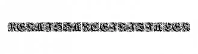
( Fonts by Torre de Prata - Marcos André Falcão Malafaia - Personal-use only. For commercial use please contact owner. )
An ornate, Renaissance-inspired decorative font with intricate patterns.
![Renaissance-Initialen Frei Schriftart Herunterladen]() Herunterladen 49 Downloads@WebFont
Herunterladen 49 Downloads@WebFont -
( Fonts by Vunira Design - Personal-use only. For commercial use please contact owner. )
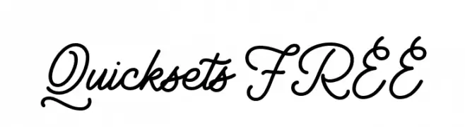
A flowing, cursive font with elegant, continuous strokes and a modern calligraphic style.
![Quicksets FREE Frei Schriftart Herunterladen]() Herunterladen 49 Downloads@WebFont
Herunterladen 49 Downloads@WebFont -
( Fonts by Almarkhatype - Abdul Malik Wisnu - Personal-use only. For commercial use please contact owner. )
A bold, expressive handwritten font with dynamic strokes.
![Crash Soul Frei Schriftart Herunterladen]() Herunterladen 49 Downloads@WebFont
Herunterladen 49 Downloads@WebFont -
( Fonts by Typodermic Fonts - Raymond Larabie - Personal-use only. For commercial use please contact owner. )
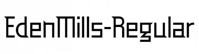
A geometric, modern font with clean lines and sharp angles.
![EdenMills-Regular Frei Schriftart Herunterladen]() Herunterladen 49 Downloads@WebFont
Herunterladen 49 Downloads@WebFont -
( Fonts by NJ Studio )
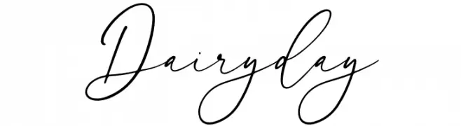
Elegant, handwritten cursive script with high contrast and connected strokes.
![Dairy day Frei Schriftart Herunterladen]() Herunterladen 49 Downloads@WebFont
Herunterladen 49 Downloads@WebFont -
( Fonts by Maulana Creative )
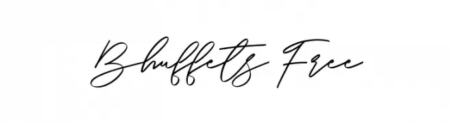
Elegant handwritten script with connected, flowing strokes.
![Bhuffets Free Frei Schriftart Herunterladen]() Herunterladen 49 Downloads@WebFont
Herunterladen 49 Downloads@WebFont -
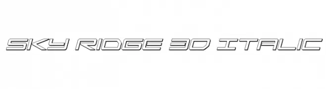
( Fonts by Daniel Zadorozny - www.iconian.com - Personal-use only. For commercial use please contact owner. )
A futuristic 3D italic font with geometric outlines and sharp angles.
![Sky Ridge 3D Italic Frei Schriftart Herunterladen]() Herunterladen 49 Downloads@WebFont
Herunterladen 49 Downloads@WebFont -
( Fonts by Daniel Zadorozny - www.iconian.com - Personal-use only. For commercial use please contact owner. )
A bold, italic, outlined font with a dynamic and energetic style.
![Peace & Houston Academy Italic Frei Schriftart Herunterladen]() Herunterladen 49 Downloads@WebFont
Herunterladen 49 Downloads@WebFont -
( Fonts by Creativework69 Studio - Daddi Daryawan - Personal-use only. For commercial use please contact owner. )
A flowing, cursive script font with elegant, connected letters.
![Mellodious Frei Schriftart Herunterladen]() Herunterladen 49 Downloads@WebFont
Herunterladen 49 Downloads@WebFont -
( Fonts by Maulana Creative - Gilang Maulana - Personal-use only. For commercial use please contact owner. )
A playful, modern handwritten font with elegant, flowing lines.
![Whillys Free Regular Frei Schriftart Herunterladen]() Herunterladen 49 Downloads@WebFont
Herunterladen 49 Downloads@WebFont -
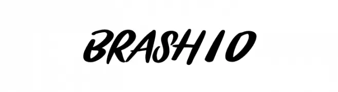
( Fonts by Nirmana Visual - Sigit Dwipa - Personal-use only. For commercial use please contact owner. )
A bold, brush script font with dynamic and expressive strokes.
![BRASHIO Frei Schriftart Herunterladen]() Herunterladen 49 Downloads@WebFont
Herunterladen 49 Downloads@WebFont -
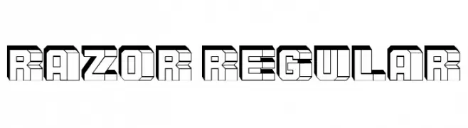
( Fonts by Vladimir Nikolic - www.creativefabrica.com/designer/vladimirnikolic/ - Personal-use only. For commercial use please contact owner. )
A bold, geometric font with a 3D effect and sharp angles.
![Razor Regular Frei Schriftart Herunterladen]() Herunterladen 49 Downloads@WebFont
Herunterladen 49 Downloads@WebFont -
( Fonts by Gassstype - Anang Fibriyanto - www.gassstype.com - Personal-use only. For commercial use please contact owner. )
A bold, brush-stroke style font with a textured, hand-painted appearance.
![Vespertine Frei Schriftart Herunterladen]() Herunterladen 49 Downloads@WebFont
Herunterladen 49 Downloads@WebFont -
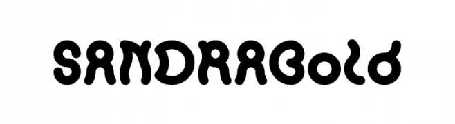
( Fonts by weknow - Wino S Kadir - Personal-use only. For commercial use please contact owner. )
A bold, playful font with rounded, bubbly characters and a whimsical style.
![SANDRA Bold Frei Schriftart Herunterladen]() Herunterladen 49 Downloads@WebFont
Herunterladen 49 Downloads@WebFont -
( Fonts by Kong Font - Personal-use only. For commercial use please contact owner. )
A bold, rounded display typeface with a modern and playful style.
![Fortman Frei Schriftart Herunterladen]() Herunterladen 49 Downloads@WebFont
Herunterladen 49 Downloads@WebFont -
( Fonts by Iconian Fonts - Daniel Zadorozny - Personal-use only. For commercial use please contact owner. )
A bold, slanted font with angular, dynamic characters.
![Frost Giant Rotalic Frei Schriftart Herunterladen]() Herunterladen 49 Downloads@WebFont
Herunterladen 49 Downloads@WebFont -
( Fonts by Rhidtype - Repi Hilmana - Personal-use only. For commercial use please contact owner. )
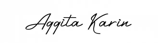
An elegant, flowing script font with graceful curves and decorative flourishes.
![Aggita Karin Frei Schriftart Herunterladen]() Herunterladen 49 Downloads@WebFont
Herunterladen 49 Downloads@WebFont -
( Fonts by Iconian Fonts - Daniel Zadorozny - Personal-use only. For commercial use please contact owner. )
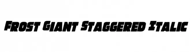
A bold, staggered italic font with a dynamic and powerful presence.
![Frost Giant Staggered Italic Frei Schriftart Herunterladen]() Herunterladen 49 Downloads@WebFont
Herunterladen 49 Downloads@WebFont -
( Fonts by Billy Argel Fonts ® )
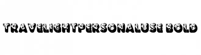
A bold, distressed, and decorative font with a vintage, three-dimensional look.
![TRAVELIGHTPERSONALUSE-Bold Frei Schriftart Herunterladen]() Herunterladen 49 Downloads@WebFont
Herunterladen 49 Downloads@WebFont -
( Fonts by Daniel Zadorozny - www.iconian.com - Personal-use only. For commercial use please contact owner. )
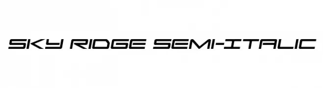
A sleek, semi-italicized font with a futuristic and modern design.
![Sky Ridge Semi-Italic Frei Schriftart Herunterladen]() Herunterladen 49 Downloads@WebFont
Herunterladen 49 Downloads@WebFont -
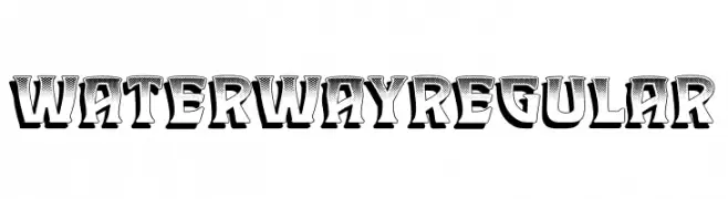
( Fonts by Vladimir Nikolic - www.creativefabrica.com/designer/vladimirnikolic/ - Personal-use only. For commercial use please contact owner. )
A bold, decorative font with a 3D effect and vintage comic book style.
![Waterway Regular Frei Schriftart Herunterladen]() Herunterladen 49 Downloads@WebFont
Herunterladen 49 Downloads@WebFont -
( Fonts by ed creative - edy suryadi - Personal-use only. For commercial use please contact owner. )
A playful, energetic script font with a fluid, handwritten style.
![Dara Frei Schriftart Herunterladen]() Herunterladen 49 Downloads@WebFont
Herunterladen 49 Downloads@WebFont


Welche Schriften sind gerade am populärsten?
Poppins, Roboto, Montserrat, Open Sans und Lato sind wegen ihrer klaren Formen und breiten Einsetzbarkeit sehr gefragt – von Markenauftritt über Landingpages bis hin zu Postern.
Welche Fonts eignen sich für Logos?
Geometrische Sans‑Serifs (z. B. Poppins, Familien im Gotham‑Stil) sind ein häufiger Griff für sauberes, skalierbares Branding. Für eine persönlichere Note bleiben Scripts und Handschrift‑Stile beliebt. Kombinieren Sie einen prägnanten Headline‑Font mit einer neutralen Brotschrift für Wiedererkennung und Harmonie.
Wie oft wird die Top‑Liste aktualisiert?
Regelmäßig – basierend auf realen Downloads und Interaktionen. Schauen Sie öfter vorbei, um aufstrebende Favoriten früh zu entdecken.
💡 Tipp: Seite bookmarken – Trends wechseln schnell, und heutige Top‑Schriften inspirieren morgen vielleicht das Rebranding.