Willkommen bei den Top‑Schriften – hier treffen Beliebtheit und Qualität aufeinander. Das sind die in diesem Jahr am häufigsten heruntergeladenen und genutzten Fonts. Wenn Sie sichere Optionen für Logo, Web oder Social suchen, starten Sie hier.
Jeder Top‑Font überzeugt durch Balance, Lesbarkeit und Vielseitigkeit. Sie finden moderne Sans‑Serifs, elegante Scripts, Vintage‑Serifs und minimalistische Displays.
-
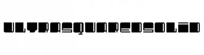
( Fonts by Ultrabold Kommunikationsdesign )
A bold, geometric font with a modern, futuristic style.
 Herunterladen 48 Downloads@WebFont
 -
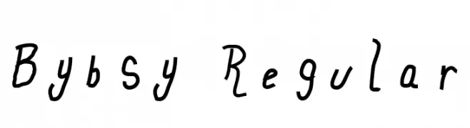
( Fonts by Sara Byblow - Personal-use only. For commercial use please contact owner. )
A playful, hand-drawn font with dynamic and irregular letterforms.
![Bybsy Regular Frei Schriftart Herunterladen]() Herunterladen 48 Downloads@WebFont
Herunterladen 48 Downloads@WebFont -
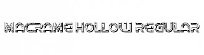
( Fonts by Vladimir Nikolic - www.creativefabrica.com/designer/vladimirnikolic/ - Personal-use only. For commercial use please contact owner. )
A bold, hollow font with geometric and industrial elements.
![Macrame Hollow Regular Frei Schriftart Herunterladen]() Herunterladen 48 Downloads@WebFont
Herunterladen 48 Downloads@WebFont -
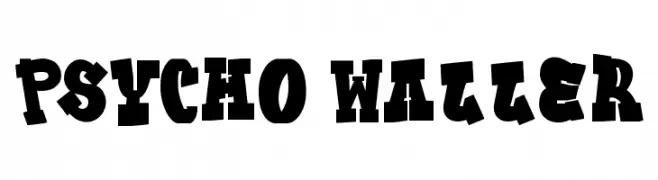
( Fonts by Dhabee Studio )
A bold, whimsical display font with irregular, energetic shapes.
![Psycho Waller Frei Schriftart Herunterladen]() Herunterladen 48 Downloads@WebFont
Herunterladen 48 Downloads@WebFont -
( Fonts by Daniel Zadorozny - www.iconian.com - Personal-use only. For commercial use please contact owner. )
A bold, geometric, and italic font with expanded width and sharp angles.
![Shogunate Expanded Italic Frei Schriftart Herunterladen]() Herunterladen 48 Downloads@WebFont
Herunterladen 48 Downloads@WebFont -
( Fonts by Daniel Zadorozny - www.iconian.com - Personal-use only. For commercial use please contact owner. )
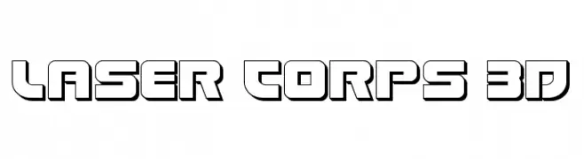
A bold, 3D futuristic font with outlined, blocky characters.
![Laser Corps 3D Frei Schriftart Herunterladen]() Herunterladen 48 Downloads@WebFont
Herunterladen 48 Downloads@WebFont -
( Fonts by Vladimir Nikolic - www.creativefabrica.com/designer/vladimirnikolic/ - Personal-use only. For commercial use please contact owner. )
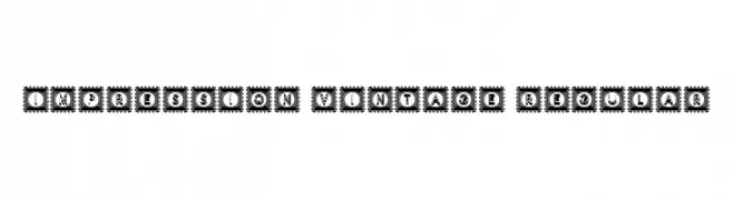
A vintage, decorative font with ornate, framed characters resembling postage stamps.
![Impression Vintage Regular Frei Schriftart Herunterladen]() Herunterladen 48 Downloads@WebFont
Herunterladen 48 Downloads@WebFont -
( Fonts by Hardtype - Richardwibi - Personal-use only. For commercial use please contact owner. )
A bold, cursive font with smooth, interconnected lines and a handwritten feel.
![Hellodilo Frei Schriftart Herunterladen]() Herunterladen 48 Downloads@WebFont
Herunterladen 48 Downloads@WebFont -
( Fonts by Inermedia Studio - Personal-use only. For commercial use please contact owner. )
A flowing, cursive handwritten font with smooth, continuous strokes.
![Sunday Of Beauty Frei Schriftart Herunterladen]() Herunterladen 48 Downloads@WebFont
Herunterladen 48 Downloads@WebFont -
( Fonts by 177Studio )
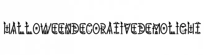
A whimsical Halloween-inspired decorative font with themed illustrations in each character.
![Halloween Decorative Demo Light Frei Schriftart Herunterladen]() Herunterladen 48 Downloads@WebFont
Herunterladen 48 Downloads@WebFont -
( Fonts by Rangkai Aksara - Personal-use only. For commercial use please contact owner. )
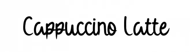
A playful, handwritten font with smooth, flowing curves and a casual style.
![Cappuccino Latte Frei Schriftart Herunterladen]() Herunterladen 48 Downloads@WebFont
Herunterladen 48 Downloads@WebFont -
( Fonts by Dav studio - Dimas Aji Virgiawan - Personal-use only. For commercial use please contact owner. )
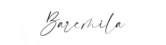
A cursive, handwritten font with elegant, flowing strokes and dynamic contrast.
![Baremila Frei Schriftart Herunterladen]() Herunterladen 48 Downloads@WebFont
Herunterladen 48 Downloads@WebFont -
( Fonts by Iconian Fonts - Daniel Zadorozny - Personal-use only. For commercial use please contact owner. )
A bold, italic font with a modern, angular design and a dynamic, futuristic style.
![Pilot Command Italic Frei Schriftart Herunterladen]() Herunterladen 48 Downloads@WebFont
Herunterladen 48 Downloads@WebFont -
( Fonts by Fontfabric - Svetoslav Simov - Personal-use only. For commercial use please contact owner. )
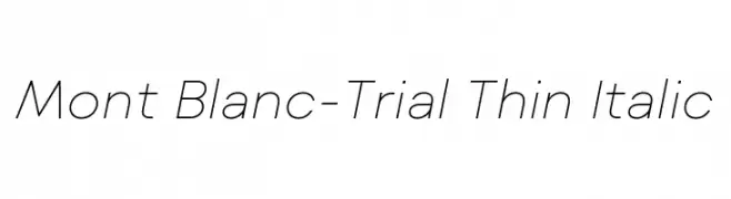
A sleek, thin italic font with a modern and elegant design.
![Mont Blanc-Trial Thin Italic Frei Schriftart Herunterladen]() Herunterladen 47 Downloads@WebFont
Herunterladen 47 Downloads@WebFont -
( Fonts by Letterara - Thomas Aradea - Personal-use only. For commercial use please contact owner. )
A playful, cursive script font with elegant loops and swirls.
![Cheerful Day Frei Schriftart Herunterladen]() Herunterladen 47 Downloads@WebFont
Herunterladen 47 Downloads@WebFont -
( Fonts by Letterhend Studio - Hendry Juanda - Personal-use only. For commercial use please contact owner. )
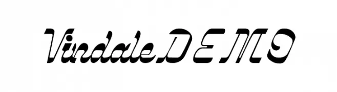
A bold, modern script font with dynamic slant and connected characters.
![VindaleDEMO Frei Schriftart Herunterladen]() Herunterladen 47 Downloads@WebFont
Herunterladen 47 Downloads@WebFont -
( Fonts by Salamahtype.com - Aswangga - Personal-use only. For commercial use please contact owner. )
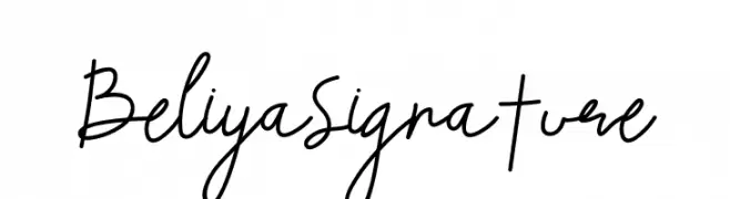
A modern, cursive handwritten font with fluid and elegant strokes.
![Beliya Signature Frei Schriftart Herunterladen]() Herunterladen 47 Downloads@WebFont
Herunterladen 47 Downloads@WebFont -
( Fonts by Surya Creatype - Surya Iswandi - Personal-use only. For commercial use please contact owner. )
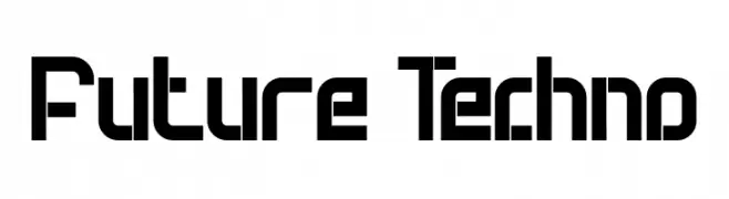
A futuristic, geometric font with angular letterforms and a modern aesthetic.
![Future Techno Frei Schriftart Herunterladen]() Herunterladen 47 Downloads@WebFont
Herunterladen 47 Downloads@WebFont -
( Fonts by YTY Digital TypeFoundry - Tzu-yuan Yin - Personal-use only. For commercial use please contact owner. )
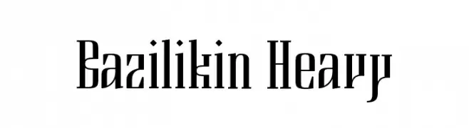
A bold, elongated serif font with a modern yet classic style.
![Bazilikin Heavy Frei Schriftart Herunterladen]() Herunterladen 47 Downloads@WebFont
Herunterladen 47 Downloads@WebFont -
( Fonts by Zultype Fonter - Personal-use only. For commercial use please contact owner. )
A bold, decorative font with high contrast and artistic flair.
![Bonnitta Frei Schriftart Herunterladen]() Herunterladen 47 Downloads@WebFont
Herunterladen 47 Downloads@WebFont -
( Fonts by Typotopia Studio - Personal-use only. For commercial use please contact owner. )
A dynamic, flowing script font with elegant, cursive strokes.
![Foxtail Regular Frei Schriftart Herunterladen]() Herunterladen 47 Downloads@WebFont
Herunterladen 47 Downloads@WebFont -
( Fonts by InspiraType )
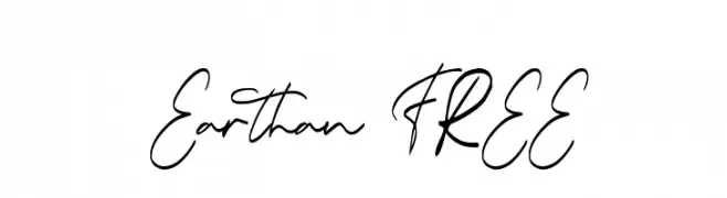
A dynamic, fluid script font with elegant, flowing lines and a modern appeal.
![Earthan FREE Frei Schriftart Herunterladen]() Herunterladen 47 Downloads@WebFont
Herunterladen 47 Downloads@WebFont -
( Fonts by Daniel Zadorozny - www.iconian.com - Personal-use only. For commercial use please contact owner. )
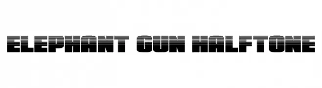
A bold, halftone-effect font with a modern and dynamic style.
![Elephant Gun Halftone Frei Schriftart Herunterladen]() Herunterladen 47 Downloads@WebFont
Herunterladen 47 Downloads@WebFont -
( Fonts by Roman Paslavskiy - Personal-use only. For commercial use please contact owner. )
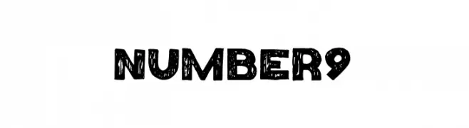
A bold, distressed font with a rugged, vintage appearance.
![Number9 Frei Schriftart Herunterladen]() Herunterladen 47 Downloads@WebFont
Herunterladen 47 Downloads@WebFont -
( Fonts by semuthitam - Mokhamad Junaedi - Personal-use only. For commercial use please contact owner. )
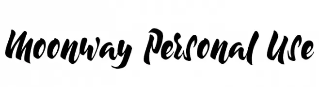
A bold, expressive handwritten font with dynamic, fluid characters.
![Moonway Personal Use Frei Schriftart Herunterladen]() Herunterladen 47 Downloads@WebFont
Herunterladen 47 Downloads@WebFont -
( Fonts by Murebek Type - Personal-use only. For commercial use please contact owner. )
A bold, expressive font with a hand-drawn, brush-like style.
![Extreme Frei Schriftart Herunterladen]() Herunterladen 47 Downloads@WebFont
Herunterladen 47 Downloads@WebFont -
( Fonts by Kong Font - fontkong.com - Personal-use only. For commercial use please contact owner. )
A flowing, cursive script font with elegant, connected letters.
![RachelleStern Frei Schriftart Herunterladen]() Herunterladen 47 Downloads@WebFont
Herunterladen 47 Downloads@WebFont -
( Fonts by Noah Type - noahtype.com - Personal-use only. For commercial use please contact owner. )
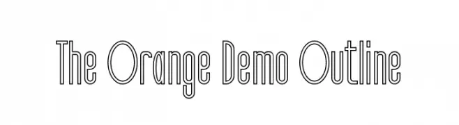
A modern, outlined font with a geometric and edgy style.
![The Orange Demo Outline Frei Schriftart Herunterladen]() Herunterladen 47 Downloads@WebFont
Herunterladen 47 Downloads@WebFont -
( Fonts by Mans Greback - www.mansgreback.com - Personal-use only. For commercial use please contact owner. )
A playful, handwritten-style font with bold, rounded characters.
![Beach Vibes Frei Schriftart Herunterladen]() Herunterladen 47 Downloads@WebFont
Herunterladen 47 Downloads@WebFont -
( Fonts by Vladimir Nikolic - www.creativefabrica.com/designer/vladimirnikolic/ - Personal-use only. For commercial use please contact owner. )
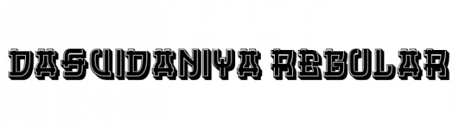
A bold, geometric decorative font with a three-dimensional outline.
![Dasvidaniya Regular Frei Schriftart Herunterladen]() Herunterladen 47 Downloads@WebFont
Herunterladen 47 Downloads@WebFont -
( Fonts by Mans Greback - Personal-use only. For commercial use please contact owner. )
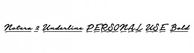
A bold, cursive font with underlined characters, perfect for dynamic and stylish designs.
![Notera 2 Underline PERSONAL USE Bold Frei Schriftart Herunterladen]() Herunterladen 47 Downloads@WebFont
Herunterladen 47 Downloads@WebFont -
( Fonts by Vable Studio - Azka Rizki - Personal-use only. For commercial use please contact owner. )
A bold, playful font with a dripping effect, perfect for creative projects.
![Lukalama-Regular Frei Schriftart Herunterladen]() Herunterladen 47 Downloads@WebFont
Herunterladen 47 Downloads@WebFont -
( Fonts by weknow - Wino S Kadir - Personal-use only. For commercial use please contact owner. )
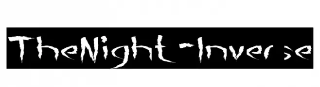
A bold, jagged font with sharp, irregular edges for a dramatic effect.
![The Night-Inverse Frei Schriftart Herunterladen]() Herunterladen 47 Downloads@WebFont
Herunterladen 47 Downloads@WebFont -
( Fonts by Chen Yining - Personal-use only. For commercial use please contact owner. )
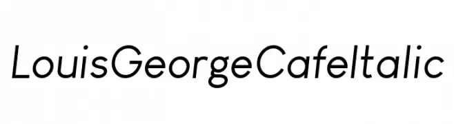
A sleek, modern italic font with smooth curves and clean lines.
![Louis George Cafe Italic Frei Schriftart Herunterladen]() Herunterladen 47 Downloads@WebFont
Herunterladen 47 Downloads@WebFont -
( Fonts by Font Monger - Chris Vile - Personal-use only. For commercial use please contact owner. )
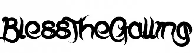
A bold, expressive font with sharp edges and sweeping curves.
![Bless The Galling Frei Schriftart Herunterladen]() Herunterladen 47 Downloads@WebFont
Herunterladen 47 Downloads@WebFont


Welche Schriften sind gerade am populärsten?
Poppins, Roboto, Montserrat, Open Sans und Lato sind wegen ihrer klaren Formen und breiten Einsetzbarkeit sehr gefragt – von Markenauftritt über Landingpages bis hin zu Postern.
Welche Fonts eignen sich für Logos?
Geometrische Sans‑Serifs (z. B. Poppins, Familien im Gotham‑Stil) sind ein häufiger Griff für sauberes, skalierbares Branding. Für eine persönlichere Note bleiben Scripts und Handschrift‑Stile beliebt. Kombinieren Sie einen prägnanten Headline‑Font mit einer neutralen Brotschrift für Wiedererkennung und Harmonie.
Wie oft wird die Top‑Liste aktualisiert?
Regelmäßig – basierend auf realen Downloads und Interaktionen. Schauen Sie öfter vorbei, um aufstrebende Favoriten früh zu entdecken.
💡 Tipp: Seite bookmarken – Trends wechseln schnell, und heutige Top‑Schriften inspirieren morgen vielleicht das Rebranding.