Willkommen bei den Top‑Schriften – hier treffen Beliebtheit und Qualität aufeinander. Das sind die in diesem Jahr am häufigsten heruntergeladenen und genutzten Fonts. Wenn Sie sichere Optionen für Logo, Web oder Social suchen, starten Sie hier.
Jeder Top‑Font überzeugt durch Balance, Lesbarkeit und Vielseitigkeit. Sie finden moderne Sans‑Serifs, elegante Scripts, Vintage‑Serifs und minimalistische Displays.
-
( Fonts by Nirmana Visual - Sigit Dwipa - Personal-use only. For commercial use please contact owner. )
A bold, hand-drawn font with a dynamic and urban style.
 Herunterladen 47 Downloads@WebFont
 -
( Fonts by AukimVisuel - Audry Kitoko Makelele - Personal-use only. For commercial use please contact owner. )
A bold, hand-drawn font with a textured, scrawled appearance and expanded width.
![Kumba Scrawl SemiBold Expanded Frei Schriftart Herunterladen]() Herunterladen 47 Downloads@WebFont
Herunterladen 47 Downloads@WebFont -
( Fonts by Linecreative - ARI JUANDA - Personal-use only. For commercial use please contact owner. )
A bold, futuristic font with rounded edges and a geometric design.
![Popboy Frei Schriftart Herunterladen]() Herunterladen 47 Downloads@WebFont
Herunterladen 47 Downloads@WebFont -
( Fonts by Vunira Design - Personal-use only. For commercial use please contact owner. )
A bold, flowing script font with elegant curves and fluid strokes.
![Awugh Frei Schriftart Herunterladen]() Herunterladen 47 Downloads@WebFont
Herunterladen 47 Downloads@WebFont -
( Fonts by weknow - Wino S Kadir - Personal-use only. For commercial use please contact owner. )
A bold, angular font with a dynamic and modern style.
![MASTER-Inverse.otf Frei Schriftart Herunterladen]() Herunterladen 47 Downloads@WebFont
Herunterladen 47 Downloads@WebFont -
( Fonts by AlifRyanZulfikar - Personal-use only. For commercial use please contact owner. )
A whimsical script font with elegant, flowing cursive letters and decorative flair.
![Christmas Bear - Personal Use Frei Schriftart Herunterladen]() Herunterladen 47 Downloads@WebFont
Herunterladen 47 Downloads@WebFont -
( Fonts by FantasÃa - Javiera Iturra Urzúa - Personal-use only. For commercial use please contact owner. )
A bold, decorative font with an abstract, web-like pattern.
![Roto Regular Frei Schriftart Herunterladen]() Herunterladen 47 Downloads@WebFont
Herunterladen 47 Downloads@WebFont -
( Fonts by Irfan Hidayat - Personal-use only. For commercial use please contact owner. )
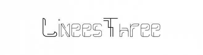
A modern, geometric font with a linear, dynamic style.
![Linees Three Frei Schriftart Herunterladen]() Herunterladen 47 Downloads@WebFont
Herunterladen 47 Downloads@WebFont -
( Fonts by Sudarman Mulka - Personal-use only. For commercial use please contact owner. )
A fluid and elegant script font with a handwritten appearance.
![Worthy Frei Schriftart Herunterladen]() Herunterladen 47 Downloads@WebFont
Herunterladen 47 Downloads@WebFont -
( Fonts by Alpaprana Studio - Personal-use only. For commercial use please contact owner. )
A dynamic and flowing script font with elegant, connected letterforms.
![Memphis Frei Schriftart Herunterladen]() Herunterladen 47 Downloads@WebFont
Herunterladen 47 Downloads@WebFont -
( Fonts by Creatype Studio - Rian Rahardi - Personal-use only. For commercial use please contact owner. )
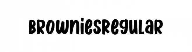
A playful, bold font with a hand-drawn, whimsical style.
![Brownies Regular Frei Schriftart Herunterladen]() Herunterladen 47 Downloads@WebFont
Herunterladen 47 Downloads@WebFont -
( Fonts by Studio Morgana.id )
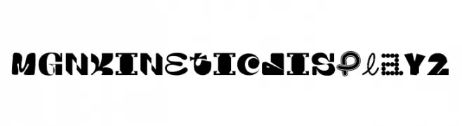
A bold, geometric display font with playful, artistic elements.
![MGN Kinetic Display 2 Frei Schriftart Herunterladen]() Herunterladen 47 Downloads@WebFont
Herunterladen 47 Downloads@WebFont -
( Fonts by Fachranheit - Fachrul Rozi - Personal-use only. For commercial use please contact owner. )
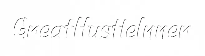
A dynamic script font with fluid, cursive strokes and a modern flair.
![GreatHustleInner Frei Schriftart Herunterladen]() Herunterladen 47 Downloads@WebFont
Herunterladen 47 Downloads@WebFont -
( Fonts by Letterara - Thomas Aradea - Personal-use only. For commercial use please contact owner. )
A charming and elegant script font with flowing, interconnected letters.
![Angelynn Frei Schriftart Herunterladen]() Herunterladen 47 Downloads@WebFont
Herunterladen 47 Downloads@WebFont -
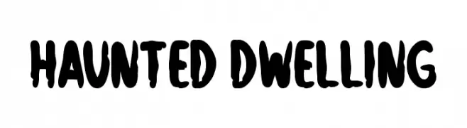
( Fonts by Md Shohail Bhuian - Personal-use only. For commercial use please contact owner. )
A bold, spooky font with a dripping effect, ideal for Halloween themes.
![Haunted Dwelling Frei Schriftart Herunterladen]() Herunterladen 47 Downloads@WebFont
Herunterladen 47 Downloads@WebFont -
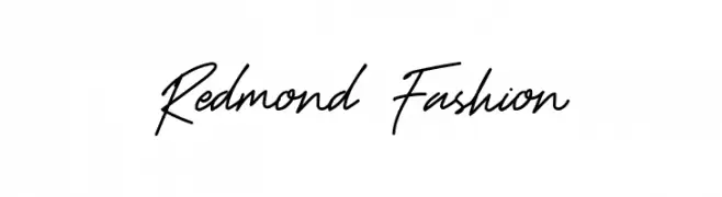
( Fonts by UI Creative - Personal-use only. For commercial use please contact owner. )
A modern, cursive handwritten font with fluid strokes and elegant connections.
![Redmond Fashion Frei Schriftart Herunterladen]() Herunterladen 47 Downloads@WebFont
Herunterladen 47 Downloads@WebFont -
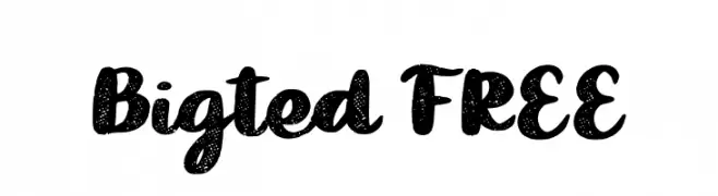
( Fonts by Vunira Design - Personal-use only. For commercial use please contact owner. )
A bold, textured script font with a playful, handcrafted style.
![Bigted FREE Frei Schriftart Herunterladen]() Herunterladen 47 Downloads@WebFont
Herunterladen 47 Downloads@WebFont -
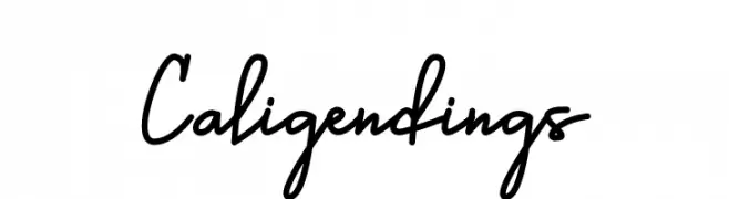
( Fonts by Prioritype Co - Prio Nurokhim Aji - Personal-use only. For commercial use please contact owner. )
A flowing, cursive font with elegant, connected strokes.
![Caligendings Frei Schriftart Herunterladen]() Herunterladen 47 Downloads@WebFont
Herunterladen 47 Downloads@WebFont -
( Fonts by weknow - Wino S Kadir - Personal-use only. For commercial use please contact owner. )
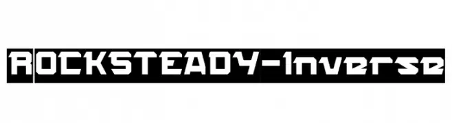
A bold, geometric font with a stencil-like, futuristic design.
![ROCK STEADY-Inverse Frei Schriftart Herunterladen]() Herunterladen 47 Downloads@WebFont
Herunterladen 47 Downloads@WebFont -
( Fonts by Benjamin Eriksen - Personal-use only. For commercial use please contact owner. )
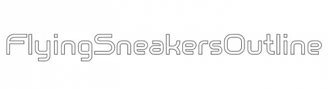
A modern, geometric outline font with a futuristic and sleek design.
![Flying Sneakers Outline Frei Schriftart Herunterladen]() Herunterladen 47 Downloads@WebFont
Herunterladen 47 Downloads@WebFont -
( Fonts by UI Creative - Personal-use only. For commercial use please contact owner. )
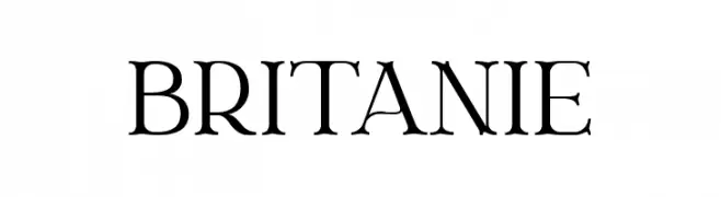
A classic serif font with elegant strokes and balanced contrast.
![Britanie Frei Schriftart Herunterladen]() Herunterladen 47 Downloads@WebFont
Herunterladen 47 Downloads@WebFont -
( Fonts by Vladimir Nikolic - Personal-use only. For commercial use please contact owner. )
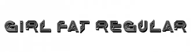
A bold, geometric font with a futuristic, decorative style.
![Girl Fat Regular Frei Schriftart Herunterladen]() Herunterladen 47 Downloads@WebFont
Herunterladen 47 Downloads@WebFont -
( Fonts by Mans Greback - www.mansgreback.com - Personal-use only. For commercial use please contact owner. )
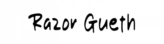
A playful, bold handwritten font with an informal and lively style.
![Razor Gueth Frei Schriftart Herunterladen]() Herunterladen 47 Downloads@WebFont
Herunterladen 47 Downloads@WebFont -
( Fonts by Doehantz Studio - Abduhan Fikhri - Personal-use only. For commercial use please contact owner. )
A flowing, cursive script font with elegant, sweeping curves.
![Elok Frei Schriftart Herunterladen]() Herunterladen 47 Downloads@WebFont
Herunterladen 47 Downloads@WebFont -
( Fonts by Edy Bagus - Personal-use only. For commercial use please contact owner. )
A whimsical script font with playful curls and elegant swirls.
![Allice Demo Frei Schriftart Herunterladen]() Herunterladen 47 Downloads@WebFont
Herunterladen 47 Downloads@WebFont -
( Fonts by K_IN Studio - Personal-use only. For commercial use please contact owner. )
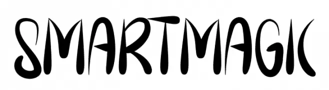
A dynamic, playful font with elongated strokes and a hand-drawn quality.
![Smart Magic Frei Schriftart Herunterladen]() Herunterladen 47 Downloads@WebFont
Herunterladen 47 Downloads@WebFont -
( Fonts by StringLabs - stringlabscreative.com - Personal-use only. For commercial use please contact owner. )
A bold, expressive script font with a hand-drawn, dynamic style.
![Agil Script Frei Schriftart Herunterladen]() Herunterladen 47 Downloads@WebFont
Herunterladen 47 Downloads@WebFont -
( Fonts by sronstudio - Yusron Billah - Personal-use only. For commercial use please contact owner. )
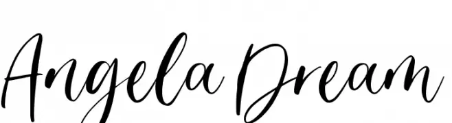
A graceful, cursive font with elegant, flowing strokes and artistic flourishes.
![Angela Dream Frei Schriftart Herunterladen]() Herunterladen 47 Downloads@WebFont
Herunterladen 47 Downloads@WebFont -
( Fonts by Mans Greback - www.mansgreback.com - Personal-use only. For commercial use please contact owner. )
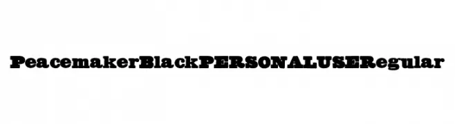
A bold, impactful font with strong, commanding characters.
![Peacemaker Black PERSONAL USE Regular Frei Schriftart Herunterladen]() Herunterladen 47 Downloads@WebFont
Herunterladen 47 Downloads@WebFont -
( Fonts by Iconian Fonts - Daniel Zadorozny - Personal-use only. For commercial use please contact owner. )
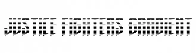
A bold, gradient-striped font with a modern, dynamic style.
![Justice Fighters Gradient Frei Schriftart Herunterladen]() Herunterladen 47 Downloads@WebFont
Herunterladen 47 Downloads@WebFont -
( Fonts by Letterena Studios - letterena.com - Personal-use only. For commercial use please contact owner. )
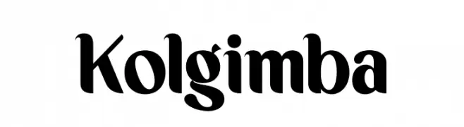
A bold, high-contrast font with elegant curves and unique character designs.
![Kolgimba Frei Schriftart Herunterladen]() Herunterladen 47 Downloads@WebFont
Herunterladen 47 Downloads@WebFont -
( Fonts by Royaltype - Darwinoo - Personal-use only. For commercial use please contact owner. )
A sleek, modern font with tall, narrow letters and a uniform stroke width.
![ElegantSans Frei Schriftart Herunterladen]() Herunterladen 47 Downloads@WebFont
Herunterladen 47 Downloads@WebFont -
( Fonts by Vunira Design - Personal-use only. For commercial use please contact owner. )
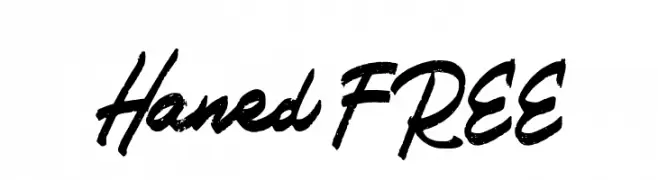
A bold, textured handwritten font with a dynamic and energetic style.
![Haned FREE Frei Schriftart Herunterladen]() Herunterladen 47 Downloads@WebFont
Herunterladen 47 Downloads@WebFont -
( Fonts by Sophea )
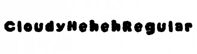
A playful, cloud-like font with bold, rounded characters.
![Cloudy Heheh Regular Frei Schriftart Herunterladen]() Herunterladen 47 Downloads@WebFont
Herunterladen 47 Downloads@WebFont -
( Fonts by Yssa J Armnsyh )
![Qiw Regular Frei Schriftart Herunterladen]() Herunterladen 47 Downloads@WebFont
Herunterladen 47 Downloads@WebFont


Welche Schriften sind gerade am populärsten?
Poppins, Roboto, Montserrat, Open Sans und Lato sind wegen ihrer klaren Formen und breiten Einsetzbarkeit sehr gefragt – von Markenauftritt über Landingpages bis hin zu Postern.
Welche Fonts eignen sich für Logos?
Geometrische Sans‑Serifs (z. B. Poppins, Familien im Gotham‑Stil) sind ein häufiger Griff für sauberes, skalierbares Branding. Für eine persönlichere Note bleiben Scripts und Handschrift‑Stile beliebt. Kombinieren Sie einen prägnanten Headline‑Font mit einer neutralen Brotschrift für Wiedererkennung und Harmonie.
Wie oft wird die Top‑Liste aktualisiert?
Regelmäßig – basierend auf realen Downloads und Interaktionen. Schauen Sie öfter vorbei, um aufstrebende Favoriten früh zu entdecken.
💡 Tipp: Seite bookmarken – Trends wechseln schnell, und heutige Top‑Schriften inspirieren morgen vielleicht das Rebranding.