Willkommen bei den Top‑Schriften – hier treffen Beliebtheit und Qualität aufeinander. Das sind die in diesem Jahr am häufigsten heruntergeladenen und genutzten Fonts. Wenn Sie sichere Optionen für Logo, Web oder Social suchen, starten Sie hier.
Jeder Top‑Font überzeugt durch Balance, Lesbarkeit und Vielseitigkeit. Sie finden moderne Sans‑Serifs, elegante Scripts, Vintage‑Serifs und minimalistische Displays.
-
( Fonts by Vunira Design - Personal-use only. For commercial use please contact owner. )
A bold, flowing script font with elegant, interconnected characters.
 Herunterladen 47 Downloads@WebFont
 -
( Fonts by Nur Solikh - Personal-use only. For commercial use please contact owner. )
A modern, elegant script font with flowing cursive letters and intricate flourishes.
![Centie Script Personal Use Frei Schriftart Herunterladen]() Herunterladen 47 Downloads@WebFont
Herunterladen 47 Downloads@WebFont -
( Fonts by Harjuno Kristanto )
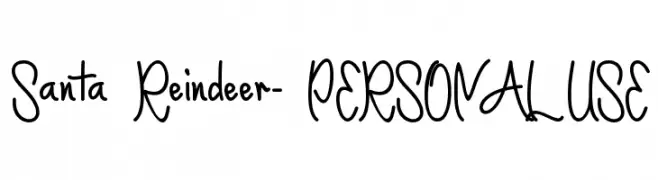
Playful handwritten script with tall, narrow uppercase letters.
![Santa Reindeer- PERSONAL USE Frei Schriftart Herunterladen]() Herunterladen 47 Downloads@WebFont
Herunterladen 47 Downloads@WebFont -
( Fonts by Shiddiq Art - Personal-use only. For commercial use please contact owner. )
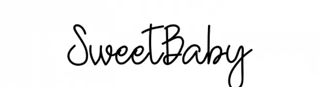
A playful, handwritten font with a whimsical and casual style.
![Sweet Baby Frei Schriftart Herunterladen]() Herunterladen 47 Downloads@WebFont
Herunterladen 47 Downloads@WebFont -
( Fonts by Zetafonts - Personal-use only. For commercial use please contact owner. )
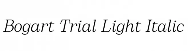
A light, elegant italic font with a classic and sophisticated style.
![Bogart Trial Light Italic Frei Schriftart Herunterladen]() Herunterladen 47 Downloads@WebFont
Herunterladen 47 Downloads@WebFont -
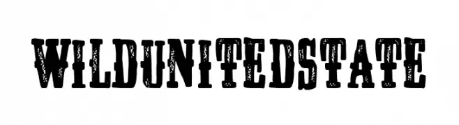
( Fonts by Woodcutter Manero - www.woodcutter.es - Personal-use only. For commercial use please contact owner. )
Distressed, bold slab serif with a rugged, vintage look.
![Wild United State Frei Schriftart Herunterladen]() Herunterladen 47 Downloads@WebFont
Herunterladen 47 Downloads@WebFont -
( Fonts by Sungi Creative - Ivan Pranata - Personal-use only. For commercial use please contact owner. )
A delicate, elegant script font with a handwritten style.
![Askania Frei Schriftart Herunterladen]() Herunterladen 47 Downloads@WebFont
Herunterladen 47 Downloads@WebFont -
( Fonts by Saji Johnny Kundukulam - Personal-use only. For commercial use please contact owner. )
A bold, textured font with a rugged, distressed appearance.
![NIBIRU Frei Schriftart Herunterladen]() Herunterladen 47 Downloads@WebFont
Herunterladen 47 Downloads@WebFont -
( Fonts by Vunira Design - Personal-use only. For commercial use please contact owner. )
A decorative font with human figure silhouettes integrated into each letter.
![Lilith Frei Schriftart Herunterladen]() Herunterladen 47 Downloads@WebFont
Herunterladen 47 Downloads@WebFont -
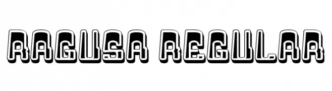
( Fonts by Vladimir Nikolic - www.creativefabrica.com/designer/vladimirnikolic/ - Personal-use only. For commercial use please contact owner. )
A bold, decorative font with a 3D outline and shadow effect, perfect for modern designs.
![Ragusa Regular Frei Schriftart Herunterladen]() Herunterladen 47 Downloads@WebFont
Herunterladen 47 Downloads@WebFont -
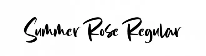
( Fonts by Graphue - Personal-use only. For commercial use please contact owner. )
A bold, expressive handwritten font with fluid strokes and dynamic style.
![Summer Rose Regular Frei Schriftart Herunterladen]() Herunterladen 47 Downloads@WebFont
Herunterladen 47 Downloads@WebFont -
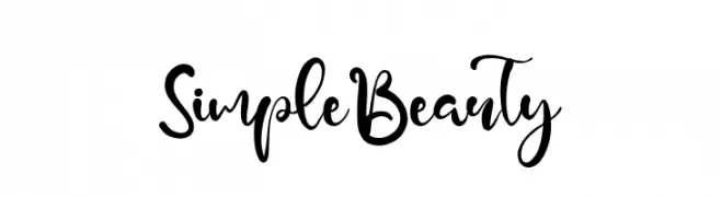
( Fonts by Kong Font - Personal-use only. For commercial use please contact owner. )
A playful, cursive font with flowing, interconnected letters and dynamic stroke contrast.
![SimpleBeauty Frei Schriftart Herunterladen]() Herunterladen 47 Downloads@WebFont
Herunterladen 47 Downloads@WebFont -
( Fonts by The Docallisme - Amry Al Mursalaat - Personal-use only. For commercial use please contact owner. )
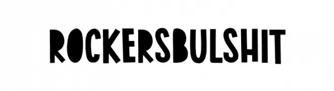
A bold, playful typeface with a retro vibe and rounded characters.
![Rockers Bulshit Frei Schriftart Herunterladen]() Herunterladen 47 Downloads@WebFont
Herunterladen 47 Downloads@WebFont -
( Fonts by Manuel Ramos - Personal-use only. For commercial use please contact owner. )
A sleek, elongated font with thin lines and a modern aesthetic.
![Reason Frei Schriftart Herunterladen]() Herunterladen 47 Downloads@WebFont
Herunterladen 47 Downloads@WebFont -
( Fonts by Woodcutter Manero - www.woodcutter.es - Personal-use only. For commercial use please contact owner. )
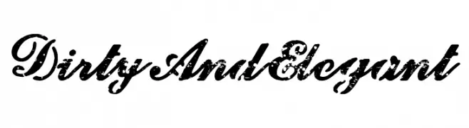
Distressed, bold cursive script with elegant swashes.
![Dirty And Elegant Frei Schriftart Herunterladen]() Herunterladen 47 Downloads@WebFont
Herunterladen 47 Downloads@WebFont -
( Fonts by Mans Greback - Personal-use only. For commercial use please contact owner. )
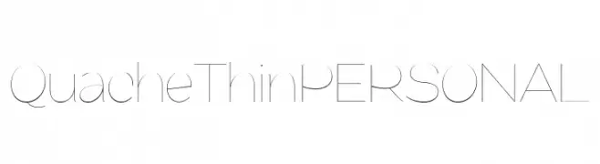
A sleek, ultra-thin font with a modern and minimalistic design.
![QuacheThinPERSONAL Frei Schriftart Herunterladen]() Herunterladen 47 Downloads@WebFont
Herunterladen 47 Downloads@WebFont -
( Fonts by Letterayu - Sri Rahayu - Personal-use only. For commercial use please contact owner. )
A lively, flowing script font with elegant curves and connected strokes.
![Happy Summer Frei Schriftart Herunterladen]() Herunterladen 47 Downloads@WebFont
Herunterladen 47 Downloads@WebFont -
( Fonts by Rayn Media - Rayan - Personal-use only. For commercial use please contact owner. )
A fluid, elegant script font with a modern yet classic handwritten style.
![Syaquilla Frei Schriftart Herunterladen]() Herunterladen 47 Downloads@WebFont
Herunterladen 47 Downloads@WebFont -
( Fonts by Mariyana )
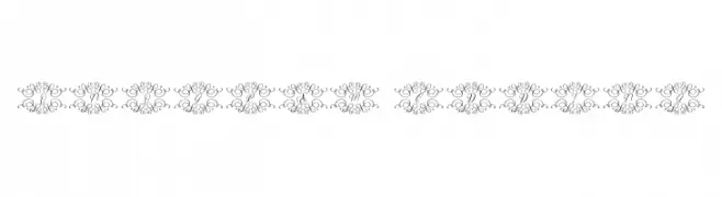
Ornate, decorative monogram font with elegant flourishes.
![Monogram Wedding Frei Schriftart Herunterladen]() Herunterladen 47 Downloads@WebFont
Herunterladen 47 Downloads@WebFont -
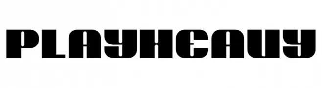
( Fonts by Don Marciano - Personal-use only. For commercial use please contact owner. )
A bold, modern display typeface with thick, blocky letters and high contrast.
![Play Heavy Frei Schriftart Herunterladen]() Herunterladen 47 Downloads@WebFont
Herunterladen 47 Downloads@WebFont -
( Fonts by Jadatype - Jada Akbal - Personal-use only. For commercial use please contact owner. )
A bold, expressive handwritten font with dynamic strokes and artistic flair.
![Mariposha Frei Schriftart Herunterladen]() Herunterladen 47 Downloads@WebFont
Herunterladen 47 Downloads@WebFont -
( Fonts by NanaNissa - Personal-use only. For commercial use please contact owner. )
An elegant script font with flowing, cursive strokes and a sophisticated style.
![Morelove Frei Schriftart Herunterladen]() Herunterladen 47 Downloads@WebFont
Herunterladen 47 Downloads@WebFont -
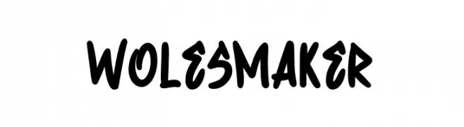
( Fonts by Kong Font - fontkong.com - Personal-use only. For commercial use please contact owner. )
A bold, handwritten font with a playful and energetic style.
![Wolesmaker Frei Schriftart Herunterladen]() Herunterladen 47 Downloads@WebFont
Herunterladen 47 Downloads@WebFont -
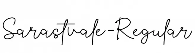
( Fonts by Yosep Hendhry - Personal-use only. For commercial use please contact owner. )
A graceful and flowing script font with a handwritten appearance.
![Sarastvale-Regular Frei Schriftart Herunterladen]() Herunterladen 47 Downloads@WebFont
Herunterladen 47 Downloads@WebFont -
( Fonts by Alit Design - Alit Suarnegara - Personal-use only. For commercial use please contact owner. )
A bold, high-contrast font with elegant and decorative elements.
![MORVA Frei Schriftart Herunterladen]() Herunterladen 47 Downloads@WebFont
Herunterladen 47 Downloads@WebFont -
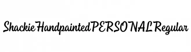
( Fonts by Mans Greback - www.mansgreback.com - Personal-use only. For commercial use please contact owner. )
A hand-painted, cursive font with dynamic strokes and a lively appearance.
![Shackie Handpainted PERSONAL Regular Frei Schriftart Herunterladen]() Herunterladen 47 Downloads@WebFont
Herunterladen 47 Downloads@WebFont -
( Fonts by tomchalky.com - Personal-use only. For commercial use please contact owner. )
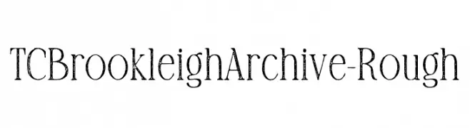
A vintage serif font with a distressed, textured appearance.
![TCBrookleighArchive-Rough Frei Schriftart Herunterladen]() Herunterladen 47 Downloads@WebFont
Herunterladen 47 Downloads@WebFont -
( Fonts by Mans Greback - Personal-use only. For commercial use please contact owner. )
A sleek, modern, and condensed font with a light and minimalist design.
![QuacheLightCondensedPERSONAL Frei Schriftart Herunterladen]() Herunterladen 47 Downloads@WebFont
Herunterladen 47 Downloads@WebFont -
( Fonts by NanaNissa - Personal-use only. For commercial use please contact owner. )
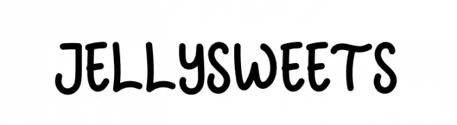
A playful, bold, and rounded handwritten-style font with a casual feel.
![JELLYSWEETS Frei Schriftart Herunterladen]() Herunterladen 47 Downloads@WebFont
Herunterladen 47 Downloads@WebFont -
( Fonts by Fontfabric - Svetoslav Simov - Personal-use only. For commercial use please contact owner. )
A modern, geometric sans-serif font with balanced proportions.
![Code Next-Trial SemiBold Frei Schriftart Herunterladen]() Herunterladen 47 Downloads@WebFont
Herunterladen 47 Downloads@WebFont -
( Fonts by Woodcutter Manero - www.woodcutter.es - Personal-use only. For commercial use please contact owner. )
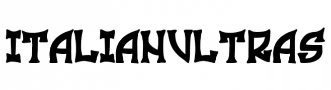
Bold, angular display font with sharp serifs and high impact.
![Italian Ultras Frei Schriftart Herunterladen]() Herunterladen 47 Downloads@WebFont
Herunterladen 47 Downloads@WebFont -
( Fonts by AGUS ALFIAN - ghielz.com - Personal-use only. For commercial use please contact owner. )
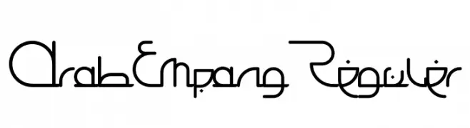
A modern, geometric font with fluid, continuous lines and a futuristic aesthetic.
![Arab Empang Reguler Frei Schriftart Herunterladen]() Herunterladen 47 Downloads@WebFont
Herunterladen 47 Downloads@WebFont -
( Fonts by InkCloudDesign - Camilia Sa - Personal-use only. For commercial use please contact owner. )
A playful, handwritten-style font with a casual and friendly appearance.
![Blast Regular Frei Schriftart Herunterladen]() Herunterladen 47 Downloads@WebFont
Herunterladen 47 Downloads@WebFont -
( Fonts by Noah Type - noahtype.com - Personal-use only. For commercial use please contact owner. )
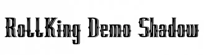
A bold, shadowed font with a gothic flair and strong visual impact.
![RollKing Demo Shadow Frei Schriftart Herunterladen]() Herunterladen 47 Downloads@WebFont
Herunterladen 47 Downloads@WebFont -
( Fonts by Woodcutter Manero - www.woodcutter.es - Personal-use only. For commercial use please contact owner. )
Bold 3D display font with strong shadows and playful style.
![New Blackbuster Frei Schriftart Herunterladen]() Herunterladen 47 Downloads@WebFont
Herunterladen 47 Downloads@WebFont


Welche Schriften sind gerade am populärsten?
Poppins, Roboto, Montserrat, Open Sans und Lato sind wegen ihrer klaren Formen und breiten Einsetzbarkeit sehr gefragt – von Markenauftritt über Landingpages bis hin zu Postern.
Welche Fonts eignen sich für Logos?
Geometrische Sans‑Serifs (z. B. Poppins, Familien im Gotham‑Stil) sind ein häufiger Griff für sauberes, skalierbares Branding. Für eine persönlichere Note bleiben Scripts und Handschrift‑Stile beliebt. Kombinieren Sie einen prägnanten Headline‑Font mit einer neutralen Brotschrift für Wiedererkennung und Harmonie.
Wie oft wird die Top‑Liste aktualisiert?
Regelmäßig – basierend auf realen Downloads und Interaktionen. Schauen Sie öfter vorbei, um aufstrebende Favoriten früh zu entdecken.
💡 Tipp: Seite bookmarken – Trends wechseln schnell, und heutige Top‑Schriften inspirieren morgen vielleicht das Rebranding.