Willkommen bei den Top‑Schriften – hier treffen Beliebtheit und Qualität aufeinander. Das sind die in diesem Jahr am häufigsten heruntergeladenen und genutzten Fonts. Wenn Sie sichere Optionen für Logo, Web oder Social suchen, starten Sie hier.
Jeder Top‑Font überzeugt durch Balance, Lesbarkeit und Vielseitigkeit. Sie finden moderne Sans‑Serifs, elegante Scripts, Vintage‑Serifs und minimalistische Displays.
-
( Fonts by a Max Infeld - XEROGRAPHER FONTS - xerographer.blogspot.com . Personal-use only. For commercial use please contact owner. )
A playful, hand-drawn font with a casual and artistic style.
 Herunterladen 1326 Downloads@WebFont
 -
( Copyright (c) 2010, Kimberly Geswein (kimberlygeswein.com) )
A casual, handwritten font with fluid strokes and a personal touch.
![NothingYouCouldDo Frei Schriftart Herunterladen]() Herunterladen 1326 Downloads@WebFont
Herunterladen 1326 Downloads@WebFont -
( Google Web Fonts )
A sleek, modern, light italic font with smooth strokes and tight spacing.
![Ubuntu Light Italic Frei Schriftart Herunterladen]() Herunterladen 1326 Downloads@WebFont
Herunterladen 1326 Downloads@WebFont -
( Fonts by Manfred Klein. Free for private and charity use. Free for commercial with donation to organizations )
A classic, condensed serif font with elegant and sophisticated styling.
![LimesCondensed Frei Schriftart Herunterladen]() Herunterladen 1326 Downloads@WebFont
Herunterladen 1326 Downloads@WebFont -
![LMS Scooby Doo Frei Schriftart Herunterladen]() Herunterladen 1326 Downloads@WebFont
Herunterladen 1326 Downloads@WebFont -
![Tribbon A Frei Schriftart Herunterladen]() Herunterladen 1326 Downloads@WebFont
Herunterladen 1326 Downloads@WebFont -
![AlFars 10 Badriya Frei Schriftart Herunterladen]() Herunterladen 1326 Downloads@WebFont
Herunterladen 1326 Downloads@WebFont -
( Fonts by Altsys Metamorphosis )
Bold, geometric hazard and safety pictogram set.
![Hazard Regular Frei Schriftart Herunterladen]() Herunterladen 1326 Downloads@WebFont
Herunterladen 1326 Downloads@WebFont -
( Fonts by Anke Arnold - www.anke-art.de )
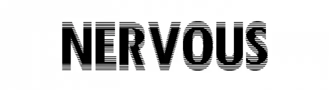
A bold, dynamic font with horizontal line patterns for a modern, edgy look.
![Nervous Frei Schriftart Herunterladen]() Herunterladen 1326 Downloads@WebFont
Herunterladen 1326 Downloads@WebFont -
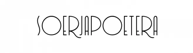
![Soerjapoetera Frei Schriftart Herunterladen]() Herunterladen 1325 Downloads@WebFont
Herunterladen 1325 Downloads@WebFont -
( Fonts by www.peter-wiegel.de. Personal-use only. For commercial use please contact owner. )
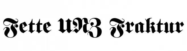
A bold, decorative Blackletter font with intricate details and historical elegance.
![Fette UNZ Fraktur Frei Schriftart Herunterladen]() Herunterladen 1325 Downloads@WebFont
Herunterladen 1325 Downloads@WebFont -
( Fonts by Blue Vinyl - Jess Latham - www.bvfonts.com )
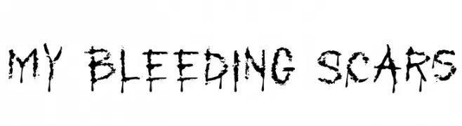
A bold, distressed font with jagged, ink-splattered strokes for a grungy, rebellious look.
![My Bleeding Scars Frei Schriftart Herunterladen]() Herunterladen 1325 Downloads@WebFont
Herunterladen 1325 Downloads@WebFont -
( Fonts by Casady & Greene )
A bold, modern sans-serif font with a geometric structure and clean lines.
![KasseFLF-Bold Frei Schriftart Herunterladen]() Herunterladen 1325 Downloads@WebFont
Herunterladen 1325 Downloads@WebFont -
![Baron Kuffner Frei Schriftart Herunterladen]() Herunterladen 1325 Downloads@WebFont
Herunterladen 1325 Downloads@WebFont -
( Fonts by Apostrophic Lab )
A tall, narrow, and modern unicase font with consistent stroke width.
![Labtop Unicase Frei Schriftart Herunterladen]() Herunterladen 1325 Downloads@WebFont
Herunterladen 1325 Downloads@WebFont -
![Square Bold Frei Schriftart Herunterladen]() Herunterladen 1325 Downloads@WebFont
Herunterladen 1325 Downloads@WebFont -
![Stencil Export Frei Schriftart Herunterladen]() Herunterladen 1325 Downloads@WebFont
Herunterladen 1325 Downloads@WebFont -
( Fonts by huawei.com - Personal-use only. For commercial use please contact owner. )
A modern, geometric sans-serif font with uniform stroke widths.
![HarmonyOS Sans Medium Frei Schriftart Herunterladen]() Herunterladen 1324 Downloads@WebFont
Herunterladen 1324 Downloads@WebFont -
( Fonts by Fontfabric - Svetoslav Simov - Personal-use only. For commercial use please contact owner. )
A bold, modern sans-serif typeface with clean lines and geometric shapes.
![Uni Neue-Trial Heavy Frei Schriftart Herunterladen]() Herunterladen 1324 Downloads@WebFont
Herunterladen 1324 Downloads@WebFont -
( Fonts by Fontfabric - Svetoslav Simov - Personal-use only. For commercial use please contact owner. )
A smooth, flowing script font with a casual, handwritten style.
![Nexa Rust Script L Demo 1 Frei Schriftart Herunterladen]() Herunterladen 1324 Downloads@WebFont
Herunterladen 1324 Downloads@WebFont -
( Fonts by weknow - Wino S Kadir )
A modern, rounded sans-serif font with clean lines and high legibility.
![WEKNOW Windows Frei Schriftart Herunterladen]() Herunterladen 1324 Downloads@WebFont
Herunterladen 1324 Downloads@WebFont -
( Copyright (c) 2010, Kimberly Geswein (kimberlygeswein.com) )
A playful, handwritten font with a casual and friendly vibe.
![Swanky and Moo Moo Frei Schriftart Herunterladen]() Herunterladen 1324 Downloads@WebFont
Herunterladen 1324 Downloads@WebFont -
![DeLarge Bold Frei Schriftart Herunterladen]() Herunterladen 1324 Downloads@WebFont
Herunterladen 1324 Downloads@WebFont -
![MrsEavesSmartLig-Italic Frei Schriftart Herunterladen]() Herunterladen 1324 Downloads
Herunterladen 1324 Downloads -
![carbono Frei Schriftart Herunterladen]() Herunterladen 1324 Downloads@WebFont
Herunterladen 1324 Downloads@WebFont -
( Fonts by Rob Dobi - Toxic Type - www.dobi.nu )
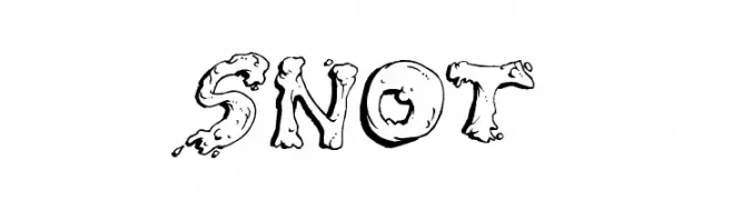
A playful, blob-like font with a whimsical and cartoonish style.
![Snot Frei Schriftart Herunterladen]() Herunterladen 1324 Downloads@WebFont
Herunterladen 1324 Downloads@WebFont -
( Fonts by PampaType - Personal-use only. For commercial use please contact owner. )
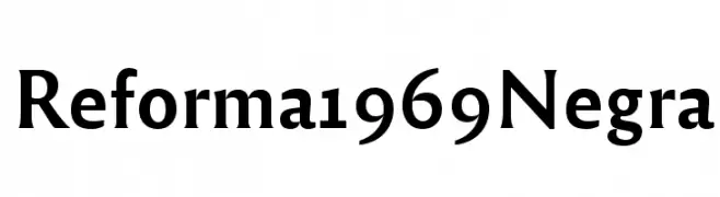
A bold, modern serif font with clean lines and elegant curves.
![Reforma 1969 Negra Frei Schriftart Herunterladen]() Herunterladen 1323 Downloads@WebFont
Herunterladen 1323 Downloads@WebFont -
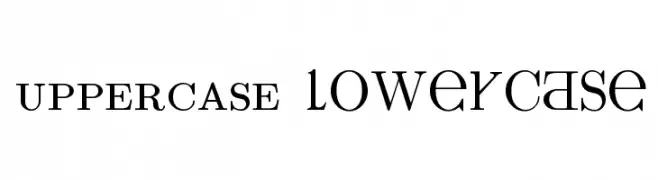
![UPPERCASE & lowercase Frei Schriftart Herunterladen]() Herunterladen 1323 Downloads@WebFont
Herunterladen 1323 Downloads@WebFont -
( Fonts by BLKBK - https://blkbk.ink - Personal-use only. For commercial use please contact owner. Sponsoren Schriftart )
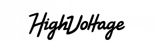
A bold, energetic script font with smooth curves and a slight slant.
![High Voltage Frei Schriftart Herunterladen]() Herunterladen 1323 Downloads
Herunterladen 1323 Downloads -
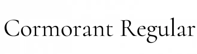
( Copyright (c) 2015, Christian Thalmann and the Cormorant Project Authors (github.com/CatharsisFonts/Cormorant) )
A classic serif font with high contrast and elegant strokes.
![Cormorant Regular Frei Schriftart Herunterladen]() Herunterladen 1323 Downloads@WebFont
Herunterladen 1323 Downloads@WebFont -
( Fonts by junkohanhero )
A bold, distressed font with a vintage, handcrafted look.
![Rough Simple Frei Schriftart Herunterladen]() Herunterladen 1323 Downloads@WebFont
Herunterladen 1323 Downloads@WebFont -
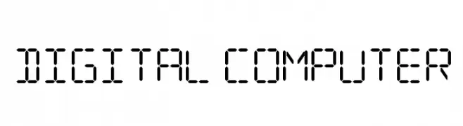
![Digital Computer Frei Schriftart Herunterladen]() Herunterladen 1323 Downloads@WebFont
Herunterladen 1323 Downloads@WebFont -
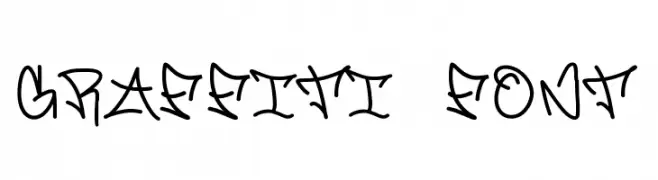
![Graffiti font Frei Schriftart Herunterladen]() Herunterladen 1323 Downloads@WebFont
Herunterladen 1323 Downloads@WebFont -
( Fonts by Jenna Mahaffy )
A bold, distressed font with a hand-drawn, textured style.
![Decibel Frei Schriftart Herunterladen]() Herunterladen 1323 Downloads@WebFont
Herunterladen 1323 Downloads@WebFont -
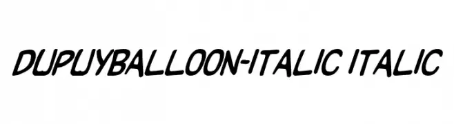
![DupuyBALloon-Italic Italic Frei Schriftart Herunterladen]() Herunterladen 1323 Downloads@WebFont
Herunterladen 1323 Downloads@WebFont


Welche Schriften sind gerade am populärsten?
Poppins, Roboto, Montserrat, Open Sans und Lato sind wegen ihrer klaren Formen und breiten Einsetzbarkeit sehr gefragt – von Markenauftritt über Landingpages bis hin zu Postern.
Welche Fonts eignen sich für Logos?
Geometrische Sans‑Serifs (z. B. Poppins, Familien im Gotham‑Stil) sind ein häufiger Griff für sauberes, skalierbares Branding. Für eine persönlichere Note bleiben Scripts und Handschrift‑Stile beliebt. Kombinieren Sie einen prägnanten Headline‑Font mit einer neutralen Brotschrift für Wiedererkennung und Harmonie.
Wie oft wird die Top‑Liste aktualisiert?
Regelmäßig – basierend auf realen Downloads und Interaktionen. Schauen Sie öfter vorbei, um aufstrebende Favoriten früh zu entdecken.
💡 Tipp: Seite bookmarken – Trends wechseln schnell, und heutige Top‑Schriften inspirieren morgen vielleicht das Rebranding.