Willkommen bei den Top‑Schriften – hier treffen Beliebtheit und Qualität aufeinander. Das sind die in diesem Jahr am häufigsten heruntergeladenen und genutzten Fonts. Wenn Sie sichere Optionen für Logo, Web oder Social suchen, starten Sie hier.
Jeder Top‑Font überzeugt durch Balance, Lesbarkeit und Vielseitigkeit. Sie finden moderne Sans‑Serifs, elegante Scripts, Vintage‑Serifs und minimalistische Displays.
-
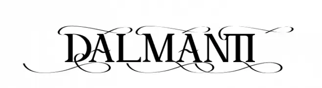
( Fonts by Analogous Studio - Muhammad Ilham - Personal-use only. For commercial use please contact owner. )
A classic serif font with elegant flourishes and balanced weight.
 Herunterladen 46 Downloads@WebFont
 -
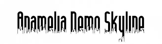
( Fonts by Edric Studio - Personal-use only. For commercial use please contact owner. )
A modern, decorative font with a city skyline motif integrated into tall, narrow letterforms.
![Anamelia Demo Skyline Frei Schriftart Herunterladen]() Herunterladen 46 Downloads@WebFont
Herunterladen 46 Downloads@WebFont -
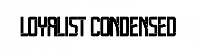
( Fonts by Vladimir Nikolic - Personal-use only. For commercial use please contact owner. )
A bold, geometric, and condensed font with a modern, edgy style.
![Loyalist Condensed Frei Schriftart Herunterladen]() Herunterladen 46 Downloads@WebFont
Herunterladen 46 Downloads@WebFont -
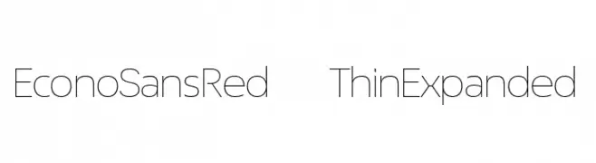
( Fonts by ingoFonts - Ingo Zimmermann - Personal-use only. For commercial use please contact owner. )
A modern, thin, expanded sans-serif font with a clean and geometric style.
![EconoSansRed-33ThinExpanded Frei Schriftart Herunterladen]() Herunterladen 46 Downloads@WebFont
Herunterladen 46 Downloads@WebFont -
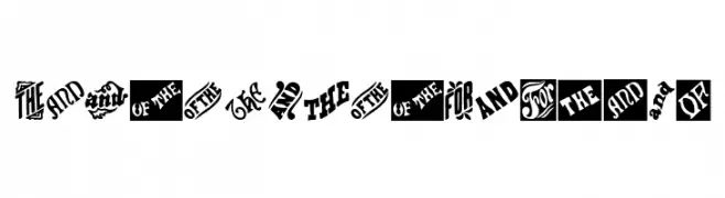
( Fonts by Woodcutter Manero - www.woodcutter.es - Personal-use only. For commercial use please contact owner. )
Ornate, vintage-inspired catchword display font with bold, decorative styling.
![Vintage Catchwords Frei Schriftart Herunterladen]() Herunterladen 46 Downloads@WebFont
Herunterladen 46 Downloads@WebFont -
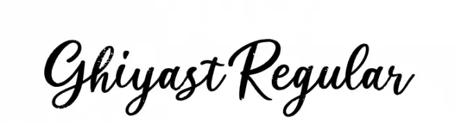
( Fonts by Creatype Studio - Rian Rahardi - Personal-use only. For commercial use please contact owner. )
A dynamic and expressive script font with fluid, cursive letterforms.
![Ghiyast Regular Frei Schriftart Herunterladen]() Herunterladen 46 Downloads@WebFont
Herunterladen 46 Downloads@WebFont -
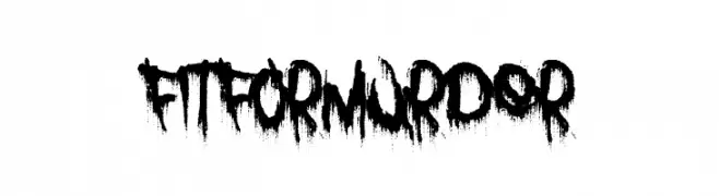
( Fonts by Font Monger - Chris Vile - Personal-use only. For commercial use please contact owner. )
A bold, grunge-style font with a dripping, distressed effect.
![Fit for Murder Frei Schriftart Herunterladen]() Herunterladen 46 Downloads@WebFont
Herunterladen 46 Downloads@WebFont -
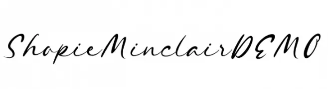
( Fonts by Letterhend Studio - Hendry Juanda - Personal-use only. For commercial use please contact owner. )
A fluid and elegant script font with smooth, flowing lines and a slight slant.
![ShopieMinclairDEMO Frei Schriftart Herunterladen]() Herunterladen 46 Downloads@WebFont
Herunterladen 46 Downloads@WebFont -
( Fonts by Sendika Vidiyantoro - Personal-use only. For commercial use please contact owner. )
A playful, casual handwritten font with flowing strokes and rounded edges.
![Yayak Frei Schriftart Herunterladen]() Herunterladen 46 Downloads@WebFont
Herunterladen 46 Downloads@WebFont -
( Fonts by Jetsmax.com - Personal-use only. For commercial use please contact owner. )
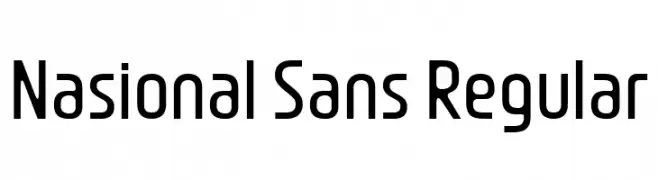
A modern, geometric sans-serif font with consistent stroke width and clear character distinction.
![Nasional Sans Regular Frei Schriftart Herunterladen]() Herunterladen 46 Downloads@WebFont
Herunterladen 46 Downloads@WebFont -
( Fonts by Fontfabric - Svetoslav Simov - Personal-use only. For commercial use please contact owner. )
A sleek, narrow, and italicized font with a modern and elegant style.
![Panton Narrow-Trial Thin Italic Frei Schriftart Herunterladen]() Herunterladen 46 Downloads@WebFont
Herunterladen 46 Downloads@WebFont -
( Fonts by Hugefonts - Personal-use only. For commercial use please contact owner. )
A lively, flowing script font with elegant cursive letterforms and dynamic contrast.
![bagelad Frei Schriftart Herunterladen]() Herunterladen 46 Downloads@WebFont
Herunterladen 46 Downloads@WebFont -
( Fonts by Iconian Fonts - Daniel Zadorozny - Personal-use only. For commercial use please contact owner. )
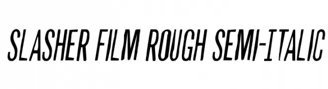
A bold, rough, semi-italic font with a dynamic and edgy style.
![Slasher Film Rough Semi-Italic Frei Schriftart Herunterladen]() Herunterladen 46 Downloads@WebFont
Herunterladen 46 Downloads@WebFont -
( Fonts by Maulana Creative - Gilang Maulana - Personal-use only. For commercial use please contact owner. )
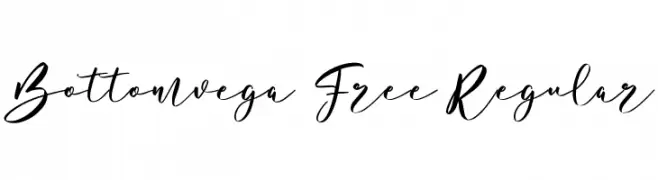
An elegant, flowing script font with smooth, cursive strokes.
![Bottomvega Free Regular Frei Schriftart Herunterladen]() Herunterladen 46 Downloads@WebFont
Herunterladen 46 Downloads@WebFont -
( Fonts by Ryan Prasetya - Personal-use only. For commercial use please contact owner. )
A bold, decorative font with rounded letterforms and playful curves.
![Retrica Frei Schriftart Herunterladen]() Herunterladen 46 Downloads@WebFont
Herunterladen 46 Downloads@WebFont -
( Personal-use only. For commercial use please contact owner. )
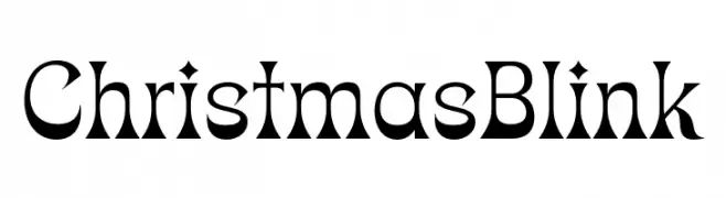
Decorative serif font with high contrast and festive, ornamental style.
![ChristmasBlink Frei Schriftart Herunterladen]() Herunterladen 46 Downloads@WebFont
Herunterladen 46 Downloads@WebFont -
( Fonts by Balpirick - Personal-use only. For commercial use please contact owner. )
A lively, handwritten font with fluid strokes and a playful style.
![Herodance Frei Schriftart Herunterladen]() Herunterladen 46 Downloads@WebFont
Herunterladen 46 Downloads@WebFont -
( Fonts by Esteban Corzo - Personal-use only. For commercial use please contact owner. )
A decorative and abstract font with geometric and futuristic elements.
![Paraghyph Ver 1 Regular Frei Schriftart Herunterladen]() Herunterladen 46 Downloads@WebFont
Herunterladen 46 Downloads@WebFont -
( Fonts by Geranium Space - Megi Satyo Widodo - Personal-use only. For commercial use please contact owner. )
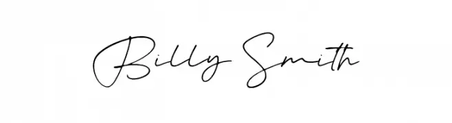
A fluid, cursive font with interconnected letters and a natural handwriting style.
![Billy Smith Frei Schriftart Herunterladen]() Herunterladen 46 Downloads@WebFont
Herunterladen 46 Downloads@WebFont -
( Fonts by Hasto Nsp - Personal-use only. For commercial use please contact owner. )
An elegant and flowing script font with connected characters and ornate flourishes.
![Ekshada Frei Schriftart Herunterladen]() Herunterladen 46 Downloads@WebFont
Herunterladen 46 Downloads@WebFont -
( Fonts by Vunira Design - Personal-use only. For commercial use please contact owner. )
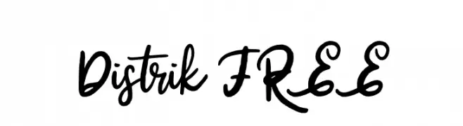
A lively, handwritten script font with medium contrast and fluid strokes.
![Distrik FREE Frei Schriftart Herunterladen]() Herunterladen 46 Downloads@WebFont
Herunterladen 46 Downloads@WebFont -
( Fonts by Zetafonts - Personal-use only. For commercial use please contact owner. )
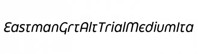
A modern, italicized font with smooth curves and consistent stroke width.
![Eastman Grt Alt Trial Medium Ita Frei Schriftart Herunterladen]() Herunterladen 46 Downloads@WebFont
Herunterladen 46 Downloads@WebFont -
( Fonts by Aburayyan - rayyan - Personal-use only. For commercial use please contact owner. )
A playful, bold handwritten font with a casual and friendly style.
![aragon Frei Schriftart Herunterladen]() Herunterladen 46 Downloads@WebFont
Herunterladen 46 Downloads@WebFont -
( Fonts by Iconian Fonts - Daniel Zadorozny - Personal-use only. For commercial use please contact owner. )
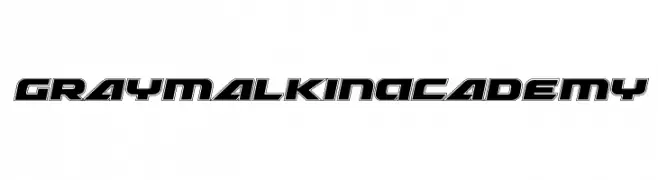
A bold, futuristic font with geometric outlines and a three-dimensional effect.
![Graymalkin Academy Frei Schriftart Herunterladen]() Herunterladen 46 Downloads@WebFont
Herunterladen 46 Downloads@WebFont -
( Fonts by Iconian Fonts - Daniel Zadorozny - Personal-use only. For commercial use please contact owner. )
A bold, condensed font with high contrast and sharp edges, perfect for impactful headlines.
![Grendel's Mother Frei Schriftart Herunterladen]() Herunterladen 46 Downloads@WebFont
Herunterladen 46 Downloads@WebFont -
( Fonts by Alpaprana - Personal-use only. For commercial use please contact owner. )
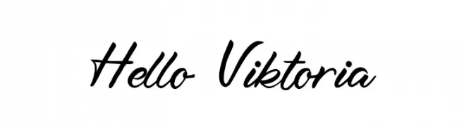
A lively, cursive font with fluid, connected strokes and a handwritten feel.
![Hello Viktoria Frei Schriftart Herunterladen]() Herunterladen 46 Downloads@WebFont
Herunterladen 46 Downloads@WebFont -
( Fonts by Inermedia Studio - Personal-use only. For commercial use please contact owner. )
A playful, whimsical script font with a handwritten style.
![Welcome Mothers Frei Schriftart Herunterladen]() Herunterladen 46 Downloads@WebFont
Herunterladen 46 Downloads@WebFont -
( Fonts by Kong Font - Personal-use only. For commercial use please contact owner. )
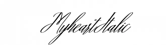
An elegant, flowing script font with a cursive, handwritten style.
![Myheart Italic Frei Schriftart Herunterladen]() Herunterladen 46 Downloads@WebFont
Herunterladen 46 Downloads@WebFont -
( Fonts by Mans Greback - www.mansgreback.com - Personal-use only. For commercial use please contact owner. )
A classic serif font with bold strokes and elegant serifs.
![Grandeux Serif PERSONAL USE Regular Frei Schriftart Herunterladen]() Herunterladen 46 Downloads@WebFont
Herunterladen 46 Downloads@WebFont -
( Fonts by FallenGraphic Studio - Vava Aryanto - Personal-use only. For commercial use please contact owner. )
An elegant, whimsical font with thin, flowing lines and intricate loops.
![Minnesottafree Frei Schriftart Herunterladen]() Herunterladen 46 Downloads@WebFont
Herunterladen 46 Downloads@WebFont -
( Fonts by Vladimir Nikolic - Personal-use only. For commercial use please contact owner. )
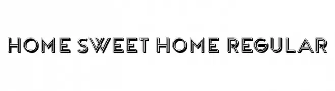
A bold, decorative font with a 3D effect and geometric structure.
![Home Sweet Home Regular Frei Schriftart Herunterladen]() Herunterladen 46 Downloads@WebFont
Herunterladen 46 Downloads@WebFont -
( Fonts by setyaisiam _type - Personal-use only. For commercial use please contact owner. )
A modern, handwritten font with elegant, thin strokes and a dynamic slant.
![Sinaloa Cruz Frei Schriftart Herunterladen]() Herunterladen 46 Downloads@WebFont
Herunterladen 46 Downloads@WebFont -
( Fonts by Iconian Fonts - Daniel Zadorozny - Personal-use only. For commercial use please contact owner. )
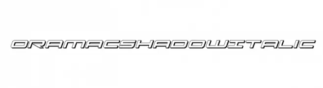
A dynamic, italicized font with a futuristic shadow effect and geometric design.
![Oramac Shadow Italic Frei Schriftart Herunterladen]() Herunterladen 46 Downloads@WebFont
Herunterladen 46 Downloads@WebFont -
( Fonts by Kong Font - fontkong.com - Personal-use only. For commercial use please contact owner. )
An elegant script font with flowing, interconnected letters and high contrast strokes.
![FrenchPolynesia Frei Schriftart Herunterladen]() Herunterladen 46 Downloads@WebFont
Herunterladen 46 Downloads@WebFont -
( Fonts by Woodcutter Manero - www.woodcutter.es - Personal-use only. For commercial use please contact owner. )
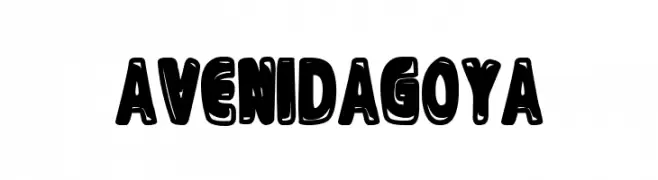
Bold, bubbly, cartoon-style display font with playful character.
![Avenida Goya Frei Schriftart Herunterladen]() Herunterladen 46 Downloads@WebFont
Herunterladen 46 Downloads@WebFont


Welche Schriften sind gerade am populärsten?
Poppins, Roboto, Montserrat, Open Sans und Lato sind wegen ihrer klaren Formen und breiten Einsetzbarkeit sehr gefragt – von Markenauftritt über Landingpages bis hin zu Postern.
Welche Fonts eignen sich für Logos?
Geometrische Sans‑Serifs (z. B. Poppins, Familien im Gotham‑Stil) sind ein häufiger Griff für sauberes, skalierbares Branding. Für eine persönlichere Note bleiben Scripts und Handschrift‑Stile beliebt. Kombinieren Sie einen prägnanten Headline‑Font mit einer neutralen Brotschrift für Wiedererkennung und Harmonie.
Wie oft wird die Top‑Liste aktualisiert?
Regelmäßig – basierend auf realen Downloads und Interaktionen. Schauen Sie öfter vorbei, um aufstrebende Favoriten früh zu entdecken.
💡 Tipp: Seite bookmarken – Trends wechseln schnell, und heutige Top‑Schriften inspirieren morgen vielleicht das Rebranding.